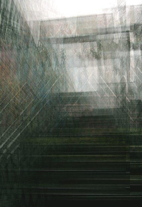
S T R U C T U R E
Structure relates to the arrangement of and relations between the parts or elements of something complex. Additionally, it further relates to the building or other object constructed materials, giving pattern or organisation to. This is something I will look at during this project and present its meaning via various different forms evident below.
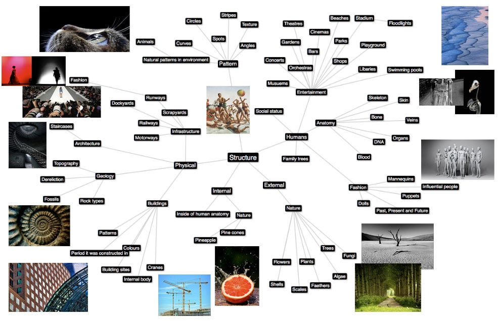
M I N D M A P O F S T R U C T U R E
Below is a mind map demonstrating my original thoughts behind structure. I have included images to further emphasis my original thoughts and to allow me to get inspired for creating my own response to this unit.
V I S U A L I N T E R P R E T A T I O N
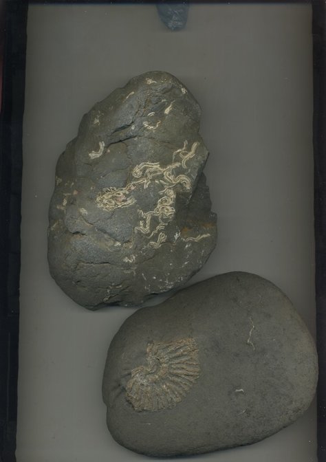
S T R U C T U R E I N N A T U R E
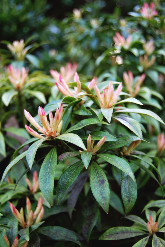
Structure in nature originates from the design that occurs in nature- in molecules, in crystals, in living cells and more. Nature at all levels builds responsive and adaptive strategies that converse material and energy resources through the use of modular components combined with least energy structural strategies. In this segment I will elaborate on this factor and respond to it through a variety of artists: Myoung Ho Lee, Sanna Kannisto and Diane Bielik.
D E V E L O P M E N T O N E
For my first development I looked at the concept from wide perspective. In order to do this I looked at Myoung Ho Lee who captures nature and the environment from a big perspective with large conceptual thought provoking ideas. Below is my analysis of his work and my response.
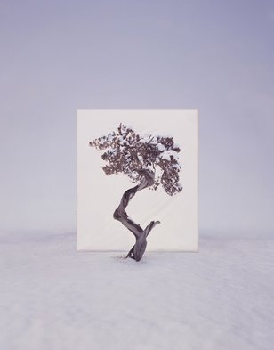
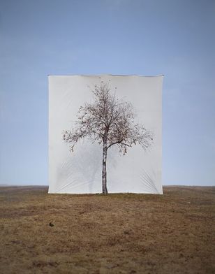
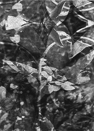
M Y O U N G H O L E E
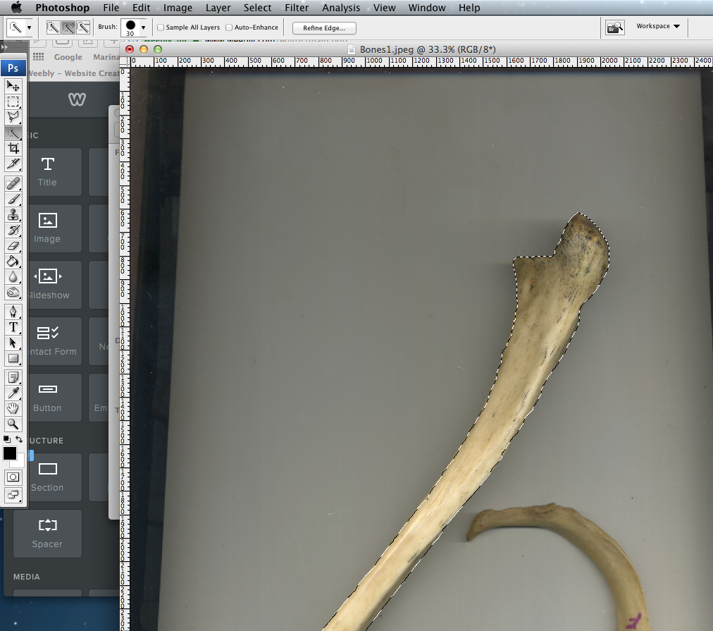
Myoung Ho Lee is a young artist born in South Korea. He has produced an extensive elaborate series of photographs that focus on projecting different representations of reality, art and environmental themes. His work tends to consist of simple conceptual elements but are executed in complex form resulting in an unusual outcome. Below is a selection of photographs from Myoung Ho Lee's series "Trees" in which he takes a simple natural object like a tree and separates it from its natural environment using an immense white background. This then allows us not only to look at the natural environment surrounding the object but also to focus in more depth at the object thus appearing how it would in a painting or photograph on a billboard.
|
|
|
I was strongly drawn to these three images as I thought they showed the contrast between different environments present in our natural world. The first image ( on the left ) represents a cold, snowy surrounding with an almost misty background highlighting the focus of the tree centre stage. Here the photography act is strongly shown as the subject is decontextualised and presents an isolated variant due to the fact that nothing withstands the stark cold winter snow. The decontextualised element is also present in the second image ( in the middle ) due to the stark isolation. I really liked the simplicity in this image the washy smooth blue sky against the brown textured rough floor create an interesting visual effect originating from the strong contrast. The contrast is also present in the focus on the image with the white background against the dark tree allowing the structural elements of the natural element chosen to be highlighted. Additionally, this contrast allows it to further stand out against it's isolated surroundings. The theme of isolation is also present in the last image I chose ( on the right ) which presents an autumnal aura. Here the shape of the tree strongly drew me revealing its structural components demonstrating its characteristics, such as the fact it flows in the wind. The colour of the tree was strongly complimented to the floor demonstrating the chosen executed and effective composition. Lastly, it is evident Myoung Ho Lee maintains a link between his work, here the theme of isolation is prominent hinting to environmental impacts that humans could be having upon the natural world thus resulting in an extremely effective outcome due to its clever composition and through provoking impacts.
R E S P O N S E
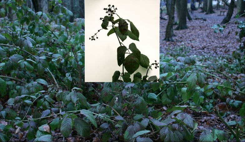
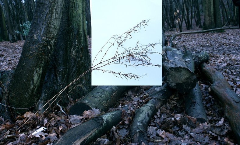
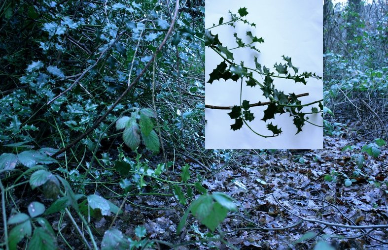
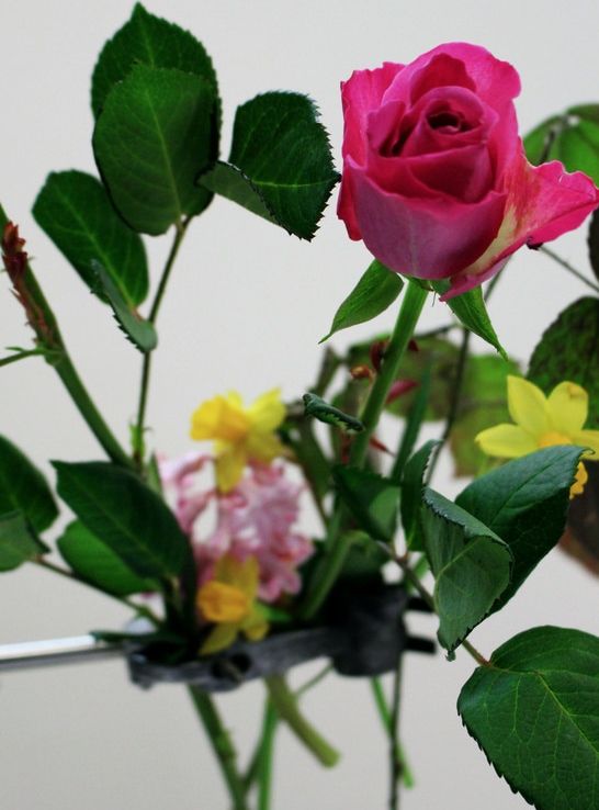
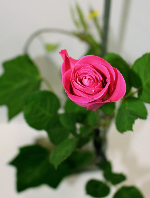
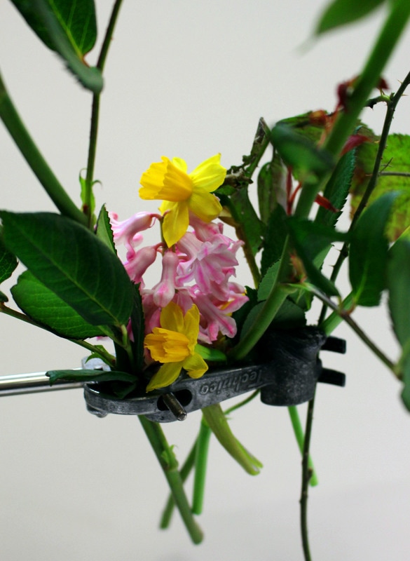
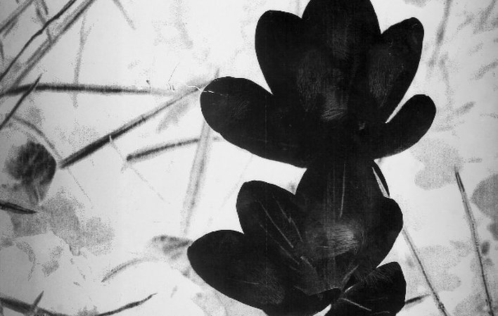
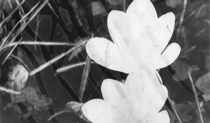
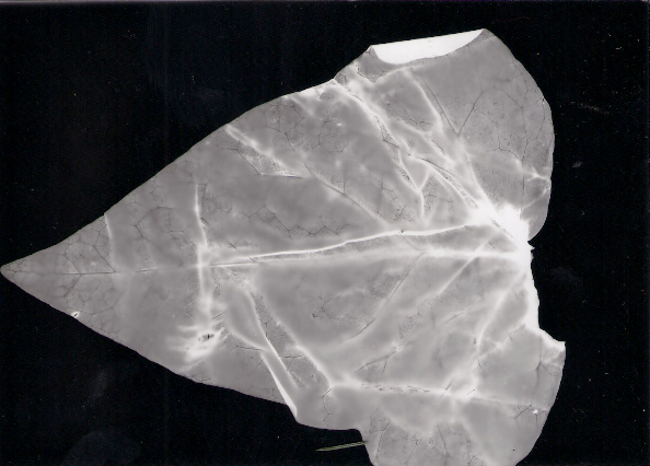
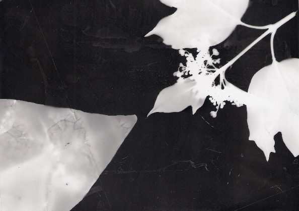
For my response to Myoung Ho Lee's work, I visited a local area, Coldfall Woods with my camera and white card. I then positioned the white card behind a selected plant and took a range of close up images and wide angle ones to replicate the same style he emits in his impressive work. Below is my contact sheets and response.
|
|
|
|
|
B E F O R E
Close up's of the plants:
When taking these images I tried to keep the whole background white and in focus. I also concerntrated on capturing the detailed structure presented by these natural plants. Then on photoshop i enhanced these factors by created a bigger contrast which for example brought out the depth in the leaves stems in image one.
|
|
|
Wide angle:
By capturing this wide angle shot featuring the piece of white paper behind the focus enabled a easy edit so I could remember where the close up shot would be placed. Additionally, it enabled me to have a preview of the final outcome to see whether it would result in an effective result. Lastly, I could of just used these as the final images in response to Myoung Ho Lee however, by editing the close ups over enabled a more detailed focus and added more depth to the image. Looking at the images below it is evident that they haven't reached there full potential, particularly seen in image two where the paper is over exposed.
|
|
|
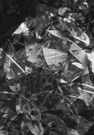
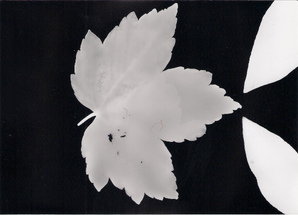
A F T E R
I then put both images into photoshop and put the close up image on top of the wide angle to result in a more effective and visual pleasing outcome. Below is my most effective outcomes.
D E V E L O P M E N T T W O
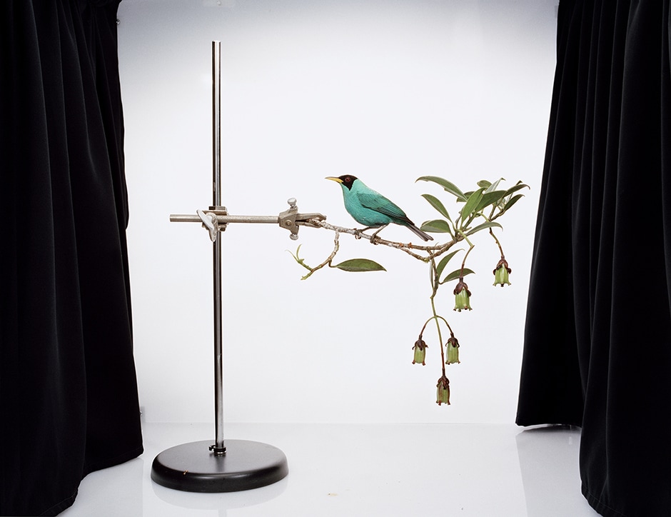
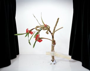
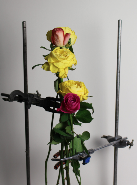
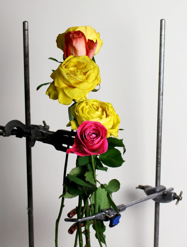
For my second development I decided to look at nature and its structure in a more focused outlook. To do this I looked at the work of Sanna Kannisto who captures plants in a studio contrasted against stark scientific equipment, almost transforming the plant into the subject of an experiment. Thus through this style of photography I was able to look at the structure of nature in more detail.
S A N N A K A N N I S T O
Sanna Kannisto is an artist who currently lives and works in Helsinki. Born in 1974 in Finland, Kannisto explores her photographic theories and concepts from an approach of nature in art and science. By combining the two she uses both methods of representation via art and those in natural sciences too. This series below was captured in Peru, French Guiana, Brazil and Coasta Rica upon which she had the unique, interesting plants and animals that she studied, staged and photographed in a staged manner, right at her fingertips. Below are three examples I was strongly drawn too.
|
|
|
My primary response to these images focused on the fact that the style of photographic approach was so different yet effective. The use of the white background correlated to the natural scientific side to her style but also allowed the subject to stand out even more, amplifying the effect. Additionally, by including the science equipment such as the metal stands in which she attached the extravagant plants and animals too signified the connection between nature and science, almost replicating a real experiment studying these ravishing pieces of nature. This style is very unique, and allows for limits and obstacles both in the research side but also in her photography, yet at the same time are mutually supportive of one another. Thus, I believe Kannisto is very effective at present these beautiful natural structures present in our environment and therefore I will use this approach and imitate it to attempt to achieve a similar outcome.
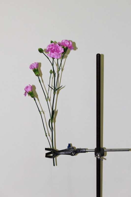
R E S P O N S E O N E
For my response, I collected a range of different flowers and plants to create variety in my outcome. I then positioned them on a metal stand, like Kannisto did with her work, in attempt to achieve a similar outcome. Also, I placed the subject against a white background to make the focus stand out even more. Below is my contact sheet and selected images.
|
|
S E L E C T E D I M A G E S
|
|
|
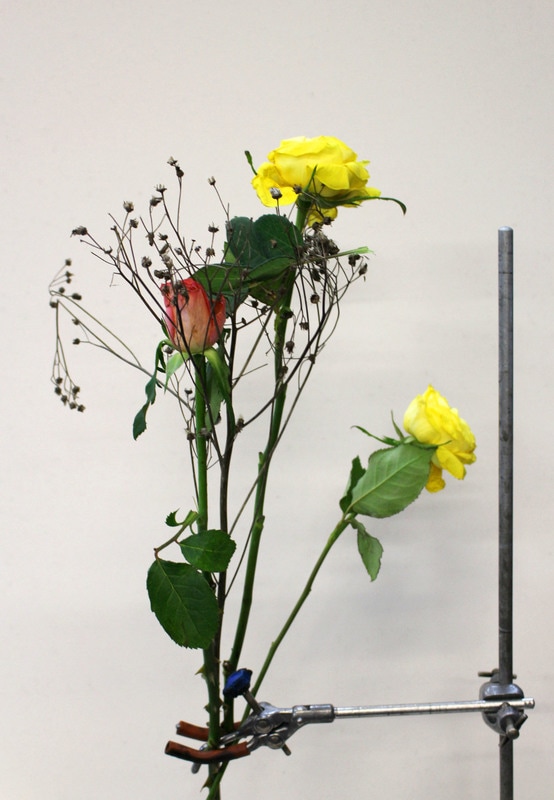
R E S P O N S E T W O
I then did a second response where I pushed the boundaries away from replicating the exact style of Kannisto by transforming her concept into a unique perspective. So, in order to do this I attempted to involve the scientific equipment and the plant/flower in the image but taken from a unique angle or a close up thus further using her style and pushing it even further. Below is my contact sheet and my selected images.
|
|
S E L E C T E D I M A G E S
|
|
|
E X T E N S I O N
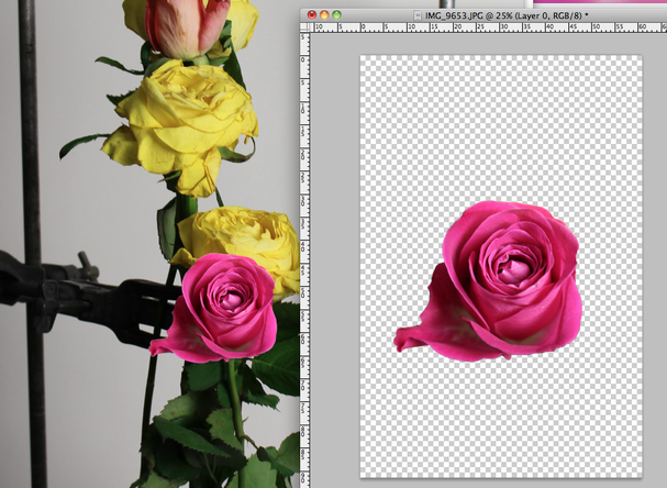
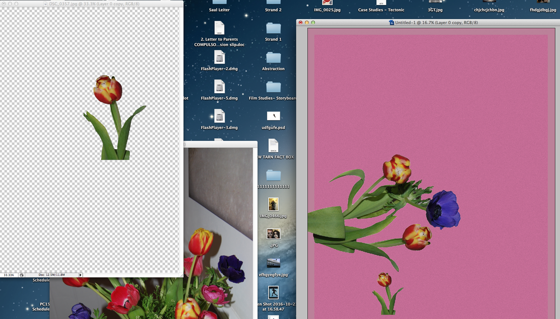
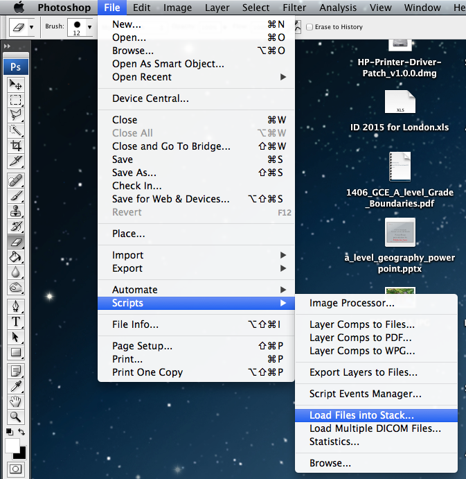
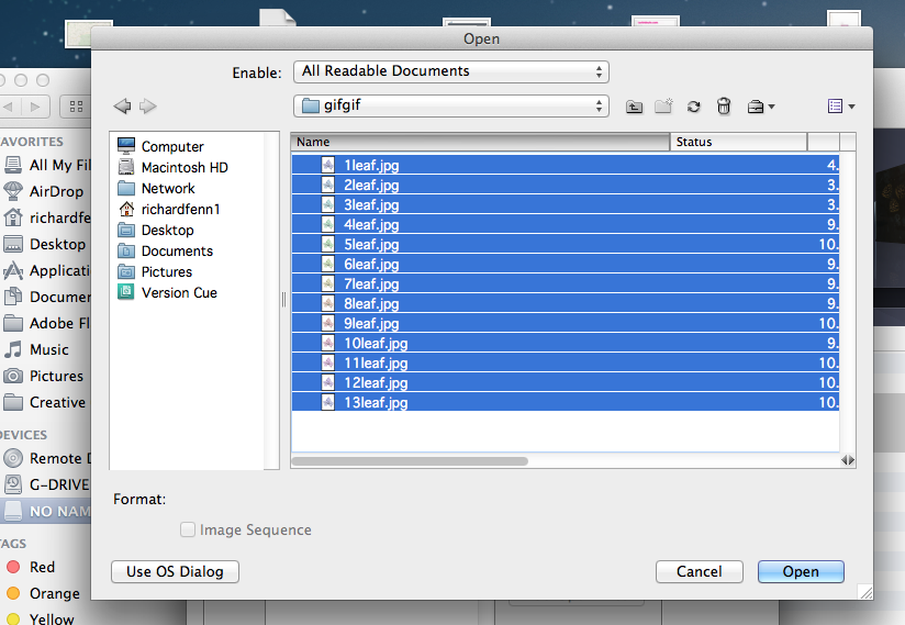
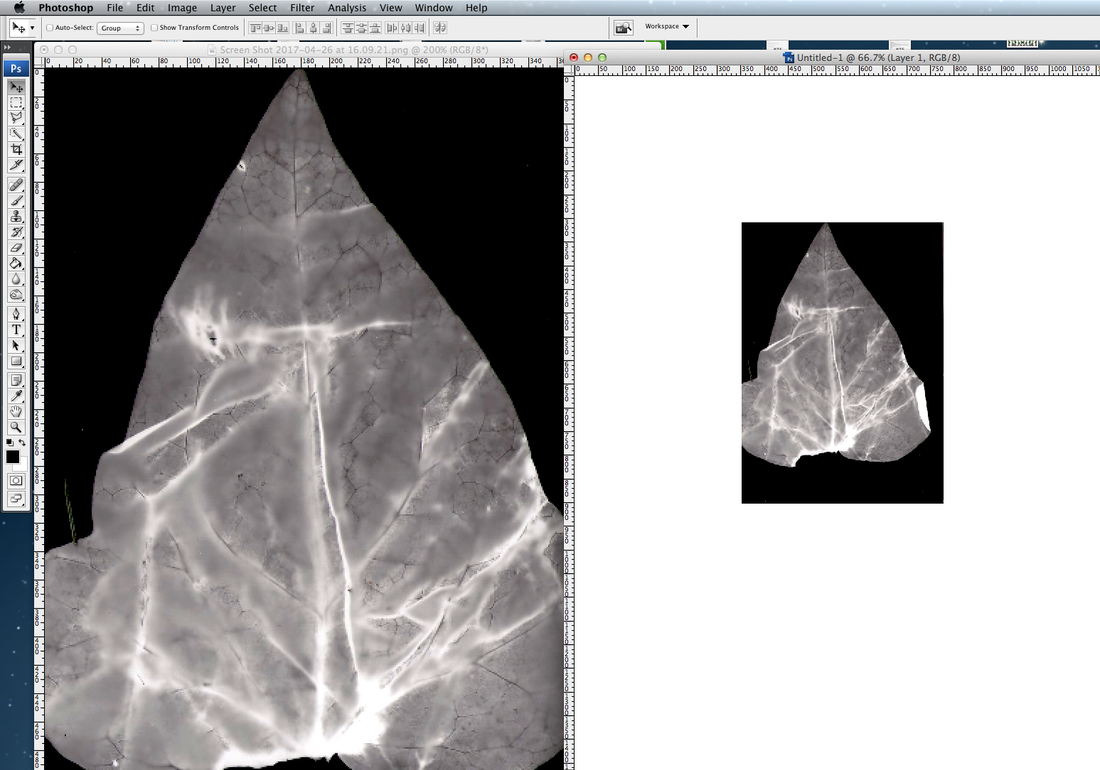
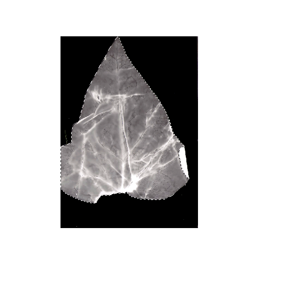
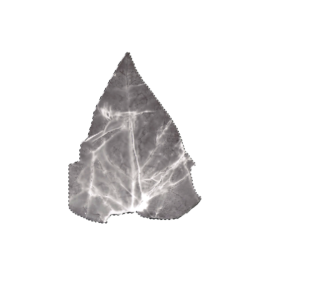
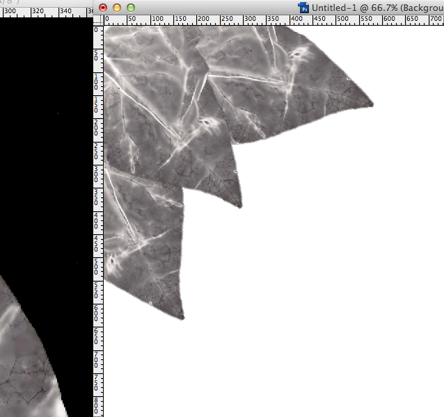
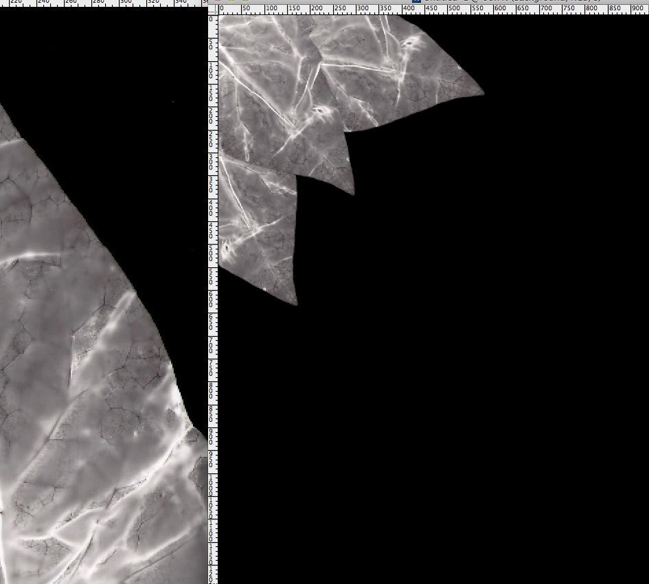
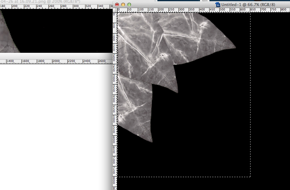
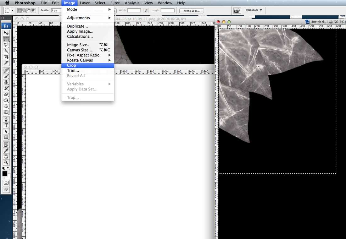
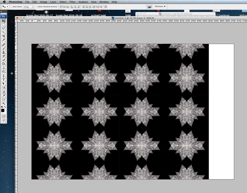
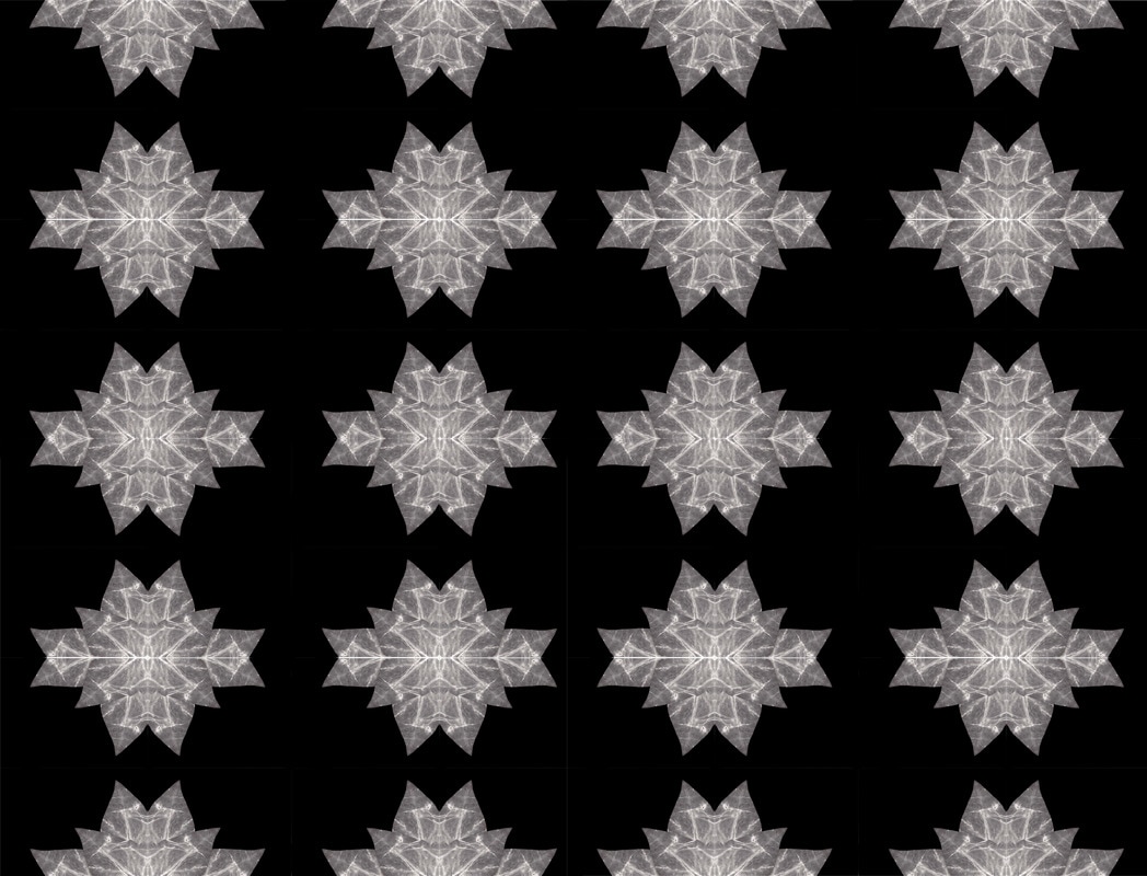
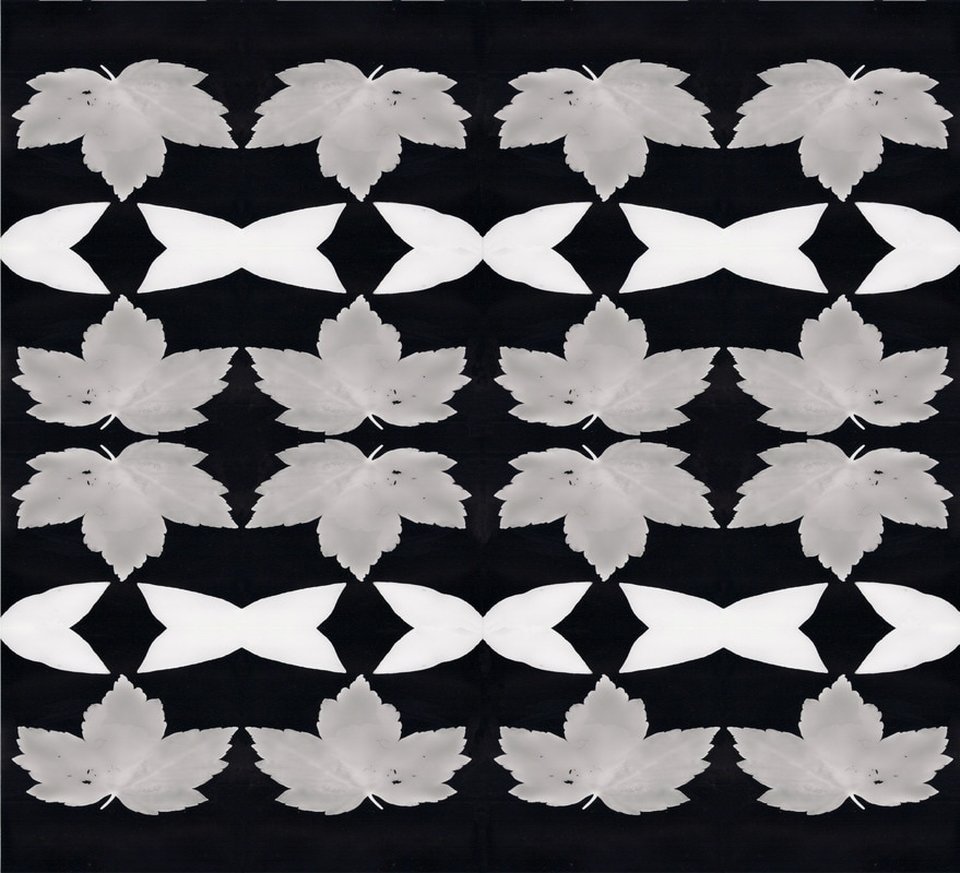
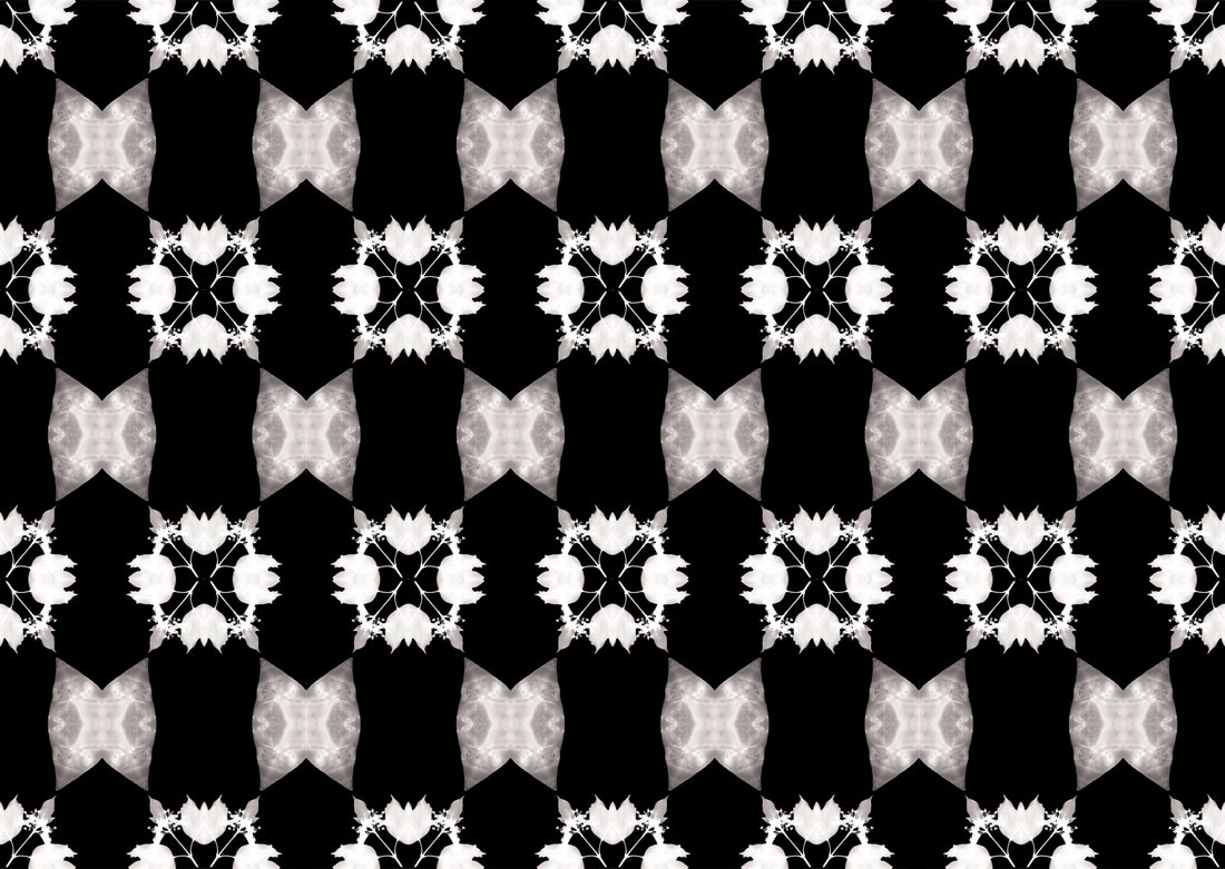
I then decided to expand this concept even further by combining Kannisto and Myoung Ho Lee's stylistic approaches together. In order to do this I chose my subject: an array of flowers positioned against a white background in metal science equipment. I then captured close ups of every flower and then the subject from far away. I then put all these images into photoshop to begin the edit. Next, I unlocked the layer of each close up of the flower and then using the quick selection tool I highlighted the flower. I then inverse selected the layer and deleted the background. This left me at the stage clearly indicted below with a screenshot I took. Lastly, I placed the isolated flowers onto the wide shot of the image to get my final outcome, which is evident below, after my contact sheet.
Below: screenshot mid-proccess on photoshop:
R E S P O N S E
|
B E F O R E
|
A F T E R
|
D E V E L O P M E N T T H R E E
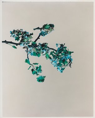
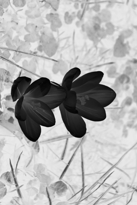
After looking at the work of Sanna Kannisto I was able to gain a deeper understanding of the structural components of plants, in particular flowers. I wanted to further expand upon this to really push the depth of detail I can reach. To attempt to achieve this I'm looking at the work of Diane Bielik and taking her concept and responding to it in my own way.
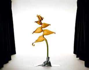
D I A N E B I E L I K
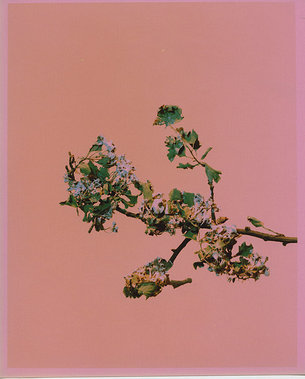
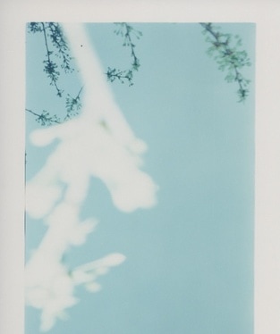
Diane Bielik is a British photographer who's work explores common themes of impermanence, commemoration and death. Below is three images from her "I AM THE DOOR" collection, made and presented in 2016. This series focuses on photographs of blossom. Some images are carefully constructed in the studio using blossom cut from the tree, left to wither and then painted and suspended in artificial skies.However, others are images made quickly on location using cheap basic cameras. Below are three I was strongly drawn to.
|
|
|
I was particularly inspired by Bielik's work as this presents the structure of nature by isolating the blossom tree but also allows for a unique and composition via its deconstruction of the surrounding elements. The reconstructive element of the blossom tree allows for it to strongly stand out and act as a focus for the viewer. The use of stark colours acting as a virtual background strongly correlate to the theme of impermanence, present throughout her work. Thus her composition of this plant is very effective and something I aim to replicate in my response and throughout my work with further responses.
R E S P O N S E
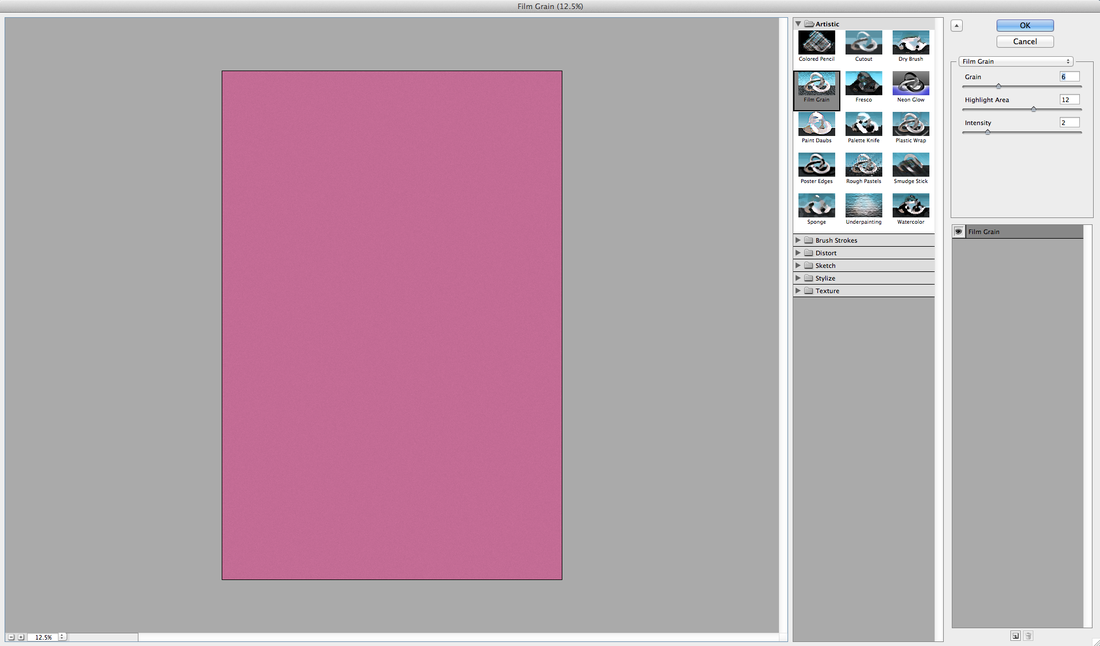
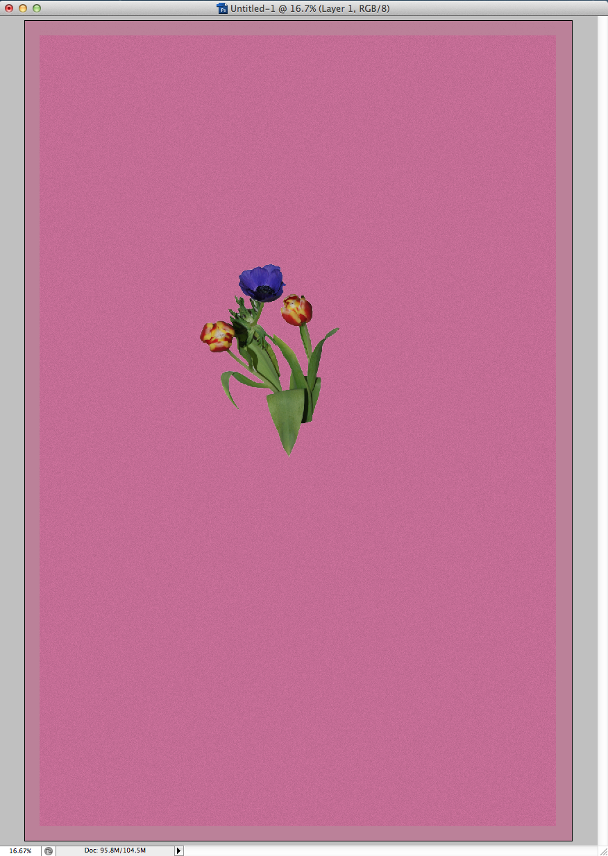
Instead of using film and manipulating the outcome to recreate this unique creative outcome I decided to use digital images and manipulate them in photoshop to recreate the same effect. To do this I selected the flower using the quick selection tool then inverse selected the background and deleted it. I then created a new white layer filled it with a complimenting blue and selected a barrier round the edge and filled it with a darker blue to replicate the style of Diane Bielik. I then selected a filter - filter gallery - then film grain. This would then add the same effect the film camera projects upon the images. Lastly, I put the selected flower onto the blue background and merged the layers, to finalise the image. Below is my outcome.
M E T H O D :
O U T C O M E :
E X H I B I T I O N V I S I T
For my exhibition visit, I visited the white chapel gallery in East London. I thought this was particularly fitting due to its year round display of exhibition, artist commissions, collection displays, historical archived and more. Opening in 1901 as public art gallery, the gallery plays a central role in London's cultural landscape and its pivotal continued growth of the worlds most vibrant contemporary art quarter. Thus this lead me to my visit in which I visited two particularly interesting parts of the gallery: 1) Terrains of the body 2)
T E R R A I N S O F T H E B O D Y
I decided to visit the Whitechapel Gallery to view the Terrains of the Body collection on from 18th January to the 16th April. This exhibition featured many enthralling photographs from the collections of the National Museum of Women in the Arts, the only international museum dedicated to women artists. From the 1970s, women who were excluded from a canon dominated by painting turned to and revolutionised photography, film and performance and thus this exhibition seeks to celebrate this legacy for future prospects. Below is images I capture of some of the work present at the exhibition and analysis of the different segment of this work.
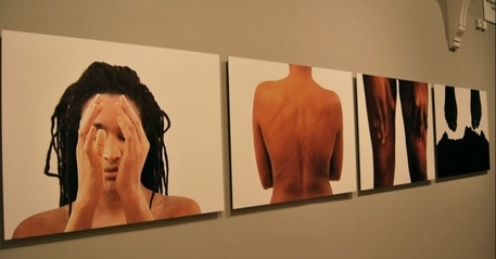
MwangiHutter - Shades of Skin, 2001
I thought these images were particularly interesting. This series of images are chromogenic prints mounted on aluminium of different body parts. This represents structure of the body and the different shapes we come in from contrasting areas of society. Mwangi and Hutter, the German artists that composed these images in 2001 who merged their names to become the single artist Mwangi Hutter work with a range of materials to reflect on changing societal realities, creating aesthetics of self knowledge and interrelationship. These issues are dealt with particularly in this series shown above.
|
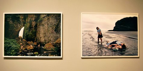
Justine Kurland - Waterfall Mama Babies, 2006 & Raft Expedition, 2001
Jutsine Kurland is an American photographer who's images tend to consist of large scale rural landscapes inhabited by nude women. Her surreal style evokes a pre industrial or post apocalyptic world which are often influenced a range of factors such as 19th century idyllic English landscape paintings and Julia Margaret Cameron's photographs. These images represent structure via their unusual unnatural structured/posed composition, their societal message warning viewers of the what a post apocalyptic world may be like and lastly via the large structures found present in the extensive rural landscapes she features.
|
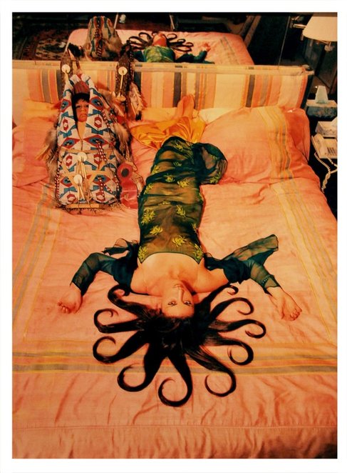
Daniela Rossell - Medusa, 1999
|
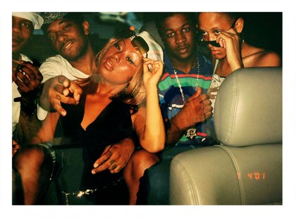
Nikki S.Lee - The Hip Hop Project, 2001
Adriana Varejao Qualquer - Coisa, 1998
|
S T R U C T U R E I N A R C H I T E C T U R E
B R U T A L I S M
Structure of architecture looks at the construction of architecture and the way it was formed, materials used ect. Brutalism is a term that was coined for futuristic architecture being created by Le Corbusier and others like him. Thus this term is now strongly associated with architecture consisting of an extensive mass of raw concrete. This soon became associated with a movement emerging in a postwar British society, excited by this futuristic outcome. The outcome of these buildings took a geometric form yet now are typically associated with areas social housing and thus tend to have high levels of unpleasant social behaviour.
D E V E L O P M E N T O N E
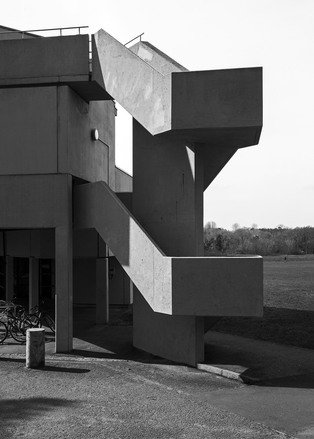
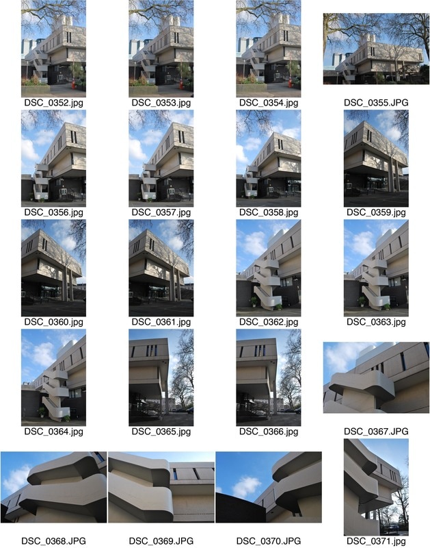
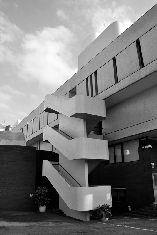
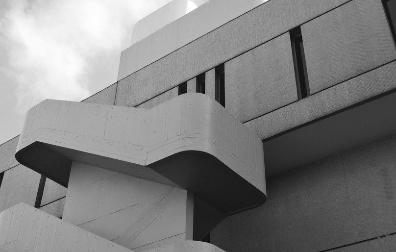
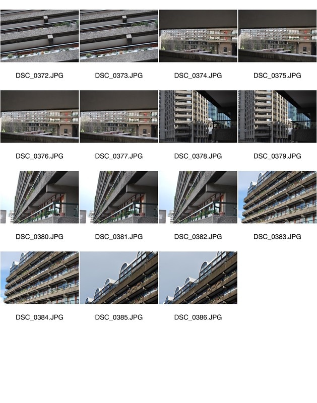
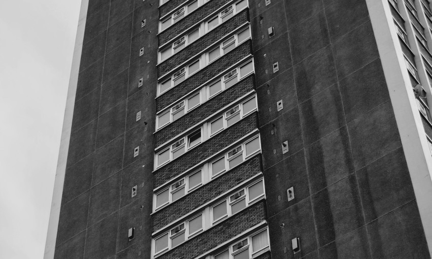
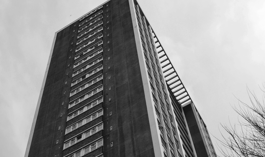
For my first response, I will look at the work of Simon Phipps who portrays Brutalist architecture in a realistic and distinguishing manner. Thus after researching and examining his style I will attempt to respond with a range of locations.
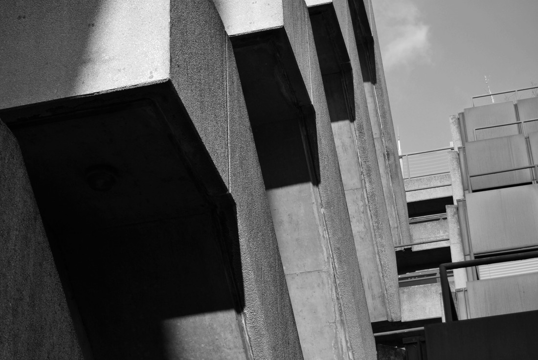
S I M O N P H I P P S
Simon Phipps is a British photographer known for his effective striking images of Brutalist Architecture. He tends to present these photographs as monochrome images printed directly onto an aluminium substrate rather than displaying images as photographic prints. He believes that this concept captures the idea of "valuation of materials as found", whilst aluminium would also resonate with concrete as a material in its visual neutralness. Below is three images I selected from his blog.
|
|
|
Above is three images I selected from Simon Phipps post war british architectural focus, as they stood out to me. I was drawn to the simplicity of the images; he makes no attempt to overcomplicate the image with abstract angles or editing and thus this works effectively as the concept he is capturing is already bold and therefore the complication is unnecessary. His composition presents the structure of these buildings as overpowering and dramatic, particularly with the monochromic edit. Additionally, the fact that no humans are involved in the images allows the audience's focus to be drawn to these dense structures. I was particularly draw to his clever use of lighting, for example the image on the right the light hits the structure on one side of the staircase and thus further enhances the dramatic and intimidating aura imposed upon the viewer. Furthermore, this is something I will attempt to capture in my work.
R E S P O N S E O N E
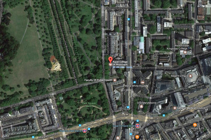
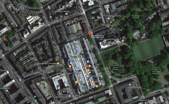
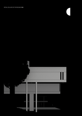
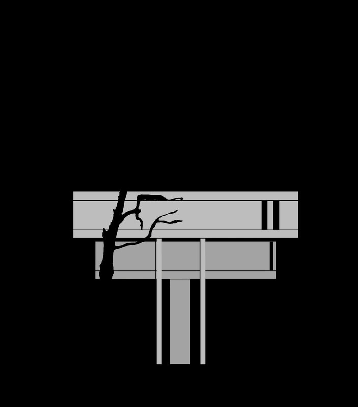
R O Y A L C O L L E G E O F P H Y S I C A N S
For my first response I visited The Royal College of Physicians in Regents park and attempted to capture the building in a realistic manner thus this involving capturing my images from my perspective and allowed the outcome to be what I was looking at when I was there rather than distorting the building in any form. Below is a map illustrating the location of this site, my contact sheet and chosen images.
|
|
S E L E C T E D I M A G E S
Evaluation- I was happy with these images yet I thought they were very simplistic. By focusing on specific architectural elements I encompassed the brutalist style yet I thought this removed the realistic element. Therefore, in my next response, I will visit a different location and attempt to capture a more realistic outcome, as though the viewer is there.
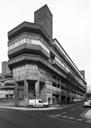
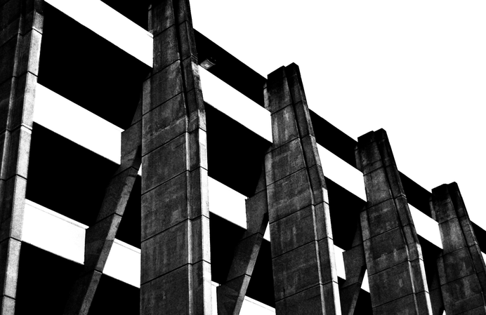
R E S P O N S E T W O
T H E B R U N S W I C K C E N T R E
For this response, I visited the Brunswick centre, a very distinctive place thus the pictures would be very recognisable. I thought this would be effective as the spectator would be draw to them via recognition and also this concept strongly correlates to Phipp's work.
|
|
S E L E C T E D I M A G E S
|
|
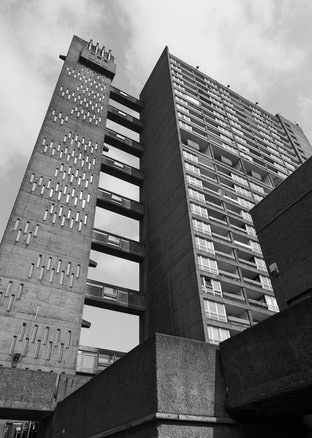
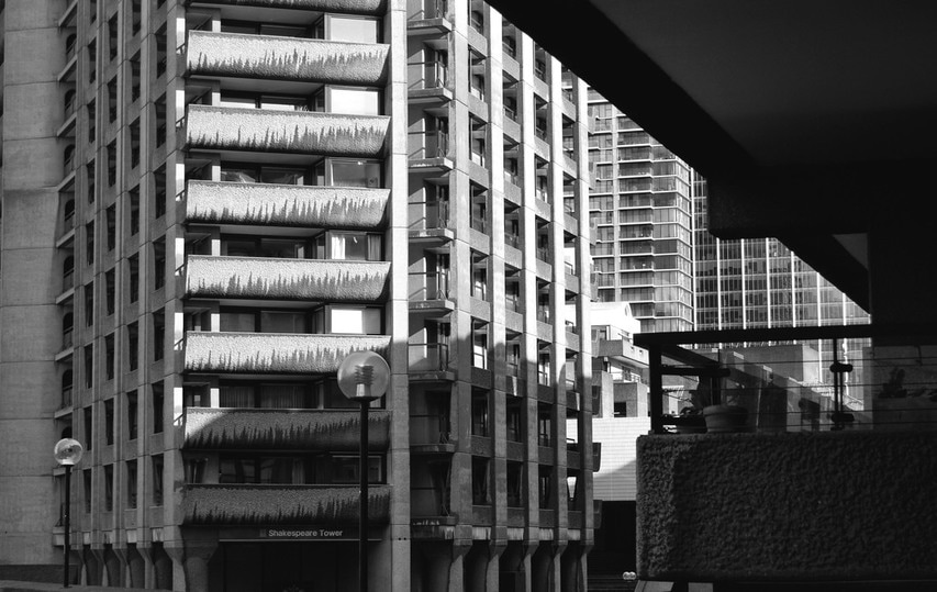
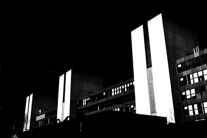
R E S P O N S E T H R E E
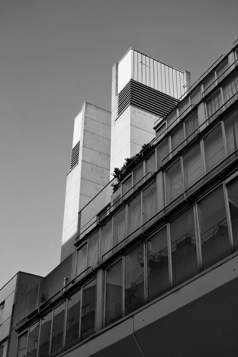
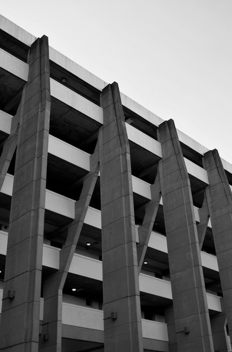
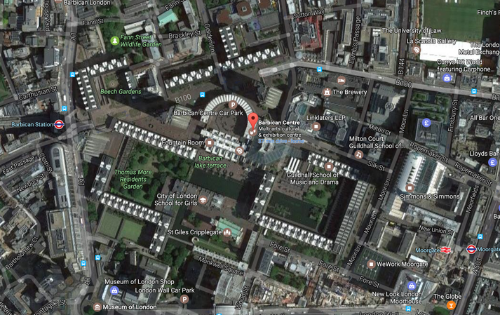
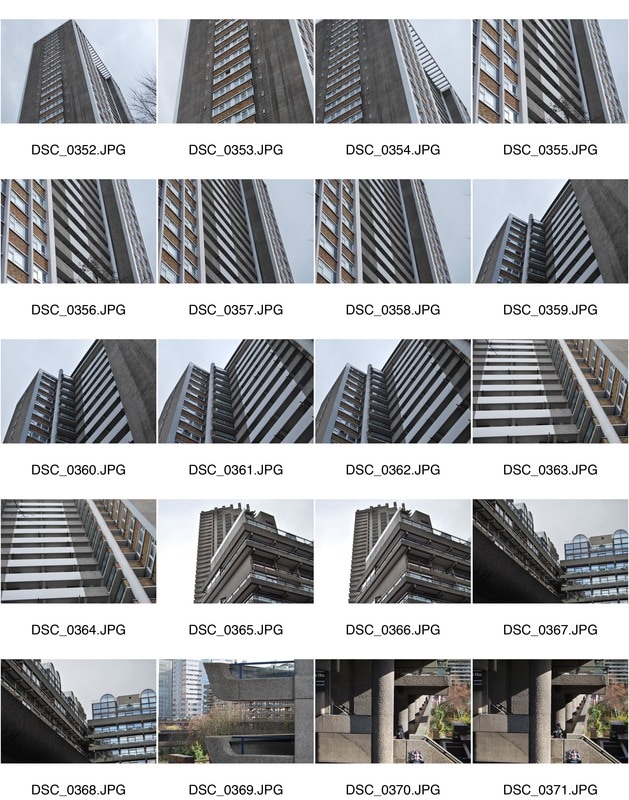
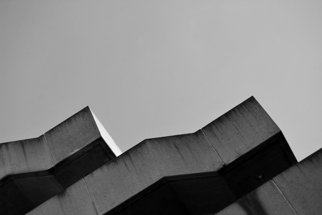
T H E B A R B I C A N
I then decided to capture images at the Barbican due to its distinctive look. Additionally, I went on a day that was more dismal thus didn't possess the bright outcome of my images previously. This creates a more effective outcome as once turned black and white, the whole image encompasses this dismal completeness, correlating to each other. Below is a map showing the location of this building, my contact sheet and my selected images.
|
|
S E L E C T E D I M A G E S
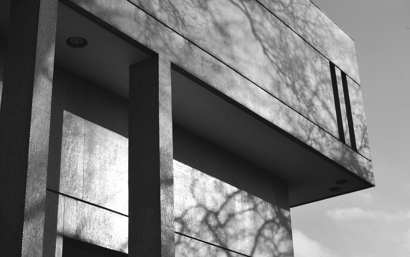
R E S P O N S E F O U R
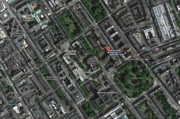
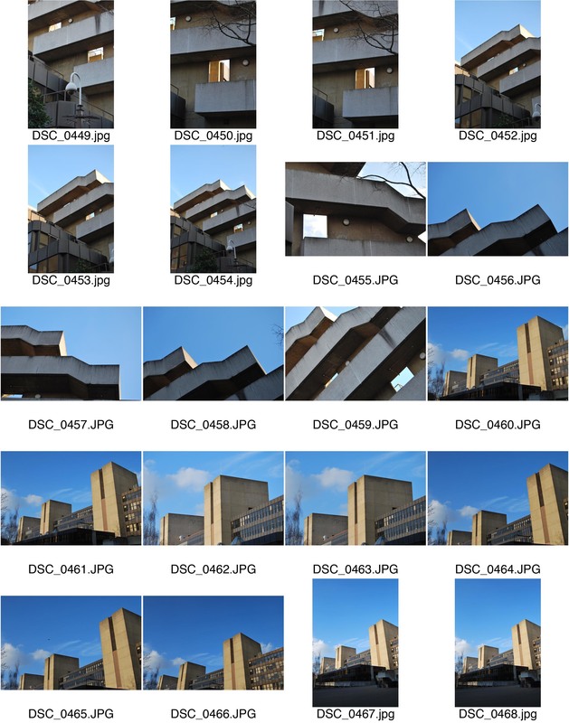
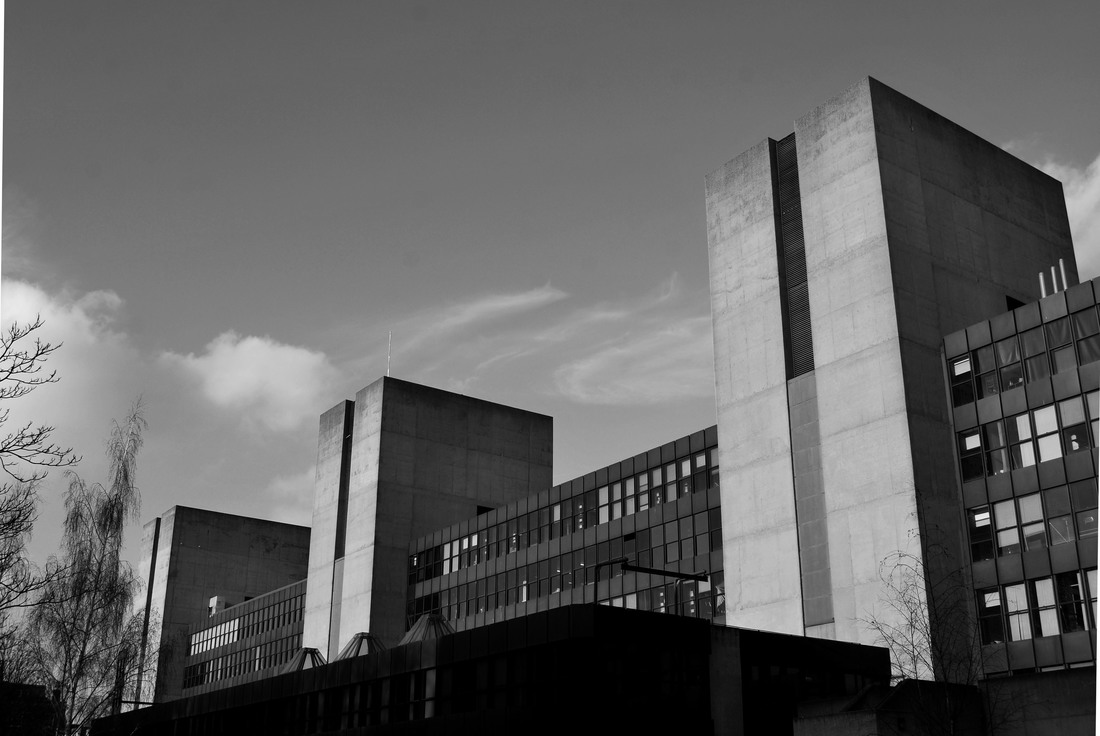
U C L I N S T I T U I O N O F E D U C A T I O N
For my last response I visited the UCL institute of Education building as I thought it had an impressive demeanour. Additionally, for my last response I wanted to create a more experimental outcome so instead of taking these photographs in a convention traditional form I attempted to distort the angle creating a unique outcome. This then enabled me to expand my original response away from Phipps by incorporating his influence but going one step further. Below is a map illustrating the location where I took my images, my contact sheet and my edited images.
|
|
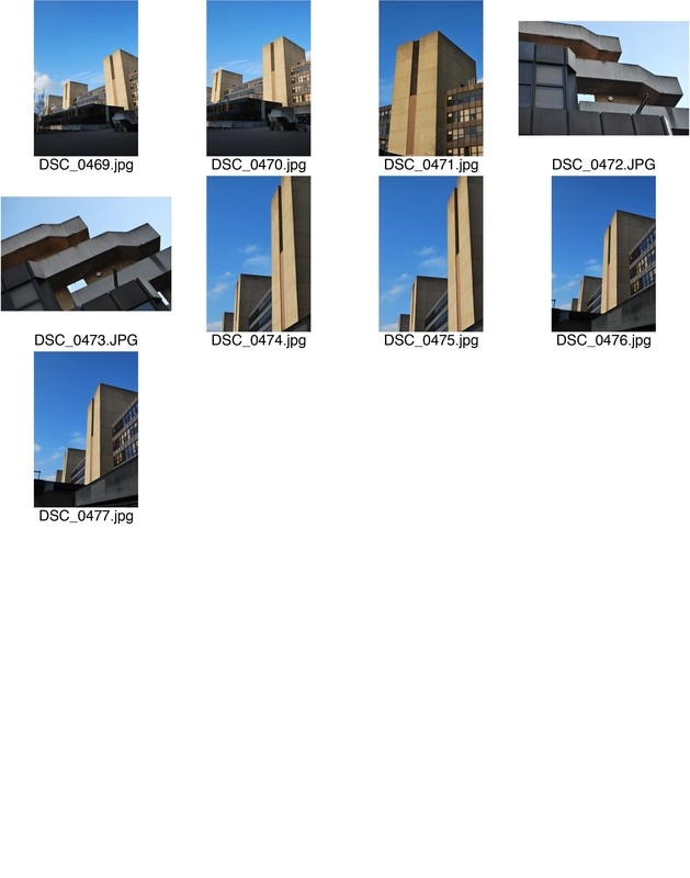
S E L E C T E D I M A G E S
With this image, I took it from a side angle from slightly below to manipulate its composition. This gave an overpowering impression, which enhanced its dramatic brutalist demeanour.
For this image I primarily chose to capture these brutalist stairs but transform the spectators perception. I did this by manipulating its compostion by capturing the photograph from below at a unique angle.
Lastly, I wanted to really push the boundaries far beyond the conventional style of Phipp's so I decided to capture the top of the brutalist stairs at an extreme angle. This combined with the simplistic background create an unusual form of presenting this distinctive structural form.
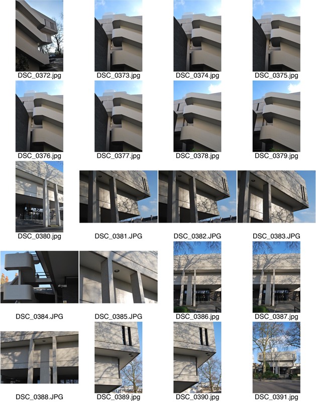
D E V E L O P M E N T T W O
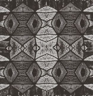
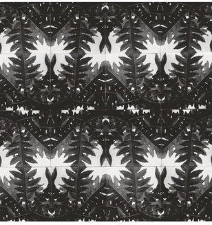
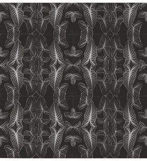
T H O M A S D A N T H O N Y
Thomas Danthony is a French artist based in London. His work is characterised by a clever use of light, bold compositions and a dose of mystery. In trying to recreate Often hid photographs appear like basic, colourful drawings by incorporating photoshop to adjust the effect.Below is three images from his impressive line of work.
|
|
|
R E S P O N S E O N E
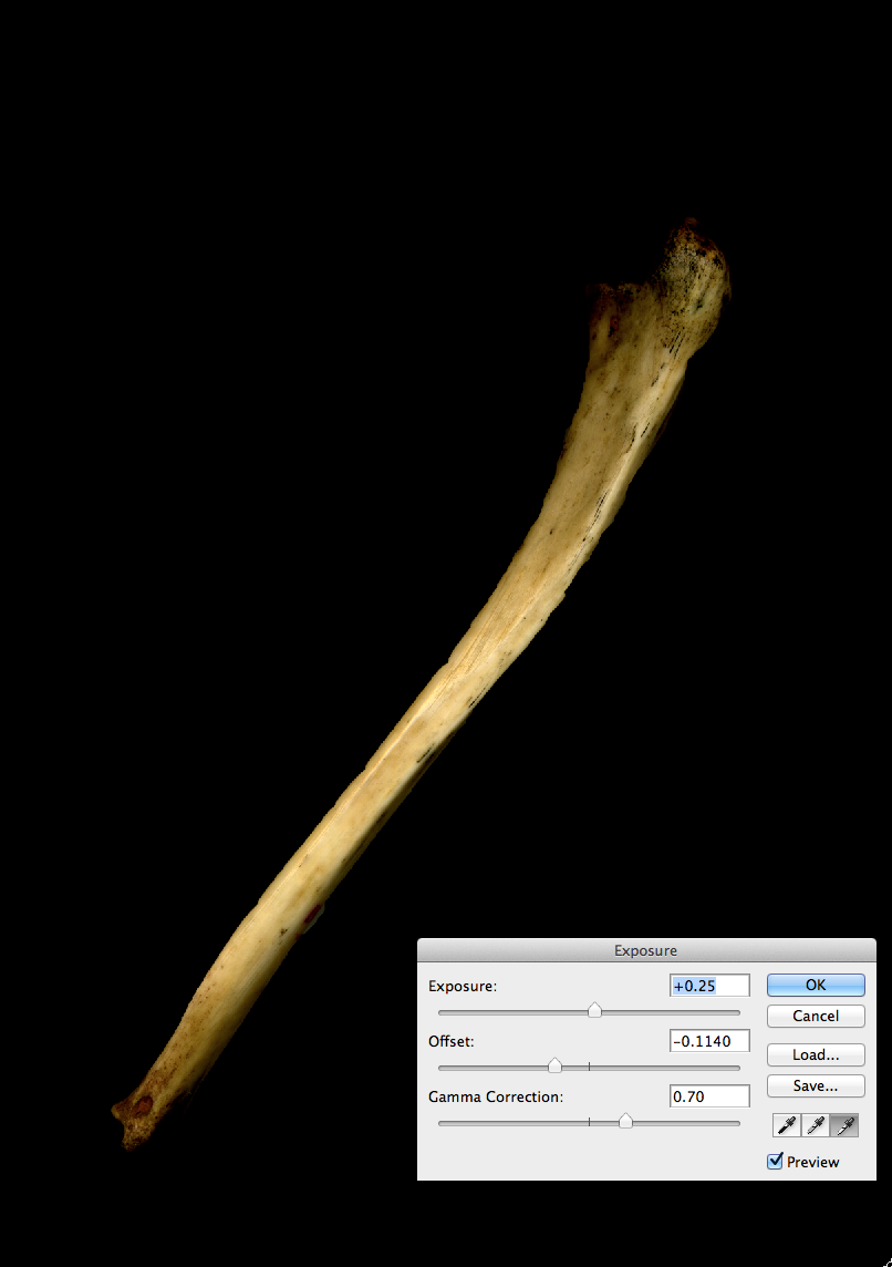
For my first response to Danthony's work I selected a range of brutalist pictures I had captured prior and put them into photoshop. I wasn't completely sure on how to create the most effective result similar to his style so I experimented with a range of aspects. This was my first technique where I first changed the image to black and white by going to image -> adjustments -> black and white. Next I went to adjustments -> levels and adjusted the dark leaver to around 80, the light leaver to around 160 and the middle leaver to around 1.3. This began to form the style I was aiming for. Next, to enhance this contrast I adjusted the curves by going to image -> adjustments -> curves. Lastly, to finalise my image I went to image -> adjustments -> exposure... With this I altered the exposure, increasing it, decreased the offset and increased the gamma radiation. This resulted in an image similar to the style of Thomas Danthony. Below are my attempts.
R E S P O N S E T W O
I wasn't fully satisfied with my first response and thus attempted a second with a different method. For this method I created a new file and used the black paint brush tool and filled the entire background. Next I used the Rectangular Marquee tool and selected a rectangle shape in the centre of the image, which I filled with a grey paint brush. Then I used the same tool and cut two very thin rectangular shapes to imitate the architectural style of the Royal College of Physician's building. Next, I did the same but created two windows. Then, i created a smaller rectangle underneath it using the same tool. However, I chose a darker grey to create the sense of shadow. Next, I created three more vertical rectangles following the same colour scheme. Lastly I selected a tree on my original brutalist image of this building and coloured it in black, then i dragged it onto this image in aim of replicating a similar style to Thomas Danthony.
E X H I B I T I O N V I S I T
T H E R A D I C A L E Y E : M O D E R N I S T P H O T O G R A P H Y
F R O M T H E S I R E L T O N J O H N C O L L E C T I O N
The Radical Eye is a Modernist Photography exhibition from the Sir Elton John Collection, showing at the Tate Modern. It focuses on the classic modernist period of the 1920s-50s, often referred to the 'coming of age' period of photography. This is the first time over the past twenty five years where a group of Man Ray portraits are brought together with portraits by Matisse, Picasso and Breton. Additionally, it displays 150 rare vintage prints by iconic figures such as Brassai, Imogen Cunningham, Andre Kertesz, Dorothea Lange, Tina Modotti and Aleksandr Rodchenko. Thus displaying the work of artists who at the time were transforming the use of photography via experimentation and innovations and ultimately have had an extensive impact on artists over time, still today, by altering their perception of photography. Below are some photographs from the exhibition and two videos with Sir Elton John looking at the collection.
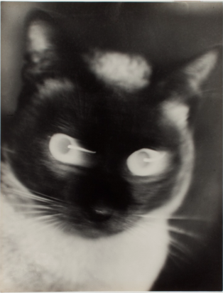
Otto Umber 'Katz' 1927
|
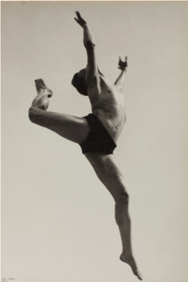
IIse Bing Willem 'Dancer' 1932
|
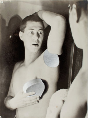
Herbert Bayer 'Self Portrait' 1932
|
|
|
|
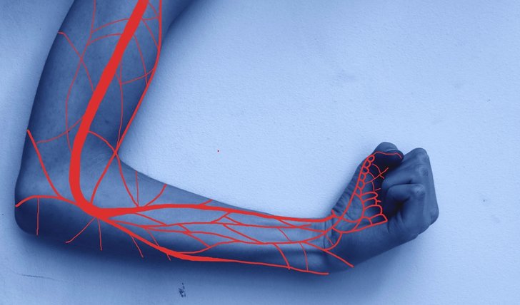
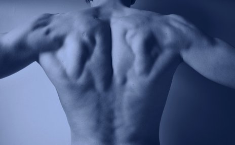
S T R U C T U R E O F T H E B O D Y
P R O F F E S O R G U N T H E R V O N H A G E N S
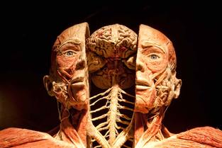
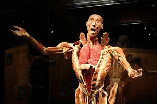
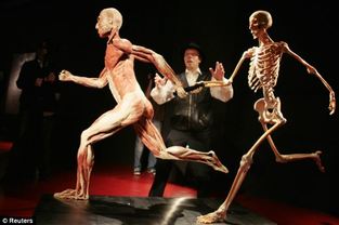
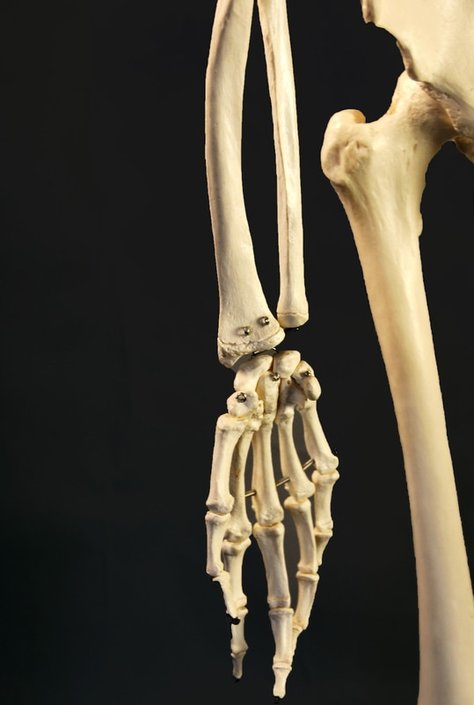
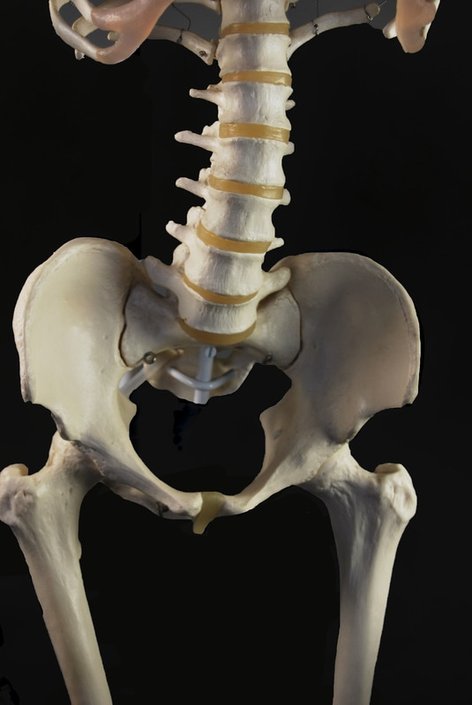
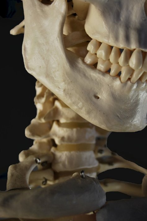
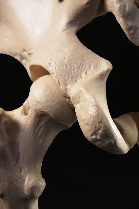
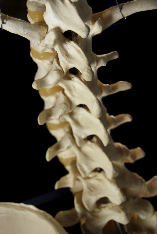
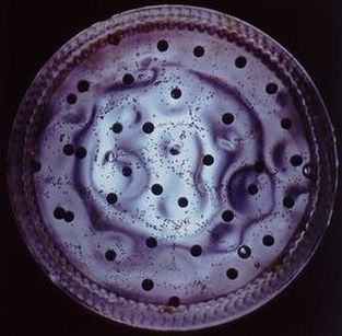
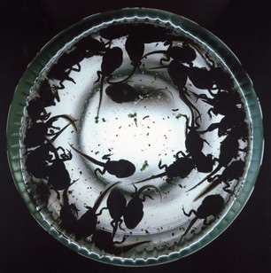
Professor Gunther Von Hagens is a German anatomist who invested plastination. Here are three images from his famous exhibiton called "Bodyworlds". This shocking concept in which he displays real corpses enable the audience to have deeper understand about their anatomy.
|
|
|
I was strongly drawn to this concept. Its shocking display of the internal and external aspects of the human anatomy create disturbing aura bestowed upon the audience. Also, his compositional style in which he positions these corpes around chess boards and doing other normal human activities demonstrates humans are all the same structurally. This unique form of displaying the human structure is something that particularly inspires me and thus I will attempt to incorporate this style into my work.
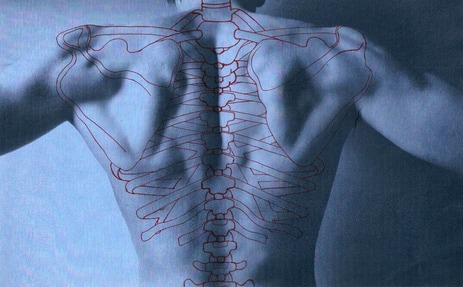
R E S P O N S E
In order to replicate Hagens's style, i began to photograph a skeleton against a dark background. I chose to photograph the skeleton against a dark background as it allows the subject to be brought to focus. I decided to enhance this by putting my chosen images into photoshop and selecting the image using the quick selection tool and colouring in the background with the paint brush tool in black.
|
|
|
S E L E C T E D I M A G E S
|
|
|
|
M Y O U T C O M E
|
Using this tutorial below I combined the images above with an image I took of a male subject to reveal the structure of the human anatomy. The image on the right of the video is my outcome I attempted on photoshop, following the instructions permitted below. |
|
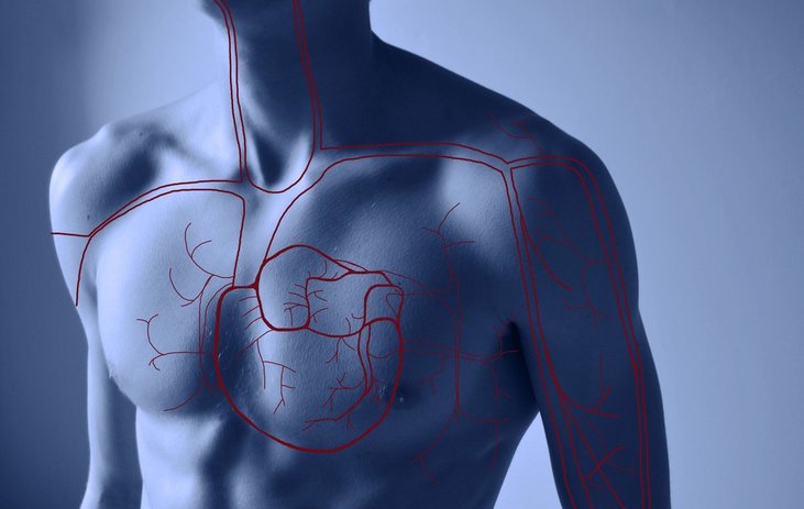
P A T R I C K H I C K L E Y
Patrick Hickley is an artist who's work focuses primarily on the human anatomy. Below i have selected three images from his "Complex Structures" series. This collection consists of photographs taken of the human body which have been printed and then sewed red stitching to represent the veins, arteries, organs and the human skeleton.
|
|
|
I thought these images are very effective. The strong presence of icy blue tones against the striking prominent red colour thread allows them to contrast against each other, making the red even more visible. His accuracy almost acts as the actual veins and organs bringing the focus to the image and combing science with art in a visually creative way. Thus this allows the audience to recognise the internal structural components. This is something I was inspired by and thus will attempt to incorporate it into my work.
R E S P O N S E
For my first response, I decided to attempt to copy the concept via the use of photoshop. To do this once i selected my chosen image and placed it into photoshop. I then used adjusted the tones by making it possess a blue colour. Next I used the paint brush, adjusted the colour to a bright red and drew on the veins present in the arms. Below is my contact sheet and selected images.
S E L E C T E D E D I T
Evaluation - I liked the effect of using a range of different sized red paint brushes on photoshop to create variety but the colour of bright red appeared too drastic and thus defeated the impact of the final outcome. I also wanted to explore larger parts of the body such as a chest or leg. I will look to explore these body parts in my second response.
R E S P O N S E T W O
In this response I captured a range of new images of different parts of the body in nude to create a stark and raw outcome. Below is my contact sheet and my outcome. I used the same process as I did prior but instead of using a bright red I used the colour sampler tool to select the same red found on the original images created my Hickley in order to create a ore effective outcome.
|
|
S E L E C T E D I M A G E :
E X P A N S I O N
To expand this concept further I decided to artistically present this concept. So, in order to do this I edited the selected image on photoshop to adjust the colour in the same style as Hickleys then I printed the image out drew the bone structure found on a back in red and then scanned the image in. This then allowed a different result to the photoshopped version and thus a more interesting, unique outcome. Below is my outcome and comparison.
|
B E F O R E
|
A F T E R
|
T H R E E S T R A N D S
STRAND ONE:
STRUCTURE OF SOCIETY
For this strand I will focus on a particular element of society: the structure of the urban environment. In order to fully explore this I will aim to capture images that don't have humans featured in this, this will enable the audience to focus whats present in the photograph without any distractions. Additionally, I aim to go to an area that isn't neatly kept or cared for to create a sense of disorder imposed upon a busy city environment.
STRAND TWO:
REPRESENTATION OF WOMEN
I decided to do this as a strand due to the evermore relevance this has in 21st century society. As we progress and protest against the wrongdoings of the world, female inferiority becomes forefront. Protests against female treatment allows education and understanding to others who lack the knowledge surrounding this topic encouraging them to campaign as well, against its problematic issue. In order to present this I will look at the work of Cindy Sherman and find a unique form of responding.
STRAND THREE:
BIOLOGICAL STRUCTURE
For my last strand I will focus on the biological components of our world and their unique structures they present to the world. Not only will I focus on live anatomy but also the skeleton structure of mammals. I will look at a range of artists to explore this concept.
S T R A N D O N E
S T R U C T U R E O F S O C I E T Y
U R B A N E N V I R O N M E N T
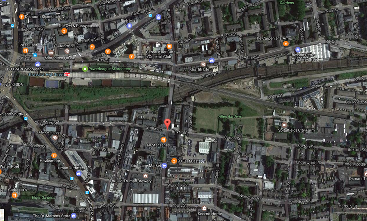
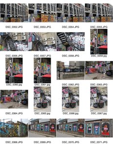
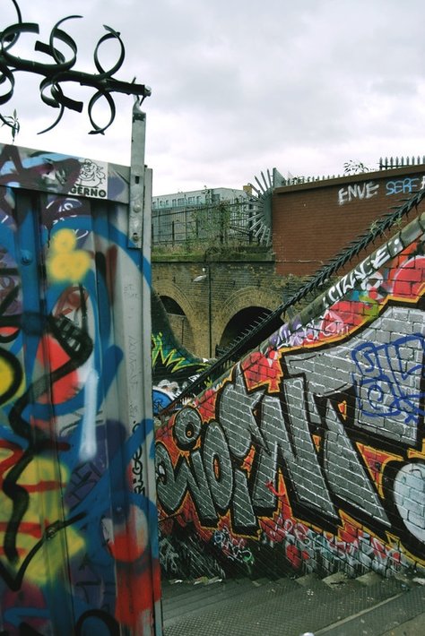
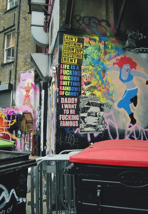
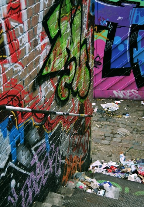
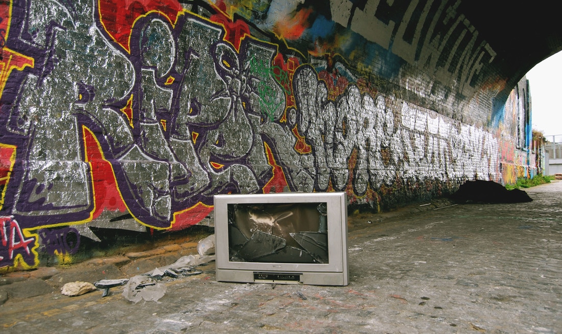
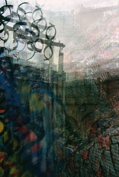
First I haven't to capture images of an urban environment without any human interference so, I visited brick lane and captured images of the urban environment around the entire area without humans in it. This removal of humans allows a focus on the image and the treatment present in it for example, if there is litter or graffiti present. I decided to chose brick lane as it is a vibrant, popular place for a range of ages that has a particular unique connection with humans. Below is a map illustrating where i visited, my contact sheet and my final chosen images.
R E S P O N S E
Below is my contact sheet and my chosen selected images. These have been edited on photoshop adjusting their hue/saturation, levels, curves and much more in order to create a more striking and vibrant image, correlating to the subject of my focus.
|
|
|
|
S E L E C T E D E D I T S
|
|
|
|
I M P O S I N G S T R U C T U R E
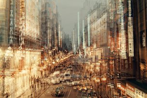
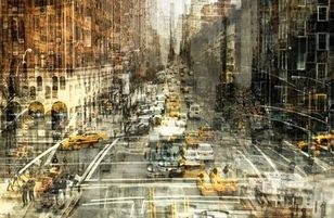
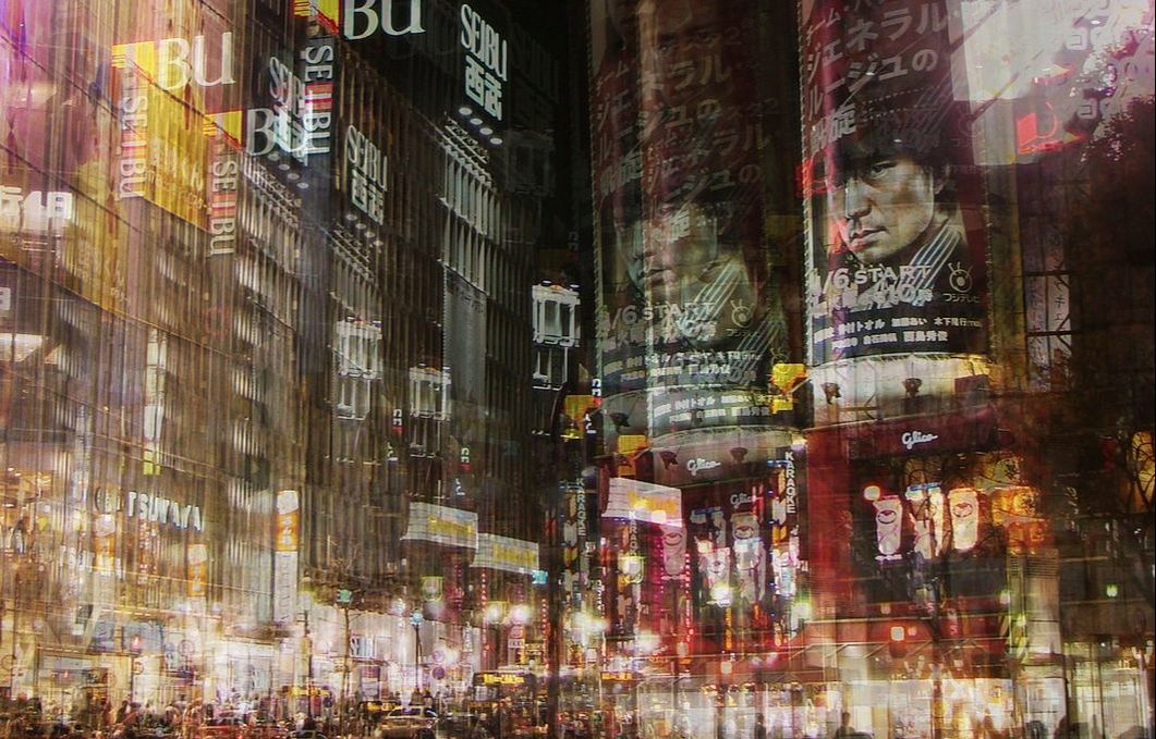
I then wanted to add a structural compositional aspect to the images. In order to demonstrate this to its full extent I decided to look at the work of Stephanie Jung and manipulate the images using her style.
S T E P H A N I E J U N G
Stephanie Jung is a photographer who is based in Germany who's work focuses on fine art and portrait photography. She discovered her passion for experimental photography when she finished her studies in Visual Communications in 2010. Since then, she travels the world, especially to large populated cities, to capture vibrant and busy scenes of cities. She then edits her photographs in a particular way to enhance the hectic mood she aims to capture.
|
|
|
I believe all three of the images above are particularly effective. Stephanie's style of photographing a typical urban scenery combined with the added double exposure edit, portrays city disorder in a whole new unique form. From research I discovered that Stephanie Jung's inspiration for her pieces was not from the classic beauty of the landscape or the abstraction some buildings present but instead it was the repeating events of everyday normal life that presented as an interesting and compelling concept. "My biggest inspiration comes from life itself." This shows that her focus for capturing these images was portraying a scene of normality. I believe she is particularly effective in doing so, her photos show a mass disruption of cars, people and bright lights. Which is something all heavily populated cities include. But by adding this unique edit creates a whole new perspective and emphasis the hectic scene. This is something I will attempt to recreate in my work.
R E S P O N S E
I decided to use the images I had captured prior in Brick Lane and distorted them via Jung's style. This allows a contrast to be made from the images before and them now after, displaying to the audience to manipulated composition. I was very pleased with this outcome as I thought it heightened the effect I was aiming to bestow upon the audience- the typical busy nature present in an urban environment. This is strongly reflected via the use of multiple layers adjusting their opacity to create a disorderly feel.
|
|
S T R A N D T W O
R E P R E S E N T A T I O N O F W O M E N
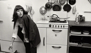
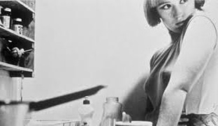
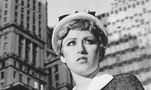
C I N D Y S H E R M A N
Cindy Sherman was born in 1954 in New Jersey. Her work began in 1977 where she started capturing photographs featured in her series "Complete Untitled Film Stills." This series is 69 black and white images of scenarios that challenged the cultural sterotype surrounding women, supported by the media. In each of these images she featured herself in which she elaborately disguised herself to focus primarily on sexual sterotypes imposed upon women. Below are three images I thought were particularly inspiring.
|
|
|
I was strongly drawn to Sherman's work due to her creativity and her challenging of the dire problematic issues surrounding women, current in our society today. Additionally, by making these images self portraits shows how imitate these photographs are and how close this issue is to her heart, giving a sense of urgency to eradicate it. I really liked the fact that Sherman brought the whole image to live to strongly demonstrate the stereotypes. For instance, in image one the women is seen in the kitchen, a typical domestic environment associated with women, but to enhance this she has featured a range of pots and pans in the background to allow the audience to spot this iconography. Hence making it an effective image. This is something that strongly drew me to her style.
R E S P O N S E
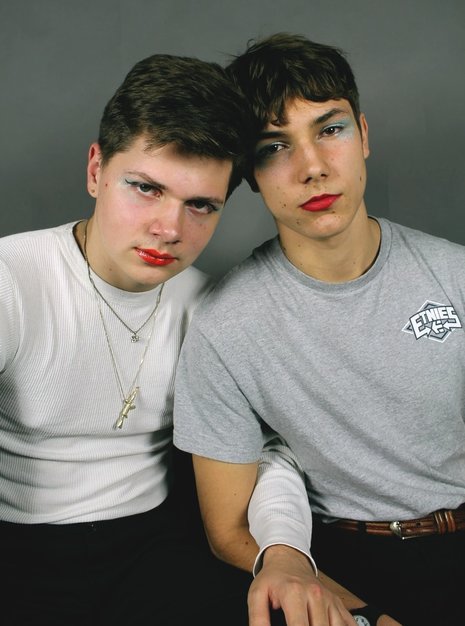
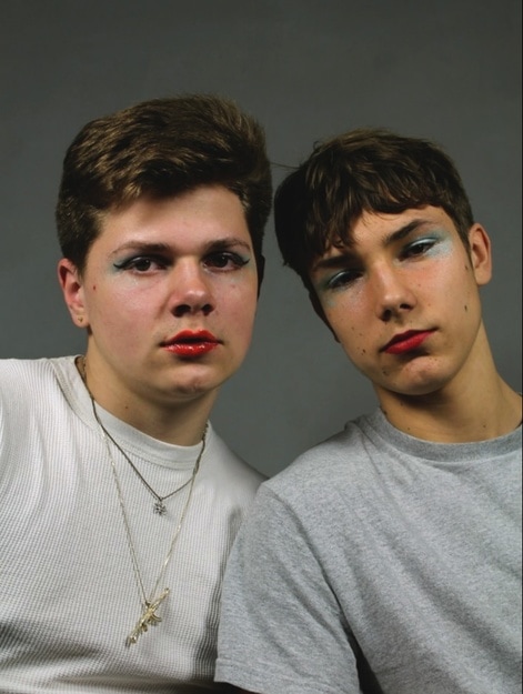
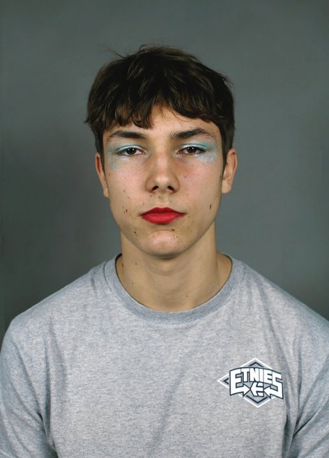
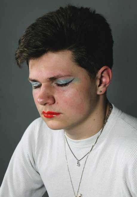
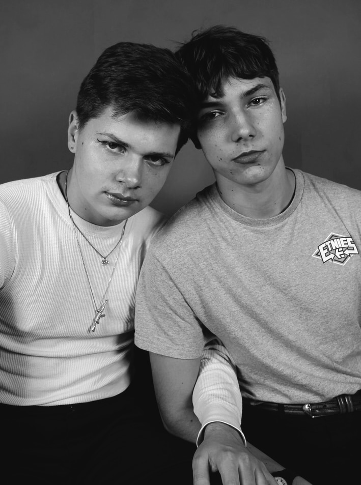
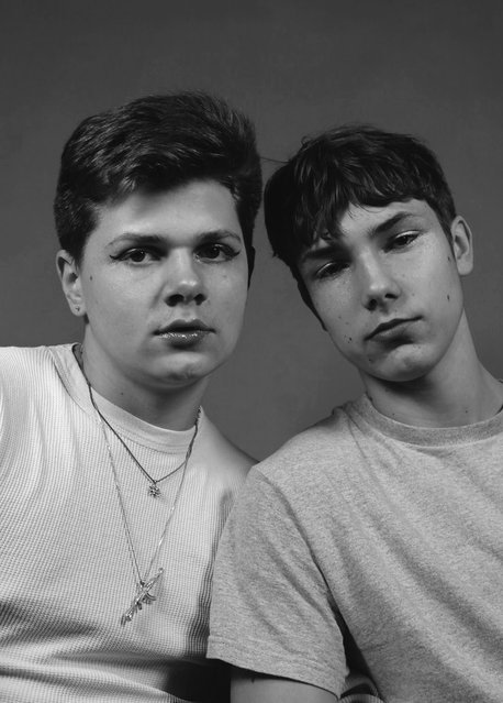
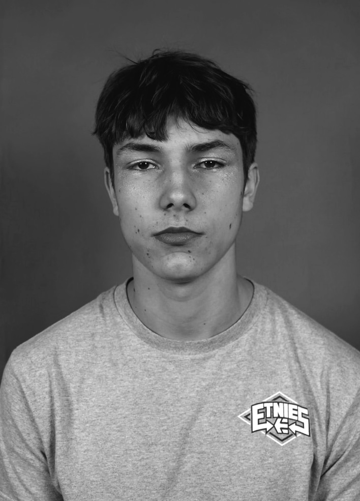
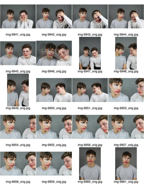
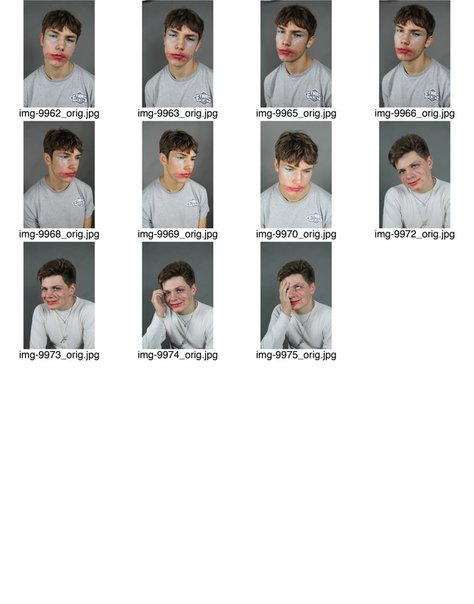
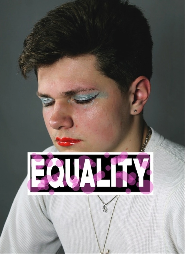
In order to imitate Sherman's style I decided to focus on her compositional elements and the meaning behind them. So for my response I wanted to focus on the negative connotations surrounding a women and replicate them onto a male figure. This i decided to do blatantly via the use of makeup and their sad/blank expressions demonstrating their emotional distress when wearing something synonymous with a women. Below is my contact sheet and selected edited images.
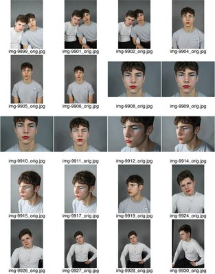
|
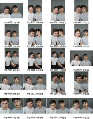
|
|
S E L E C T E D I M A G E S
C O L O U R E D I T S
|
|
|
|
B L A C K A N D W H I T E E D I T S
|
|
|
|
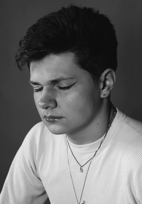
R E S P O N S E T W O
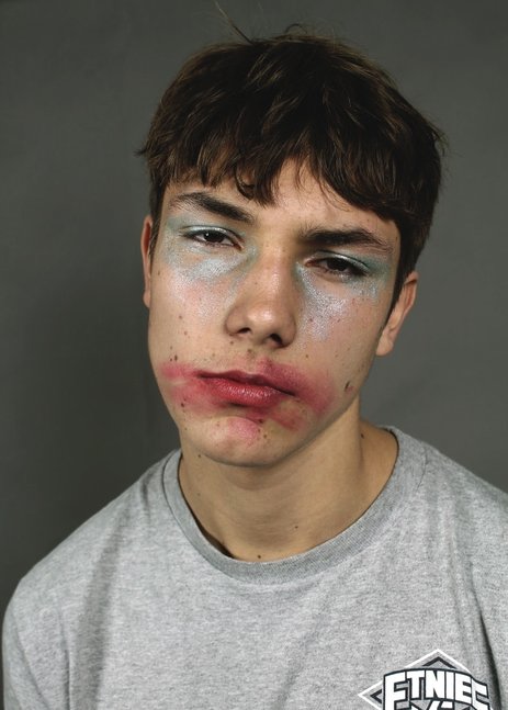
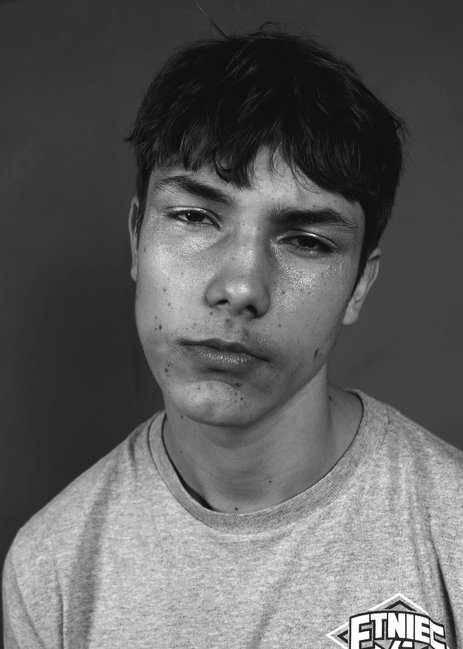
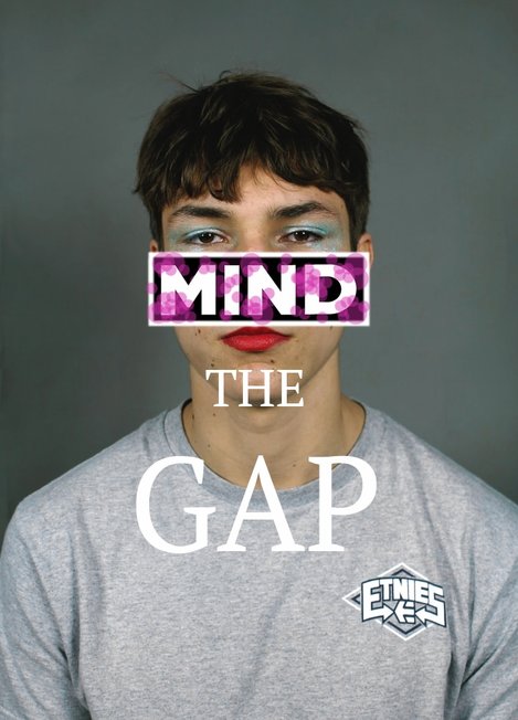
To further heighten this concept, I then smudged the makeup on the men's faces and told them to enhance their uncomfortable expressions.This then allows the audience to recognise the extent of marginalisation and encourage it to stop. Below is my contact sheet and selected images.
|
|
S E L E C T E D I M A G E S
C O L O U R E D I T S
|

|
B L A C K A N D W H I T E E D I T S
|
|
I N F L U E N C E
Upon visiting Shoreditch to capture some images of the local environment, I noticed this, which appeared very striking.I thought this was very powerful and although incorporated into an advert showed society that there needs to be a change which even big companies like Gap agree with.
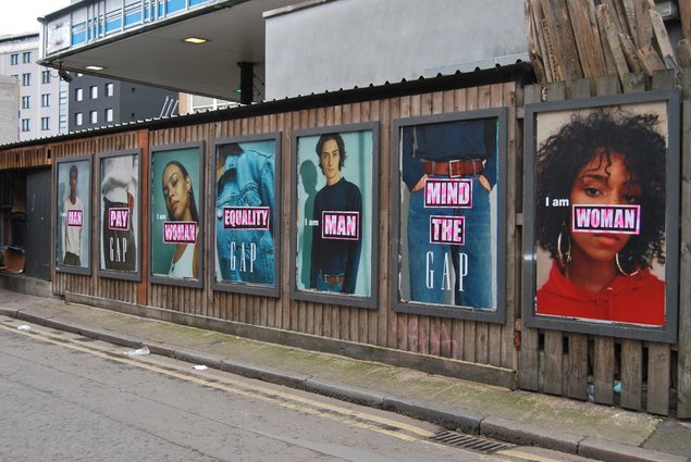
R E S P O N S E
In response to the street art/advertisement seen in Shoreditch I used the images of the male models I chose covered in makeup and manipulated them to replicate the same style. In order to do this I created a box filled it with black paint, then created a white border and then used the text tool to type to striking words in. Finally, to create the same outcome I used the pink paint brush and changed the opacity to make it not as dramatic and added to the word to create a more feminine look, thus this then correlated to its message about feminism.
|
|
S T R A N D T H R E E
B I O L O G I C A L S T R U C T U R E
After looking at the structure of the body prior I was interesting in the aspect of photographing biological structures. Thus I have decided to further elaborate this concept in more detail. Below I will look at a variety of aspects to display this.
D E V E LO P M E N T O N E
First I decided to look at the animals as a whole and look at the wider perspective. In order to construct this concept I decided to look at Damien Hirst and responded in a variety of forms such as visiting my school science department and utilised their resources.
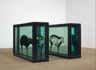
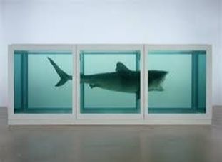
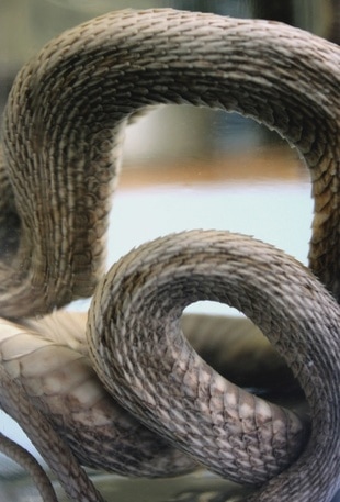
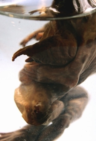
D A M I E N H I R S T
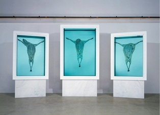
Damien Hirst is an English artist and art collector who's work tends t consist of controversial topics. For instance, below I have selected three images from his series "FORMALDEHYDE" in which involves the preservation of an array of animals, such as sharks and cows. The animals are placed in a blue liquid, formaldehyde, the preservative which creates a striking cold hue.
|
|
|
I think this exhibition is very abstract. By allowing the audience to inspect these animals in an array of manners, as their external forms and some with their internals displayed it creates an effective response. Thus this grants the viewer with a unique perspective of the animals internal structure. Furthermore, this demonstrates the animals as almost like a precious scientific observation. Alternatively, this chose of display can correlate to the main human involvement with animals; mass incarceration for our dietary needs and thus allowing this exhibition to have a deeper and meaningful message. However, despite this, the effective use of simplistic composition in demonstrating the structure is something I was strongly inspired by and look to recreate in my own work.
R E S P O N S E O N E
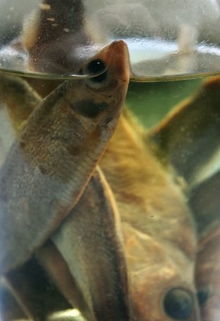
For my first response, I visited the science department and captured image of animals they had preserved in jars. For my first selection of images I thought I would capture them up close to emphasis their intricate structures and details and their lifeless sole. Below is my contact sheet and three selected images.
S E L E C T E D I M A G E S
|
|
|
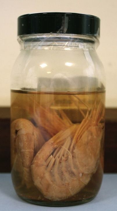
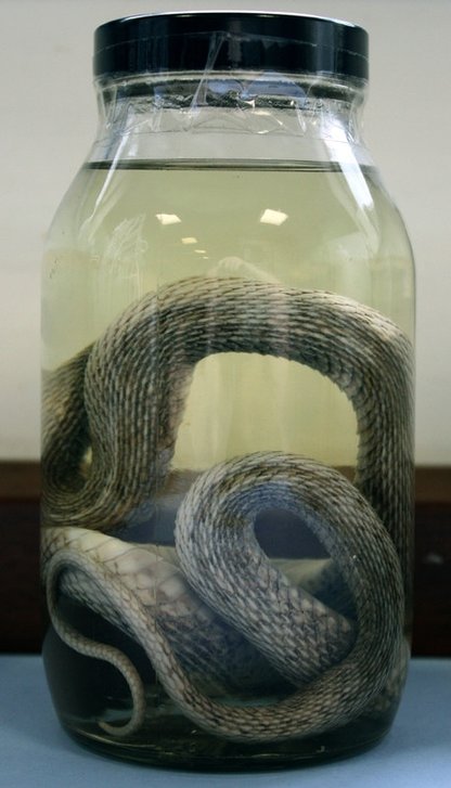
R E S P O N S E T W O
This then lead me to step back and look at the whole subject from a greater perspective and although in my first response it allowed me to look at the details and their unique structures I wanted to imitate Hirst's style and thus capture the focus within the jar involving both of these aspects. Below is my contact sheet and selected images.
S E L E C T E D I M A G E S
|
|
R E S P O N S E T H R E E
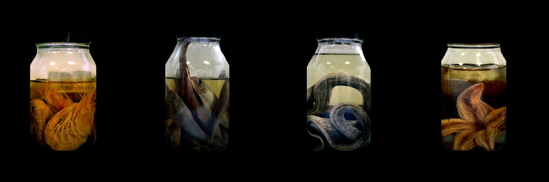
For my final response, I looked back at my previous responses and combined the two aspects whilst taking it a step further. In order to do this I went back and captured the jars again from close up and from a far. I then combined these images on photoshop and set a range of them against a black background. This then created the allusion that these jars were in isolation being scientifically expected, something Damien Hirst's exhibition emitted. Below is my outcome.
D E V E L O P M E N T T W O
For my second development I wanted to focus on refining the structural element of these subjects. In order to do this I decided to focus in great detail on the intricate elements of organisms, for instance using a macro lens or microscopes. In order to further elaborate this concept I will look at the work of Susan Derges and thus be inspired to respond in a similar fashion.
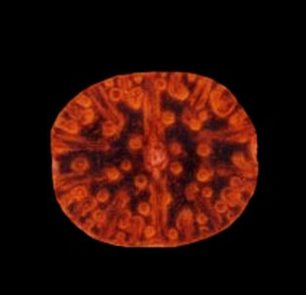
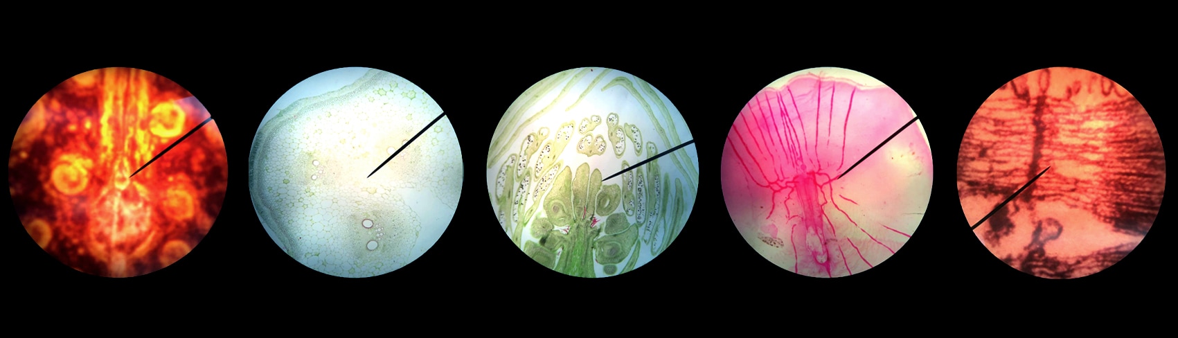
S U S A N D E R G E S
Susan Derges is an English photographer and artist, born in 1955. Her work tends to focus on cameraless photographic processes, specialising in natural subjects such as landscapes. Below are three examples of her work.

|
|
|
I was particularly inspired by the work of Susan Derges as these images appear very bold and striking. The fact that they are surrounded by a black background creates a unique compositional form where the audience's attention in focused upon the subject. These subjects tend to be of interesting nature and often feature some sort of pattern, demonstrating their structure through a unusual form and perspective. Within seeming chaos, she almost presents a sense of wonder at the underlying orderliness. This is something that drew me to her distinct style and hence why I aim to imitate it.
R E S P O N S E O N E
For my first response I visited the science block and captured images of cells through a microscope. There was many difficulties doing this as the natural light would reflect from the glass onto my camera distorting the image. Additionally, getting the camera in the right angle to capture these small specimens caused me some difficultly also. However, I managed to overcome these with patience and a stead hand, which can be seen below. In order to incorporate Derges's style I put these images into photoshop and gave them a black background so that the audience's attention could be focused onto the cells and its structure. Below is my outcomes.
|
|
|
R E S P O N S E T W O
For my second response I put a range of these images into photoshop and created a black background using the paintbrush. I then added them onto the same image by created a new file and copy and pasting them all onto there. This allowed them to have a concept in which they looked like the beginning of a scientific experiment. Additionally, by lining them all up allows the audience to compare their different structures and components.
D E V E L O P M E N T O F S T R A N D T H R E E
B I O L O G I C A L S T R U C T U R E
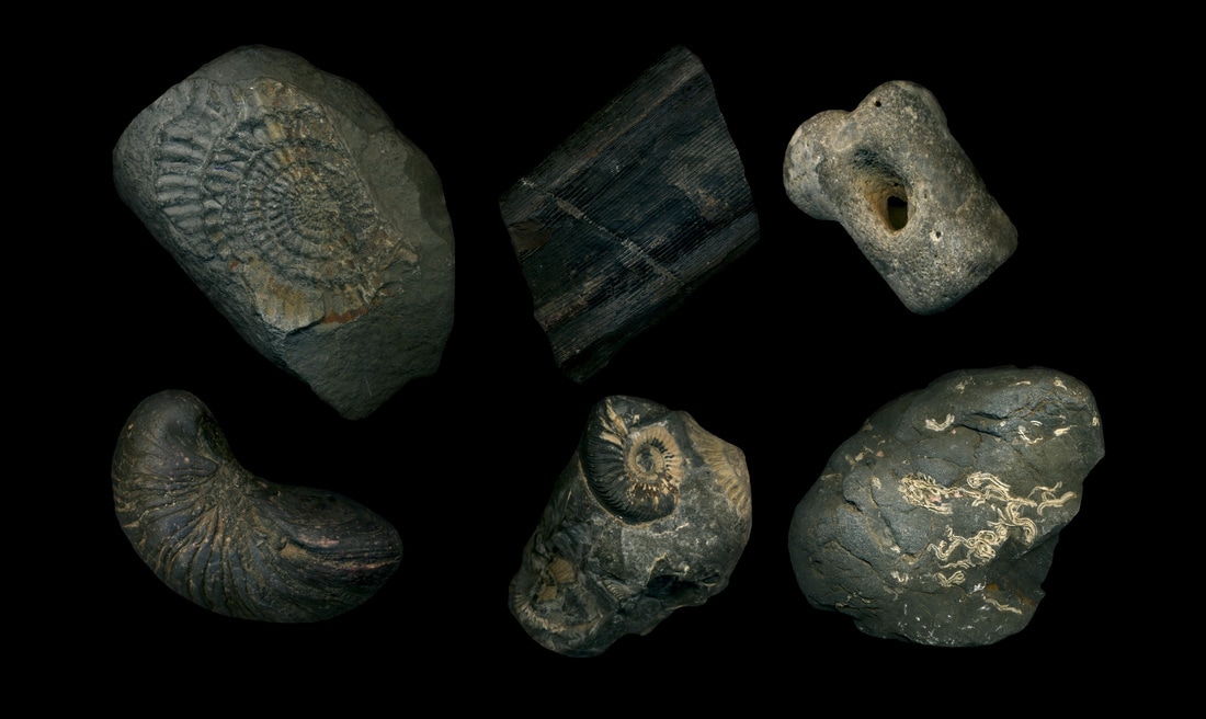
Biological structure focuses on the structure of the natural biology that exists in our planet. This may be influenced by time for example, fossils or by the natural cycles that occur in our ecosystem such as the ability for a plant to grow and thrive. Thus I will look at a variety of components associated with this topic.
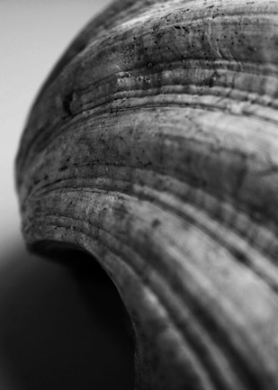
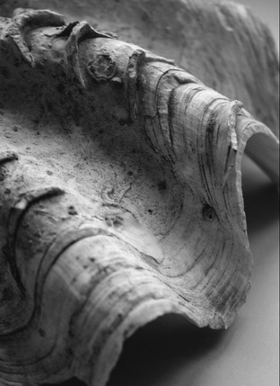
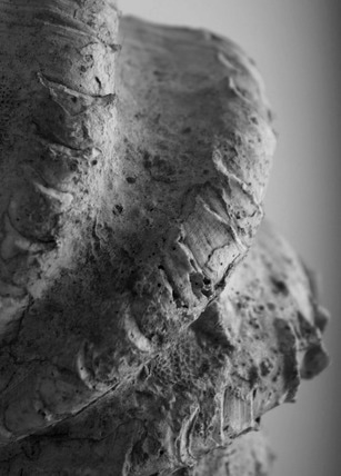
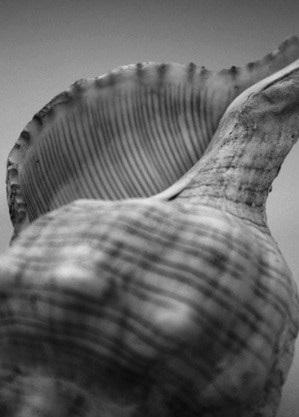
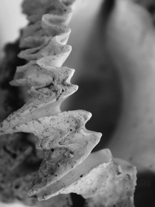
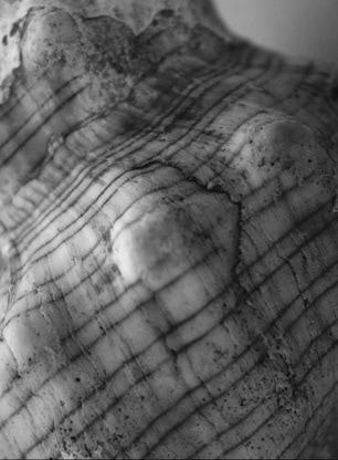
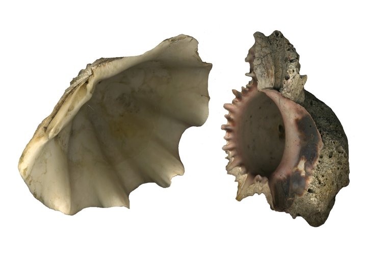
F I R S T R E S P O N S E : G E O M O R P H O L O G Y
Geomorphology is the study of physical features of the surface of the earth and their relation to its geological structures.Thus in knowledge of this I looked at a range of features that occur on this earth naturally for instance fossils or shells and experimented with the way in which I could present their structure, such as Olivia Parker's style. I believe this is an effective start of development as it enables my learning and understanding to begin as a broad context of biological structures, which I aim to focus in later on in my work. Below is my developments attempting to reconstruct this subject focus.
D E V E L O P M E N T O N E
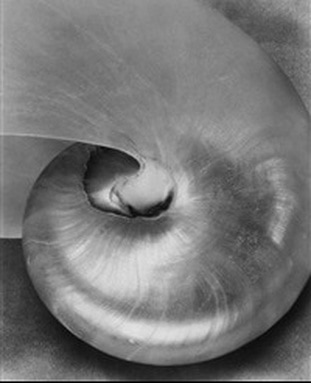
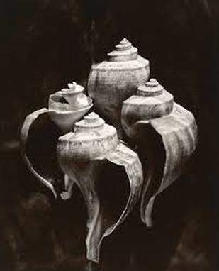
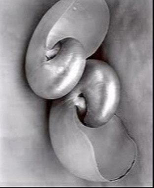
O L I V I A P A R K E R
Olivia Parker is a photographer who became involved in this artistic form in 1970. Her work tends to consist of ephemeral constructions in which she captures and experiments with endless possibilities of light. Below is three images from her project "Weighting the Planets (1978-1983)" in which focuses primarily on experimental pieces of work based on natural elements of our planet e.g. Shells or the story of Adam and eve (humans).
|
|
|
I chose these three images as my primary source of inspiration for my development of my strand as I was drawn to their abstract representation of aspects that belong to the natural world. For example, the image in the middle demonstrates Parkers experimentation of light by capturing the shells in a dark and mysterious atmosphere thus resenting them in a new, unique form. It is almost as though they have been photographed in aim of presenting them with a sense of authority or preciousness due to their composition and light source shining down on them. Furthermore, this representation of shells allows the audience to view the structure of their bodies in a whole new way. Thus this is something I was particularly captured by and is something I aim to demonstrate in my work below.
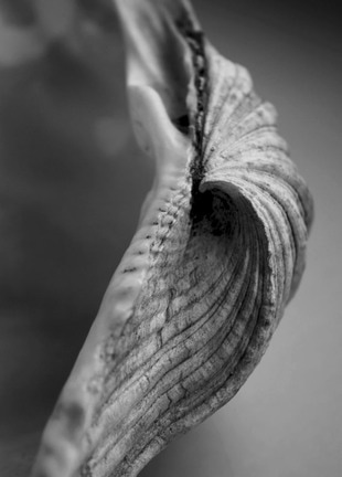
R E S P O N S E O N E
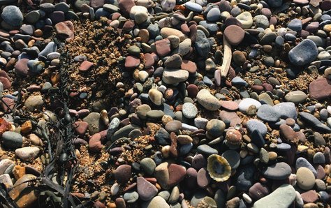
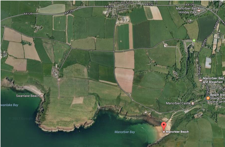
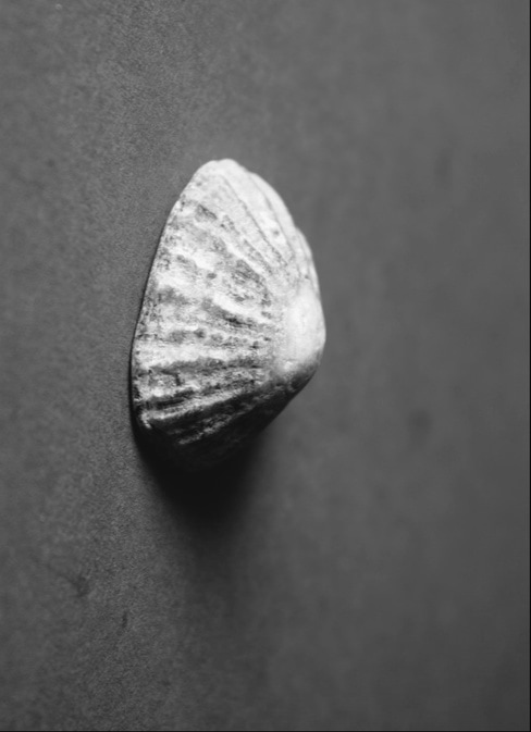
For my first response to Parker's "Weighing the Planets" I decided to capture the shells from their natural environment in order to demonstrate the element of resources derived from our planet. To do this I collected shells from a beach in Pembrokeshire, Wales. Below I have demonstrated an image displaying where I have taken them from and a map of the site.
|
Site in which the subjects were taken from:
|
Map of site:
|
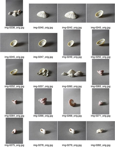
I then brought them into the studio and experimented in a variety of ways. First the light source, when looking at Parker's images I noticed they tend to come from an unusual angle so I positioned my light source to the right of the subject to create a dramatic shadow. Next, I changed the side of the shell between put down and upside down to experiment with the most effective outcome. Lastly, I attempted to form a type of narrative with the subject in which I hope I achieved in my final images. Below is my contact sheet and my final images.
My contact sheet:
|
|
S E L E C T E D I M A G E S
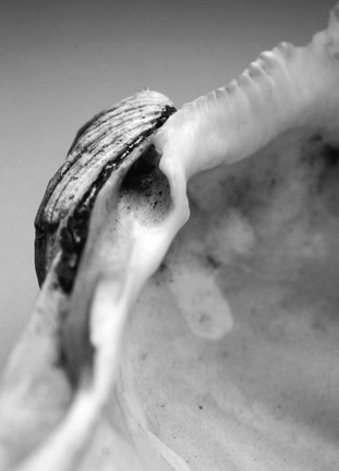
For this image I attempted to create the effect that the shell is clasping onto the side of an object. The light source is then from above and connotes a sense of hope. This demonstrates an experimental front due to the abstract angle.
|
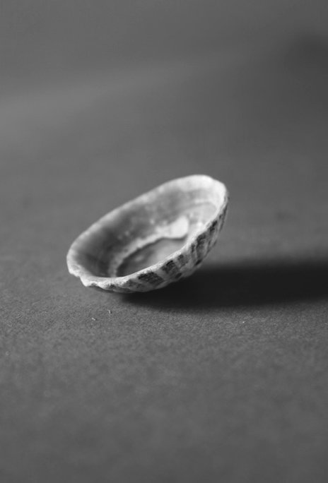
I decided to capture this image with the shell upside down as this then created an abstract form of presenting its structure. It almost makes the structure encompass an alien form almost like a satellite dish.
|
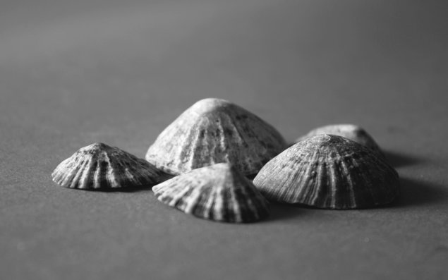
For this image I focused on transforming its composition. My aim was to create an photograph that replicated something that came from a natural source so in this case I attempted to transform this series of shells into a mountain form.
R E S P O N S E T W O
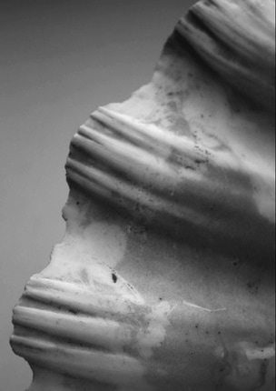
For my second response I decided to visit the science department and utilise the resources they had. I discovered a range of shells that I decided to capture in unique angles. This outcome I believe was more successful than my attempt prior as the angles and range of subjects I used was similar to the style of Parker's. Below is my contact sheet and selected images.
S E L E C T E D I M A G E S
|
|
|
|
|
|
|
|
|
E X P A N S I O N
To expand this concept, I then scanned these shells in to isolate them as a focal subject. I then put then into photoshop where i was able to further isolate them using the quick selection tool and copy and pasting them onto a plain white background. This then resulted in an unusual effect as those these are artifactual specimens. Additionally, by isolating them allows the audience to focus on the structural components of the subject in greater detail, without distractions surround them. Below is my outcome.
D E V E L O P M E N T T W O
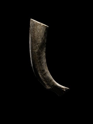
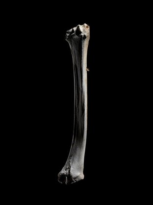
N I C K C A B R E R A
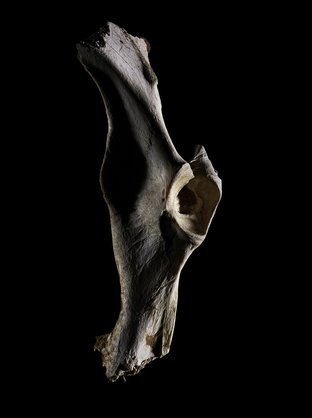
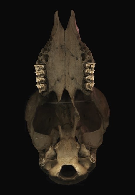
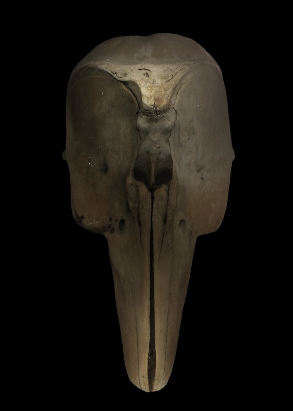
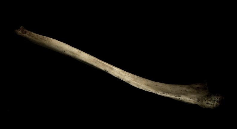
Nick Cabrera is an American photographer who is based in Austin, Texas. He is currently working at The Voorhes Studio. There is little information about his personal life or his photographic lifestyle except from his website. He has many projects including "Blue", "Burnt", "Bone study" and "Franklins". Below is three images from his series "Bone Study".
|
|
|
I was particularly drawn to Cabrera's style of presenting these fossils. The use of the minimalist background and clever construction of lighting presents the structure of these bones in a unique outcome. The lighting draws specialist attention to minute aspects of the bones and positions them in a precious perspective, almost as though they are an artefact. This is something I aim to create with my response.
R E S P O N S E
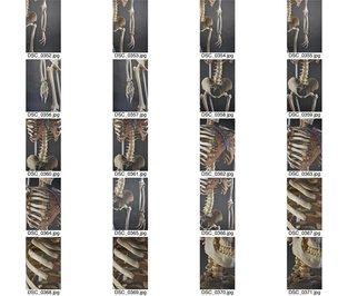
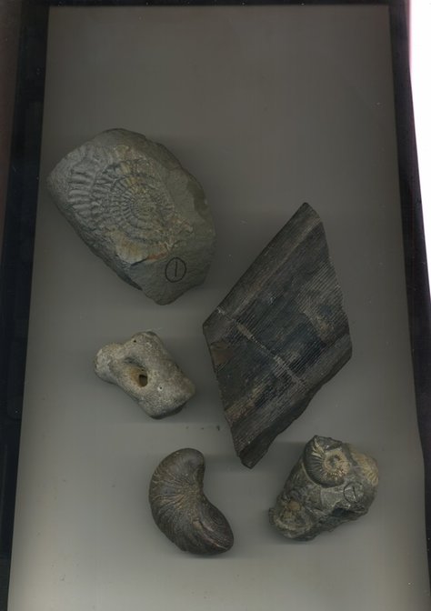
In order to response to Nick Cabrera's work I visited the science department in our school which possess a range of fossils and bones of a variety of animals. I decided that the best form to capture these bones were to scan them in. Below is my contact sheet of all the scans of bones I made.
S E L E C T E D I M A G E S
M E T H O D
O U T C O M E
|
|
P A U L K E N N Y
Paul Kenny is a British contemporary artist who's work focuses on natural aspects. He began taking out his camera and photographing sea water and rocks in black and white focusing on the minute details of beauty that he thought felt captured his weird and wonderful new playground of possibility. He now tends to further elaborate this concept by collecting objects from these landscapes and capturing them in the studio by playing with the scale and layout to create a negative on a glass plate which he then scans into a computer.This innovative "camera-less" approach has lead to his impressive style. Below is three impressive images from his series "Seaworks 3".
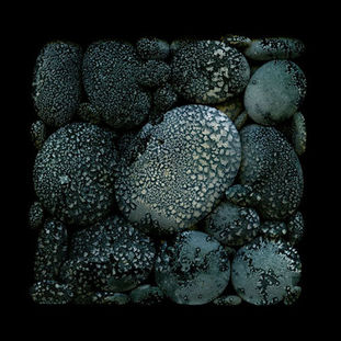
|
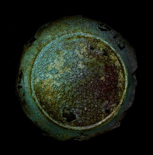
|
|
I chose these images as they stood out predominantly due to their simple concept but complex composition. The use of striking black background contrasted with the central location of the bright subject creates a sense of importance. This is effective as the subjects Kenny tends to focus on are precious sea stones, like in image one. Also, the perfected arrangement draws the viewers attention further into the image drawing their attention to the minute details, such as their structural components. This is something that particularly inspired me and thus is something I will aim to demonstrate in my work.
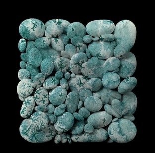
R E S P O N S E
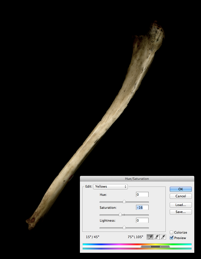
After responding to previous artist I discovered the most effective way to respond to Paul Kenny. Thus in order to achieve the most effective outcome I scanned fossils I found in the science department, as shown below (my scans) in the highest quality I could. This enabled me to manipulate them on photoshop using a range of factors. First, I created a new plain international paper by going to file->new. Then I used the paint brush, selected black paint and coloured the background in order to create a similar effect to Paul Kenny's. Next, I selected the fossils I wanted to use using the quick selection tool and copy and pasted them onto the black painted paper. I free transformed each fossil in my desired location and angle. I then edited each fossil using the same technique: adjusting the levels to create a greater contrast, added curves, adjusted the saturation by enhancing the yellow and green tones whilst desaturating the other colours and lastly i made the offset lower so that the edges slightly blended in the background rather than having a harsh edge thus this created the sense the fossils were taken against this background originally. Finally, I used the black paint brush and lower the opacity so I could blend the harsh edges into the background slightly. Below is my scans and my final outcome.
B E L O W
|
|
A F T E R
S E C O N D R E S P O N S E : N A T U R E
After looking at Geomorphology I decided to look at other structures present on earth, rather than rocks and fossils I wanted to delve into something more natural and aesthetically pleasing. In order to do this I chose to focus on nature. Nature is the phenomena of the physical world collectively, including plants, animals, the landscape, and other features and products of the earth. These products range from subtle beauty such as flowers or imposing dramatic towers like trees. This is something I am particularly inspired by hence by second response to my development being of this subject. In order to fully experiment with different styles I focused on all areas to see the most effective methods of presenting this from Grant Simon Rogers to Roxanne Worthington. Below is my attempts.
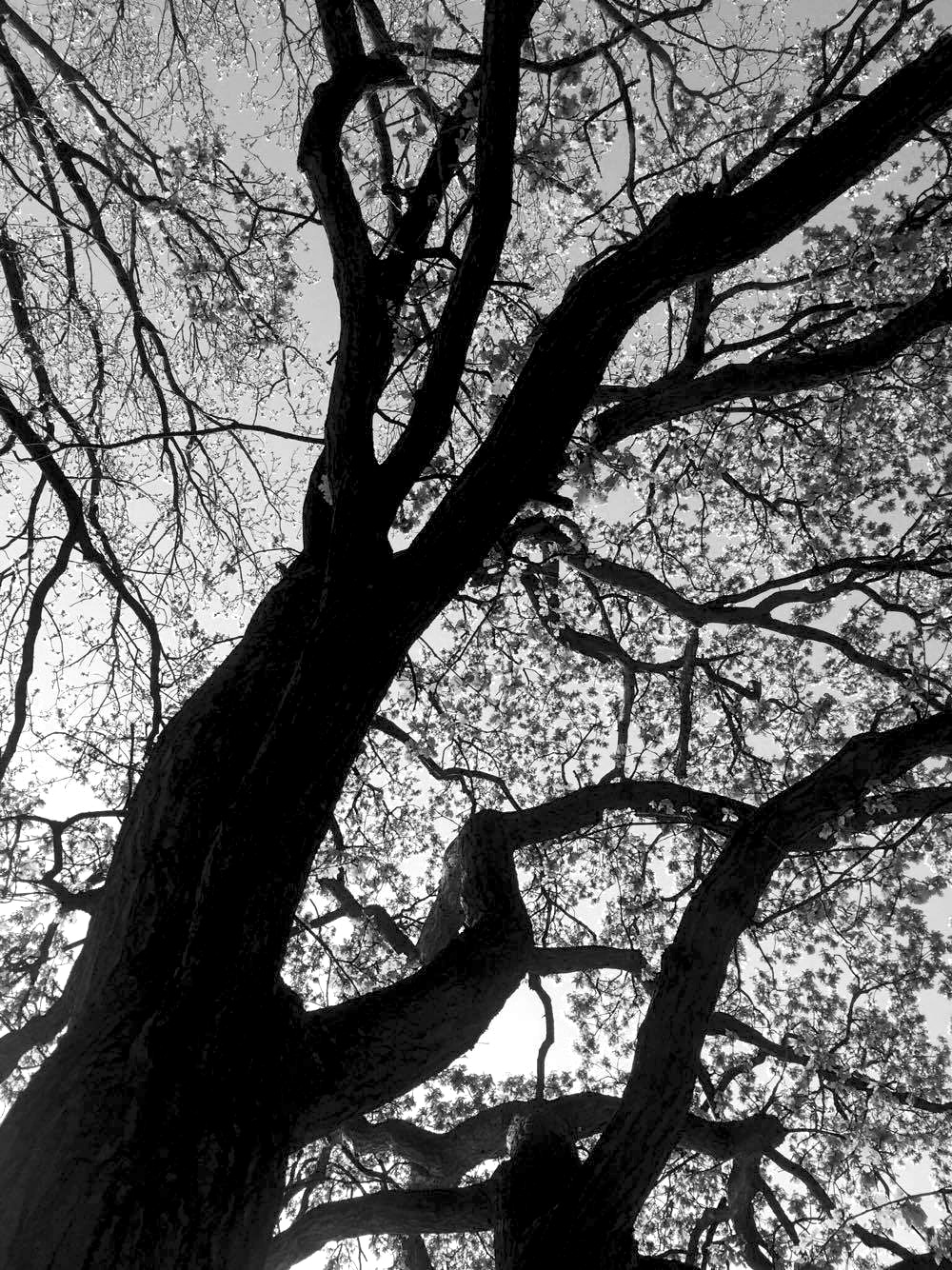
D E V E L O P M E N T O N E
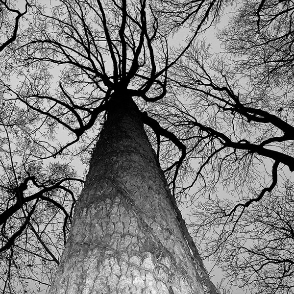
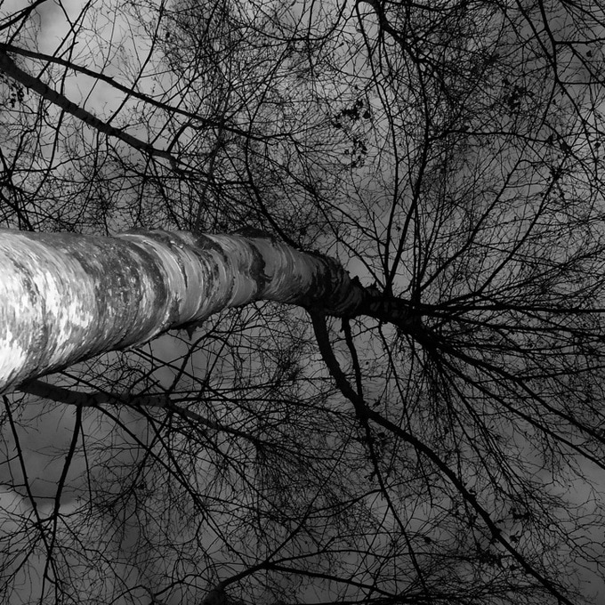
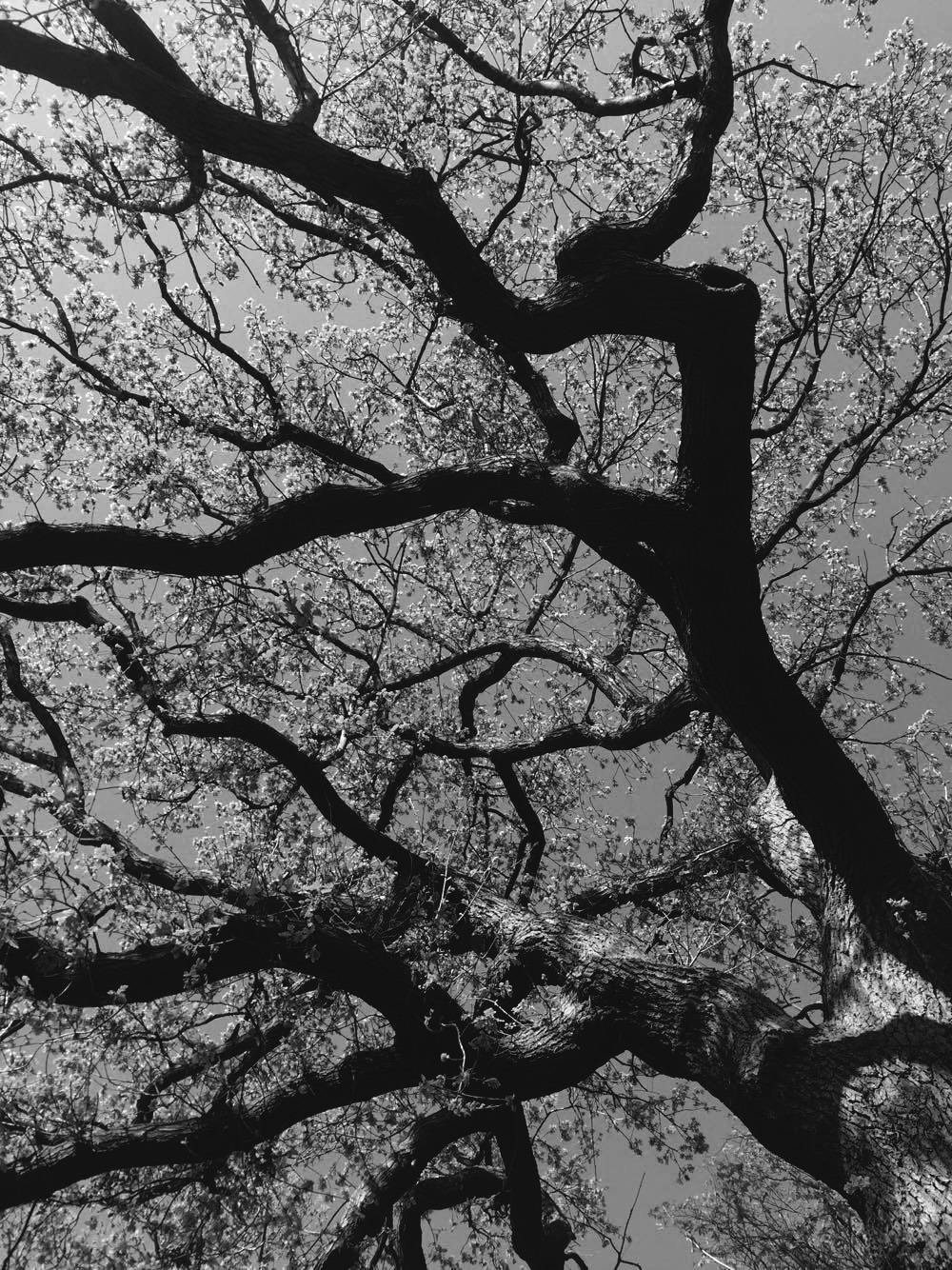
G R A N T S I M O N R O G E R S
Photographer Grant Simon Rogers is an amateur photographer, who has little information about himself online apart from his Flickr account. His images consist of simple concepts and are rarely processed accepted minor tweaks such as cropping the image square. All of his photographs are captured in day light with flash to create his unique style. Below are three images I selected from his flickr account.
|
|
|
I chose these images of Grant Simon Roger's as they were very striking. The angle he selected and the scene he created has transformed these innocent symbols of nature into something out of a horror movie. This is further enhanced via the use of the contrasted monochromatic edit which transforms this peaceful environment consisting of something eerie and isolated. From capturing these trees from below it gives an overpowering impression and allows the viewer to focus on the structure of the branches against the bright sky.
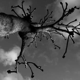
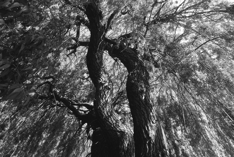
R E S P O N S E
For this response, I visited by local park and captured images of trees in a similar style to Roger's. This meant that I had to stand close to the bottom of the trunk and superimpose the tree by capturing it from this extreme angle giving the impression that they are overpowering structures. Below is my contact sheet and selected images.
|
|
S E L E C T E D I M A G E S
|
|
D E V E L O P M E N T T W O
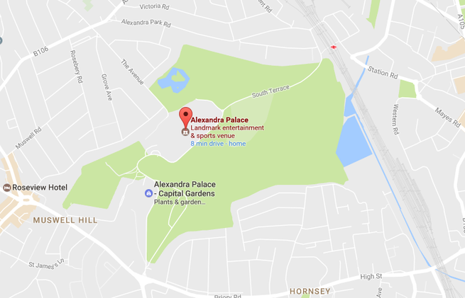
For my second development I decided to work closely with other forms of nature in my local area. In order to do this I visited Alexandra Palace, as illustrated below, and took images of the surrounding nature, focusing primarily on striking elements as I thought this would result in the most effective outcome. Below is my contact sheet and final outcomes.
M A P
O U T C O M E
|
|
|
Then I inverse these images on photoshop in order to print them onto acetate. Once these images were printed on acetate I was able to use them in the dark room to create an effective result. Below is my inverse images.
|
|
|
R O X A N N E W O R T H I N G T O N
Roxanne Worthington is an artist who's focal interest is fine art. She uses photography as a medium that grants her access to express herself. Her work originated in the darkroom but has more recently become more expressive with the use of alternative process. Below is three images from her series "Breath". This line of work is all about different ways of looking, the alternative perspectives that can be viewed from one photograph, for example the image on the right demonstrates the beauty of this flower and its bloom, but also a flower that is slowly 'dieting' by being squashed between two pieces of glass.
|
|
|
I chose these three images as I thought they were the most effective. They present an extremely crisp and clean outcome, making her prints appear interesting. The evolution of camera task and working in the darkroom created a unique outcome that transformed these simplistic natural organisms into a new perspective of looking at them. The use of photograms have allowed the viewer to focus on the structure of these different plants and in doing so almost transforms the image into a unique form. For my response, I wanted to look into the idea of creating these photograms as her work looks a lot like X-rays of the plants making her work look very anatomical as you can see the different areas of the flowers/ leaves that you can't see with the naked eye, which intrigued me. So in order to do this I will work in the dark room with a range of plants to create the same effect.
R E S P O N S E
These images are printed versions of the pictures I captured in Alexandra Palace which I then printed again on acetate so I could use these in the darkroom. I will then be able to use the acetate images to create a similar outcome to Roxanne Worthington. Additionally I will attempt a range of experimental techniques in aim of achieving a unique outcome to present the structure.
|
|
|
E X P E R I M E N T A L M E T H O D S
O N E
S O L A R I S A T I O N
Solarisation is similar to the process when making a photogram. The objects are arranged on the photographic paper in a pattern or style of my preference and then exposed to light for the same 3 seconds. The exposed photographic paper is then placed into the developer until the image begins to appear, once this occurs I then took the developed image out and re-exposed the image again for 3 seconds. After that, I continued the same process when making a photogram by putting the image back into the developer for 1 minute, then the stop for 2 minutes, then the fix for 1 minute and finally run the image under cold water and dried it using the drier. This then resulted in an image similar to the result of a photogram but the tone of the usually negative white areas became grey. Below are the results.
|
|
T W O
P A I N T I N G W I T H D E V E L O P E R
This process resulted in a very unique and effective outcome. First I arranged my chosen objects and exposed this arrangement for 3 seconds. Then instead of carefully placing the exposed photographic paper into the developer I used a paintbrush and experimented with it by painting on the developer in different styles. Once this was complete, I then continued the same process as before and put the developed image into the stop and fix, then ran it under cold water and dried it
T H R E E
D O U B L E E X P O S U R E
To create this double exposure effect it involved changing the placing of the objects and adjusting the timing of exposure. First I placed my objects onto the photographic paper and exposed this arrangement to low aperture lighting of 1 second, then after that I rearranged the objects and exposed the arrangement for 2 seconds. I then continued to use the same chemicals for the same amount of time; 1 minute in the developer, 2 minutes in the stop and then 1 minute in the fix.
|
|
|
D E V E L O P M E N T T H R E E
C H A R L E S G E R V A I S
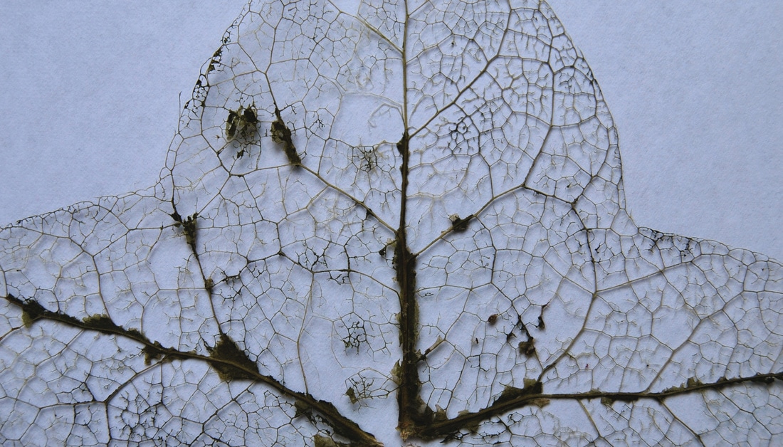
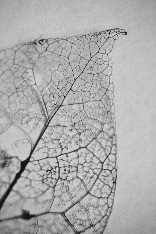
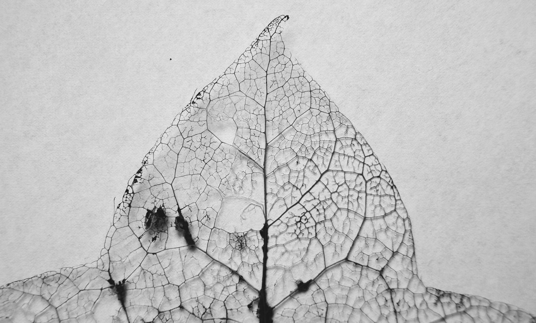
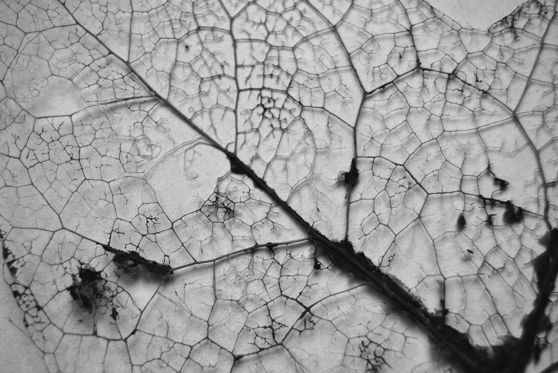
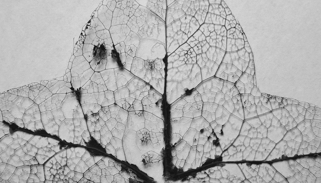
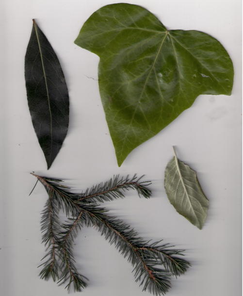
Charles Gervais is a Canadian artist who is responsible for the photographs presented below. They are part of his project "One Beautiful Thing" in which he captures something he finds beautiful every week. These leaves are ones he found years ago and had promptly forgot about them allowing them to mature and transform into a leaf with added shape and texture creating a more exciting outcome.
|
|
I was strongly drawn to these images primarily for their striking composition, in which Gervais hung these specimens on black thread to create this distinctive and isolated outcome. I liked the fact the background is dark, allowing the leaf to become the focus to the audience and thus the details and its intricacy is highlighted, showing its unique structure. Additionally, the fact that he has chosen to take these leaves out of their natural environment and capture them in an alien situation allows the leaf to act as though it is a specimen being observed for scientific use. These aspect is something I would like to replicate in my own work as I believe it demonstrates the physical structure of these natural objects in a unique and striking form.
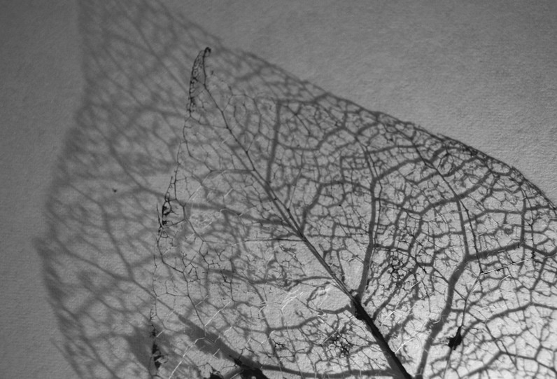
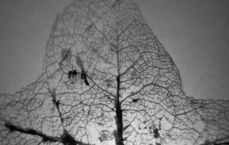
R E S P O N S E
To create these images below I first captured pictures of the leave against a dark background with strong lights to highlight the leaf. Once the images had been captured I chose my favourite photos in which I thought would work the best to achieve the most effective outcome and began to edit them in photoshop. I first selected the background using the quick selection tool, once the background was selected I used the black paintbrush and coloured the background in to replicate Gervais' style. Next, I went to image then adjustments and then made the image black and white. Then I added levels, curves and adjusted the exposure, offset and gamma radiation in order to create more contrast and blend the edges of the leaf into the background ever so slightly so that there wasn't a distinct edge as this looked unproffesonal. Lastly, to finalise the image I used the black paint brush again and changed the opacity to a low percentage and blended the sharp edges to create an effective outcome. Below is my contact sheets and my two final outcomes.
|
|
S E L E C T E D I M A G E S
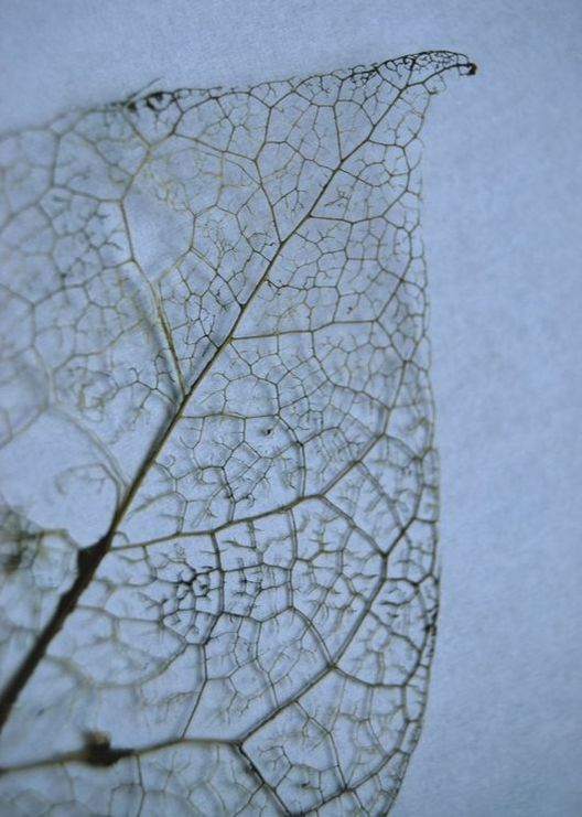
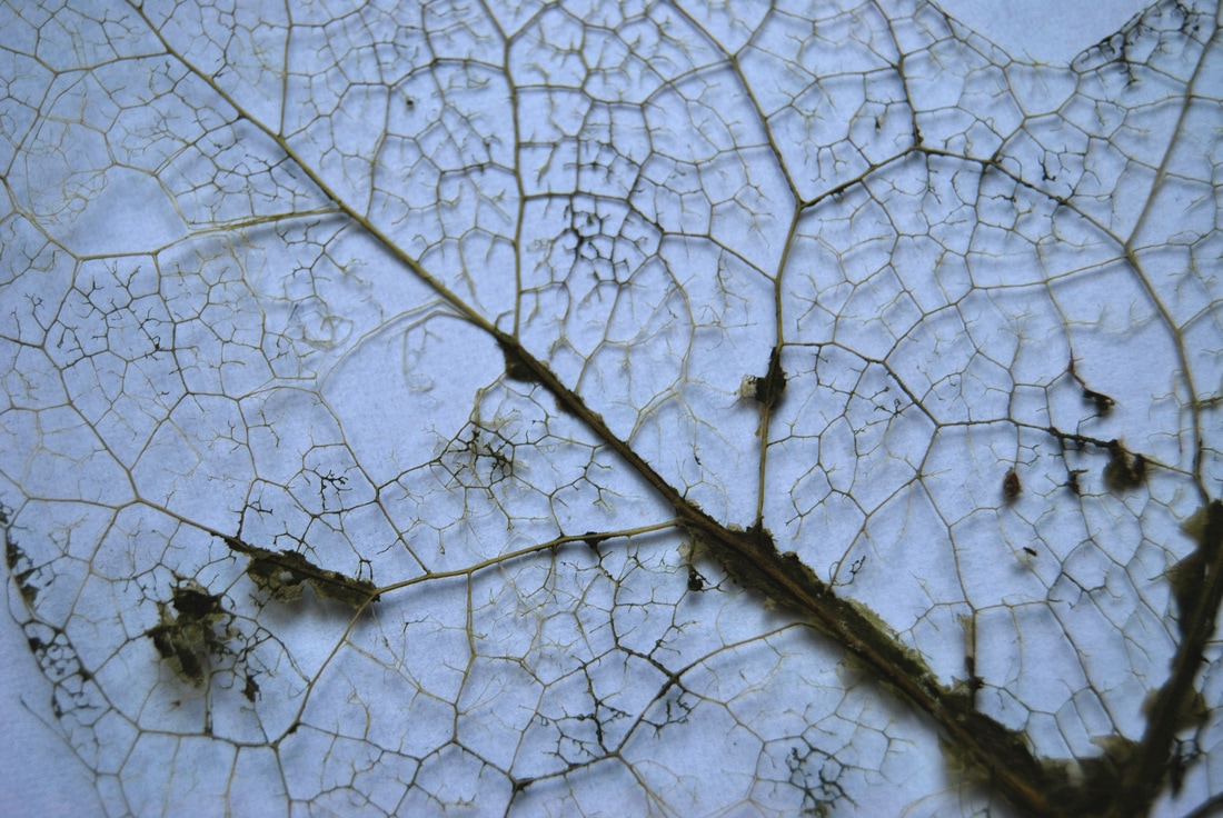
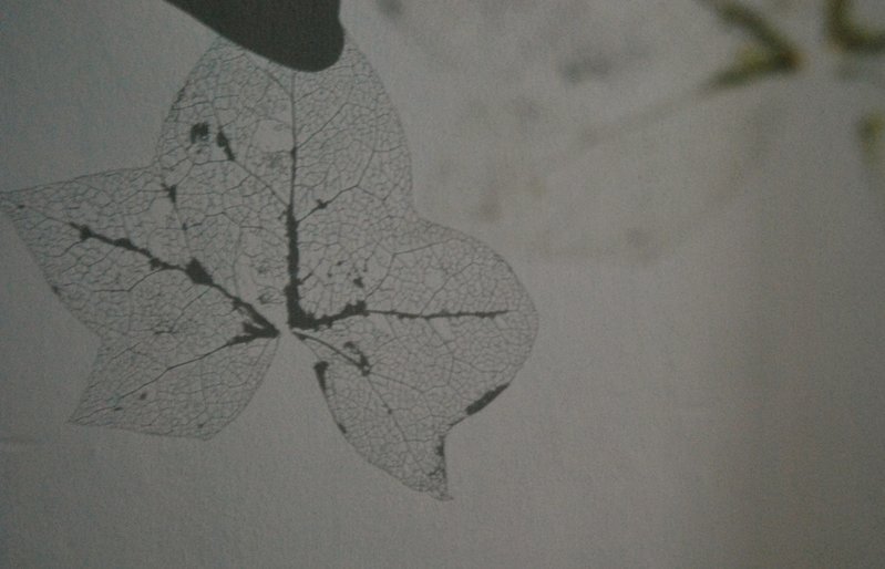
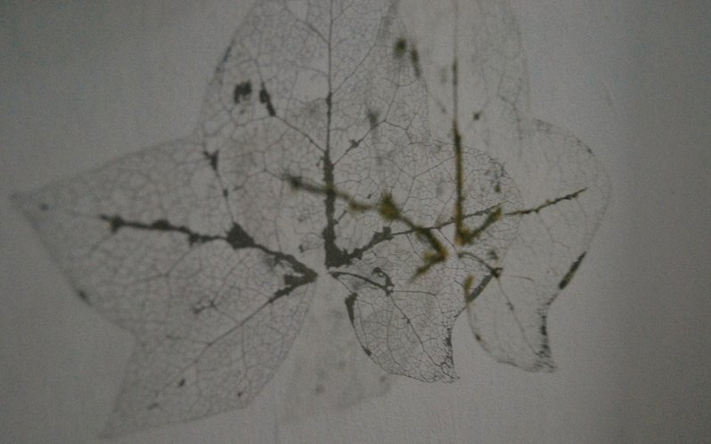
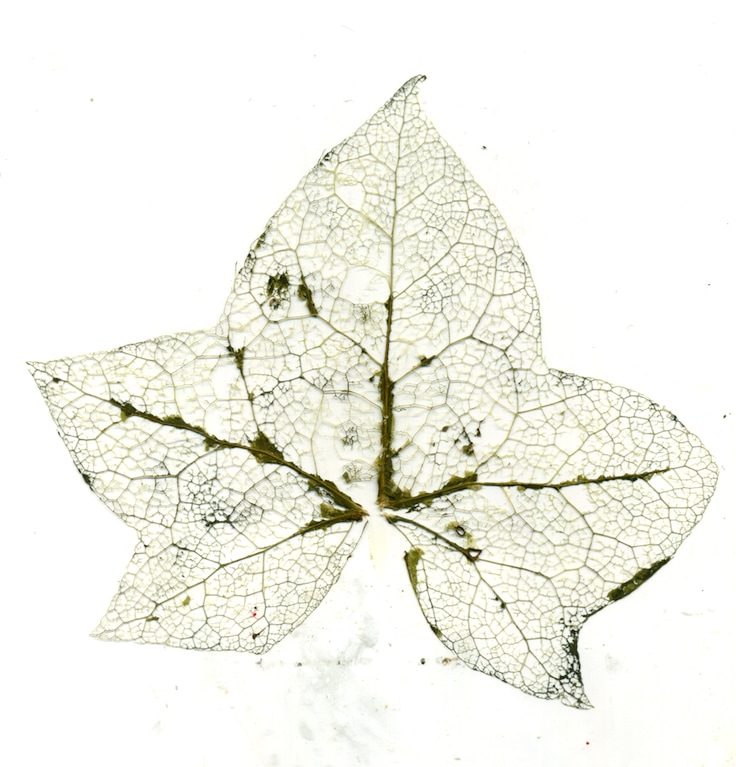
T H I R D R E S P O N S E : S K E L E T O N L E A V E S
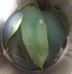
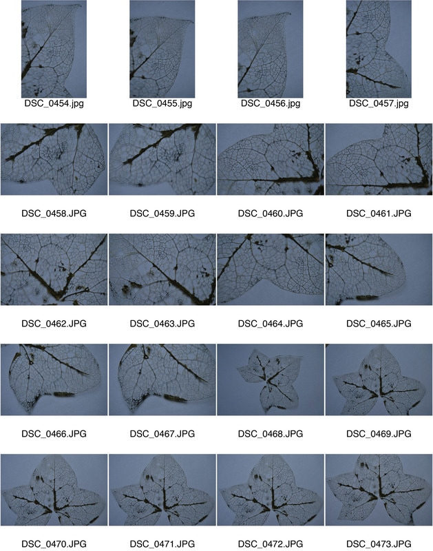
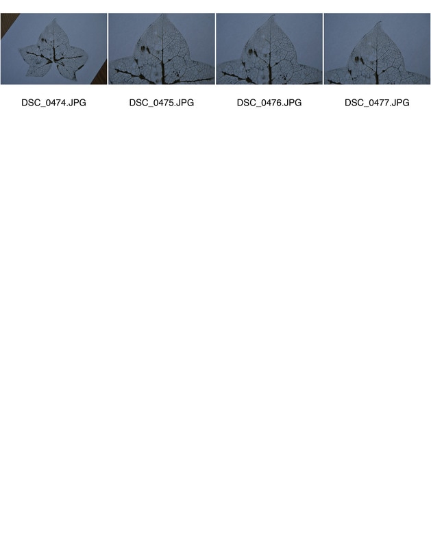
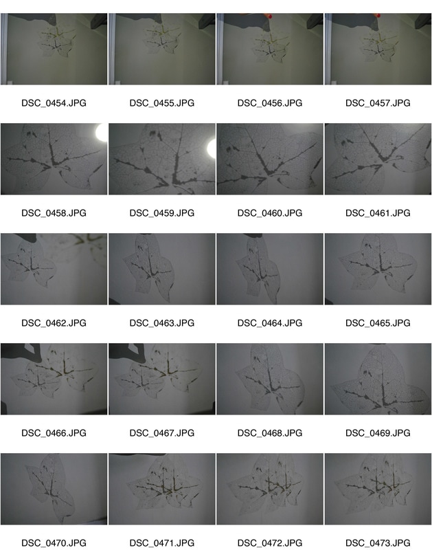
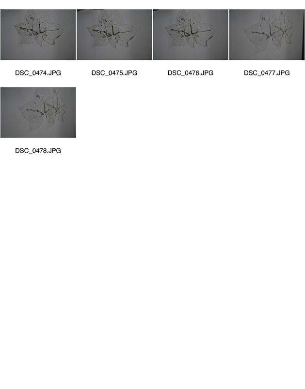
After looking at nature I decided to refine my work and look at an element of nature in more detail. I was inspired by botanical specimens but wanted to allow my work to focus on one subject rather than looking at nature from a wider context. Additionally, I wanted to focus more on presenting the structure of these specimens. Thus this lead me to look at Skeleton leaves. Skeleton leaves are a process than can be applied to natural leaves to reveal the "skeleton" of viens. This allowed me to experiment in a range of forms to demonstrate the structure in natural, stripped down to its bare minimum. In order to fully execute this I looked at a range of artists for instance Lemony Shots. Below is my work and the different experimental techniques I have worked with leading to my final piece.
D E V E L O P M E N T O N E
H O W T O M A K E S K E L E T O N L E A V E S ?
|
1. Chose your selected leaves- waxier leaves take longer in this process as there is more to break down so stick to leaves that are large and green from for instance, a Maple tree.
2. Add 600ml of biological detergent for every 1 pint of water into a saucepan with the leaves. As seen in the image on the right. 3. Boil this mixture for 30 minutes, when leaves have broken down. 4. Remove from the heat and rinse leaves gently. 5. Using a paint brush with harsh bristles brush away old leaf tissue to reveal the skeleton leaf. This process is very time consuming so be patient. 6. Rinse again to remove any old leaf residue. 7. Lastly, press leaves between two pieces of blotting paper and allow to dry for 2 weeks. 8. After the two weeks, they are ready to use. |
|
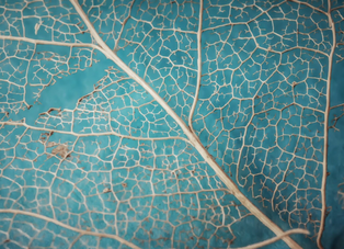
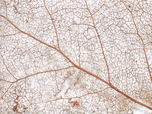
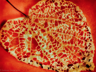
L E M O N Y S H O T S
"I am an unabashed garden creeper, alley lurker, hedge gazer, barn stalker, sidewalk sprawler, insect enthusiast, creek straddler, and frozen pond fanatic, compelled to capture the world up close." Lemony Shots.
|
|
|
I chose to use Lemony Shots as my primal inspiration for skeleton leaves for her focus on skeleton leaves. Not only this, but her variety of composition and colour enabled a striking outcome. The use of a macro len here in images one and two have allowed the audience to view the intricate structure of the skeleton leaf up close. It almost distorts the image into something pattern-like. The use of colour in image one and three contrast to the leaf in the foreground of the image, making it stand out to the viewer, drawing their attention. I was mostly inspired by the compositional techniques used and thus will encompass this influence into my work. Additionally, I will attempt to experiment with different uses of light and colour.
R E S P O N S E O N E
For my response I wanted to use Shots's technique of using a macro lens to get an extreme close up providing a detailed look at the skeleton leaf. So I used a combination of a macro lens and a normal lens to capture these images to create a unique range of outcomes. Below is my contact sheet and outcomes.
|
|
S E L E C T E D I M A G E S
C O L O U R E D I T S :
B L A C K A N D W H I T E E D I T S :
E X P E R I M E N T A T I O N
I was drawn to Lemony Shots' use of experimental colour so I decided to create another response experimenting with light..This would allow the structure of the leaves to be enhanced and almost distorted when the light was positioned at extreme angles. Thus creating a interesting outcome. Below is my contact sheets and different responses. The first response being a torch close up to the subject layed against a flat surface. Whereas the second is a torch projecting the leaf structure onto a wall.
R E S P O N S E O N E
S E L E C T E D I M A G E S
R E S P O N S E T W O
|
|
S E L E C T E D I M A G E S
D E V E L O P M E N T T W O
S C A N O G R A P H Y
Scanography is the utilising of a scanner as a camera. This process of capturing digitised images of objects for the purpose of creating printable art using a flatbed photo scanner create a unique outcome. In order to fully experiment with the concept I looked at the work of Roberta Bailey, as seen below.
R O B E R T A B A I L E Y
Roberta Bailey is an artist who's work honours the wonder and designs of Nature through botanical portraits exhibited via scanography. Her fascination of Nature motivated her to produce such effective and aesthetically pleasing photographs. Below is three examples of her work.
|
|
|
These three photographs particularly stood out to me. Primarily, there focus and intracite details of the structural components stand out dramatically. This idea of using a scanner came to Bailey went she didn't have access to a darkroom nor an enlarger to create the desired images thus lead to her experimentation of utilising a scanner. The detailed arrangement of the flowers or plant inside a plastic or glass container on top of a scanner allows the audience to be drawn into their aesthetically pleasing aspects. Additionally, by making the colours so vibrant draws the viewer in. This is a method I am particularly inspired by, especially as seeing these effective results and thus will attempt to apply with my work.
R E S P O N S E
For my response, I will scan in the skeleton leaf. This will allow me to experiment with different methods of photoshop to create a variety of effects. Additionally, the use of a scanner shows the viewer a more detailed demonstration of the structure of a leaf. Below is my outcome.
E X P E R I M E N T A T I O N
Using this scanned image of my skeleton leaf I will then transform this simple structural form into something aesthetically pleasing. To begin I will use a range of factors to distort this image, for instance photoshop to manipulate the colours. Below are my methods and their outcomes.
M E T H O D O N E : S A T U R A T I O N
For this method I placed my image into photoshop. I then went to Image -> Adjustments -> Hue/Saturation. Here I was able to manipulate both components to create an interesting outcome. Below I have experimented in two different forms.
R E S P O N S E O N E :
First I decided to create a gif with the hue changing throughout it. Below is my explained method via the use of images to help with the meaning behind my explanation. Also, below my method is my outcome.
S E L E C T E D I M A G E
R E S P O N S E T W O :
Then for this response, I also experimented with the hue. I first began by going to File -> New, and creating a new space for me to work on. Then I adjusted the hues of the leaf and placed them onto this new file. Once I was happy with the range of different colours I then created more layers and adjusted the opacity. I then free transformed these images and changed the angle to create a more unique outcome. Below is my result.
M E T H O D T W O : V E C T O R S
For this method I wanted to simplify my scanned in skeleton leaves so I decided to use the method vectors. In order to complete this method it must be done in Adobe Illustrator. First I placed by scanned image into Illustrator. Then I clicked on the image which selected it then. Once selected I clicked on the "Tracing presents and options" icon in the control panel. Next, I chose a present option for instance chose "Black and white" to vectorise your image using only black and white. Below is my outcome.
M E T H O D T H R E E : S I M P L I F I C A T I O N
For my last experimentation method I decided to further expand the concept of simplifying the original subject. I decided to do this on photoshop, where I placed by chosen image. I then used the Polygonal Lasso Tool to select each shape accurately. Next, I went to Filter -> Blur -> Average. This then filled the selected shape and simplified it in a unique form. It almost recreated the image into something consisting of a whole new concept, like an extreme birds eye view of fields. Below is the result.
F I N A L P I E C E
For my final piece
H O R S T P. H O R S T
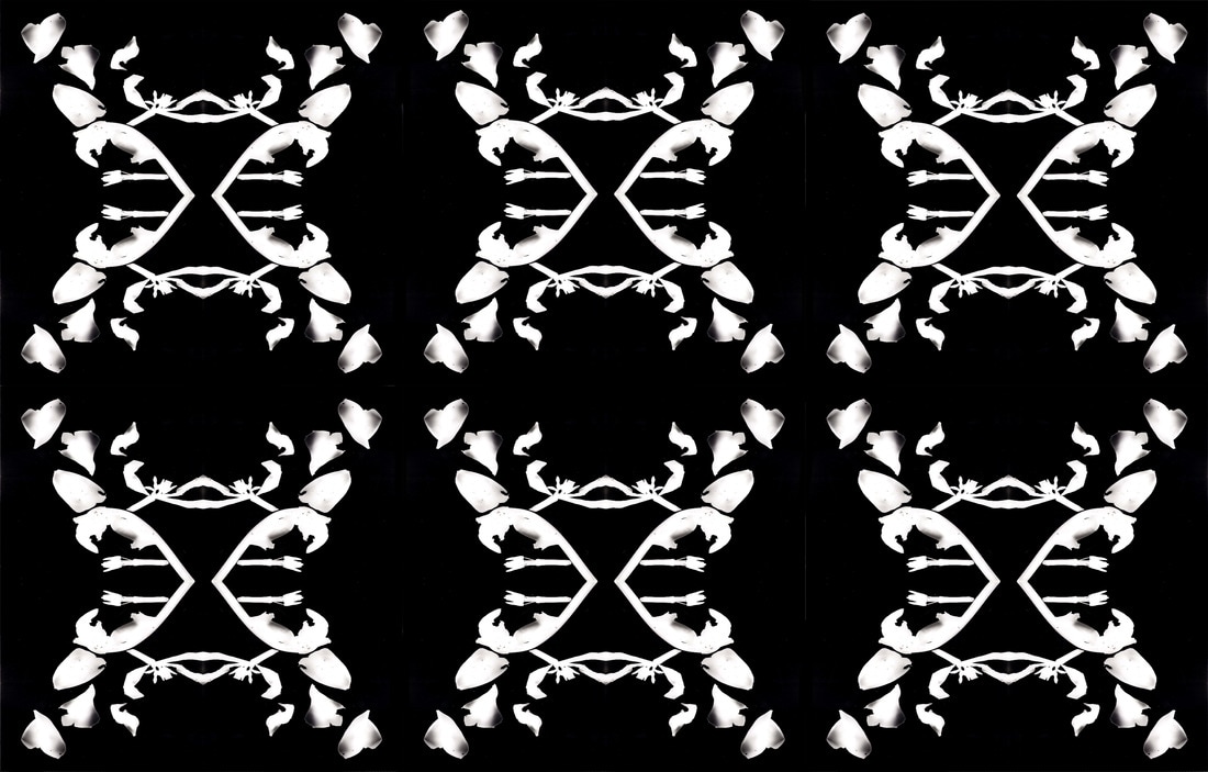
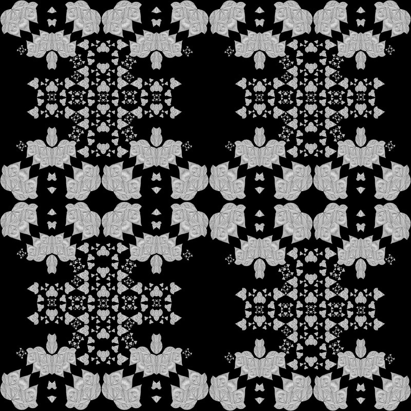
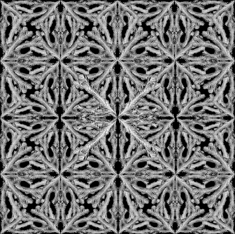
Horst Paul Albert Bohrmann, commonly known as Horst P. Horst was a German fashion photographer, whos famous work contribution figures as one of the most artistically significant and long lasting. His work became legendary with his images becoming synonymous with elegance, style and glamour. This new form of capturing images in the early 21st century allowed his work to be exhibited in many well respected locations included a variety of times featured in vogue. Below are three images I selected from his extensive line of work from a series called "Patterns from Nature". This series features photographs that are largely unseen focusing on kaleodospopic and abstract forms. I was particularly draw to this series by the fact that it was distinctively set apart from the high glamour that typically consists throughout his images. Below is my analysis.
|
|
|
I was primarily drawn to this series by the fact that the images focus predominantly on botanical specimens including plants, shells, and minerals, which strongly correlated to my primal focus. Additionally, I was attracted to the fact that these images were taken in naturally lit locations and had experimented with compositional features. These photographs were taken using a 5x4 inch Graflex View camera and a Rolleiflex shooting 2 and a quarter x 2 and a quarter inch negatives, which enabled Horst to create a series of complex collages with mosaic-like composition. By photographing these still life subjects and manipulating their natural form to create a whole new outcome allows the audience to view their structures in a whole new unique way, almost in an aesthetically pleasing form. This is something I am particularly interested in infusing into my final piece as this represents structural components in a whole new way, thus I will begin to experiment with the technique to see if I can use inspiration from Horst in my final piece.
R E S P O N S E O N E
For my first response, I decided to work in the dark room. This I thought would be most effective as Horst used negatives to create his work thus my outcome would be of a similar nature. In order to complete this I used an array of botanical subjects and arranged them in a patterned form so that once the image was in the photoshop i could create an effective result. Below is my original photograms and then some images demonstrating my method & subsequent to that is my outcomes.
O R I G I N A L P H O T O G R A M S :
M E T H O D :
O U T C O M E S :

R E S P O N S E T W O
In order to experiment prior to my final piece I collected a range of botanical subjects and scanned them in. I then put the image seen below into photoshop and was able to manipulate their natural form into a patterned scenario. I then transformed them into black and white in attempt to replicate Horst's style. Below is my outcomes using the different scanned in specimens.
B E L O W
A F T E R
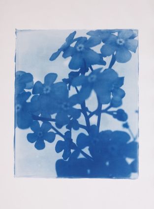
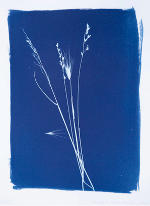
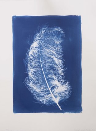
C Y A N O T Y P E
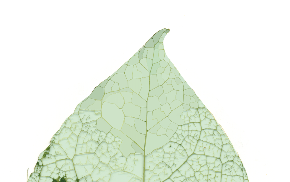
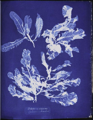
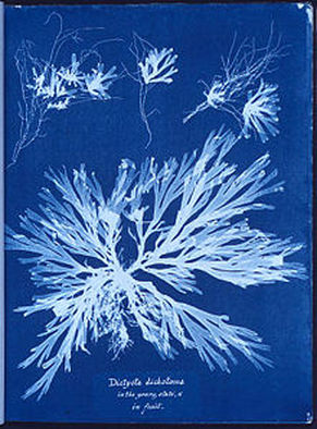
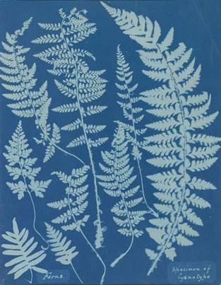
A cyanotype is a photographic printing process developed in the 20th century which produces a white silhouette image on a cyan-blue background. This process was commonly used by engineers as a simple and low cost method producing copies of drawings, known as blueprints, prior to alternative and more effective methods used now. It was created by English scientist and astronomer Sir John Herschel, who discovered this method in 1842. His procedure involves the combination of two chemicals: ammonium citrate and potassium ferricyanide, in order to create the striking blue outcome. This printing process although created solely for the purpose of creating blueprints has become an artistic revelation through Anna Atkins' artistic display of plant life which she placed directly onto coated paper and allowed the action of UV light to create this effect. This has enabled her work to become basis of her popularity. Below I will look at her work and more modern interpretation of this method.
A R T I S T I N F L U E N C E
1. A N N A A T K I N S
Anna Atkins was a famous botanist and photographer, situated in the 20th century. Her work is often considered to be by the first women to create a photograph and the first person to publish an illustrated book featuring a range of her photographic images. Her photographic interest was sparked by her friendship with William Henry Fox Talbot who taught her about his "photogenic drawing" technique and calotypes. This enabled her work to have influence from his techniques, hence the exposing an image via the use of sun focus in her work. Below is three impressive examples of Anna Atkins's.
|
|
|
I chose these images for their striking demeanours. I was particularly drawn to the first image on the left in which features a range of skeleton-like leaves allowing the viewer to see more that a white silhouette but almost inside the structure, delving deeper. This can also be seen in the image in the centre which shows that the edges are thinner than the thicker stems in the centre of the plant, creating variety within this scenario. This is something I will attempt to do in my work as I present the structures of different elements of nature. Additionally, the element of simplicity makes these images deem more powerful. The fact that it shows the honest beauty of these specimens, often taken advantage by people every day, transformed by the use of bright blue and white, almost allowing these structures to possess more importance, correlating to the connotations of white: innocence, purity and goodness. The colour of perfection. This is something I wish to bestow upon spectators viewing my work too and thus I will attempt to imitate Atkins's style.
2. E L I S A B E T H S C H E D E R-B I E S C H I N
Elisabeth Scheder-Bieschin is a German artist and photographer. Her interest in visual communication and politics led to a career in commercial photography and editorial assignments for many European magazines, allowing her career to progress. Her cyantopes which are displayed at 43 Inverness Street, an intimate art gallery within a home were created after her mother died. This was used as inspiration via incorporating her mother's possessions which act as the focal point to these cyanotypes. Below is a few images I have selected from this range of work. Her other work can be found on her website.
|
|
|
I selected these images primarily due to their simplicity. The delicate subjects such as a feather or a flower indicates traces of nostalgia, almost as though the artist is presenting her emotional stability surrounding this subject focus; her mother's death. Sheder-Bieschin has distilled all aspects of the historical influences of Sir John Herschel and allowed the object itself to communicate its own serenity. Thus this element was inspiring to me that this artist has taken something so destructive and painful emotionally and channelled it into representing an intimate look on natures beauty. This demonstrates the artist's ability to know only showcase the subject's structure in a unique form but also supply an emotive message. Therefore this is something I will attempt to incorporate into my work.
R E S P O N S E
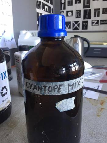
H O W T O M A K E A C Y A N O T Y P E :
|
1. Mix 25g of Ferric ammonium citrate with water and 10 grams of Potassium ferricyanide with water. These two solutions should then be blended together in equal parts.
2. Select the material you want the cyanotype to develop on: paper, card, textile or any other naturally absorbent material. 3. Once the material is selected, paint the cyanotype solution onto it and allow to dry for at least an hour. This step should be performed in the dark room so the paper doesn't expose. 4. Select your chosen objects and chose your composition, as once you have laid your objects onto the material you cannot move them as this will effect the exposure and thus you may risk them not showing up. 5. Place your objects onto your material and expose using UV light, such as the sun, a light box or a UV lamp. You should allow the image to expose for around 5-10 minutes. 6. Once the time is up, take the objects off. You should begin to see the objects coming through but not too well. 7. After exposure the material is processed by simply rinsing it with water. This will reveal a white print on a blue background. To have the most effective outcome, you should allow your images to be rinsed for 10 minutes. 8. Take your images out of the water and leave to dry for 24 hours. |
|
F I R S T A T T E M P T : S U N L I G H T
For my first attempt I tried using sunlight. This meant I had to place the objects onto the special paper with a glass sheet over the top of it so the objects didn't move from wind and other factors, the allow the sun to expose it. However, the day I chose to experiment with this method was quite cloudy which affected by results. Below is an image of me attempting this process and my attempts which I have scanned in.
|
|
S E C O N D A T T E M P T : L I G H T B O X
In order to experiment with this concept, below I attempted different timings to see the best method. So I experimented with 10 and 20 minutes. Below is my outcome.
10 MINUTES:
20 MINUTES:
E V A L U A T I O N :
After experimenting with different methods I was able to establish my chosen form. I decided that the UV light was more effective as it is constant and thus can guarantee an effective outcome. Additionally, after experimenting with different times I chose the 20 minutes as it created a more striking outcome. Thus for my final piece I will use these methods.
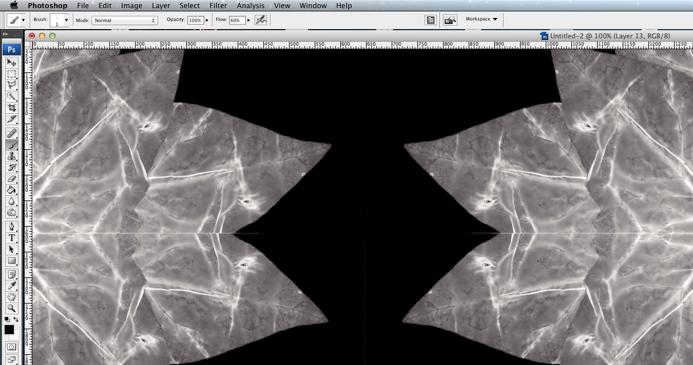
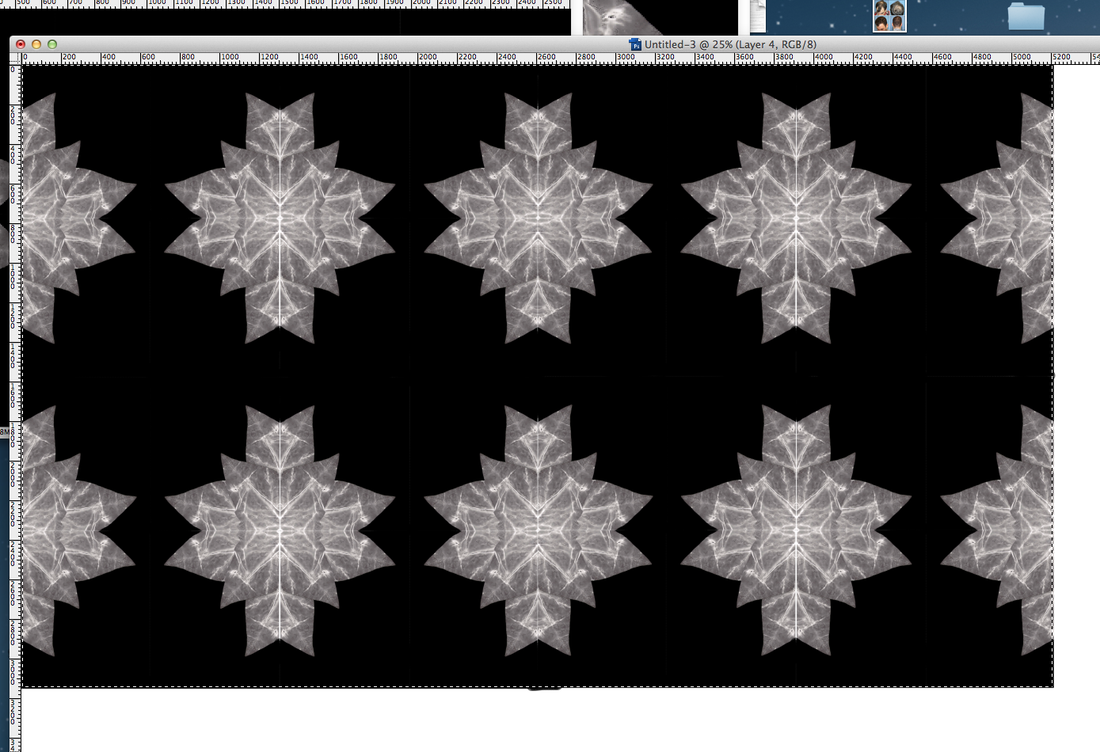
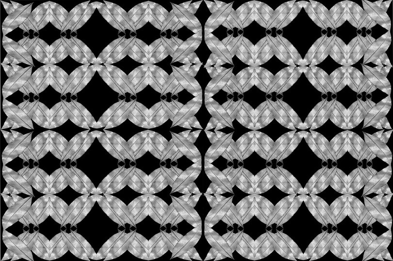
C O M B I N I N G F A C T O R S
In order to create an effective outcome imitating Horst P. Horst's style I decided to create a kaleidoscope like image of my skeleton leaves. I thought this would be effective as it shows the structure of a leaf but in a unique form creating a visually pleasing outcome. Below is my outcome in which I created on photoshop.
I then separated the kaleidoscope image into A4 segments and printed it onto black and white acetate. In doing this, it would enable me to work with it in different processes such as cyanotypes or photograms. Below is a few examples of the A4 black and white acetate, before it had been printed.
|
|
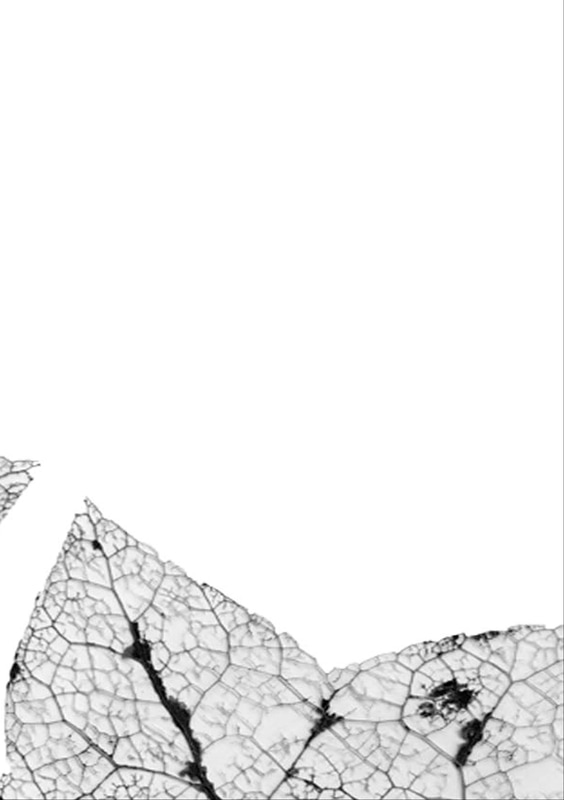
|
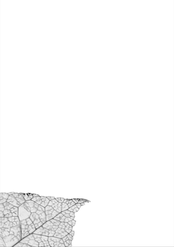
|
O U T C O M E
I then experimented using the kaleidoscope image of the skeleton leaves printed onto acetate with the cyanotype process. However, this outcome wasn't as success as I had hoped. When doing the process it was taking 2 hours for each image to expose,whereas when I had previously experimented it had taken 20-40 minutes. Additionally, when I was developing the images the paper was bleaching and tearing, thus showed me it was an ineffective material. Below is my outcome and evidence of these negative elements.
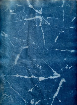
|
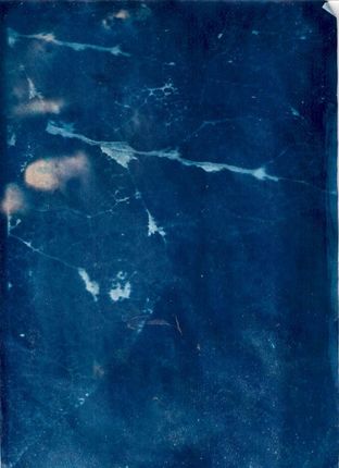
|
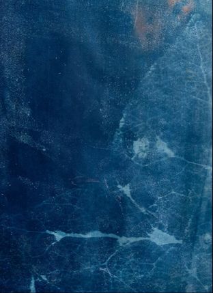
|
Evaluation- thus to improve these mistakes I decided to experiment with a different material. Thus lead me to experiment with photographic paper.Below is my outcome.
