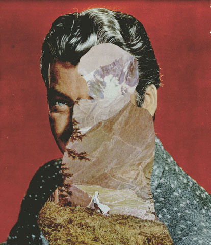
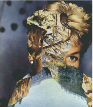
A B S T R A C T I O N
Abstraction is relating to or denoting art that does not attempt to represent external reality, but rather seeks to achieve its effect using shapes, colours, and textures. During this unit, I will attempt to represent abstraction through various unique forms.
A B S T R A C T I O N I N M Y E Y E S
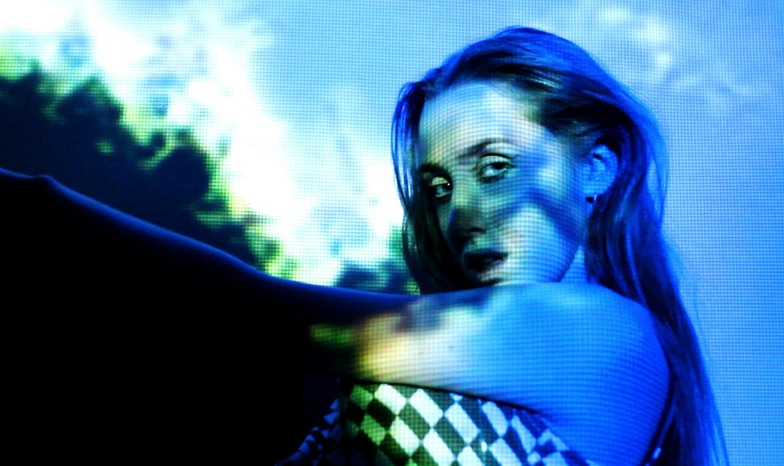
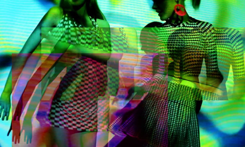
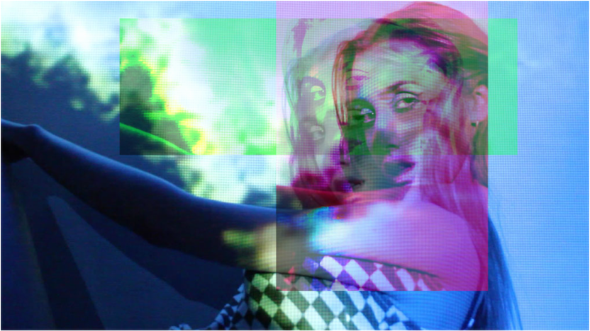
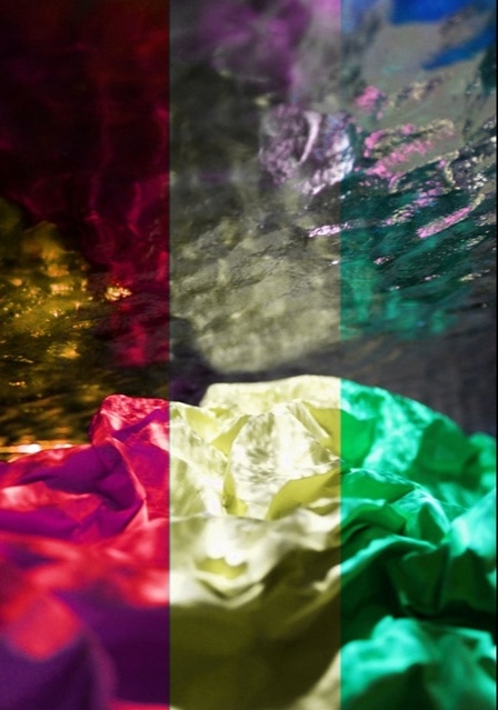
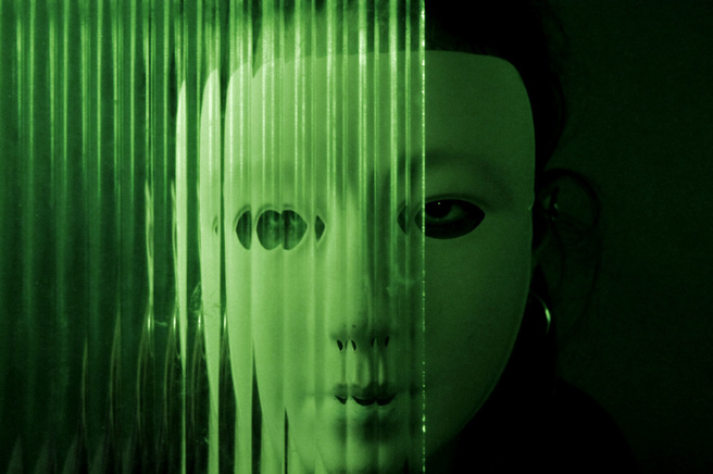
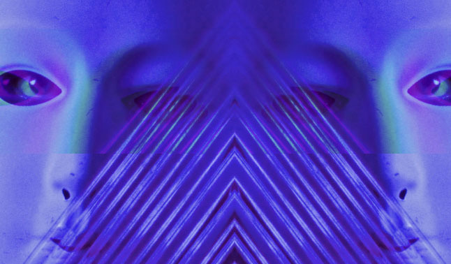
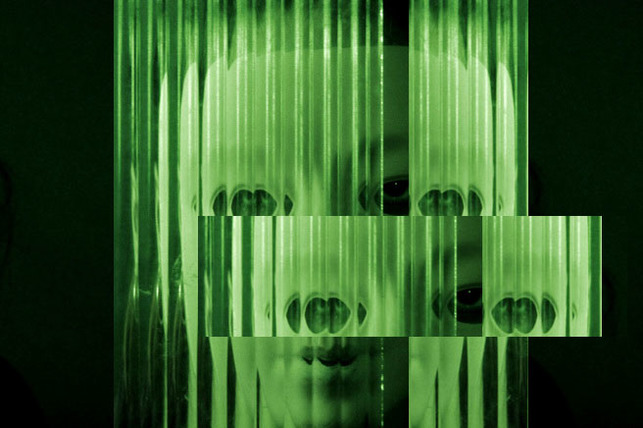
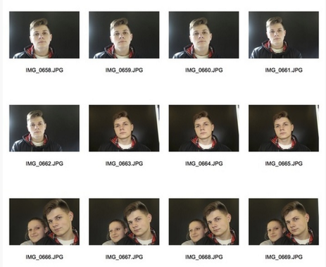
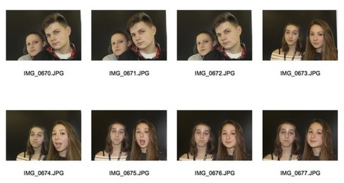
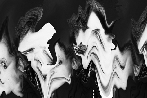
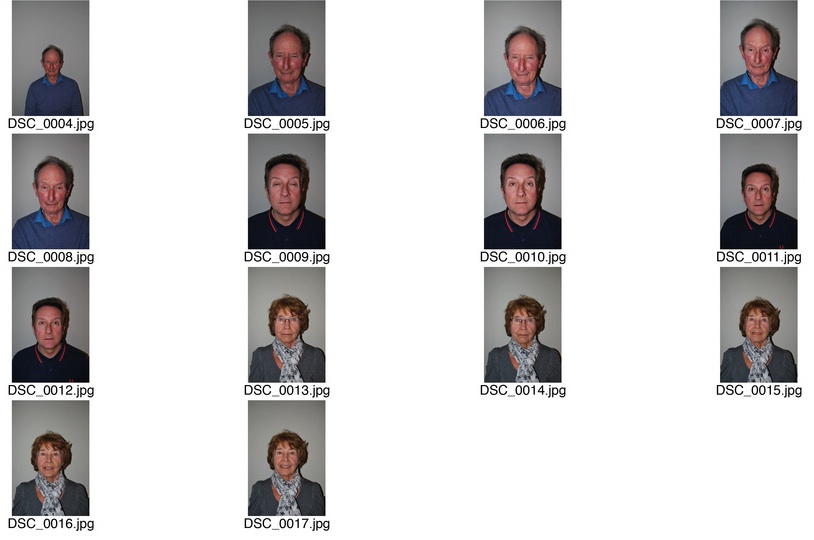
For my first response to this abstract unit, I wanted to demonstrate abstraction prominently through the aesthetics of the photo. So, in order to create an obscure image I decided to project different coloured lights and patterns onto humans. This then supplied an overall abstract aura but also featured a focus ( the model ) to further create interesting, intricate images. My thought process behind featuring the models was the fact I wanted a prominent subject which could be positioned in front of this a huge light source Below is my contact sheet.
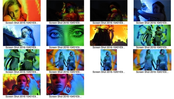
S E L E C T E D I M A G E S :
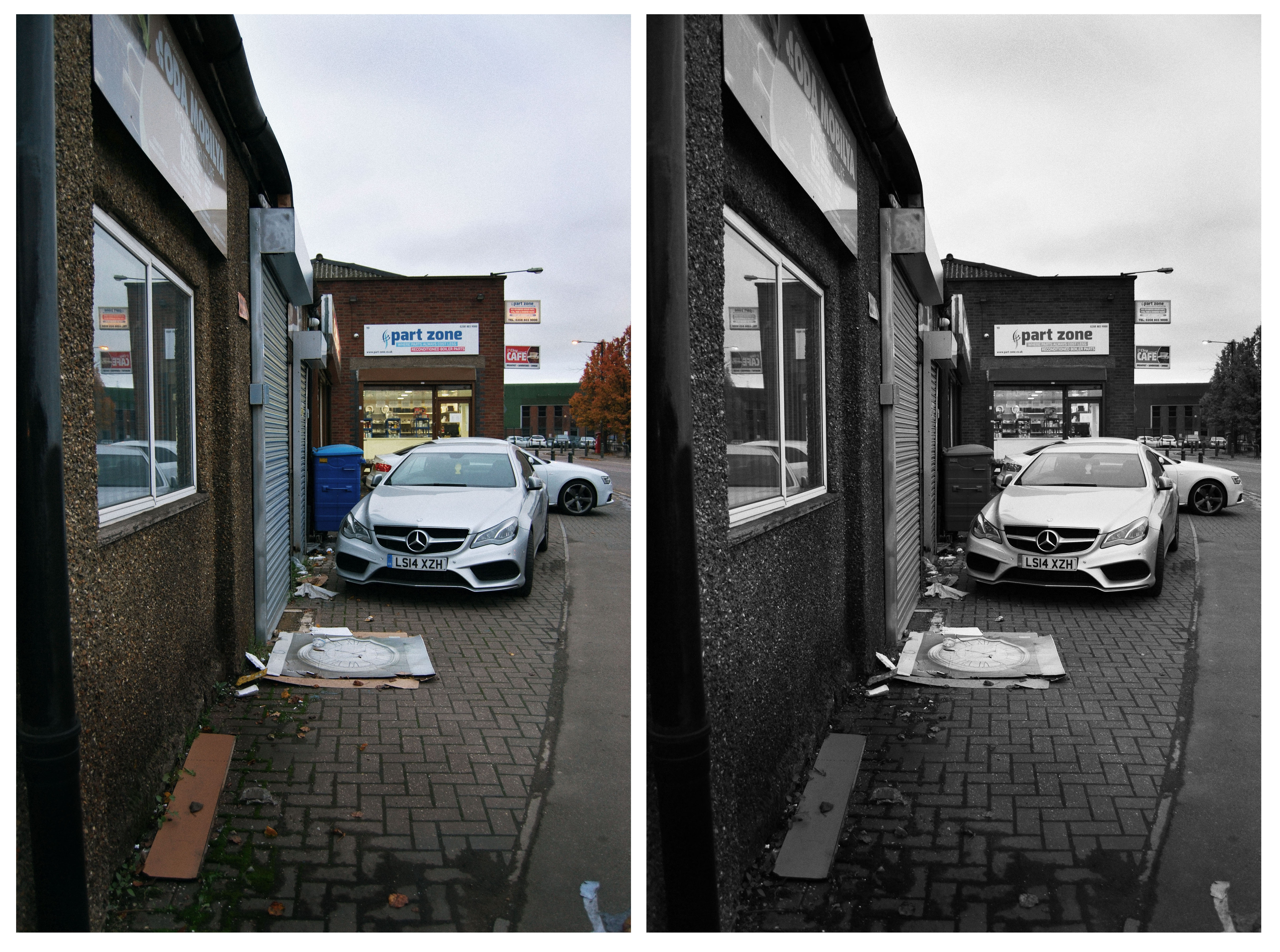
B E F O R E
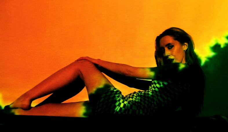
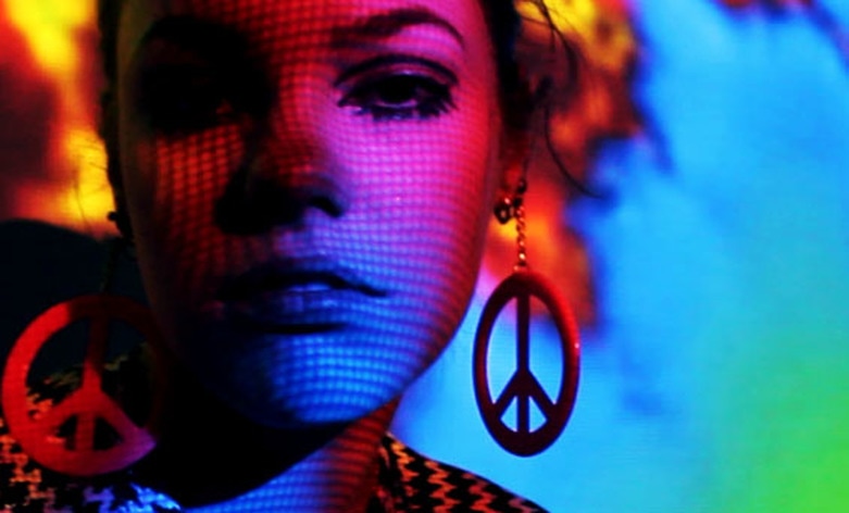
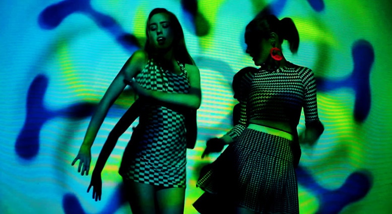
A F T E R
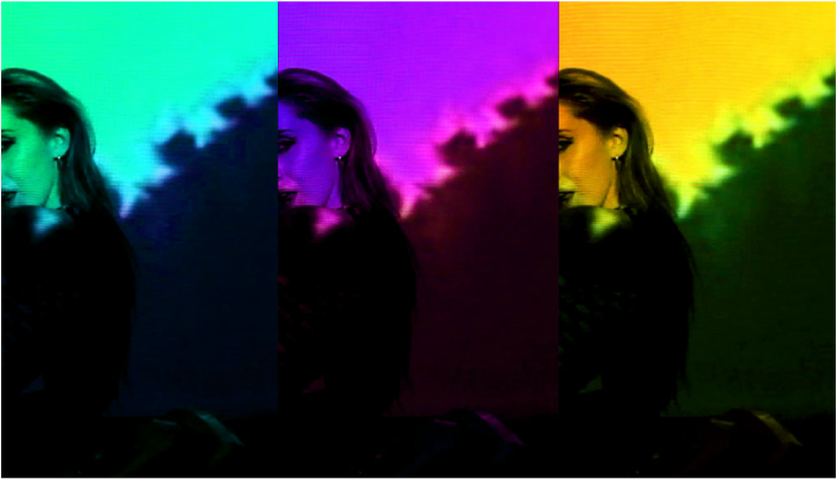
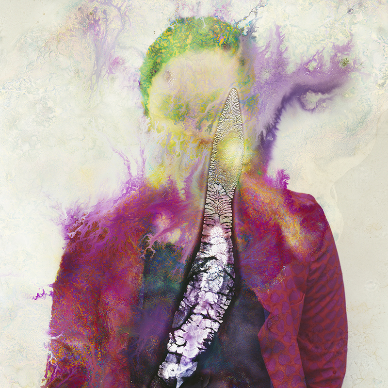
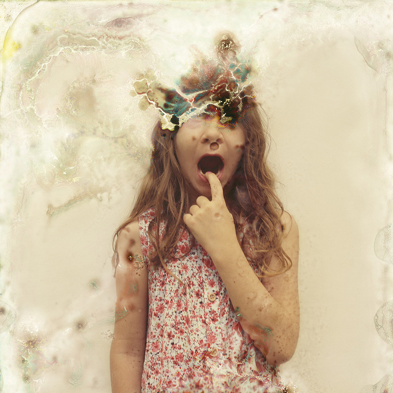
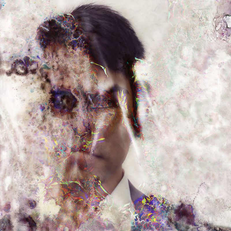
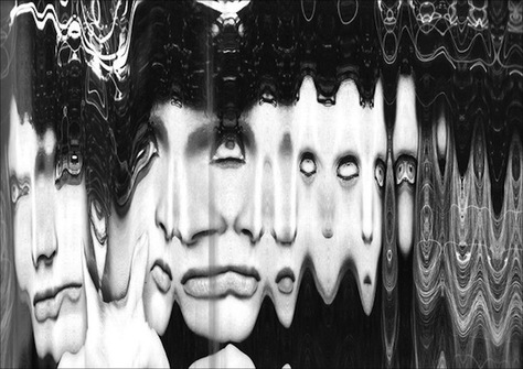
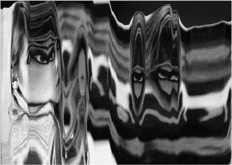
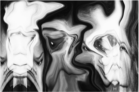
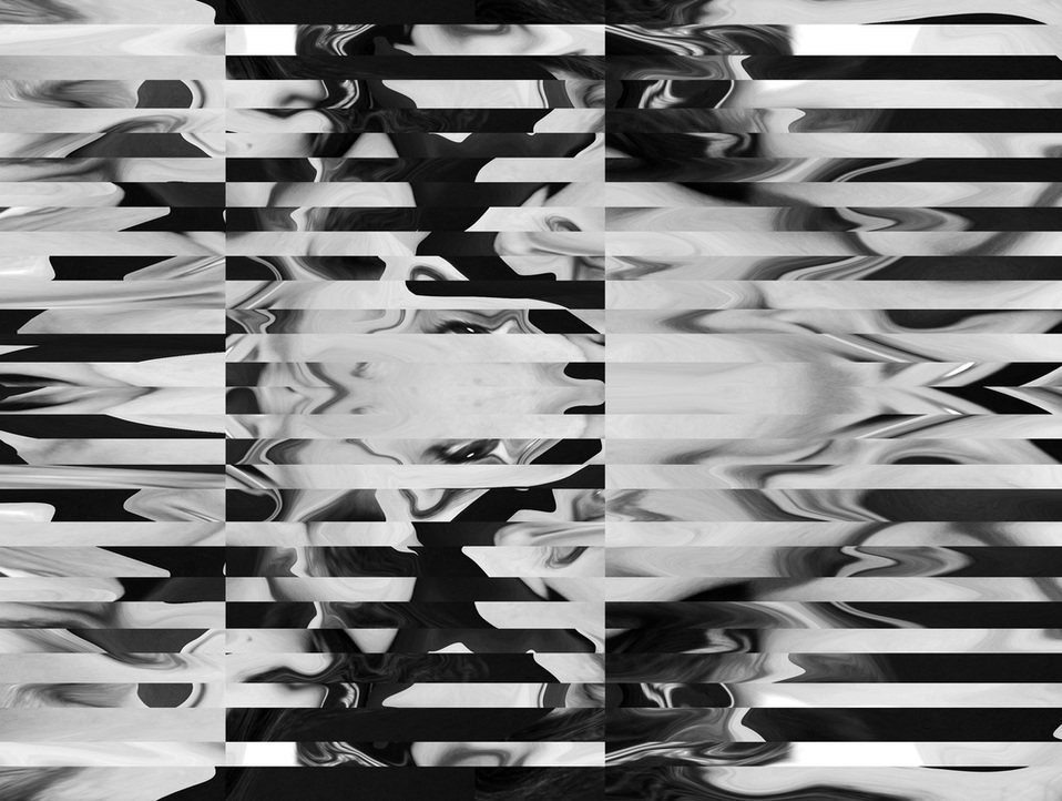
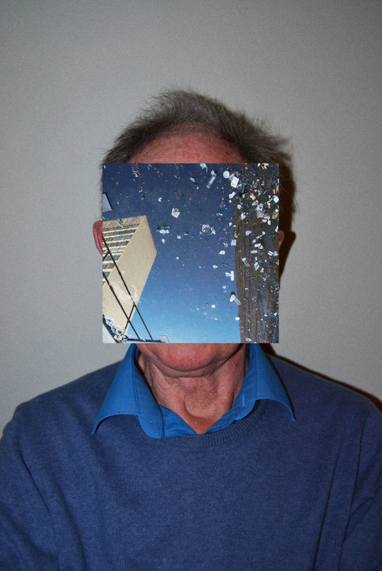
To further abstract my original images I used photoshop. I then adjusted the hue/saturation of the images and changed the opacity of multiple layers to add a disordered, double exposure effect. Below are the results.
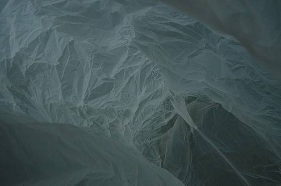
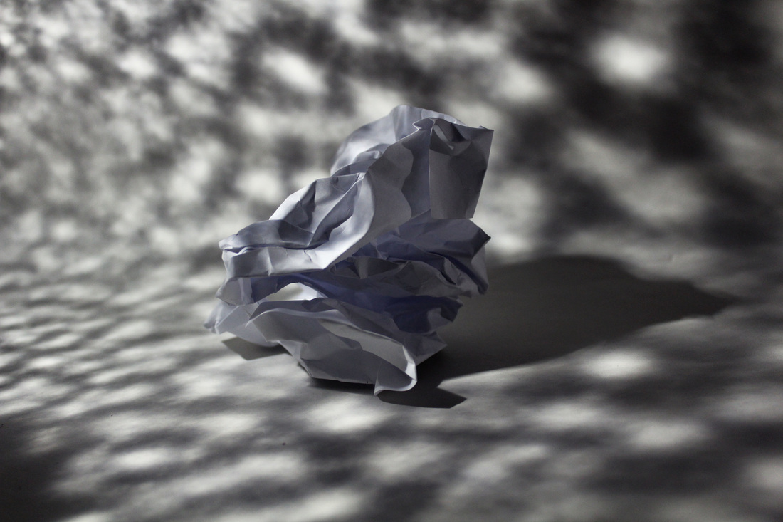
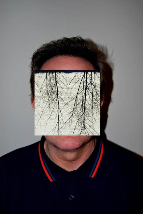
W H I T E P A P E R T E S T
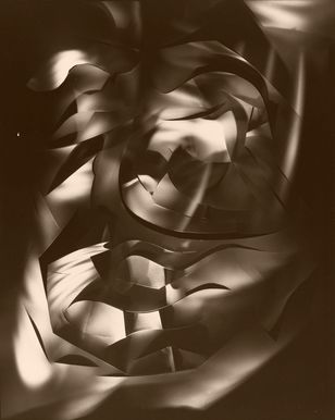
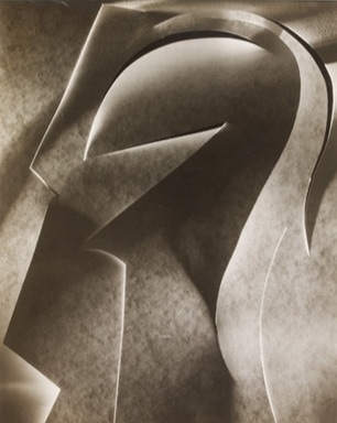
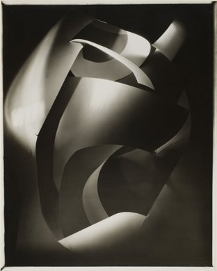
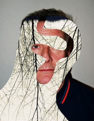
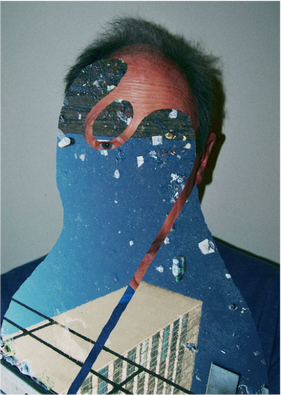
F R A N C I S B R U G U I E R E
Francis Bruguiere is an American photographer, born 1945 in San Francisco, California. He was raised by weathly parents and thus was privately educated. In 1905, Bruguiere friended photographer and modern art promoter Alfred Stieglitz, who influenced him to set up a studio in San Francisco and begin constructing pictorialist style images featuring the city after earthquakes and fires. This then lead to him to his experimentational style as seen below. Thus i selected three images seen below that I was particularly drawn to, to use as influence to my work.
|
|
|
I chose these three images in particular as I believe they are all very striking. The deformation of the paper into a whole new unique and obscure representation, results in an extremely effective outcome. I was strongly drawn to the strong contrast between the dark shadows and the bright white light featuring on some of the paper thus revealing its patterns. This use of experimentation concludes a really effective result and thus I will attempt to imitate this in my own response.
M Y R E S P O N S E
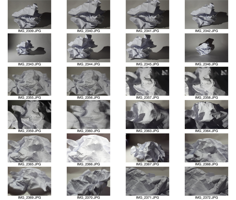
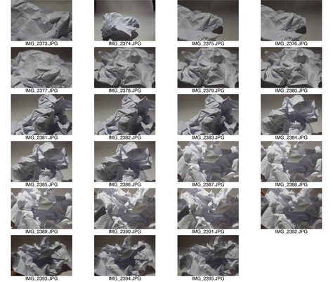
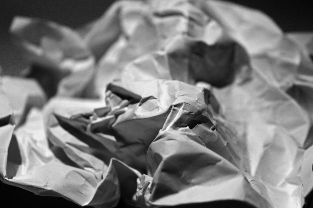
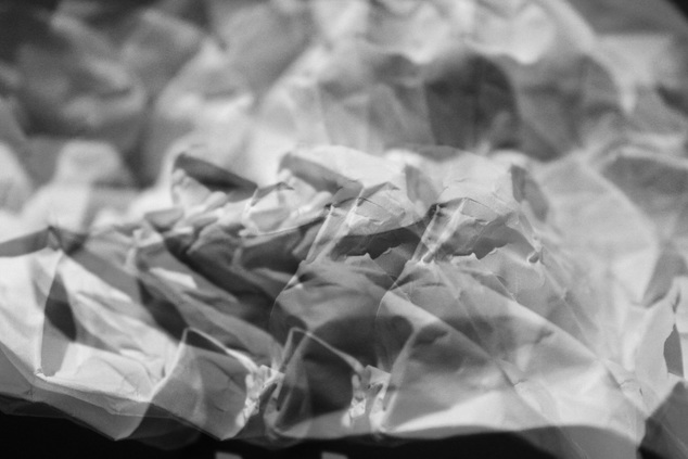
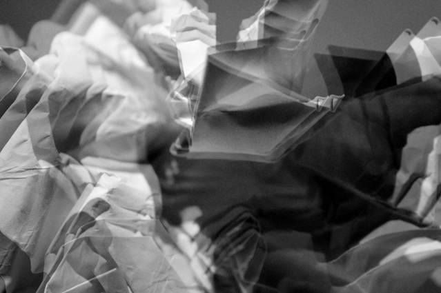
In attempt at recreating Bruguiere's work, I used a plain piece of paper and then distorted it's shape into something different, the method I used was crushing and folding. Once complete I then photographed it using bright light and experimented with different angles and styles to create a unique outcome. I also tried to create the contrast between the bright light and the dark shadows. Below is my contact sheet and selected images.
|
|
S E L E C T E D I M A G E S:
I selected my favourite images from the selection above then edited them on photoshop using the black and white filter, adjusting the curves and shadows. For the second and third selected images I added another layer and then changed its position to create a double exposure effect.
E X P A N D I N G :
F R A N C O I S D E L F O S S E
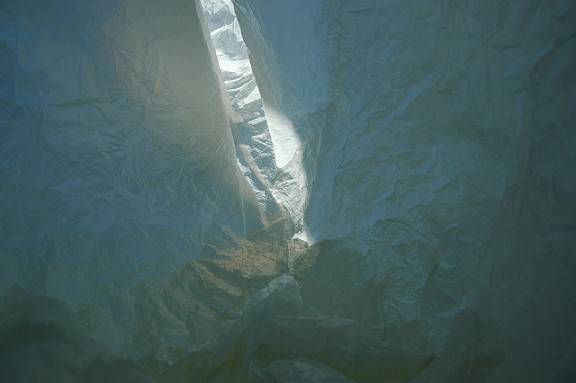
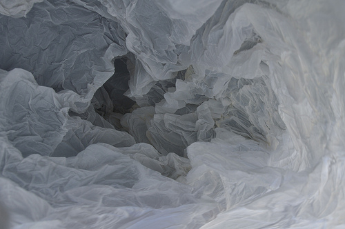
Francois Delfosse is a Belguim artist know most famously for his unique, ineresting piece named "Antarctica in a Bag". This abstract piece allows something with an intruguing concept to be done in a simplistic style. When presenting these images he cleverly mentioned that it was a "glacier cave just North of the South Pole" before adding that it was actually an imitation of the glaciers and that it was actually the view of the inside of a plastic bag. Below are my favourite images of his out of this particular topic, this being because of the shapes and lighting they all present.
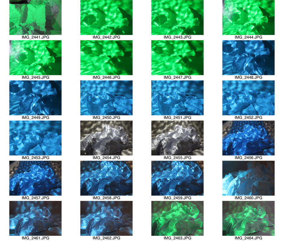
To expand, I used coloured filters that I placed over the light source and had a range of mirrors and patterned glasses that I could use. This then resulted in a more sophisticated image. Below is my contact sheet.
|
|
|
|
S E L E C T E D I M A G E S :
O R I G I N A L C O N C E P T :
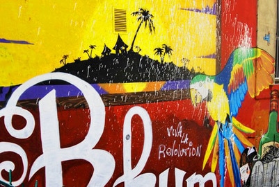
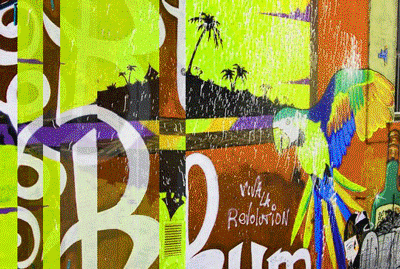
To expand upon the light concept of using crumpled white paper, I wanted to add an element of colour and shape. So to do this I began with this concept, using a ripple effect glass which added an element of obscurity to the image.

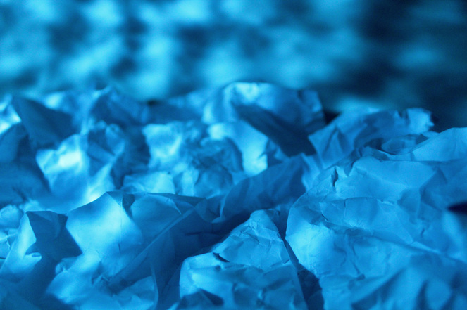
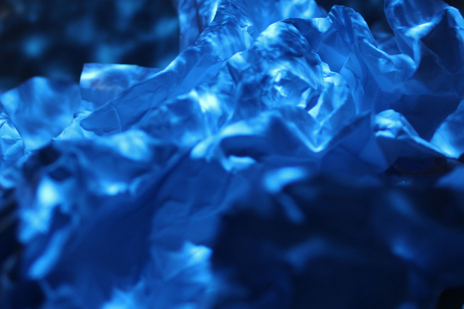
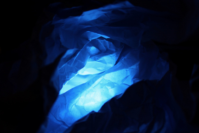
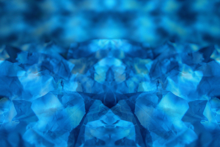
B L U E L I G H T :
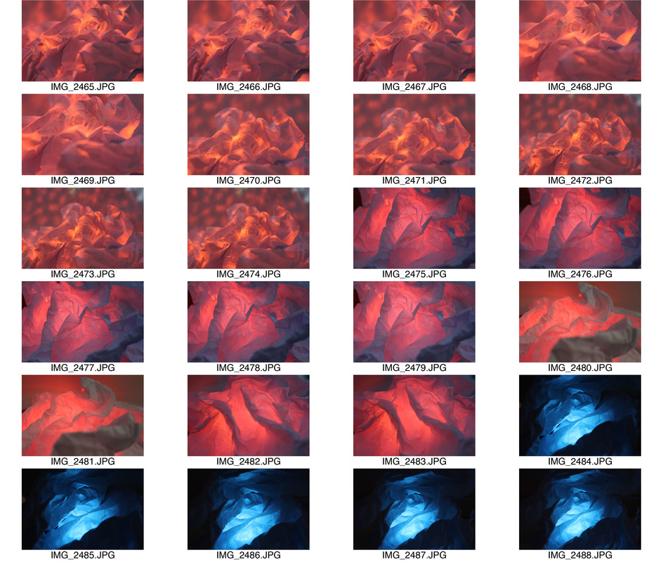
I decided to use a blue filter over the light source to create an ocean like atmosphere. The first and second photographs are taken using the ripple effect glass held above the crumpled paper and the blue filtered light source above that altogether resulting in similar light that appears when underwater. I think this combined with the abstract crumpling results in a unique, thought provoking concept. Lastly, the third photograph creates a sense of a glowing cave. I created this by placing the blue filter and light source beneath the crumpled paper and taking an extreme close up.
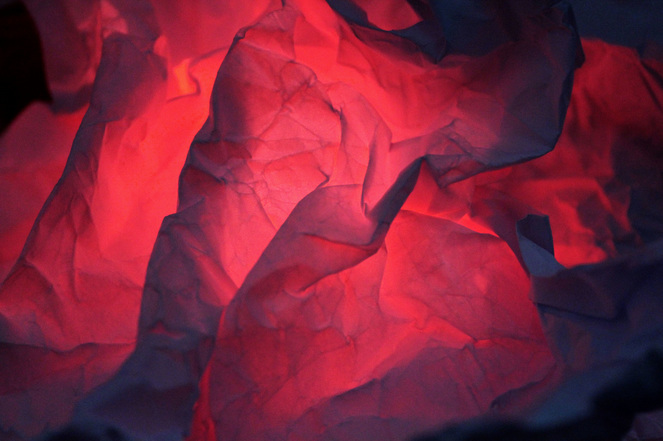
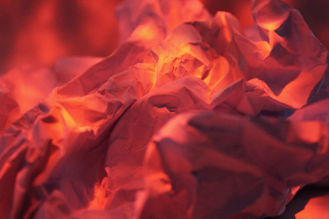
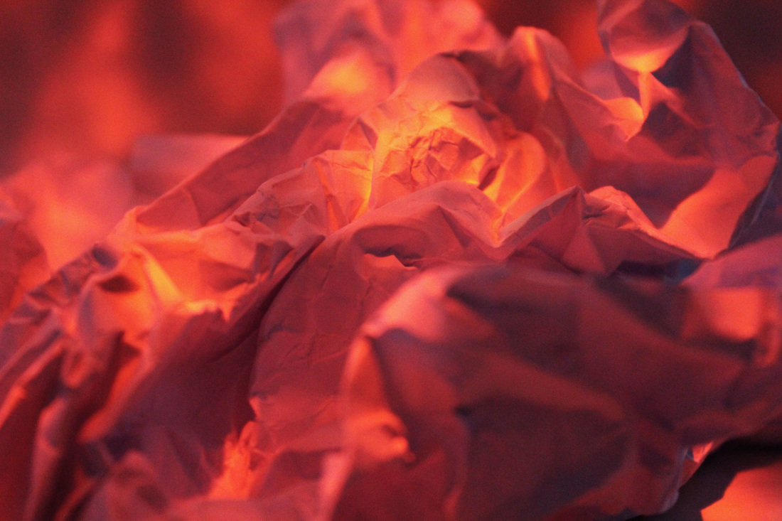
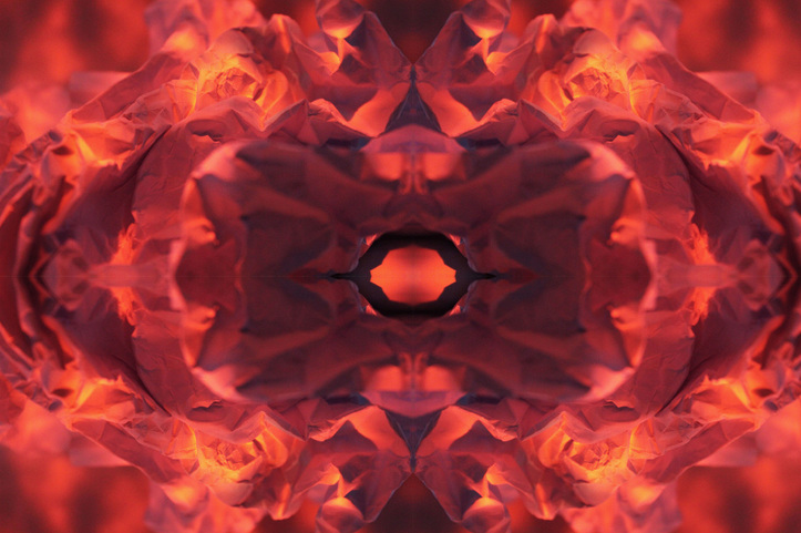
R E D L I G H T :
For these photos I used a red filter over the light source to create a fiery response. The first image was created by placing the light source and red filter underneath the piece of crumpled paper which I believe resulted in a scene that almost looks like something of volcanic nature. However, for the second image, I used the ripple effect glass again and placed the red filter over the light source which resulted in an image that I believe looks like a close up of a fire. Thus I feel that I have successfully created an abstract response using the red filter over the light source and paper that I crumpled freely.
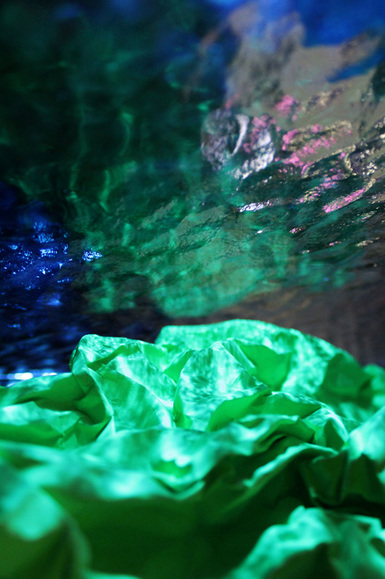
I L L U S I O N :
I created this image by using a ripple effect glass and having the light source from the other side creating this unique effect. I then changed the colour of the paper I was using to almost result in this underwater, pond like scenario. I then edited it on photoshop to enhance the colours and contrast to result in a more rich photo.
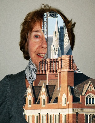
A R T I S T A N D M E :
After editing and evaluating all my pieces of work, I wanted to show a direct contrast between me and the artist and how I have tried to manipulate his work. I thought my work had similar compartments to Francois Delfosse's work such as using material and light to create a scene that looked like it belonged in the natural environment. However, the contrast between my work and his, is the different use of lights, his natural and mine harsh and unnatural, which both result in conflicting outcomes.
F R A N C O I S D E L F O S S E ' S W O R K :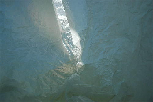
|
M Y W O R K :
|
F U T H E R D E V E L O P M E N T :
For this response, I made select few of the previous response more abstract using photoshop. Below is my results.
B E F O R E :


A F T E R :
|
|
A B S T R A C T E X P E R I M E N T
This task focuses on the fact that a photograph can become more than a representation of a moment in time. Using a select image I am going to create an artistic image demonstrating this aspect, that has gone through different processes resulting in a unique outcome. I will take influence from the artist Seung-hwan Oh and try and mimick his style into my work.
S E U N G - H W A N O H
Seung-hwan Oh bases his photographic work in Seuol, where he was born. Below is a couple of images taken from his series "Impermanence" which is based on a concept formed from the law of thermodynamics. He focuses on the fact that all life forms that collapse in our spatial-temporal dimension and uses these microorganisms to influence his work by allowing them to slowly devour the film and then later developing the images to see the results. The outcome was very successful, as seen below.
|
|
|
I believe all three of these examples of these work demonstrate Seung-hwan Oh's capability and talent. Each image represents a different distorted figure, which creates a creepy effect for the viewer. I was particularly interested in the concept of this series as it is almost commenting on something that occurs to all life forms, it ages and its natural beauty starts to fade. I really liked the outcome of this effect and will try to imitate its manipulation of pictures in my own work via various methods.
M Y R E S P O N S E :
S E L E C T E D I M A G E S
O R I G I N A L C O N C E P T :
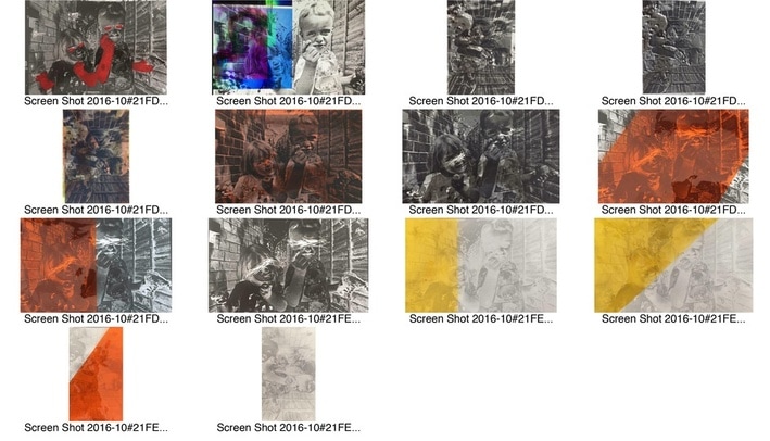
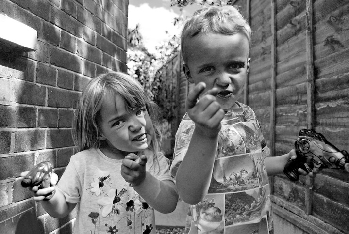
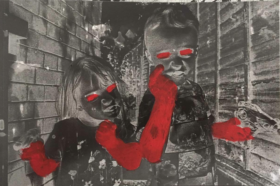
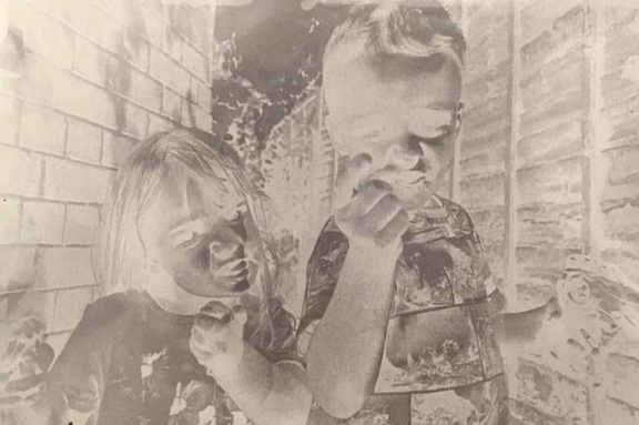
This is a photo I took of my younger cousins during the summer. Here they are posing with their water guns. I decided to edit this image in black and white to focus the image of the details of the facial expressions and features of the young children.
|
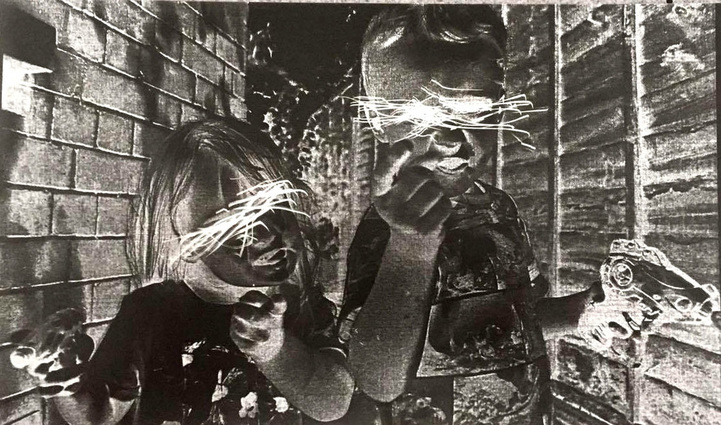
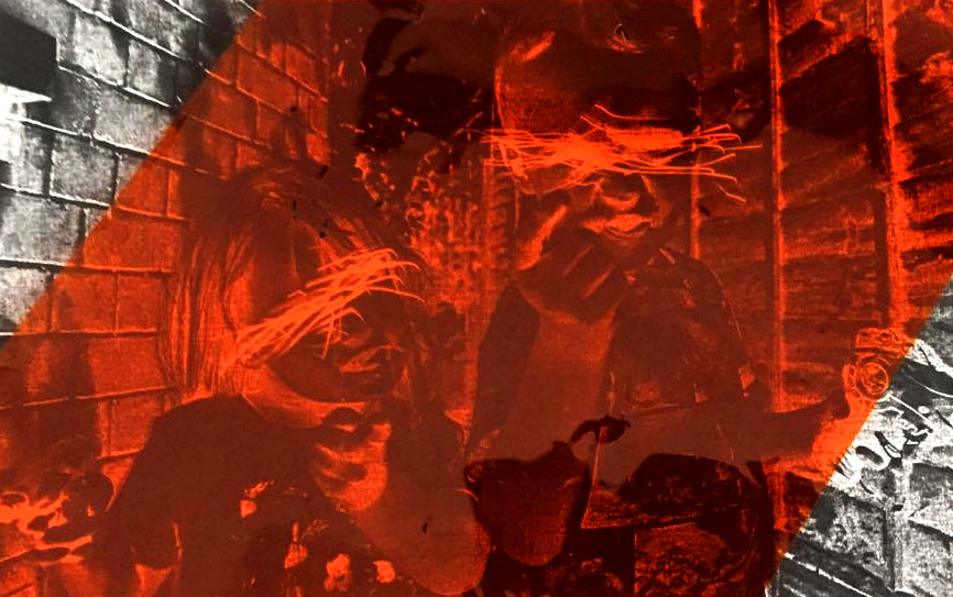
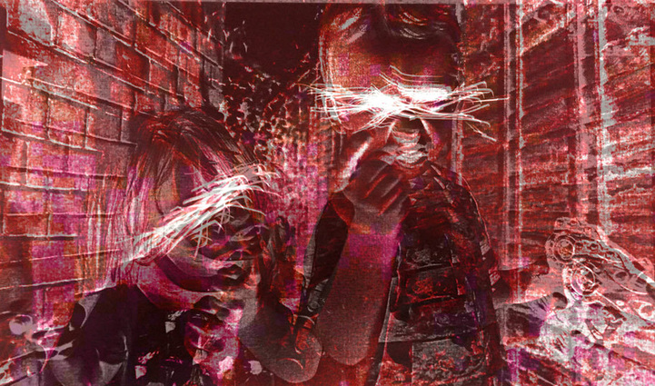
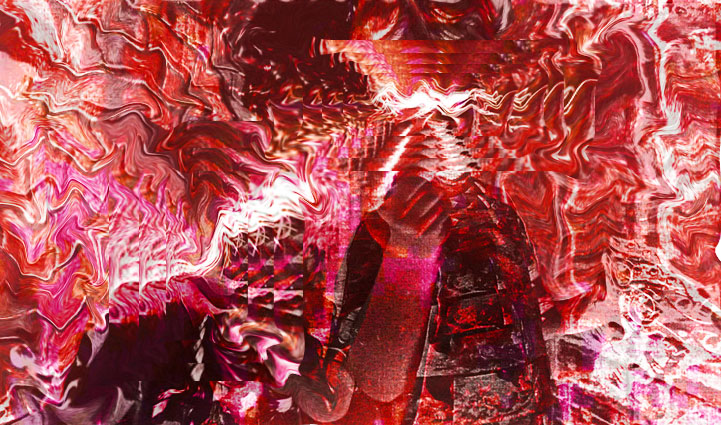
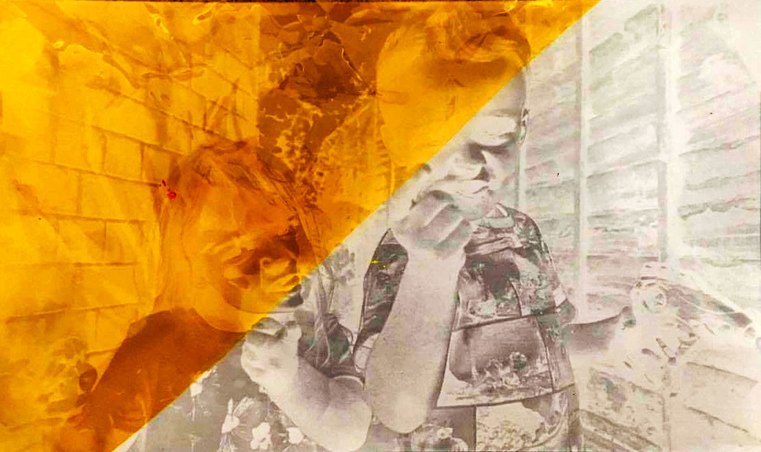
For this image, I exposed the acetitate form of the image using the enlarger onto photographic paper so that the image became a negative. I then developed the image, dried it and put it into bleach in attempt of mimicking Seund-Hwan Oh's style. I then used a sharp intrustment to stratch out the eyes to create a horror like scenario. I then decided to experiment by physically painting an image I developed using the acetate using red paint. I chose the colour red as I feel it plays homage to the fact the children are holding guns. Next, I used a orange sheet of plastic and physically placed it on top of my original image to experiment with different styles. I then scanned my image into the computer and put the image into photoshop to further make the photograph abstract. To do this I added a layer, changed its opacity and expanded it's size to create a double exposure style effect. I then changed the hue of the second layer to add a more dramatic result. I decided to expand upon the last image on photoshop as I wasn't completely satisfied with the outcome. First I used to liquify tool and distorted the background, leaving the models faces remain normal. I then added new layers focusing on the scratched out eyes and every time I made the layers smaller to create an interesting effect. I then reused the liquify tool and made sure the edges of the layers curved as well so the whole image had an element of flow and continuity. |
|
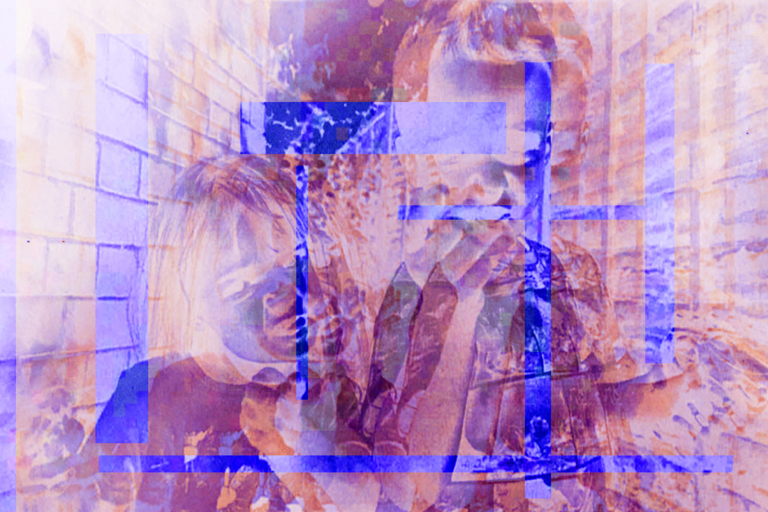
For this image, I used photographic card to expose my image on. I then exposed it for less to create a strange effect, almost as though the faces have been distorted. I then wanted to further expand this image so I experimented using yellow filter paper over the corner of this image. I decided to do this angle as it isn't conventional, something abstraction doesn't involve. So in doing this i was experimenting which i feel resulted in an effective outcome. Then, I edited this image on photoshop using multiple layers and changing the hues of both of the images to add contrast. I also cut interesting random shapes out of the above layer to develop the contrast further. Lastly, I placed the original image back into photoshop to see how else I could distort it. First, I used the liquify tool and distorted everything except the girl's eye. I then added a new layer and contrasted the hue/saturation to the original layer in which I already changed the hue and saturation. I then merged these layers. Next, I added a new layer and selected three contrasting columns and deleted the rest of the layer. Then I changed the opacity of the layer and changed its position, making it frame the girls eye in a slanted position. Lastly, I reflected the whole image making the girls eye the focus of the image. |
|
S T U D I O A B S T R A C T P O R T R A I T
For this task, I will look at the work of the famous and iconic Erwin Blumenfield and take influence from him. I will attempt to imitate his work using glass pains and different gels to create a number of digital portraits.
F I R S T R E S P O N S E
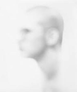
B I L L J A C O B S O N
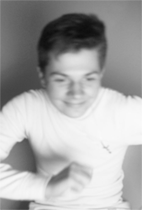
Bill Jacobson is an American photographer born in 1955 in Norwich, Connecticut. Jacobson began taking photos consisting of blurring models in 1989 after hosting various exhibitions in 1993 of which included these shadowy pale photographs. This style Jacobson possessed intended to allow the audience to experience a glimpse of the mass tragic loss occurring during the AIDS epidemic and within this projecting an aura of human similarity in both portraiture and memory.
|
|
|
The three images above are all examples of Jacobson's impressive style. I thought the message behind this series of images act as a revolutionary outcome, highlighting his utter devotion and concerntration embedded in each photograph. The blurred visual effect invites the audience to be drawn towards the images, almost discovering the hidden details on the man. The fact that Jacobson chose to blur these images against a white background connotes feelings of being lost, vunerable and unaware, something common AID victims dealt with, hence why he wanted to physically demonstrate this raw, painful emotion so that the public could visually experience what other people suffered with. Thus this allowed these image to possess significant symbolic power of an anonymous place or body. So, in knowledge of this I will use my influence from this artist and attempt to infuse his style and message in my own response.
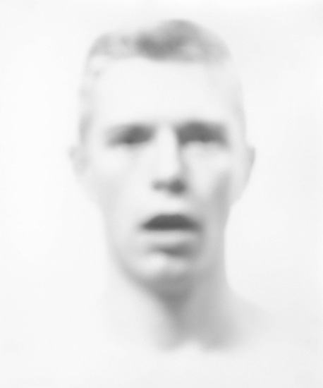
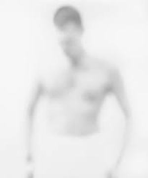
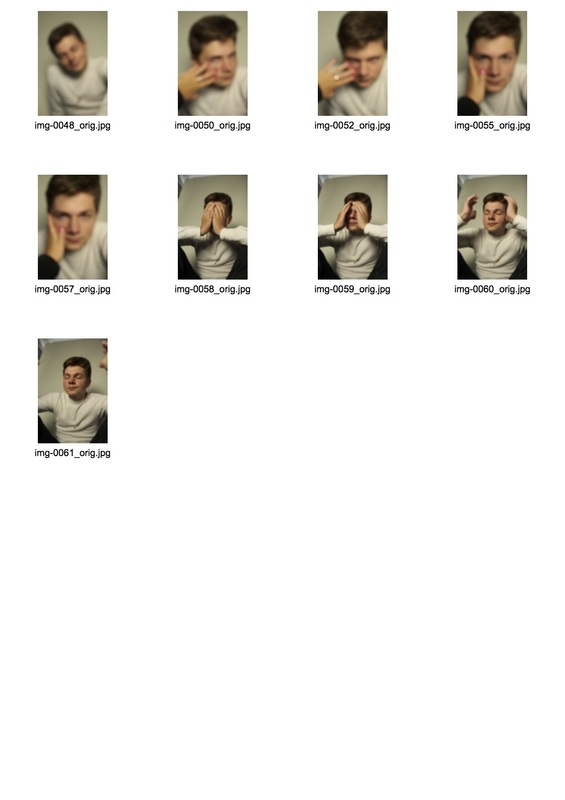
M Y R E S P O N S E :
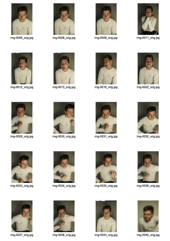
For my response, I looked at the work of Bill Jacobson and attempted in imitate his unique style. In aim of this I used a white background and made the model wear light clothing so that the image was focused on the blurred model's features. Below is my contact sheet and selected images.
|
|
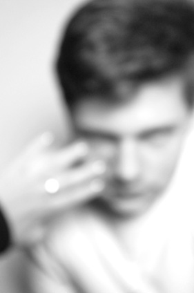
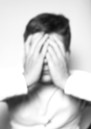
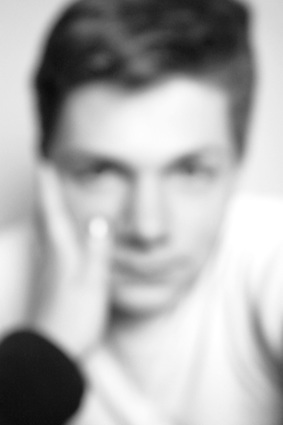
S E L E C T E D I M A G E S :
I chose these photos as i thought they were particularly effective and possessed the same style as Jacobson's. The close up of the face with variety of added angles and use of hands
|
|
|

I decided to expand the original photo by creating the same concept of Jacobson's and transforming it into a gif. Below I created a gif and showed the process I used to reach my final outcome.
First, I selected my chosen images and placed them in a file, saved on the desktop.
|
|
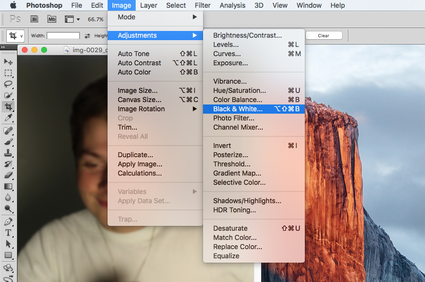
Secondly, I made the photo black and white by going to image, then adjustments and selecting the black and white tool.
|

|
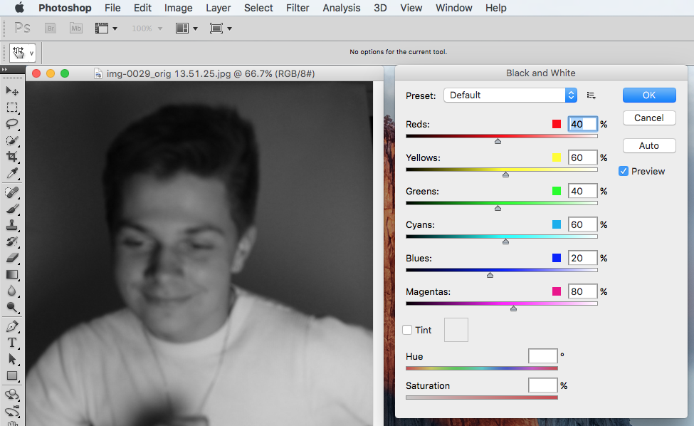
I then adjusted the different levels within the photo using the black and white tool.
|

|
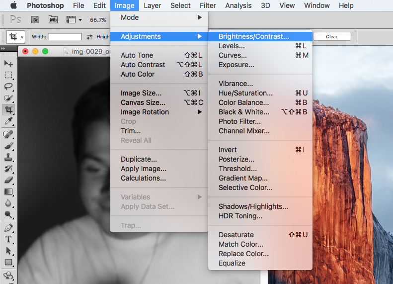
Next, I then attempted to make the photos more like Bill Jacobson so i adjusted the brightness and contrast in attempt of achieving the same look.
|
|
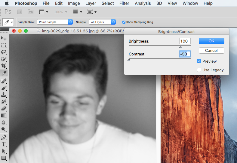
Then, once the brightness/contrast tool appear I adjusted the contrast to -50 and +100 to achieve the Jacobson style. I then did this to every photo to maintain consistency.
|
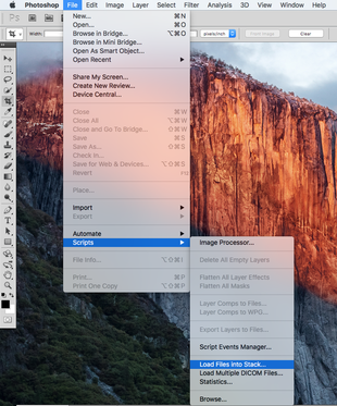
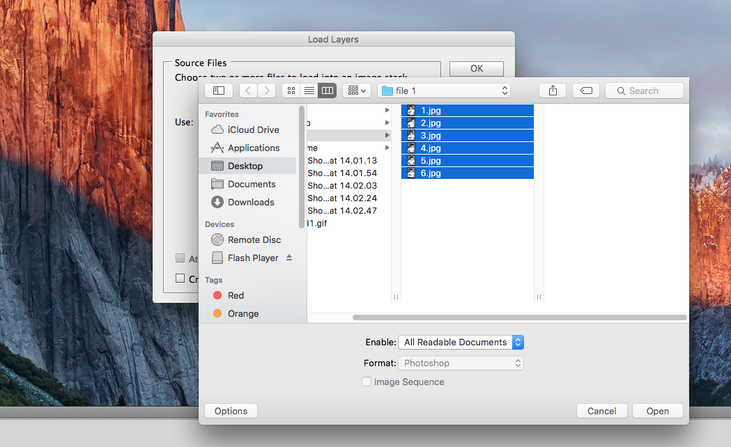
Next, I went back onto photoshop and went to file, then scripts then load files in stack.
|

|
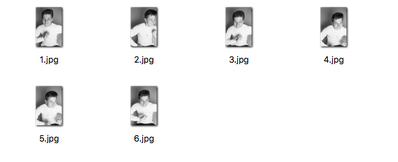
Then once I had edited all the images and made sure they all consisted of the same edit, I placed them into a file, saved onto the desktop. This meant that once I was creating my gif that I could easily access all the files.
|

|
|
|
I then selected the images I wanted from the file I created.
|
|
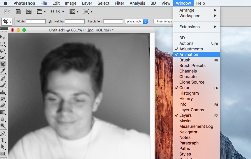
Next I went to window and selected animation which then enabled a window appear next the bottom of the image.
|
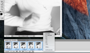
The images then appeared in order in the animation window that appeared previously. Then I made the gif quicker by selecting all the images and changing the time to 0.1 seconds.
|

|
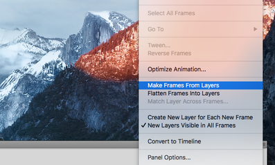
I then clicked on the top right part of the window that appeared near the bottom of the image and selected make frames from layers.
|

|
|
|
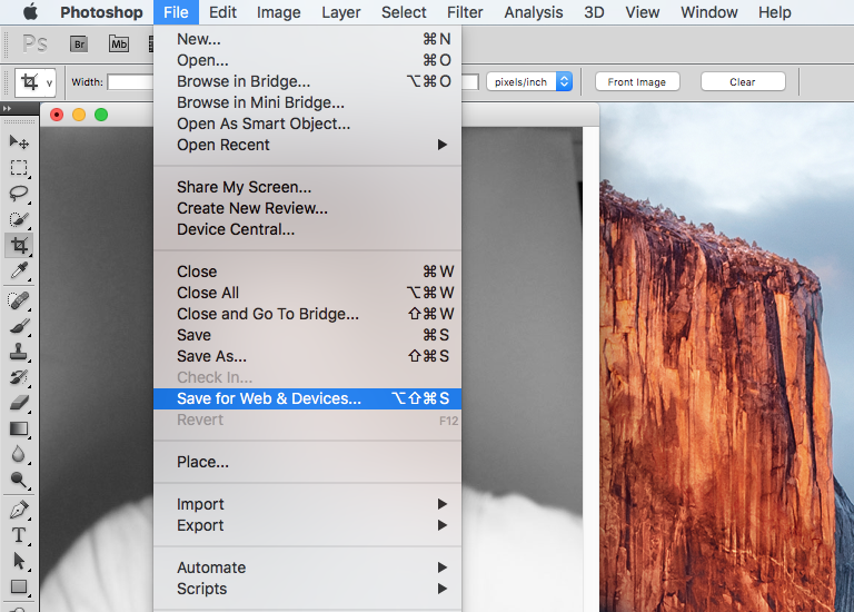
Lastly, to save the image ready to upload to weebly I went to file then save for web & devices. Below is my final outcome.
|

|
F I N A L O U T C O M E :

E X P A N S I O N
For my expansion, I decided to add an element of texture to this concept. So, in placed my model behind this patterned plastic and focused the light source from above her on the right in aim of creating a dramatic outcome. I then focused my lense on the material. Once, I upload the pictures into photoshop, I edited them in black and white to imitate Jacobson's style. I believe the outcome resulted in a very unique, unnerving response. Below is my contact sheet and my final selected images.
S E L E C T E D I M A G E S :
|
|
|
S E C O N D R E S P O N S E
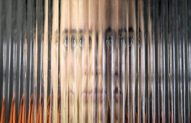
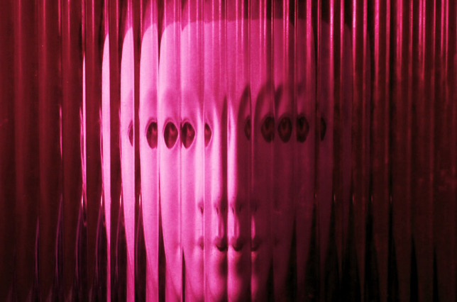
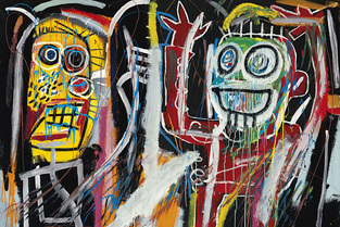
E R W I N B L U M E N F I E L D
Erwin Blumenfiled, regarded as one of the most influential photographers of the twenieth century was born in Berlin 1897. His thirty five year career resulted in an extensive and impressive line of work of which includes the following three images below.
|
|
|
I was strongly drawn to the photos I've selected above primarily due to their abstract aesthetically pleasing form. The image on the far left is particularly interesting due to the kaleidoscope effect cast upon the model's face thus resulting in a unique, effective outcome. Additionally, this also creates a patterned reflective look altering the entire picture and acting as a focus, grabbing the audience's attention further. The red lips also create add an extra burst of colour contrasting to the rest of the cool toned aura. I found the second image, centre stage very abstract. By using a mirror to reflect the human anatomy in an unusual, unique form by casting different limbs in a disturbing ways this has resulted in a animalistic outcome, something that appears very unnatural. I really liked the fact that the model looked away from the mirror as this further abstracted the image by manipulating the norms humans and their bodies are used too. Lastly, the image on the right demonstrated the a different abstract use of material. By using a stripped pane of glass Blumenfield was able to manipulate the model's face. He further amplified the manipulation by cutting up the image and sticking it back together in a different order so that the abstraction is dominant feature. Thus it is evident Blumenfield has successful manipulated the human anatomy using a variety of different materials and in doing so has created an effective outcome. I will use this knowledge and incorporate it into my response.
M Y R E S P O N S E
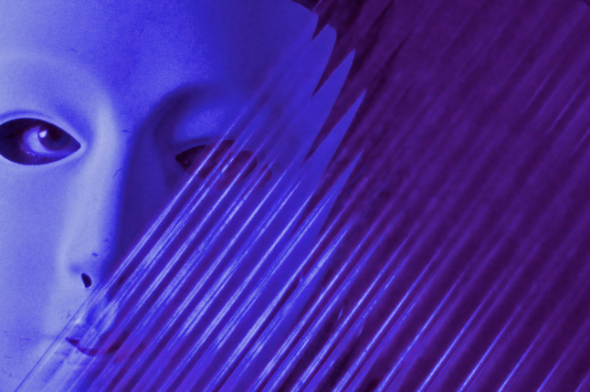
For my response, I wanted to imitate the style of Erwin Blumenfield as his work presents an effective and powerful outcome. So, in aim of this, I used various different patterned glass and coloured filters to created a distorted response. I then edited my selected images on photoshop to enhance their colours and thus make the image appear more dramatic. I also incorporated a mask to further amplify the abstracted distortion. Below is my contact sheet and selected edit images.
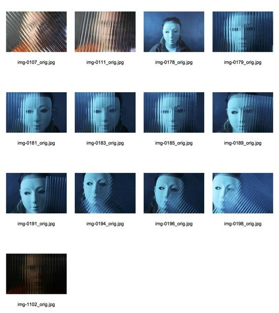
S E L E C T E D I M A G E S :
E X P A N S I O N
For my expansion, I decided to take pictures I had taken before where i physically tried to manipulate the scene to make it abstract and then put it into photoshop and manipulated it further. I decided to do this as then you can view the contrast between the before and after and the effect that both present.
D O C U M E N T A R Y A B S T R A C T I O N
For this segment, I will focus on the documentary side of abstract photography by looking at Saul Leiter and responding to his work in two different forms.
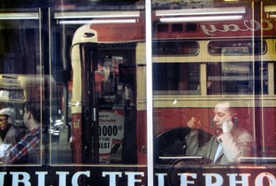
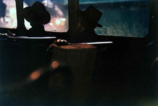
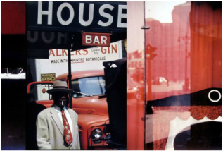
S A U L L E I T E R
Saul Leiter, born December 1923 and died November 2013, was a famous American photographer and painter, who's work contributed to a significant mainstream recognition for his pioneering role in the emerging of colour photography. In 1946, ( two decades before the 1970's colour photography school) Leiter began using Kodachrome colour slide film for his artistic shots, despite the fact that various significant artists of that era looked down upon it, revealing his originality. His work is now seen in collections of many prestigious public and private collections.
|
|
|
Above are three images I chose from Saul Leiter's extensive line of work as I was particularly drawn to them. Primarily i was attracted by the bold and vibrant colours used throughout which create an extremely striking outcome. The use of transport throughout the images demonstrate an industrial vibe and also allow the viewer to recognise the era these photographs were taken, thus adding a sentimental element to the photos in memory of the past. Leiter also tends to include humans in his work, capturing them in their natural environment, for example the first image of a business man in a cafe window, presumable on a break. This voyeristic approach in capturing these moments enables a close connection between the viewer and the people featured in the photographs, forming a stronger bond. Thus as a result, these effects have drawn me to this artist and helped me to respond in a similar style.
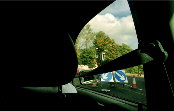
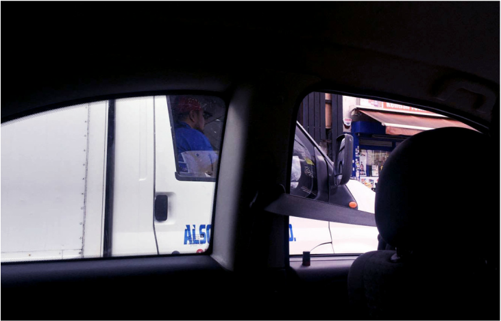
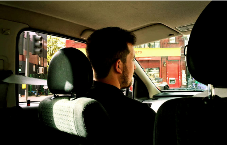
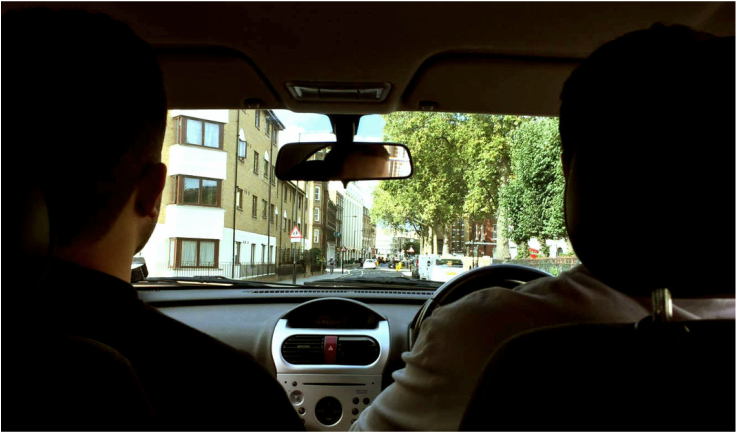
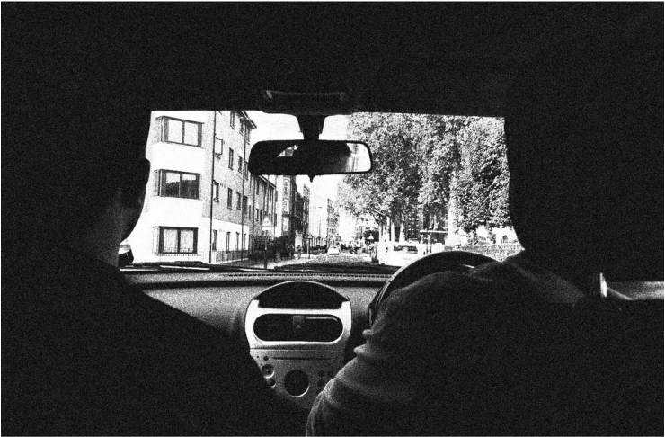
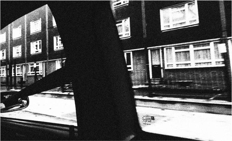
M Y R E S P O N S E
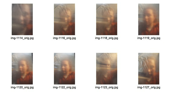
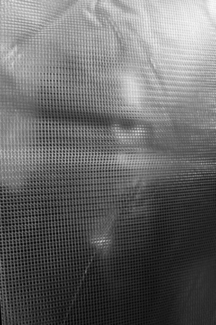
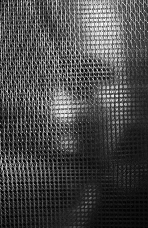
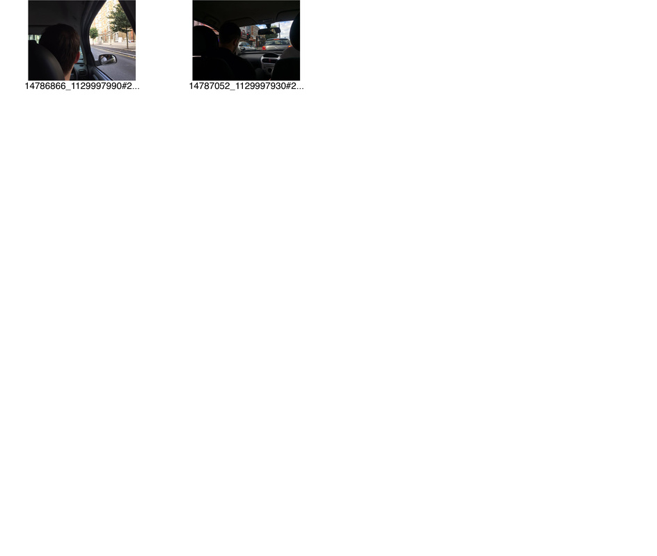
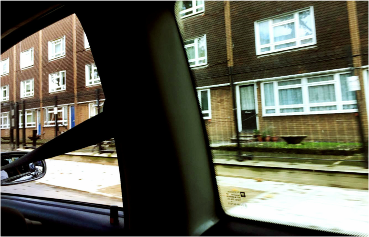
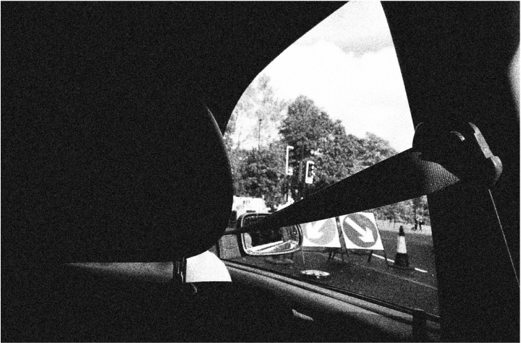
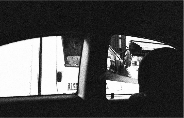
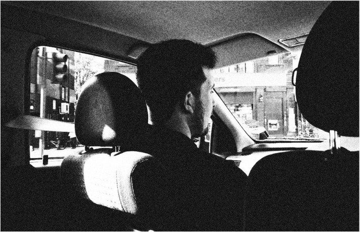
For this response, I decided to take inspiration and focus on a vehicle concept, windows specifically. So in order to do this I decided to take pictures from the inside of a car. I wanted a older car so I used my brothers car and featured my two brothers as models, in doing so I believe this resulted in a unique outcome, somewhat similar to Leiter's style. Below is my contact sheet and selected images.
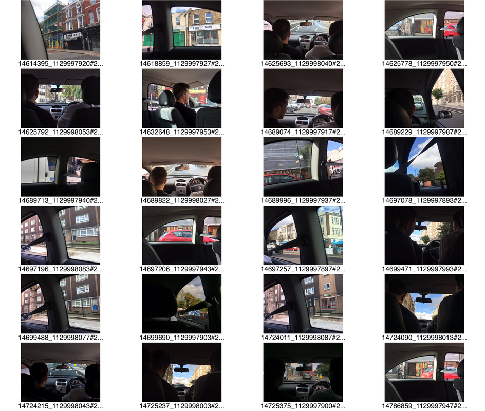
|
|
S E L E C T E D I M A G E S :
C O L O U R E D I T S :
I edited these images on photoshop in aim of having the same style as Leiter's. To achieve this I created contrast by adjusting the levels and curves and enhanced the colours by adjusting the colour balance and saturation of the images. I then cropped the images to the same size that is used for film content as I believe Leiter's work has an element of cinematography to it.
B L A C K A N D W H I T E :
I then edited the selected images to black and white and as I believe this gave them a more dramatic look. I also added a film grain to it to create a further texture to the image and to further enhance the cinematographic element.
T H R E E S T R A N D S
To decipher my chosen strands I decided to do a spider diagram around the word abstraction. This would then enable me to chose three concepts I could expand upon via various aspects and result in the most effective outcome.
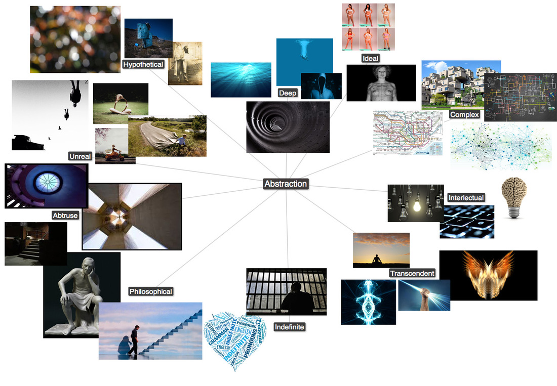
My chosen strands:
1. Manipulation of reality
2. Identity
3. Architecture
1. Manipulation of reality
2. Identity
3. Architecture
W H Y ?
|
Manipulation of reality:
Looking at the spider diagram I was particularly drawn to the Transcendent and unreal segments. I thought these were particularly interesting as it focused on topics such as human advancements and future possibilities. So, I decided to chose this as I believe this is a topic that interests us all. |
Identity:
After researching for my spider diagram and looking at it afterwards, I was strongly drawn to the philosophical and ideal side of it. I think these two both comment on societal issues and problems that one can have with themselves if they don't fit into these normalities. |
Architecture:
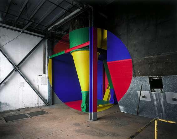
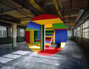
I chose to do a strand on architecture as the complex and abstruse particularly inspired me. The use of patterns and shape is something present in all environments, natural and manmade. So in order to expand upon this I chose architecture to look at the affect humans have had upon our world and our choices into organising our lives. |
F I R S T S T R A N D
M A N I P U L A T I O N O F R E A L I T Y
For my first strand, I wanted to represent abstraction by manipulating normality to something of unique and unusual nature. To do this I looked at various artists and responded in a variety of ways to demonstrate the concept to it's potential.
F I R S T C O N C E P T :
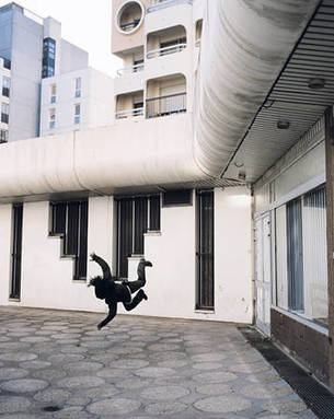
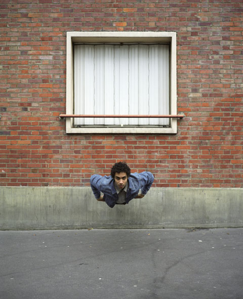
For my first response to Manipluation of reality strand I wanted to focus on the positive possibilites that could come of the future and represent this in an abstract form. To do this I decided to focus on levitation/flight in humans.
A R T I S T I N F L U E N C E :
D E N I S D A R Z A C Q
Denis Darzacq is a french photographer, based and born in Paris in 1961. He graduated from the ENSAD in 1986 and thus his photographic career followed. His work is exhibited around France and internationally, such as the Pompidou Centre. Below are three of my selected images from his extensive line of work.
|
|

|
I was strongly drawn to these images of Denis Darzacq as they present a futuristic aura due to the leviation element. I really liked the fact he adapts the angles and poses between shots adding an element of variety in his work. In some images such as the first and the last one Ive featured it, Darzacq creates a sense of falling thus demonstrating uncertainty to the viewer. However, the centre image I have chosen depicts a contrasting view, the model is facing towards the camera, looking directly at it thus showing an air of confidence, overpowering the viewer. This opposing use of levitation is very striking and is something I want to incorporate into my work due to it's abstract natural, conceptually and aesthetically..
F I R S T R E S P O N S E :
To create this distortion of reality, I created it on photoshop. First i captured photos of a model levitating and then used a picture of a building I captured near the South bank. I then put them both into photoshop. Next, I used the quick selection tool and selected the model's silhouette and then inverse the selection. Once the background around the model was selected I deleted it, leaving just the model. I was then able to drag the model onto the building picture. Lastly, I readjusted the model's angle so it appeared that he was walking up the building. I then merged the images and edited the look of the image to further amplify the look of the two layers being one image. Below is my outcome.
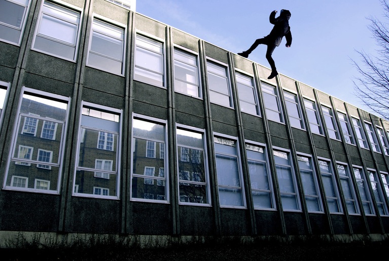
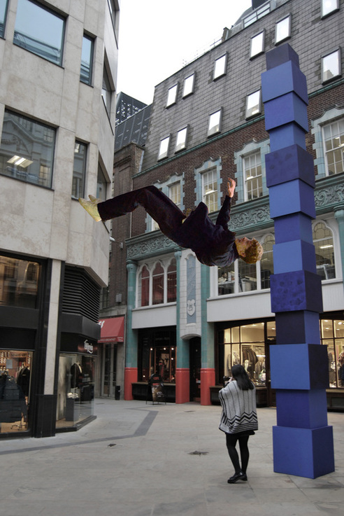
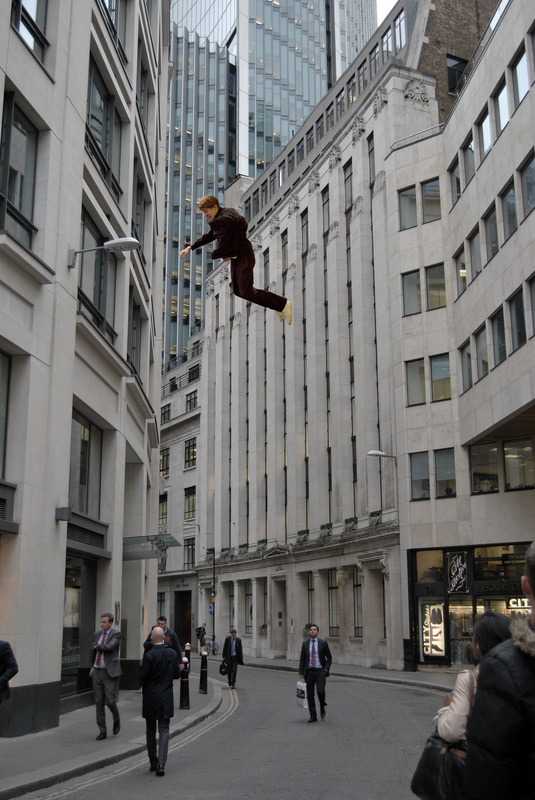
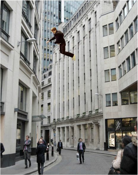
S E C O N D R E S P O N S E :
I then decided to do a second response to create a more effective outcome in which allowed the subject to be more seen and present in the image rather than using a man in all black and not featuring his face.
|
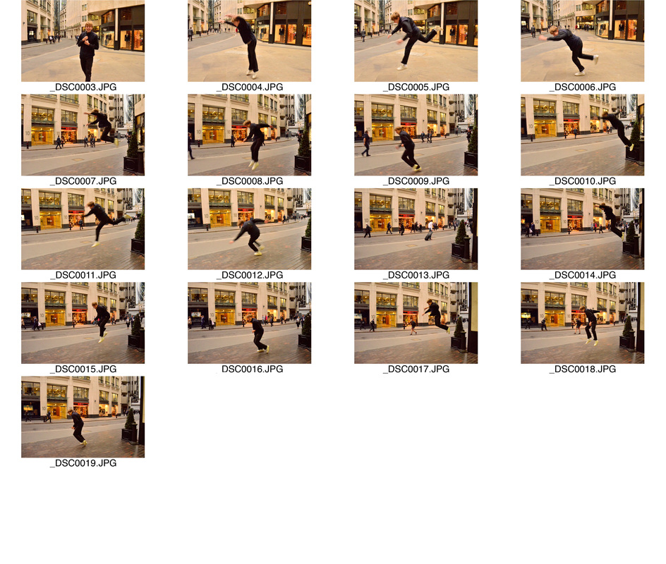
C O N T A C T S H E E T O F S U B J E C T J U M P I N G :
|
C O N T A C T S H E E T O F B A C K G R O U N D :
|
S E L E C T E D I M A G E S :
C O L O U R E D E D I T S :
I first edited these photos in colour to imitate the artist's style. In doing this allowed the result to look more realistic as the man and background merge to look like a whole. I did this by taking photos of the subject jumping and capturing these urban backgrounds. I then went onto photoshop and removed the background of the boy jumping so it was just him on his own, using the rubber and quick selection tool. I then edited the colour of the boy, desaturating his body to match the colour of the urban background. I then went tot he background and also desaturated the colours to imitate Denis Darzacq's manner.
|
|
B L A C K A N D W H I T E E D I T S :
Next, I further developed my response to Denis Darzacq's work by adding a more abstract element to the images. To do this I made the backgrounds black and white to separate the man and make him the focal point to the image.
|
|
A R T I S T A N D M E
Here is the comparison of my work to Denis Darzacq's however, I have used his style and replicated it using my own style. In his work it is based on the levitation concept but the subject is only a few feet above the ground. For mine, I wanted to use the same concept but expand it's potential by levitating the subject several meters above the ground. In doing this, I believe the effect is more shocking and memorable. Also, I wanted to hint at a concept of human progression and the possibilities that humans may be able to do in the future.
|
M Y W O R K :
|
D E N I S D A R Z A C Q:
|
|
|

E X P A N D I N G
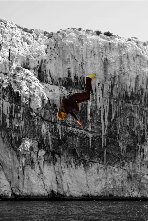
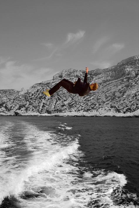
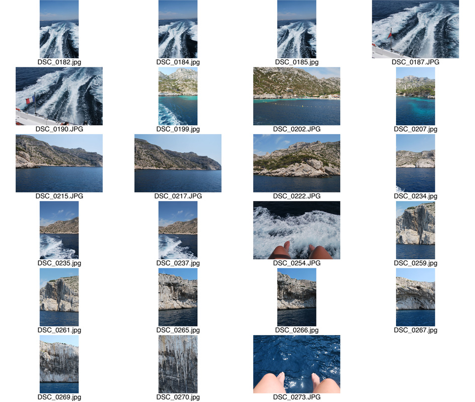
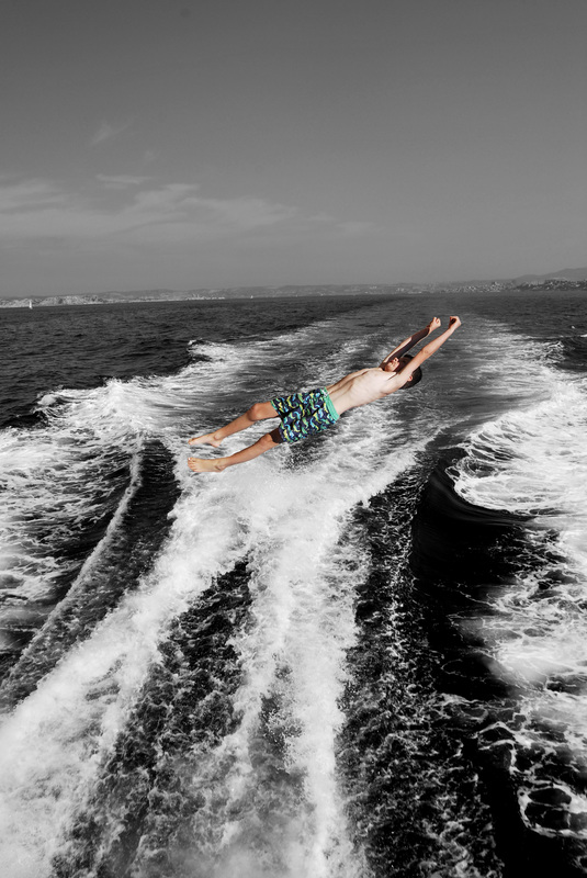
I decided to further expand this concept and make this response even more abstract by placing the levitating subject in an obscure environment. To do this, I took photos I captured when on a boat trip in Marseille and used these to contrast the layers. Also, I made the background black and white as I believe this finalises my experimentation.
F I R S T R E S P O N S E :
For my first expansion response I used the same model so the viewer could completely view the transition between the original concept and this final expansion.
|
|
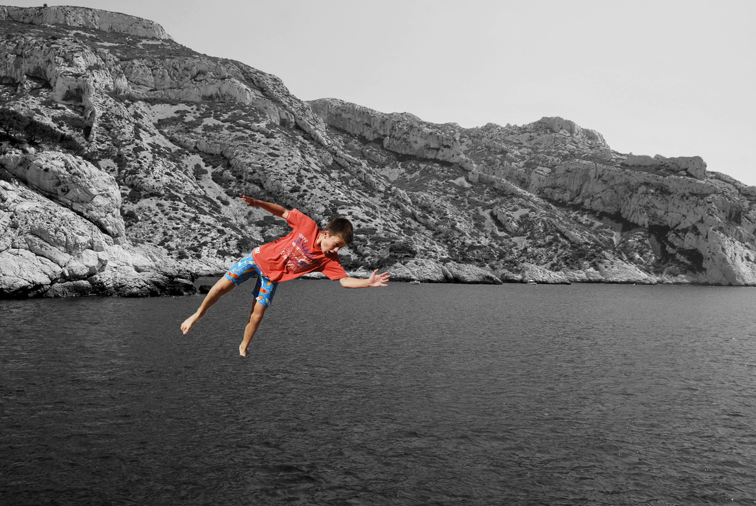
S E C O N D R E S P O N S E :
My second response involved using different subjects. So to do this, I used 2 children in colourful, beach clothing to correlate to the background. Below is my contact sheet for the two boys jumping and my contact sheet of the backgrounds I have used.
|
C O N T A C T S H E E T O F B O Y S :
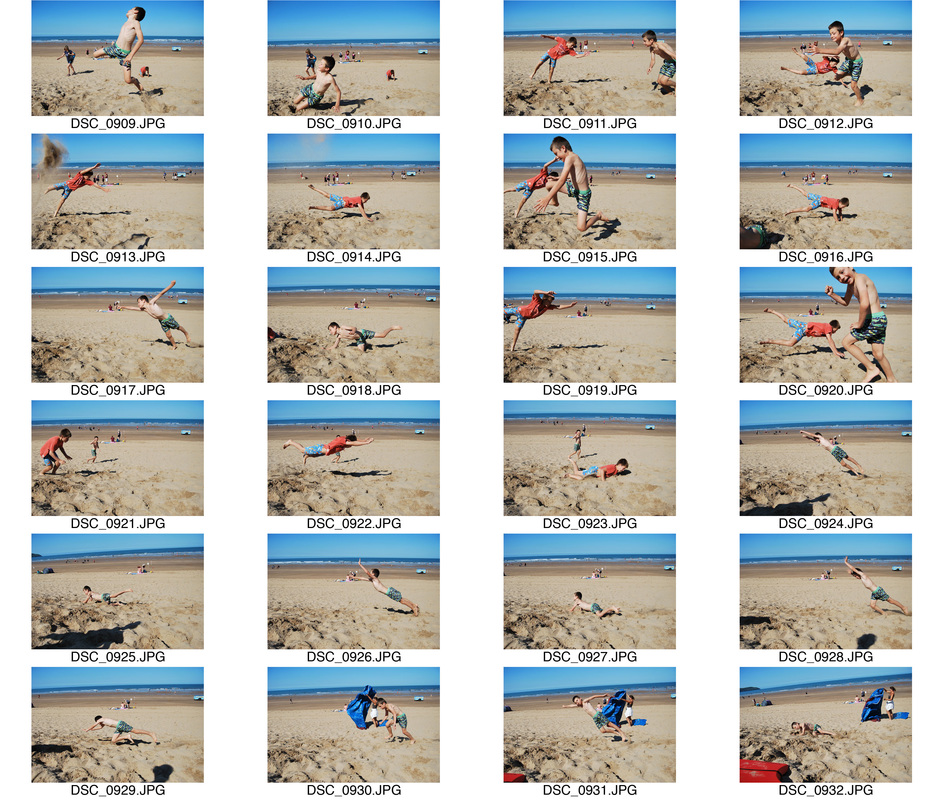
|
C O N T A C T S H E E T O F B A C K G R O U N D S :
|
S E L E C T E D I M A G E S :
S E C O N D S T R A N D
I D E N T I T Y
In this strand I will investigate into Identity and what compartments make up us as humans and how we are perceived. I will incorporate the abstract element via the aesthetical elements thus relating to the judgement viewed by other members of our society.
F I R S T C O N C E P T :
First I will look at Yovcho Gochev and focus on distortion. Within that I will demonstrate the effect these images have upon the audience and how it links to identity via it's attempt to be something else. I believe this is a problematic issue common in society that many people feel, especially if they think they are not what society calls a 'normality'.
Y O V C H O G O C H E V
Yovcho Gochev has an MA in Film Design from the Royal College of Art, London. She has strong interests in visual mnemonics and the way humans remember, imagine and dream, which is the primary inspiration for her work. The theme and importance of humour is also present as the childlike curiosity and approach to life is an element that is dominant in the work.
|
|
I chose these two images are they are first and fore more very striking. The distortion of these conventionally attractive women relates to the dysfunctional beauty standards women have to conform to thus this representation is breaking these rules and showing how it is acceptable to be different and not attempt to master these impossible beauty standards society sets up for women. Thus this therefore is demonstrating how people should be free to present themselves however they wish to society without judgement.
M Y R E S P O N S E
In my response, I have taken conventionally attractive people and distorted their appearance on photoshop using the liquefaction tool. This resulted in a unique outcome creating a quite scary conventionally "ugly" outcome. But by doing this demonstrates Gochev's aim of freedom and acceptance within beauty. Below is my contact sheet and my edited images.
|
|
S E L E C T E D I M A G E S
|
|

E X P A N S I O N :
To expand upon my response to Gochev's concept I took my images and then reflected it in various forms and cut straight lines to contrast to her concept of freedom, as this is the current society we live in, a restricted one. This then resulting in an even more distorted outcome thus showing the effect of having these restrains in place on humans and the society we currently live in.
S E C O N D C O N C E P T :
Secondly, I will look at the act of putting on a front or trying to mask oneself in order to be something else. I believe this is something many individuals do in order to appeal attractive and to fit in to a harsh society. This may involve the use of accessories or other substantial objects layered on to mask ones true identity. In order to represent this concept I will look at two artists: Amira Ghasemi and John Stezaker.
A M I R A G H A S E M I
Amira Ghasemi is a photographer located in the Middle East, who focuses primarily on resisting, particularly in the series below. I have selected two images below from her line of work that I believe particularly demonstrate an abstract representation of identity.
|
|
I was very drawn to these images due to the absence of human flesh. This then excludes human expression and appearance thus demonstrating universal human similarity. I was particularly interested in the fact she decided to keep the clothes and accessories as though this is the dominant element that defines our differences and shapes our personalities. It is also interesting in the unique abstract angles she decided to capture her images thus further relating to the title of this project. This is something I will attempt to explore in my own work.
M Y R E S P O N S E
For my response, I thought this subject matter was more a personal aspect so I wanted to capture images of one person. So to do this I took images of my family members and applied the same style that Amira Ghasemi does. In order to do this, I pulled my images into photoshop and rubbed out all the parts where the skin was seen using the eraser tool.
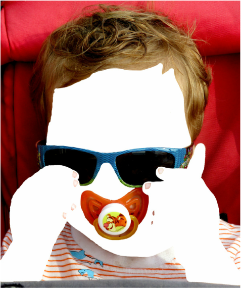
Here, it is evident of the young boy's situation due to his accessories. His clothes reveal animated sharks on them, something typical to a young male's fashion. Also the fact he has a dummy on reveals his age. Lastly the fact he wears sunglasses shows that he is in a warm place and is aware of the damage sun can cause to ones eyes.
|
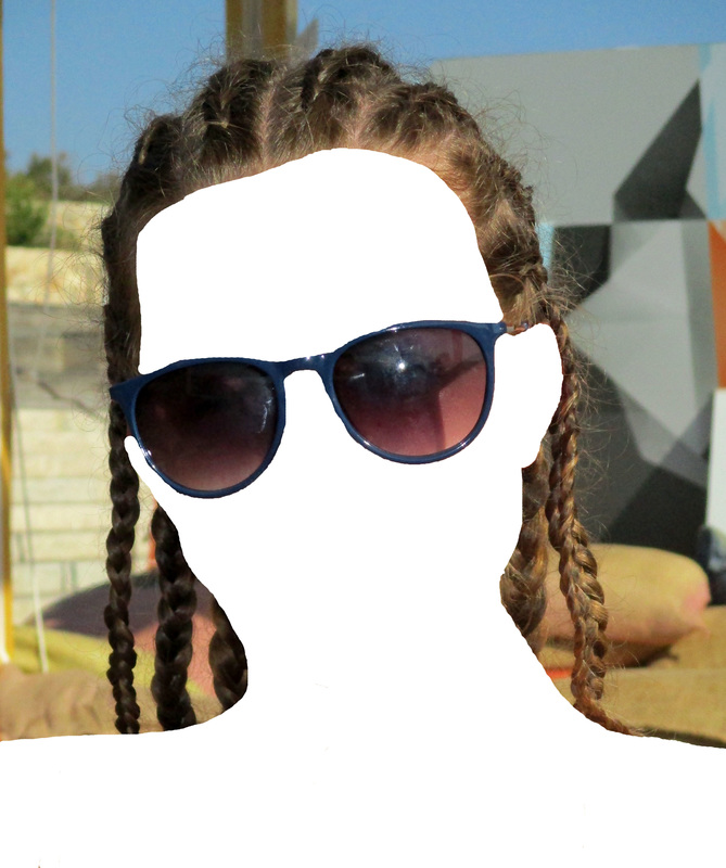
Here I have imitated the artist by erasing the subject's skin and in doing so this reveals certain character traits about her. Firstly, it is evident she pays attention to how others perceive her via her braided hair. Secondly, she is thoughtful and wears sunglasses to cover her eyes from the sun. Additionally, this shows she enjoys hot weather.
|

J O H N S T E Z A K E R
John Stezaker is an English conceptual artist, born in 1948. His work focuses on the relationships to the photographic image as a documentation of truth, purveyor of memory and a symbol of modern culture. Below are three images I was drawn too.
|
|
|
I believe these three images all represent identity. The use of the juxtaposing backgrounds allows Stezaker to adopt the content and contexts of the original images to convey witty and poignant meanings. Additionally by covering/ partially covering the faces of these people represents a sense of hidden identity and embarrassment towards who they really are. The use of the stylistic images in the coverage of these models allows the viewer to glimpse at the type of person they are but also temporality and conceptually engages the viewer in a Surrealistic perspective. This abstract outcome is something I will look at when responding.
R E S P O N S E
For my response, I noticed that the backgrounds had a lot of detail so in order to imitate this I went to central London and walked around the South bank area capturing a variety of images with contrasting looks. Additionally, when taking my pictures o the models I chose male and females, and of different ages to have a variety of outcomes. Below are my contact sheets for the background and the models and my selected edits.
Contact sheet for background:
|
|
Contact sheet for subject:
S E L E C T E D E D I T S
|
|
|
E X P A N S I O N
Then, to expand I decided to make the backgrounds to cover the models face. This then relates to Amira Ghasemi's disguising but also to John Stezaker by the partial coverage of the model.
|
|
|
T H I R D S T R A N D
A R C H I T E C T U R E
For this strand I will look at the complex and abstruse elements and how the use of patterns and shapes is an aspect presented in a variety of environments. I will then also look at the affect this has upon humans and our society by the way we have shaped our world and the choices we have made in organising our lives.
F I R S T C O N C E P T :
A B S T R A C T I O N P R E S E N T I N C I T I E S
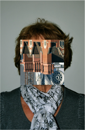
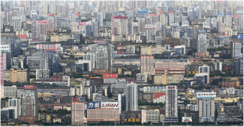
For my first response to architecture I wanted to look at abstract architecture that already existed in cities. So to do this I responded twice with two different cities: Marseille and London. In doing this allows the cultural influence in these different places to influence the style present in the two locations.
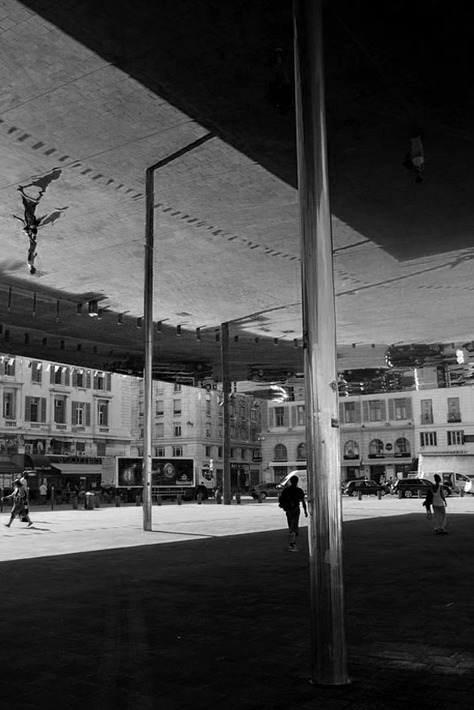
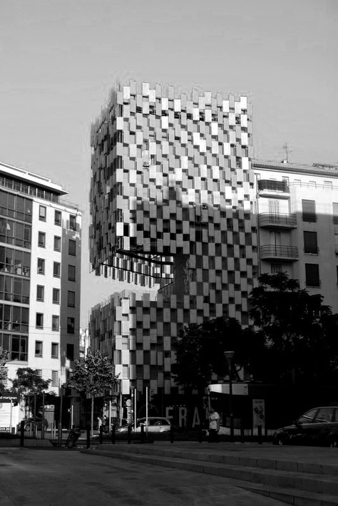
F I R S T R E S P O N S E : M A R S E I L L E
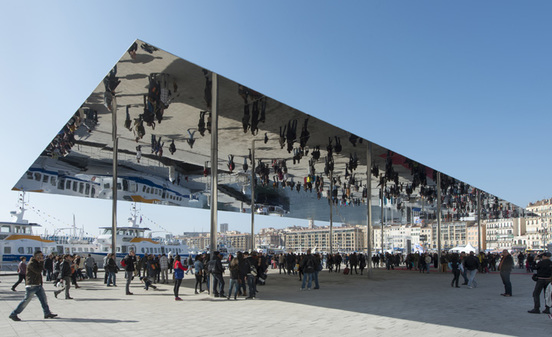
For this first reponse, I captured images around Marseille of interesting and unusual architecture. So i focused on a particularly famous piece: The European Capital of Culture built in 2013. Below is an image sourced from google of it to demonstrate the full aspect of the piece of architecture. During my response I used this piece but also captured it in an abstract form, not revealing the whole structure so that the people look as though they have been reflected into the sky.
My contact sheet:
|
|
|
S E L E C T E D I M A G E S :
I chose these images as I thought this was the most interesting architecture captured. I also think these buildings were the most unusual, correlating to the theme of this unit: abstraction. I then decided to edit them in black and white so the focus was drawn to the features and architectural aspects present in the images below.
|
|
|
|
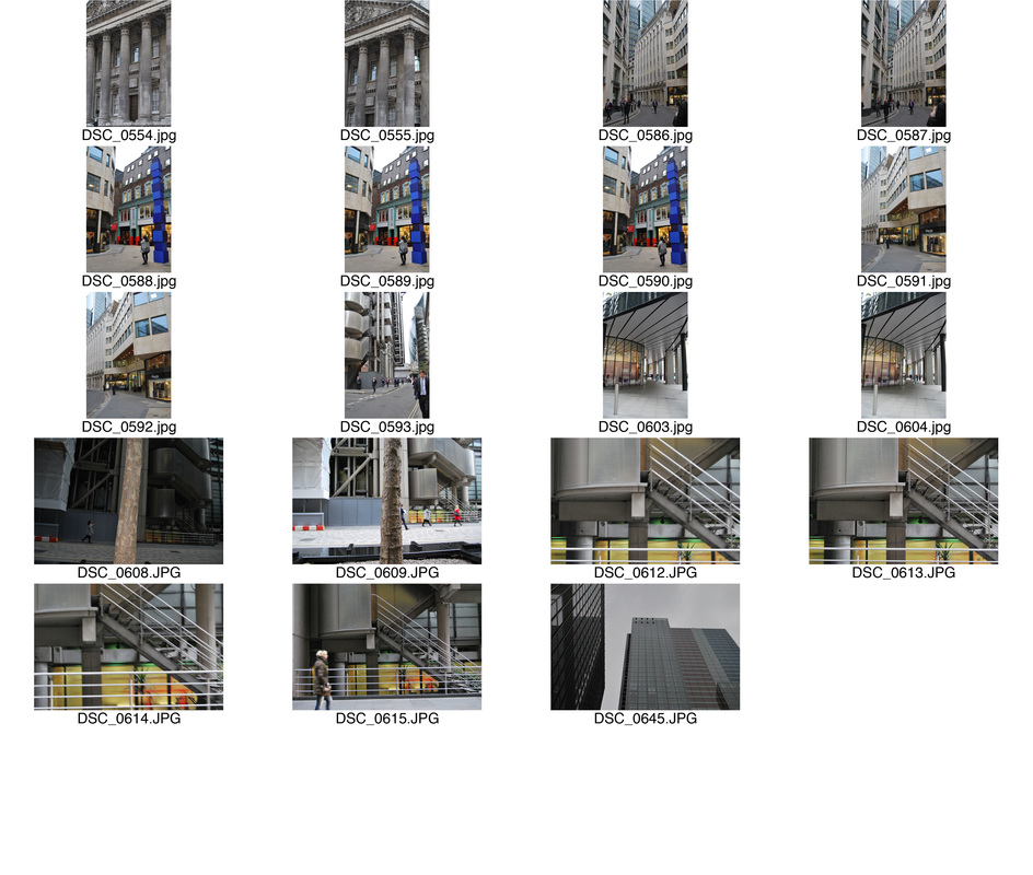
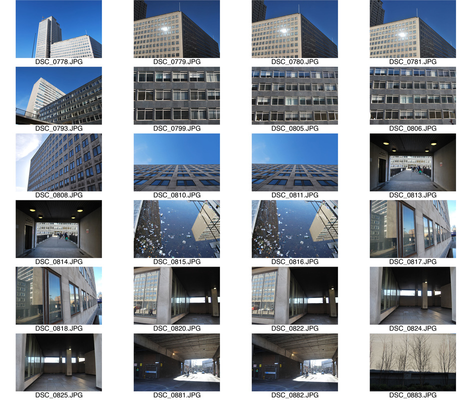
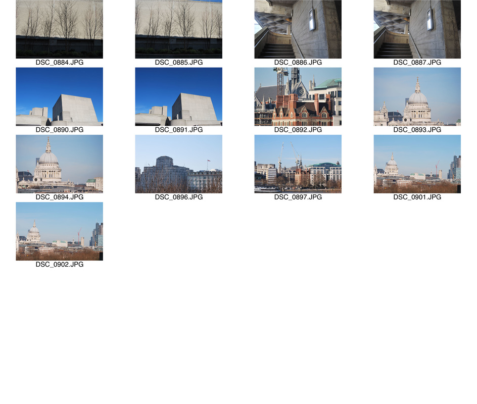
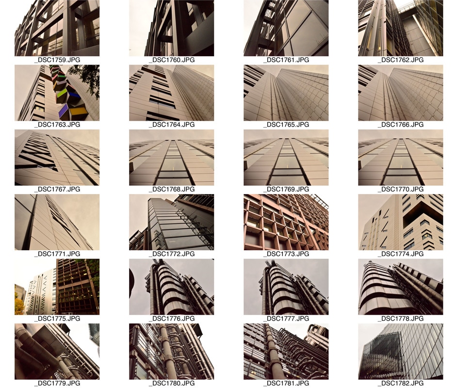
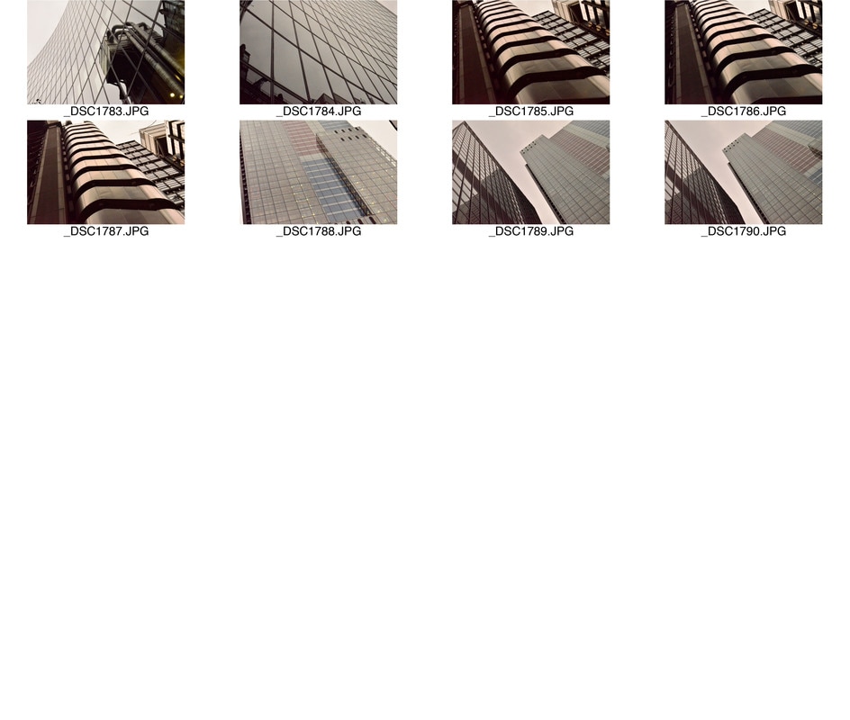
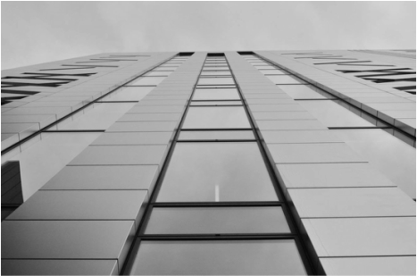
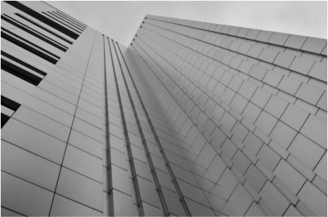
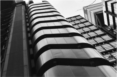
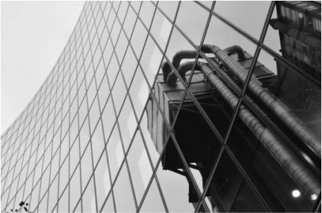
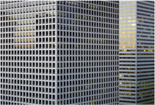
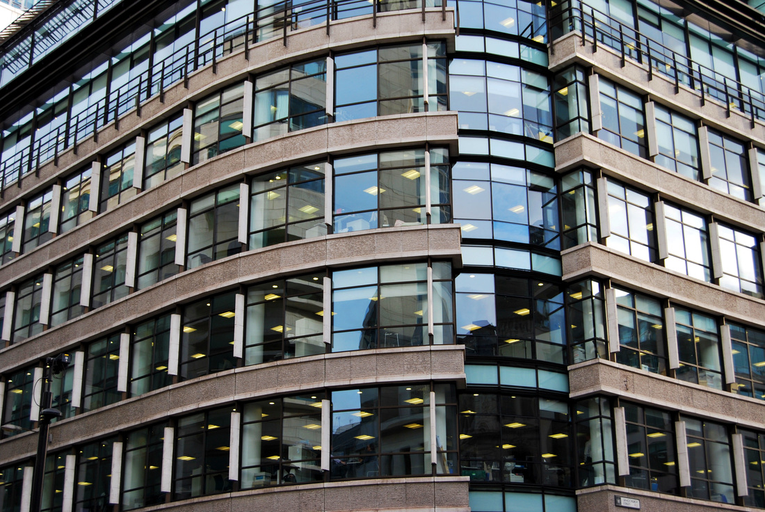
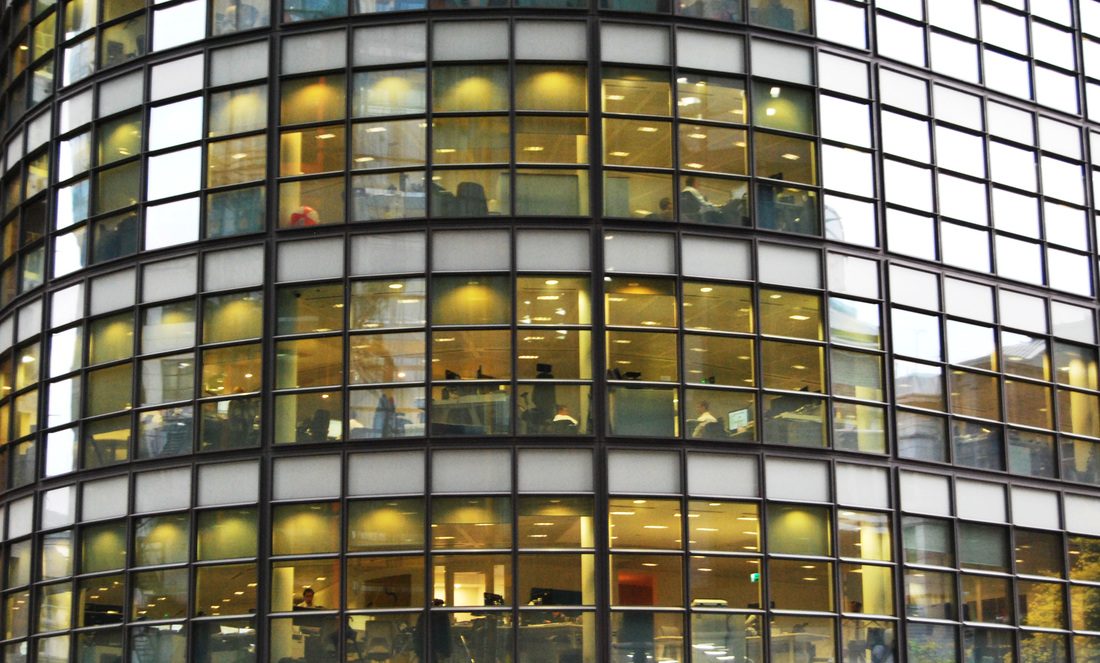
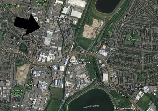
S E C O N D R E S P O N S E : L O N D O N
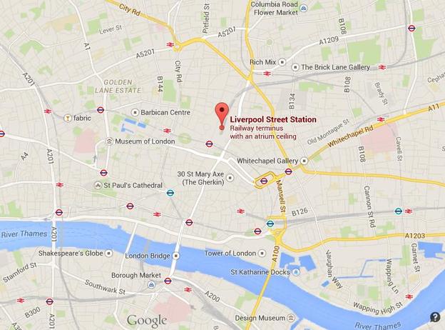
For my second response, I captured these photos in London, the city most known to myself. It is interesting to view the comparison in the styles of architecture. In London, it is evident we go for more traditional structures such as a skyscraper but will have an added feature to it for example a shape in its shape, a pattern or the material used. However, in Marseille the architecture is more rustic, old property, almost Parisian combined with the occasional dramatic architecture such as the piece featured above to contrast with it's surrounding. Below I focused on the area around Liverpool street and walked from there to Bank, as both areas tend to consist of sky scrapers. Below is a map to demonstrate my journey.
My contact sheet:
|
|
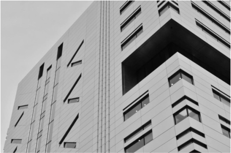
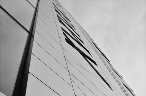
S E L E C T E D I M A G E S
|
|
|
|
|
|
S E C O N D C O N C E P T :
P A T T E R N S I N A R C H I T E C T U R E
After taking these photos around both Marseille and London I decided to bring the focus in and look at specific patterns: artistic random creative ones and order ones present in urban cities. To do this I look at Jean Micheal Basquiat, Nadav Kander and Micheal Wolf and respond to all in appropriate forms.
F I R S T R E S PO N S E :
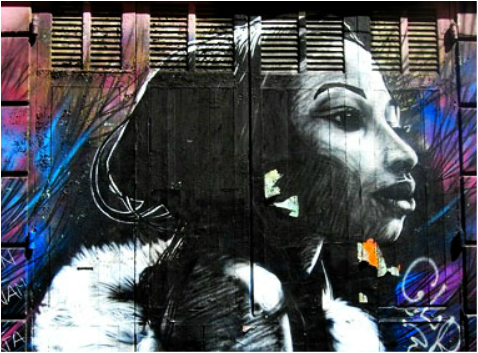
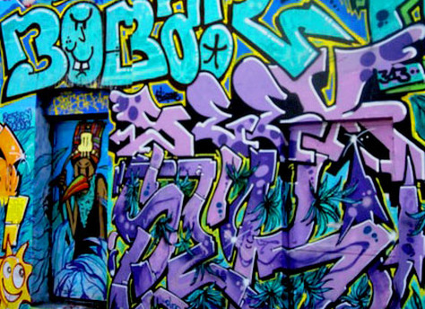
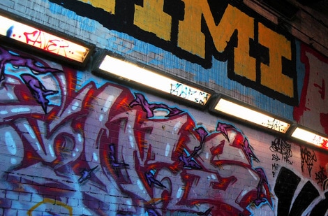
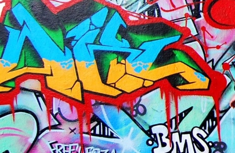
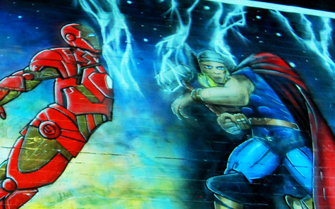
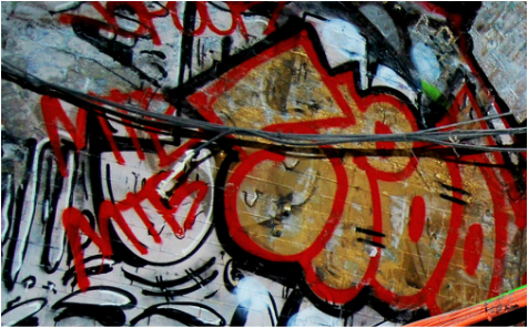
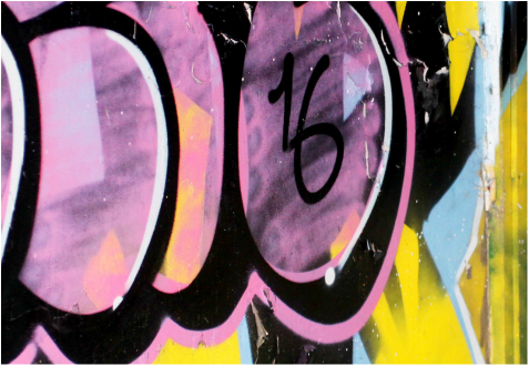
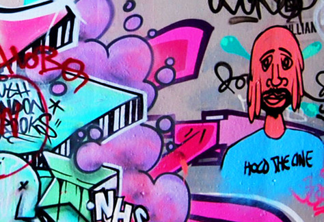
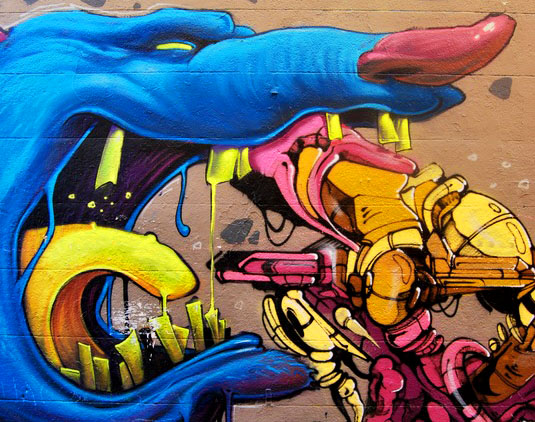
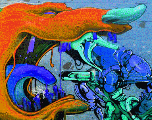
I decided to expand the first response with graffiti as it is present in almost all cities and represents pattern in a physical and artistic form.
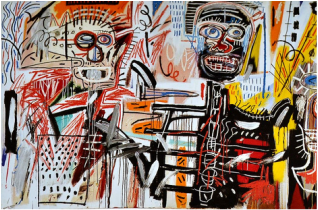
J E A N M I C H E L B A S Q U I A T
John Michel Basquiat is an American artist, born in Brookyln. His first piece of work which achieved notoriety was an informal graffiti piece featuring cultural enigmatic epigrams. Then by the 1980's, his neo-impressionist work had begun to be exhibited in various galleries and museums all over the world. Below are three images that I was strongly drawn to and that I believe relate to this concept.
|
|
|
I decided to include this artist as I believe that graffiti and street art is a vital socio-cutural element to all vibrant cities. So by including Jean Michel Basquiat as my influence, who uses this creativity naturally present in cities to recreate it into neo-impressionist paintings demonstrates his artistic representation of creative patterns present in urban environments. Additionally, I was impressed by the bold and vibrant use of colours sparking the audience's attention. I also liked the use of abstract shapes throughout these paintings which gave a unconventional twist to the outcome. So, for my response, rather than painting like Basquiat I am going to document these creative street art present in the urban environments. I will also try a variety of different angles and shots in aim of resulting in a more unique and abstract outcome.
M Y R E S P O N S E
I decided to respond with images I took in two contrasting cities so that there is a dramatic comparison between the different cultures.
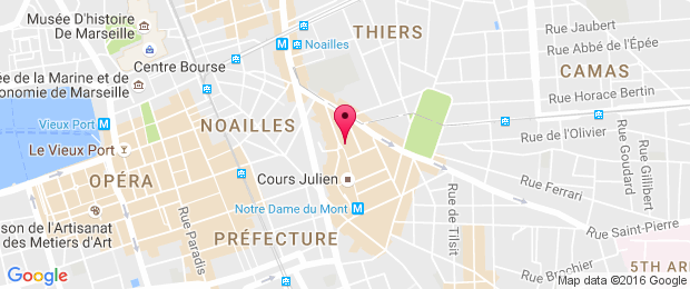
M A R S E I L L E :
To capture these images in Marseille I visted Cours Juilen, below is a map to demonstrate where I when to take these photos.
My contact sheet:
|
|
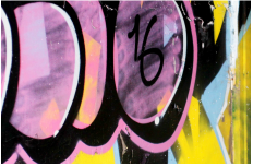
S E L E C T E D I M A G E S
|
|

|
|
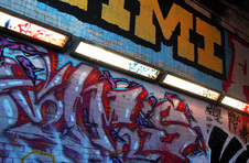
L O N D O N :
To capture these images I went to Waterloo, to the Leake Street Tunnel, below is a map to demonstrate my journey.
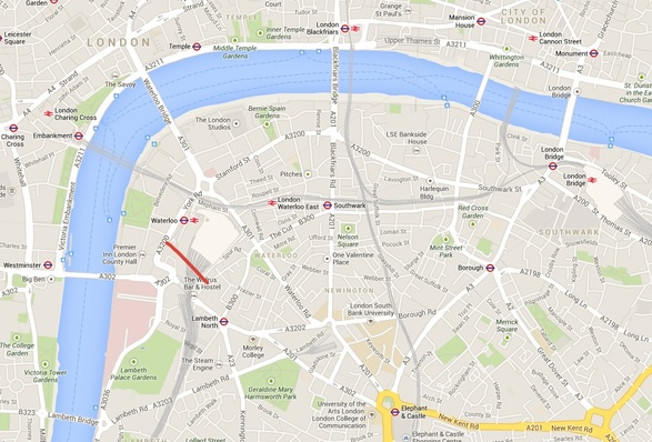
My contact sheet:
S E L E C T E D I M A G E S
|
|
|
|
|
|

G I F S
To further enhance the abstract element and to increase the colourful vibrancy I created gif of some of the images I had captured on photoshop. Below is my outcome.
L O N D O N
|
B E F O R E
|
A F T E R
|
M A R S E I L L E
|
B E F O R E
|
A F T E R
|
|
|

E X P A N S I O N
I wanted to further expand the graffiti concept by taking images of art created in a different form, yet still maintaining the same patterned close up look.
M Y R E S P O N S E
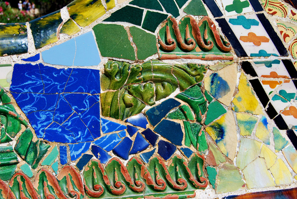
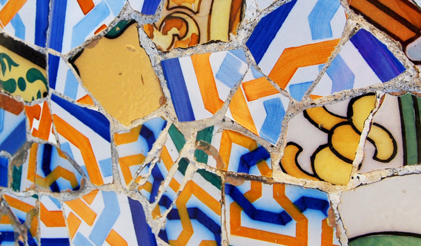
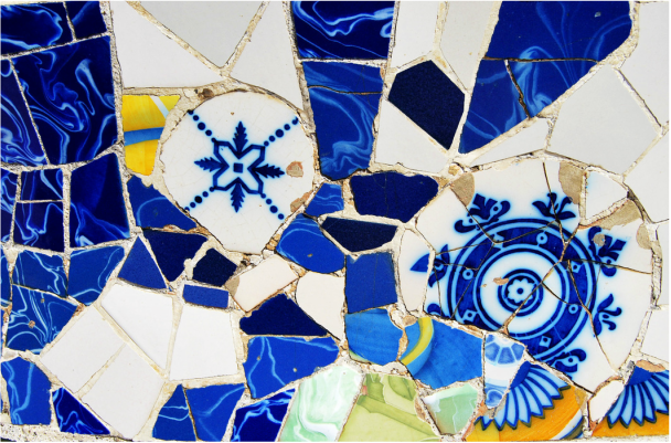
For this response, I wanted to capture a piece of well-known art so i decided to capture images of the Park Guell in Barcelona. When visitng I tried to focus on close up images of the art so the focus was on the pattern present in that environment.
S E L E C T E D I M A G E S
B E F O R E :
A F T E R :
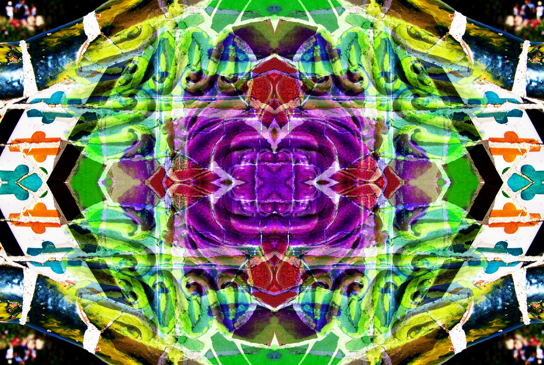
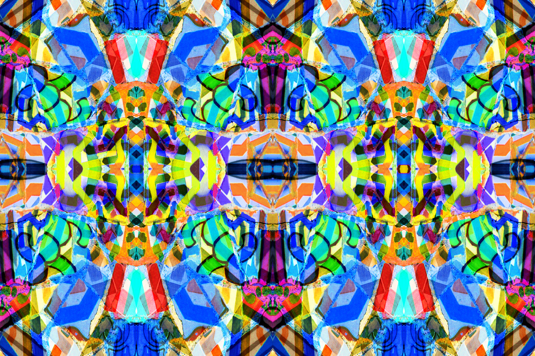

G I F S
S E C O N D R E S P O N S E :
For my second response, I wanted to look at more constructed patterns and shapes available in urban environments. So I decided to focus on the way humans have chosen to structure the architecture and the way we live our lives. So I have looked at two artist who explore similar concepts such as Nadav Kander, Micheal Wolf and Marcus Lyon.
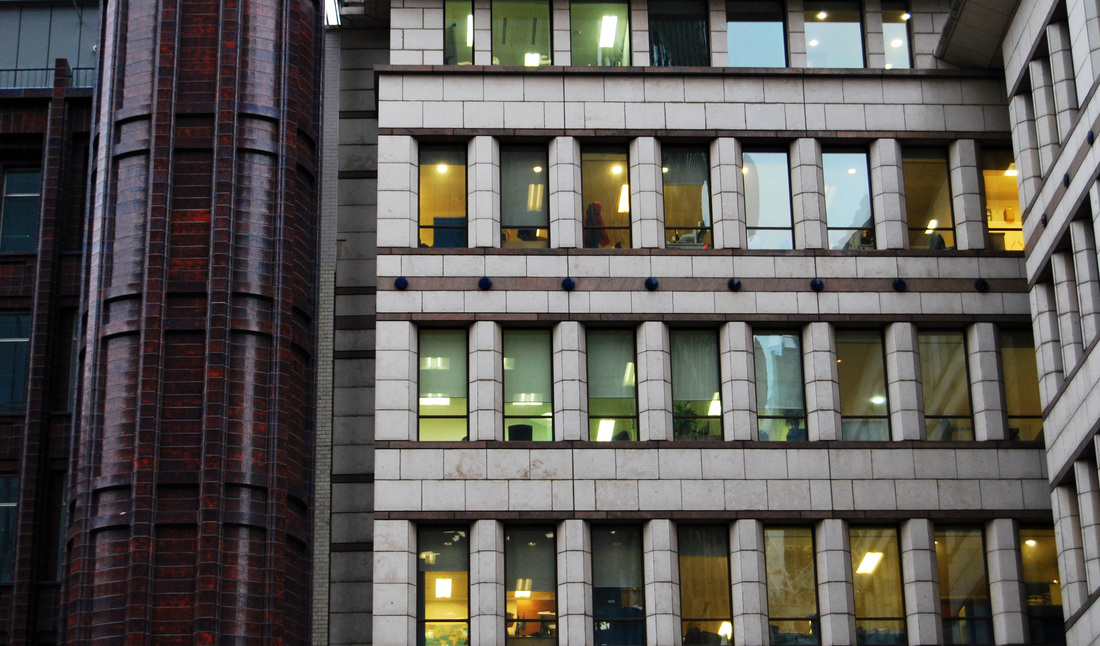
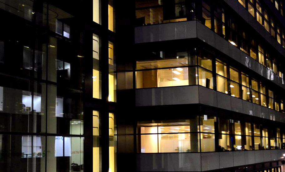
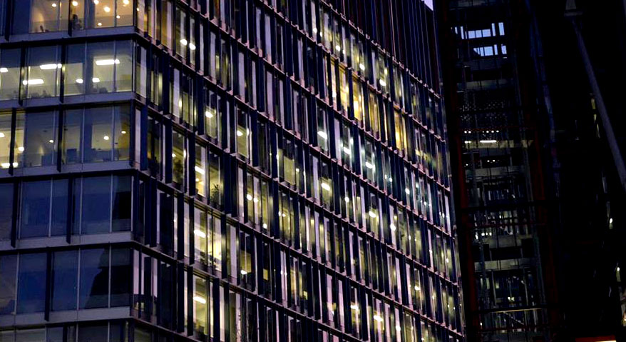
N A D A V K A N D E R
Nadav Kander was born December 1961 and is a London-based photographer/artist, known for his effective style of portraiture and landscape photography. Below I have chosen to include his piece called "The Parade and Coastal drive".
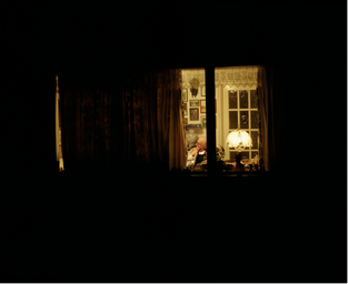
|
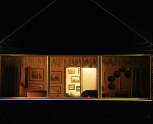
|
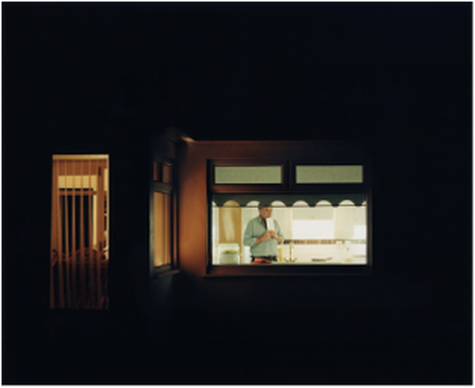
|
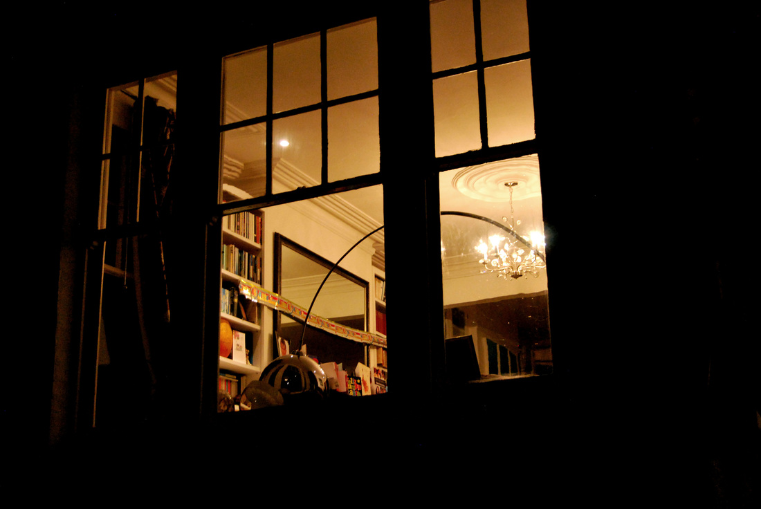
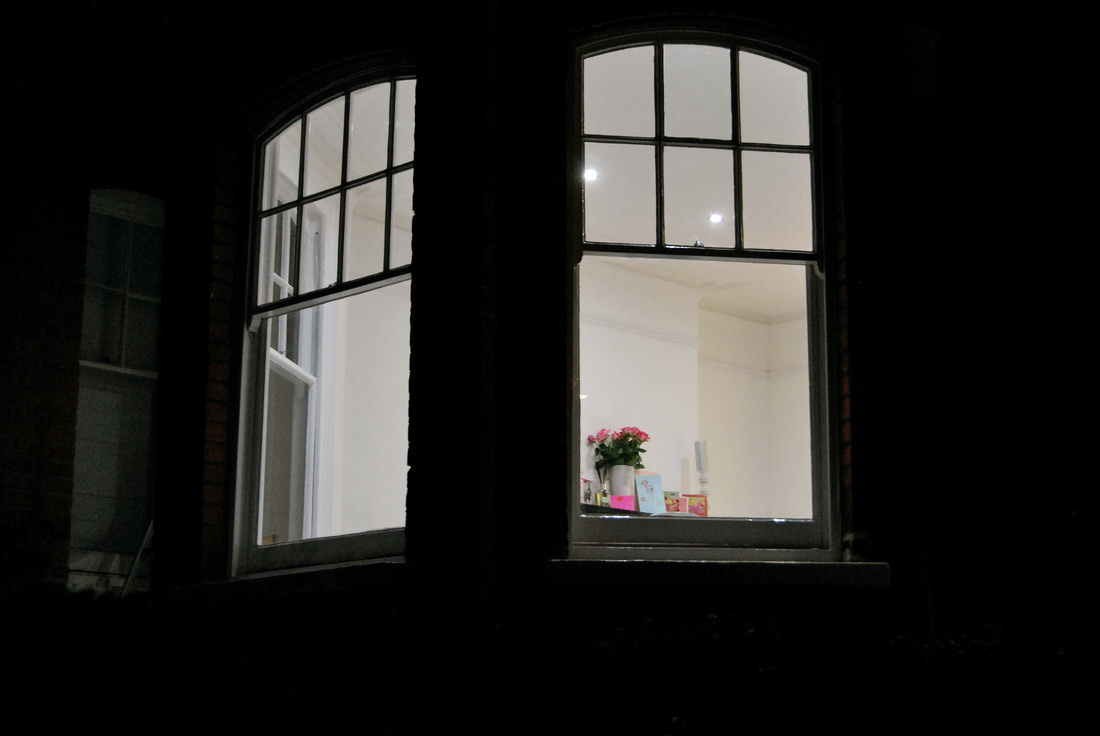
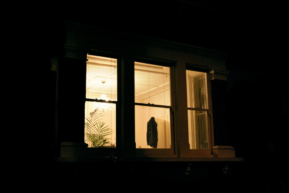
I was strongly drawn to this series by Nadav Kander in which offers revealing moments of ordinary domesticity in a typical English suburban environment. This voyeristic approach of capturing images of these people in their personal and natural environment gives the audience incite into how these different people have constructed their life: aesthetically via their architectural style and via their chosen interior design. I also was particularly drawn to Kander's choice in capturing these images at night so that there was a strong and evident contrast allowing the viewers focus to be drawn into the interior of the houses. This then further enhance the patterns evident in these scenes. So, in response to Kander I will attempt to capture images in the same style.
M Y R E S P O N S E
In response to Nadav Kander's "Parade and Coastal drive" I walked around my local area at night and looked for interesting and contrasting interiors. I then captured as many different windows as I could attempting the voyersitic style in which Kander approached his work. Below is my contact sheet and my selected images.
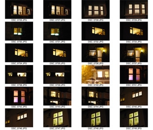
|
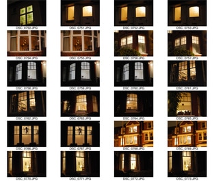
|
|
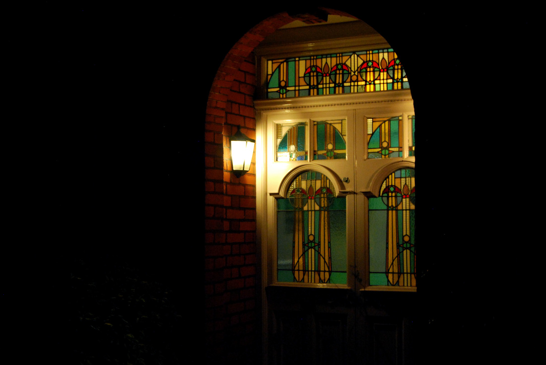
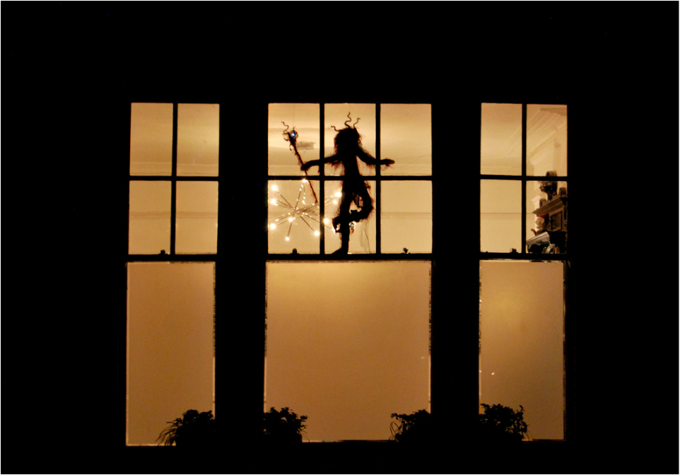
S E L E C T E D I M A G E S :
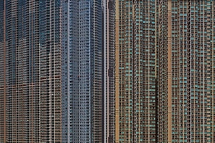
M I C H E A L W O L F
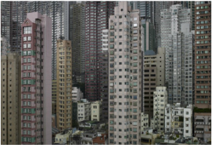
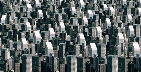
Micheal Wolf was born in Germany and raised in the United States, Europe and Canada. The focus of this photographers work is life in mega cities and many of his projects document the architecture and the honest bleak culture of these metropolises. His projects include, "Hong Kong", "Life in Cities", "Street view", "The real toy story" and "Portraits made in China 1997-1998". Some of his topics are very controversial such as during his project "Street view" , it features a section called "F*ck you" in which there are various pictures of people aiming their middle finger towards the camera however, some may say this gives you an honest opinion on what some peoples attitude is like and he is only capturing it and presenting it to the world. It is thought that due to his up bringing in various places with large cities lead him to this project. Below are three examples of his work from "Life in Cities - Architecture of density".
|
|
|
I choice these images as they imposed a dramatic imposing effect upon me and I thought they demonstrated patterns presented in the urban environment. The photograph taken on the left was one of the many Hong Kong housing quarters. Cleverly, Micheal Wolf framed the image in a particular way ensuring that the viewer could not see the whole building; from top to bottom. He photographed the middle of the building, so that the whole picture shows the structure, and he photographed the windows to emphasis the sheer amount of people living there. Which precisely brings out the feature/problem of this photo; the spread of where people live. In such a small place there lives 8 million people, on the other hand, land and housing apartments are always in deficit. I especially like this photograph as it shows great and interesting architecture but also has a greater meaning within it, which I believe was presented successfully by Micheal Wolf. However, the centre image immediately presents the viewer with a crowded and busy environment throughout. The audience can exactly identify, from the packed buildings, how small each apartment is and how crowded these people's living conditions are. You can tell by examining the photograph that the apartments seem very compressed. Micheal Wolf is someone that is considered to focus on the specific visual elements of this depicted high densely populated place and has managed to capture this cleverly and interesting, attracting much attention from his individual style and technique of his photographs. Lastly, the image on the right demonstrates that he is interested in the structure and architecture of buildings in a large heavy populated city, choosing to document it with this particular colouring/ effect gives an abscure but faded appeal. This specific photograph cleverly manages to convey two different sides, the buildings in the foreground due to there difference in colour and the fact that they end, and in contrast, the background, which presents the viewer with incomplete buildings highlighted with greens and reds. It raises a question about how this city is perceived, as a whole or each individual building/ section. I will use my research to help me to respond.
M Y R E S P O N S E
For this response, I wanted to expand upon Micheal Wolf's style. To do this I decided to capture images at both night and day time so that a contrast could be viewed, the results were particularly interesting. Below is both responses: the contact sheets and selected images.
D A Y T I M E :
|
|
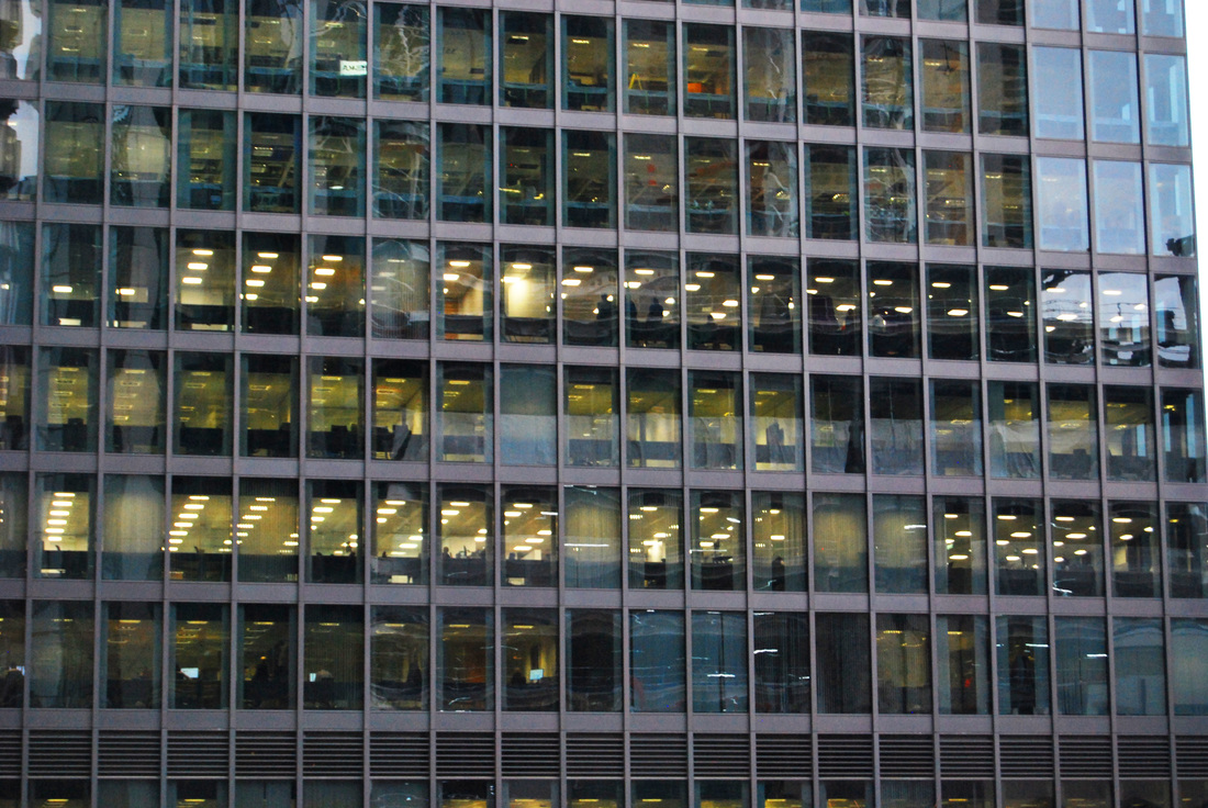
Outcome : I believe this resulted in an interesting result, especially with the day light reflected on the glass adding an unusual effect. However, I don't believe this was as successful as Micheal Wolf's style as i wasn't able to get to a high perspective to capture these photos thus I had to zoom in to create the same effect.
N I G H T T I M E :
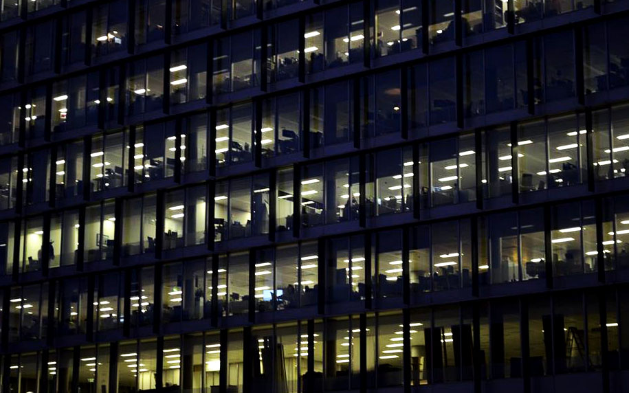

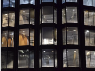
Outcome : I think this night response was better than the day one, this was due to the contrast between the darkness and the artificial light. I think looking at these images, particularly image 1 and 4 these begin to from a new image almost taking on a patterned set of data. I thought this was a unique outcome as it became something new and almost represented the way we form our lives.
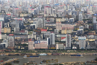
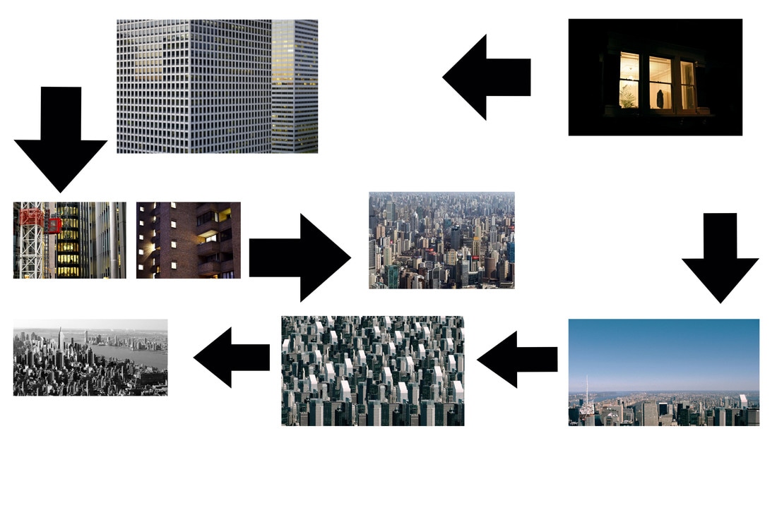
M A R C U S L Y O N
Marcus Lyon is a British artist, born in 1965. His work is part of various private and international collections. His early work took him to the slums of the developing world and thus he was able to explore issues surrounding street children and child labour. Subsequently and still until now, he is inspired by the resilience and adaptive skills of humanity at the edge. Our ability as humans to manage the chaos of changing environments has been a primary element to his work and still is.
|
|
|
In Marcus Lyon's series called Brics, in which the three photos above are featured in, he began by capturing photos of extensive cities from a helicopter. Prior to these pictures being taken, in post production he added more to the photo to give off a busy/overcrowed aura and thus relate to my topic of globalisation and over populated. His whole project was based on the idea that in future prospects, each city is going to have to deal with the ever growing human population, which is continously crowding urban landscapes. I was strongly drawn to this project primarily due to the concept but also due to the effective and talented edited, in which he manipulated the perception of reality and thus enhanced the concept to a further extentent. I will use this when creating my response and for further apsects leading to my final piece when editing my images and before post production, when capturing them.
M Y R E S P O N S E
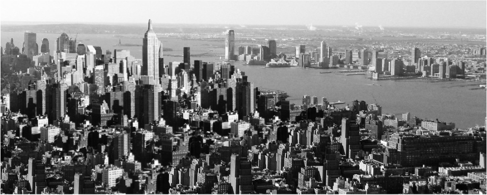
In response to Marcus Lyon's work I wanted to capture a city of large scale but did not want to capture London, as it has featured in many of my responses prior to my research into Marcus Lyon. So, in aim of adding variety to my work I decided to capture images upon my visit to New York. During my visit, I also, like Marcus Lyon, captured my images from a helicopter and thus i was able to achieve a similar effect as his work from his series Brics. Below is my contact sheet, my choosen images and then the edits.
|
|
S E L E C T E D I M A G E S
O R I G I N A L S:
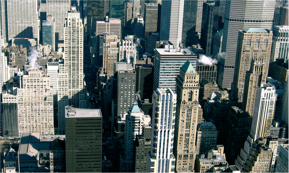
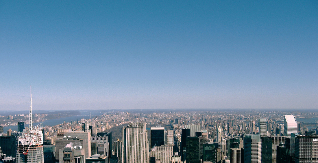
E D I T S:
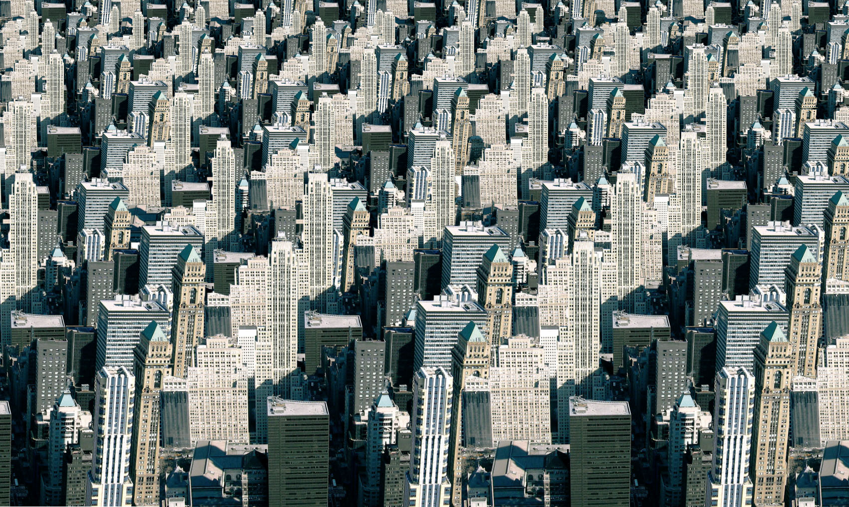
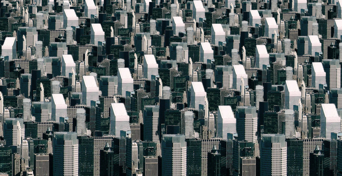

A R T I S T A N D M E
Here the comparison betwen my response and Marcus Lyon's work. In aim of imitating his work, I tried to use the same amount of selected buildings as he did to create the same overpowering effect.
|
M A R C U S L Y O N:
|
M Y R E S P O N S E:
|

E X P A N S I O N
To expand, I decided to incorporate this concept into a landscape picture. I took the original picture then used the quick selection tool and copied and pasted it, varying it's sizes. I then edited it in photoshop with a black and white filter and grain fliter to mask the fact the buildings aren't meant to be there.

S T R A N D D E V E L O P M E N T O F S T R A N D 3
G L O B A L I S A T I O N
Globalisation is the process of which businesses or other organizations develop international influence or start operating on an international scale. Globalisation encourages global trade between nations and thus consequently imapcts the nation in various ways.
F I R S T R E S P O N S E : I M P O S I N G A R C H I T E C T U R E
For my first development of this Globalisation unit, I want to explore the the lengths a country goes to, in order to encourage globalistion and trade between countries to further benefit each nation economically. So, in mind of this I chose to look at the imposing architecture built and transported for globalisation. For my first response i will look at Catherine Opie's overpass series and the effect and the subsequently look at Bernd and Hilla Becher's Gas Tower series and investigate the impact this has upon the country and it's society.
D E V E L O P M E N T O N E
C A T H E R I N E O P I E
Catherine Opie is an American photographer, born in 1961. Her work tends to look at the relationship between mainstream and meager society, with a large emphasis on landscape photography. Thus her images tend to replicate the connection between the space and the individual. This has granted Opie with great success, who is now a professor of photography at UCLA. Below are two examples of her work.
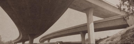
|
|
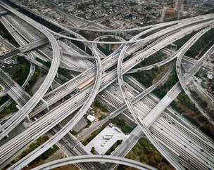
I chose these two images primarily for their daunting and overpowering first impression. The architecture present in these images demonstrates the huge and harsh concrete structures we rely on for our transportation. These structures are something humans have become increasingly interdependent on, specifically in the economic sector as transport is a vital element to trade. Additionally, we rely on them socially for transporting between each social encounter. Thus it is evident Opie is documenting an important aspect to humanity; the way we have decided our structure our lives. This is something that I am particularly interested in as trade and transportation is a dominant factor in globalisation. In my response I will look at these factor and attempt to document these elements of overpowerment and transportation.
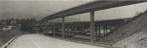
M Y R E S P O N S E
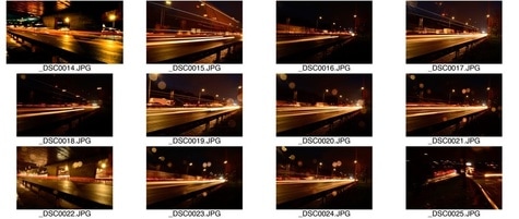
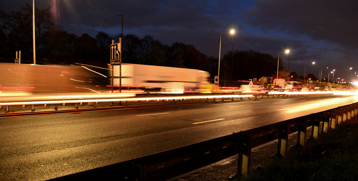
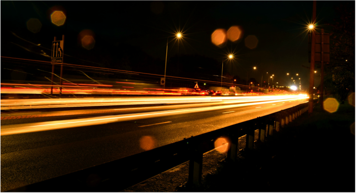
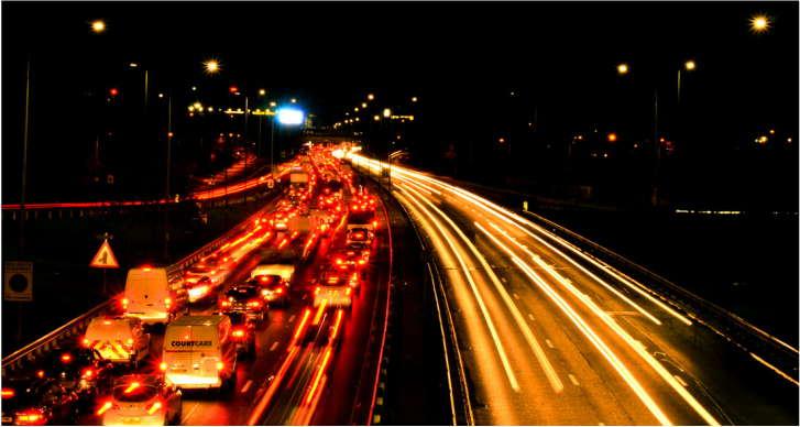
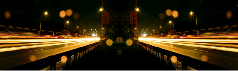
For my response, I wanted to further enhance the element of abstraction, so that it was more than just the concept but the physical composition presenting an abstract outcome. In order to do this, I went to the North Circular, when the sun had gone down and captured long exposure images of the cars passing on a motorway to create this imposing response. In doing this, I was able to capture the element of transportation and the fast rate it occurs at. Below is my contact sheet and selected images.
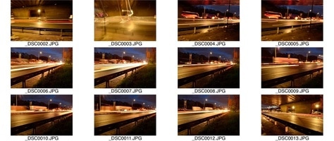
|
|
S E L E C T E D I M A G E S

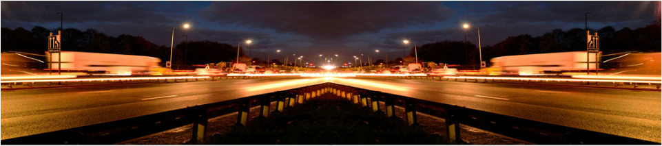
R E F L E C T E D E D I T S
I then expanded the original using photoshop. To create this oucome, I reflected this images and cropped them to create a whole new outcome. This manipulation represents physical abstraction within it's edited compostion.
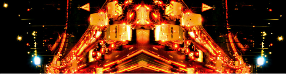

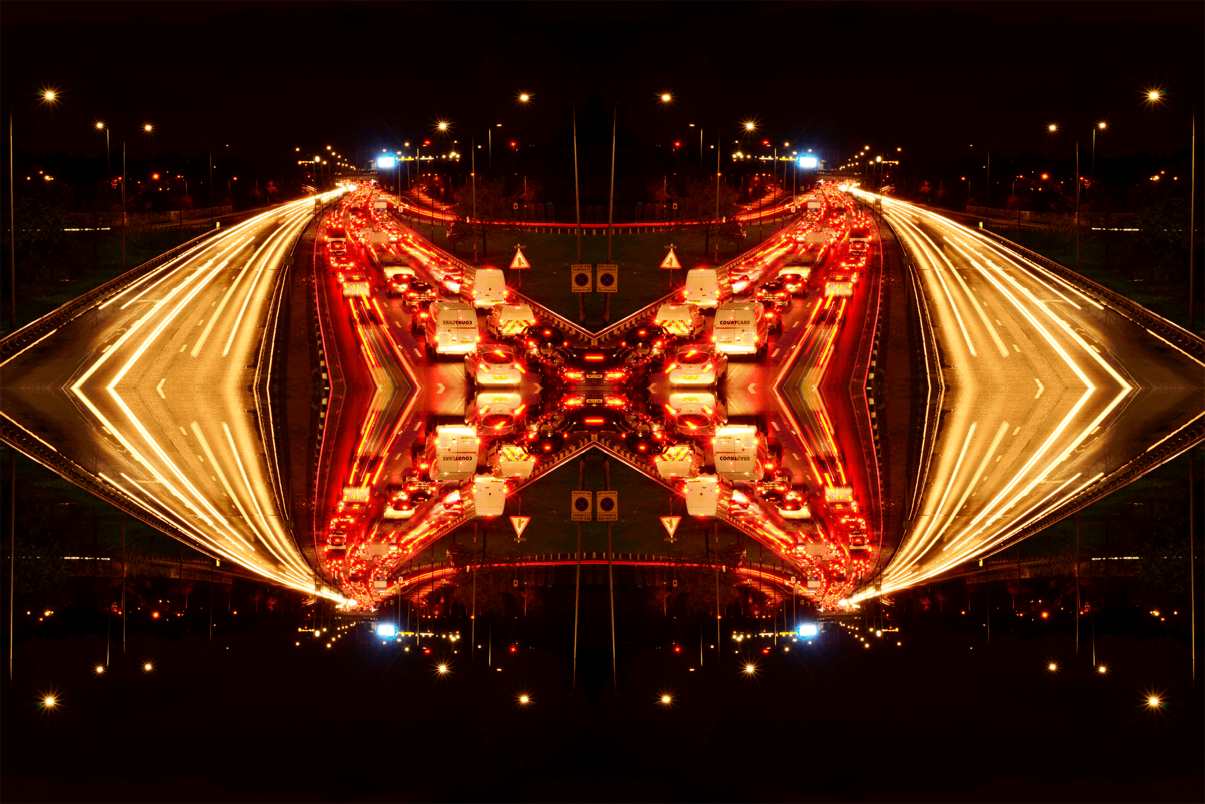
G I F
Lastly, I expanded the reflected images and converted the last one into an extensive gif. This then relates to the conceptual element of this development: Imposing architecture, as this final outcome has a dramatic and empowering effect.
D E V E L O P M E N T T W O
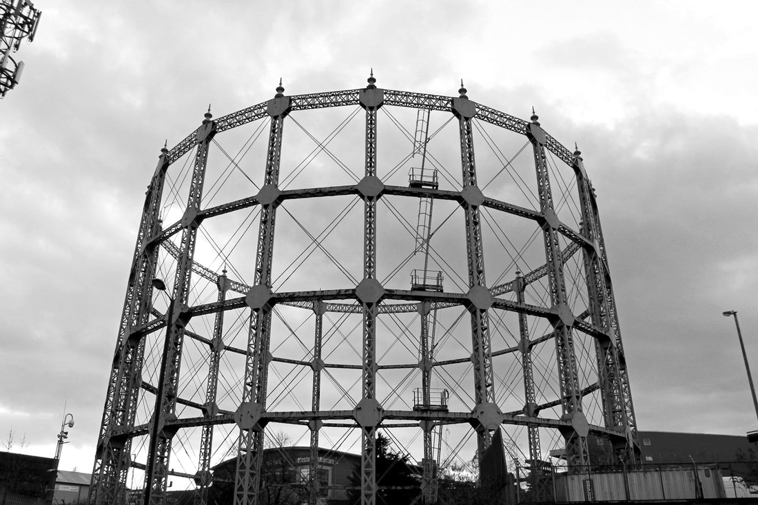
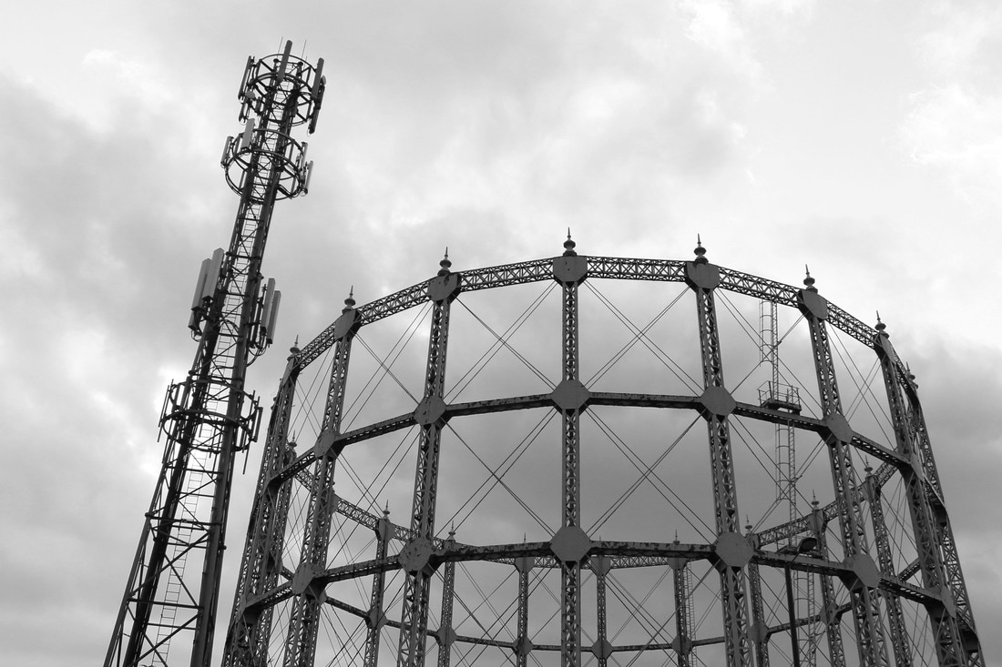
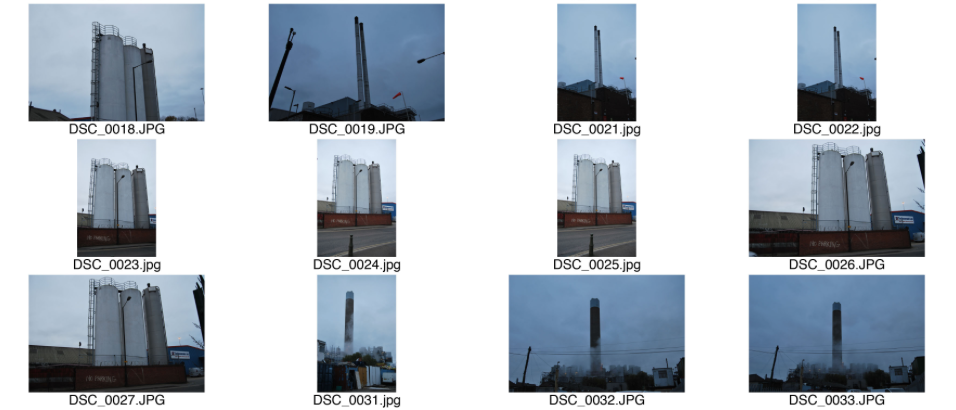
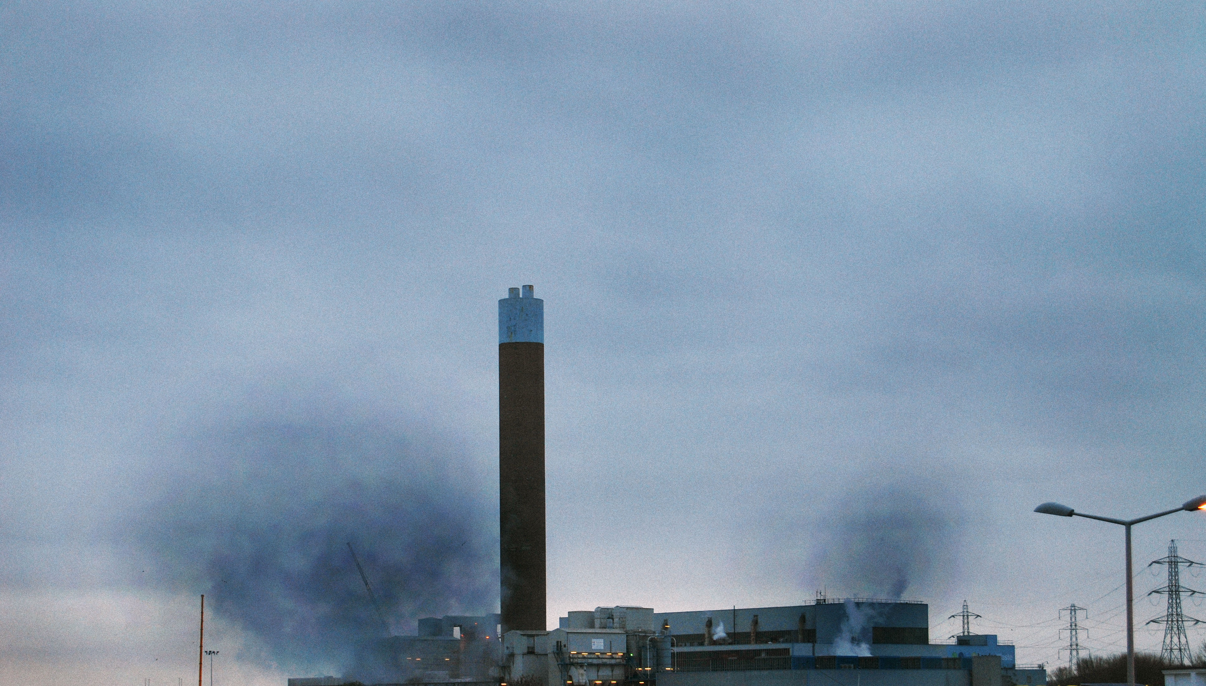
B E R N D A N D H I L L A B E C H E R
Bernd and Hilla Bercher are German conceptual artists and photographers working as a collaborative due and creating these extensive and impressive series of images of industrial buildings and landscapes. They are then presented in grids to enhance their impowering impact.
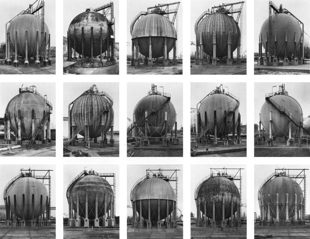
|
|
I was strongly drawn to this artist due to the stark and bleak representation of indusrial elements. The use of creating a collection of gas towers as one piece demonstrates to the audience the sheer amount there is but also how prominent they now are in our physical landscape. It also allows the viewer to appreaciate how unaesthetically pleasing these structures are, alsmot representing the ugly industrial impact we our imposing on the natural and beautiful world. This is a strong aspect to my project hence why I am responding to this.
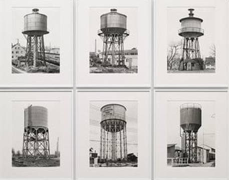
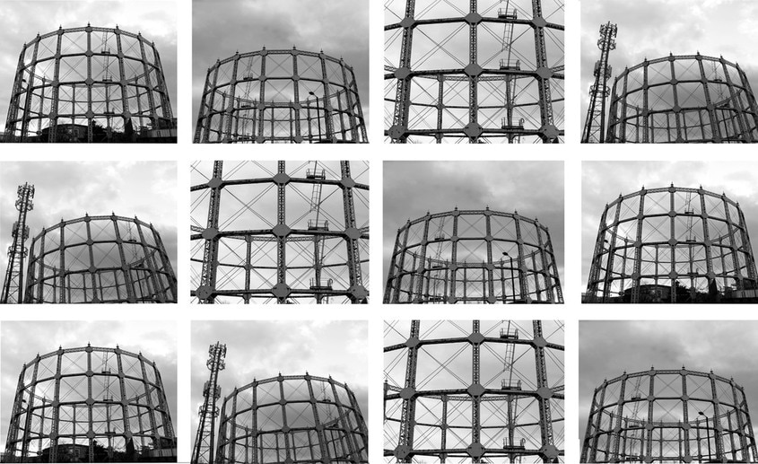
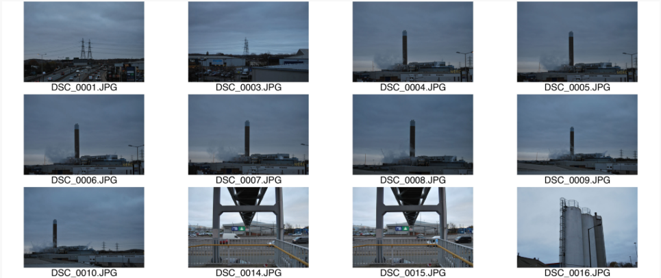
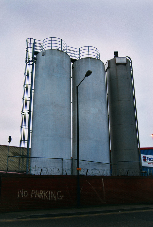
M Y R E S P O N S E
In my response, I took images of the gas tower from different contrasting angles, like Bernd and Hilla Bercher to create a unique and effective outcome. I then edited them in black and white in aim of creating the same effect as the two collaborative German conceptual artists. Below is my contact sheet, selected images and final edit, contrasting to Bernd and Hilla Bercher.
|
|
S E L E C T E D I M A G E S

F I N A L E D I T
By creating my final edit like Bernd and Hilla Bercher it resulted in an abstract and effective outcome. Thus the conceptual and aesthetcial elements are both abstract.
B E R N D A N D H I L L A B E R C H E R R E S P O N S E :

M Y R E S P O N S E :
S E C O N D R E S P O N S E : I N D U S T R Y
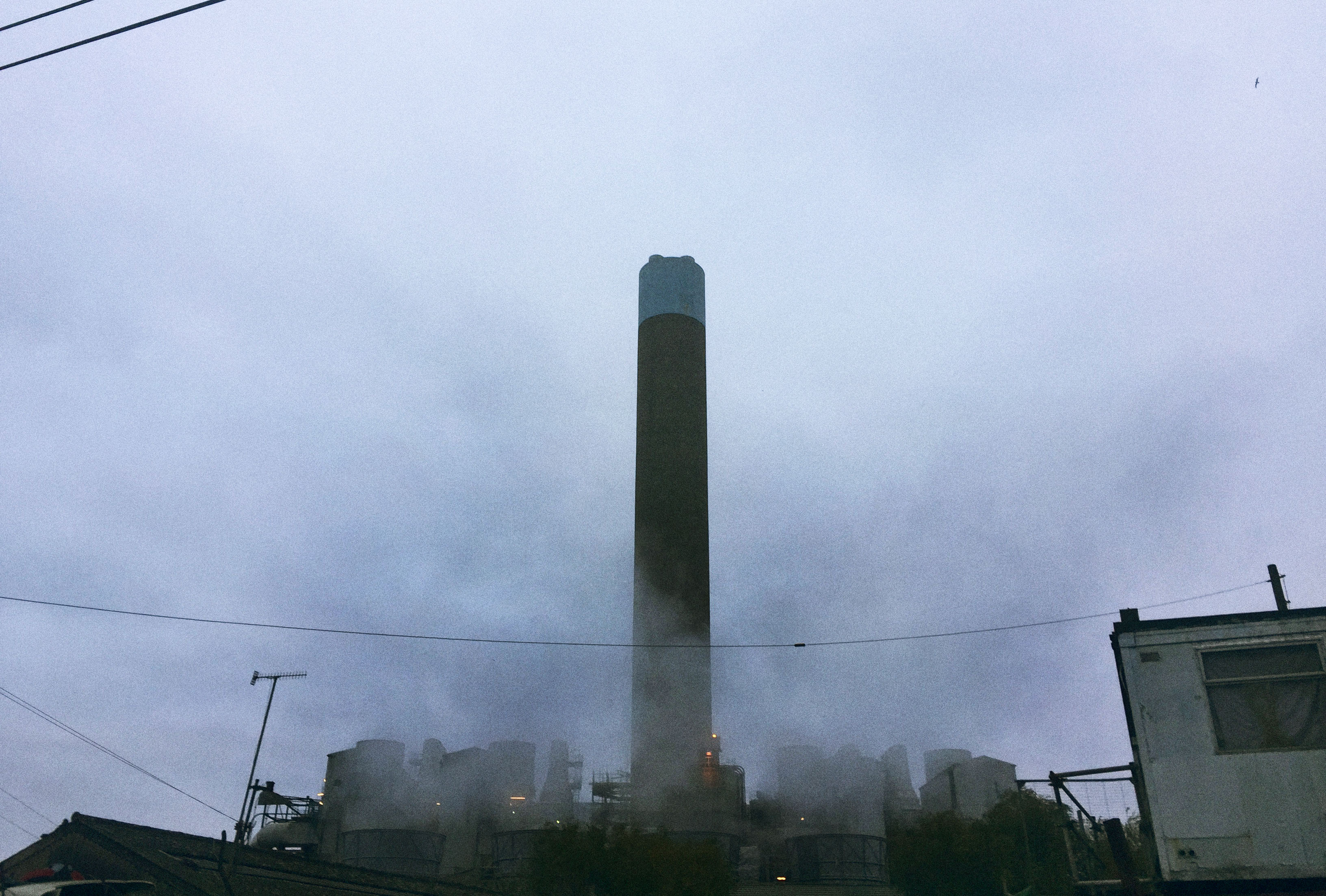
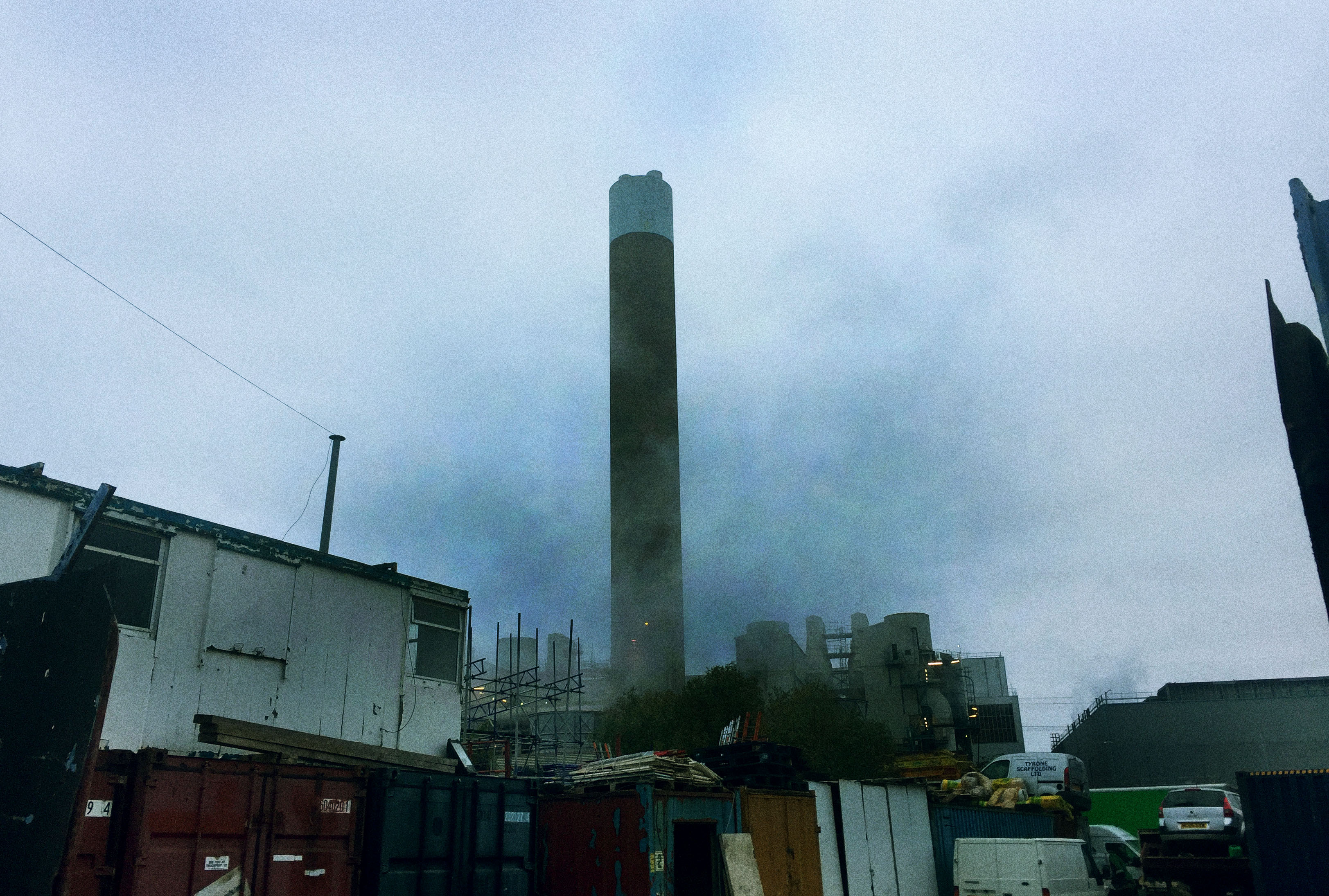
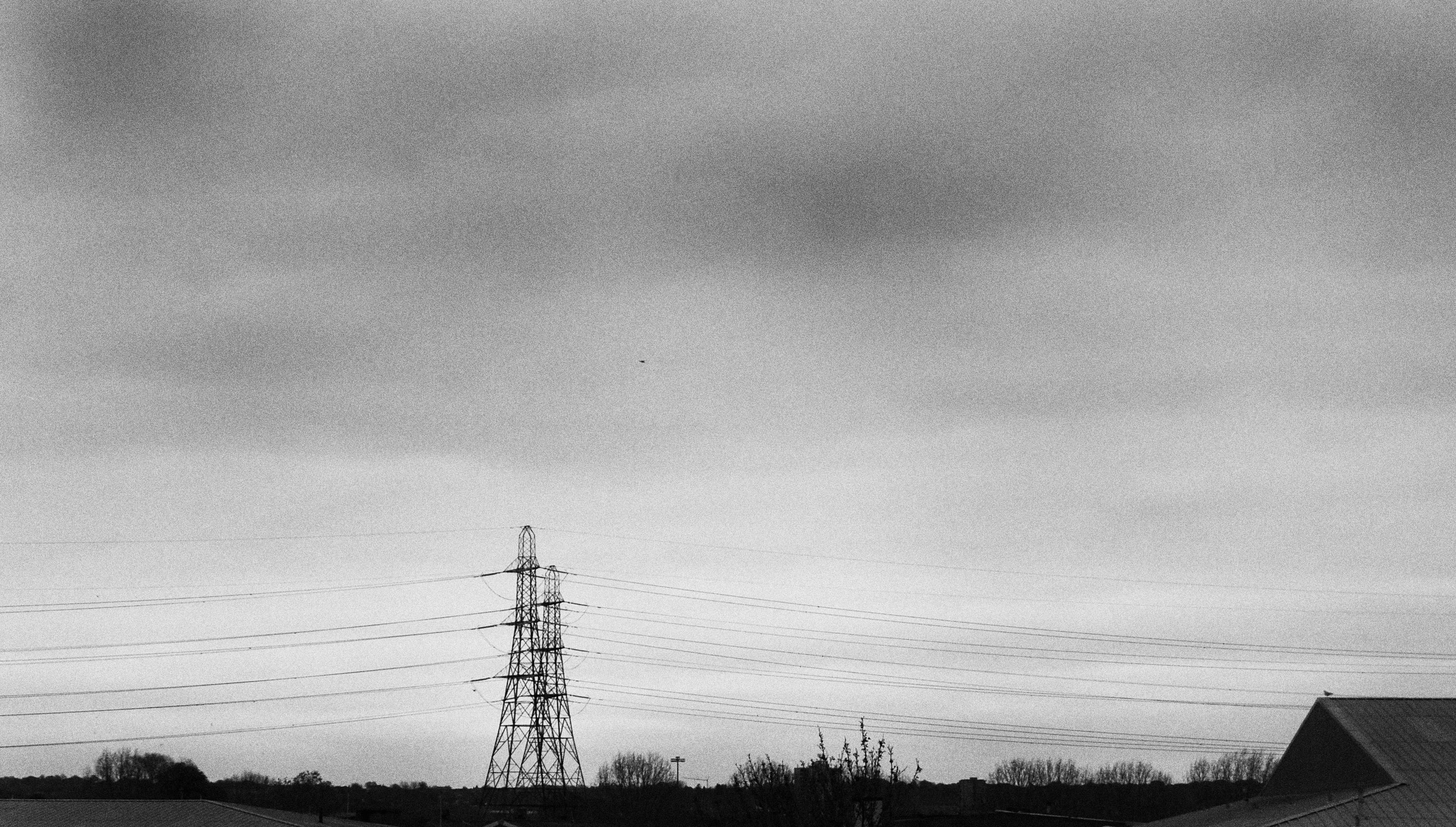
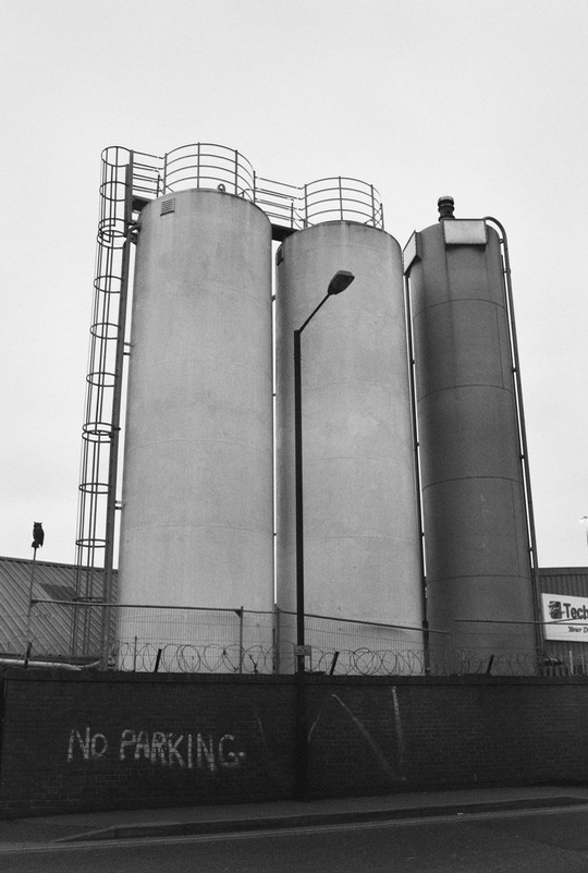
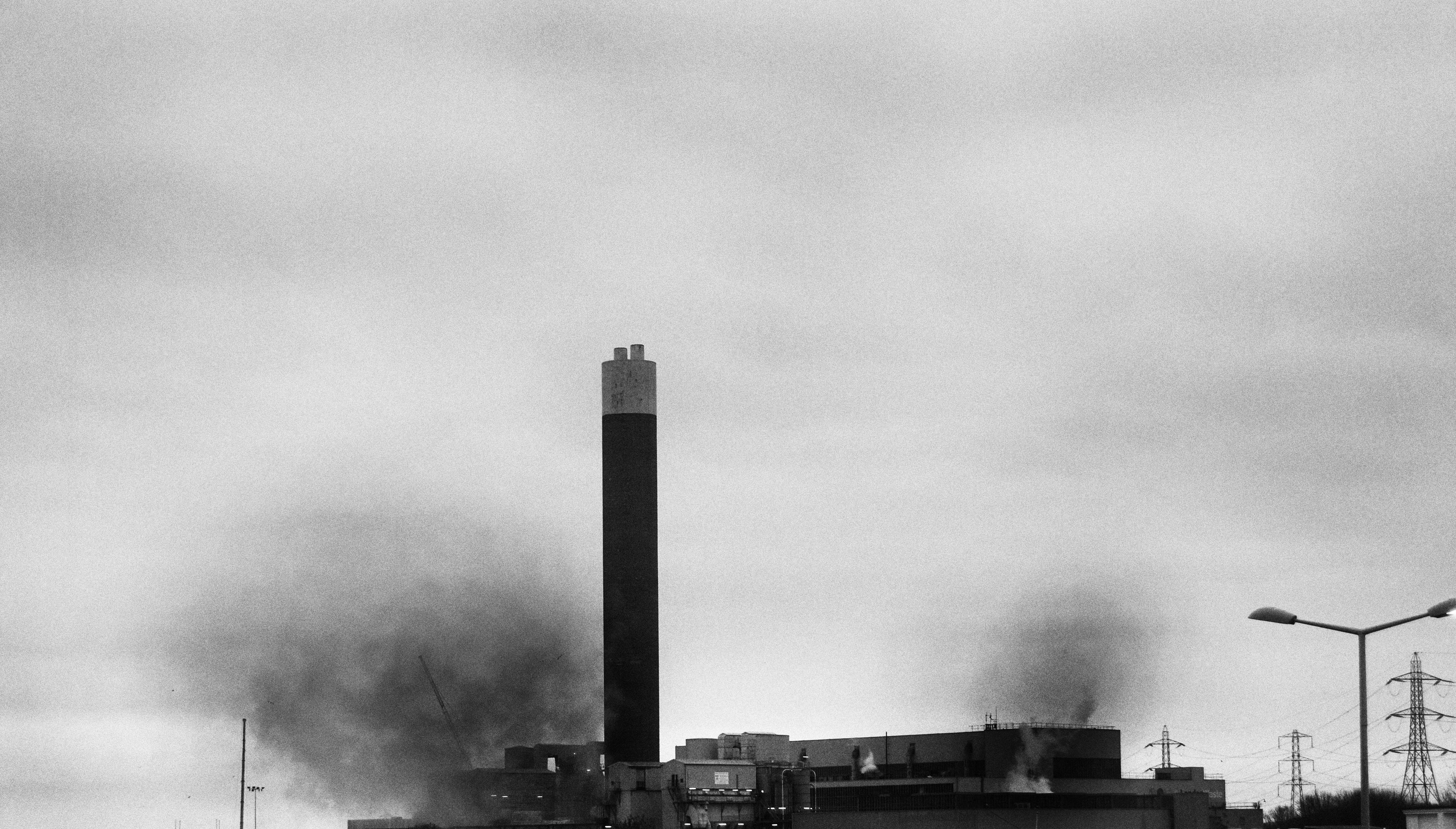
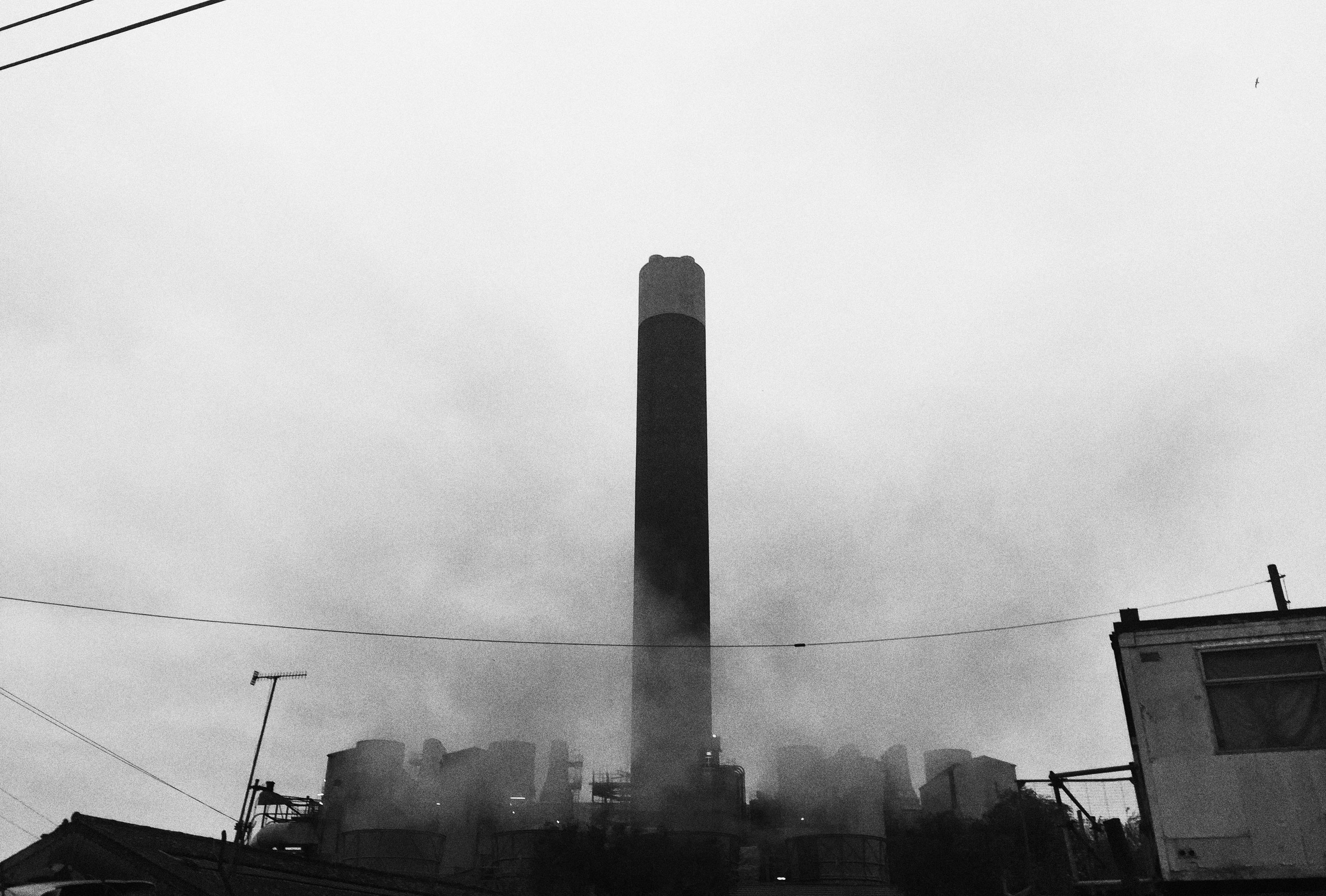
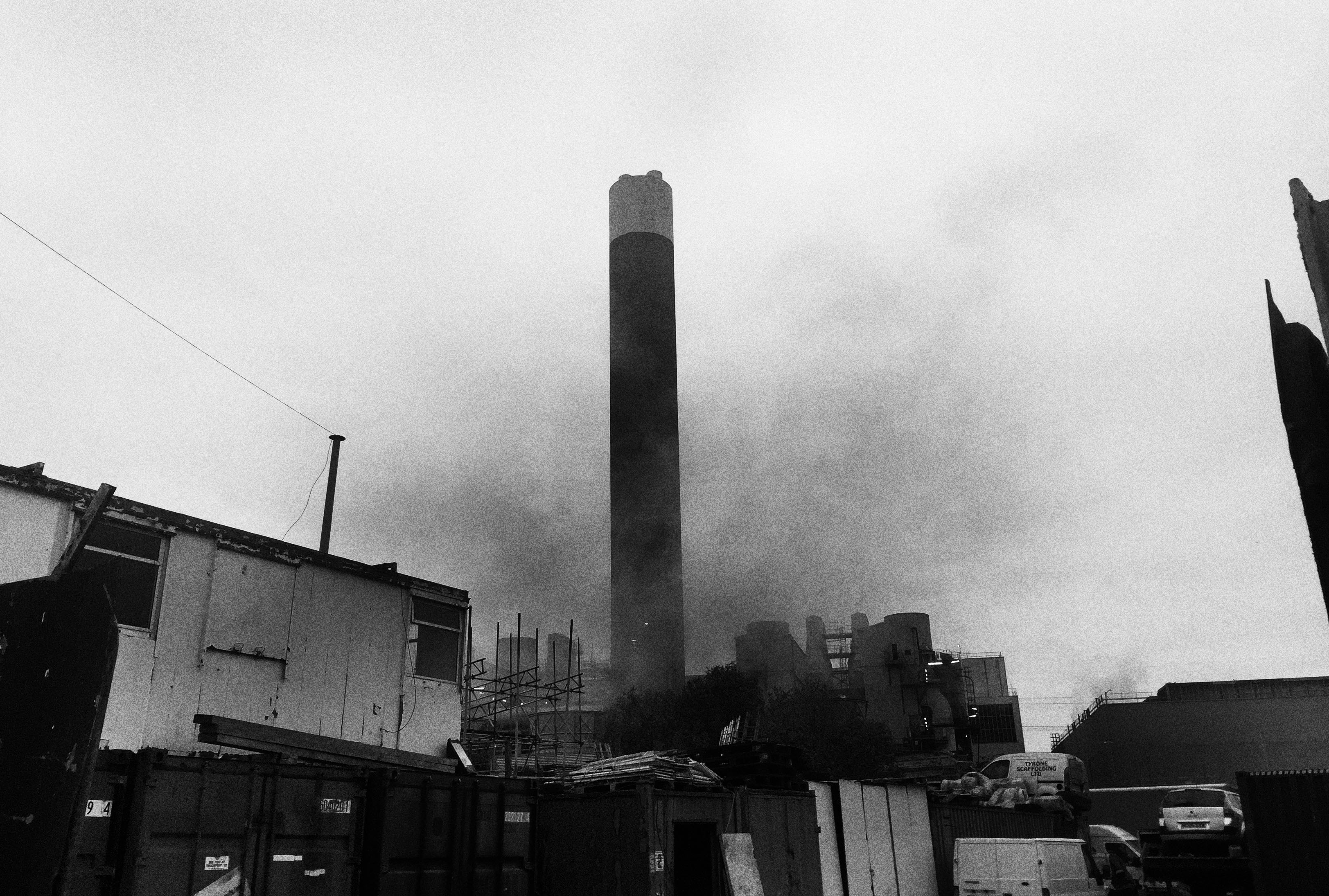
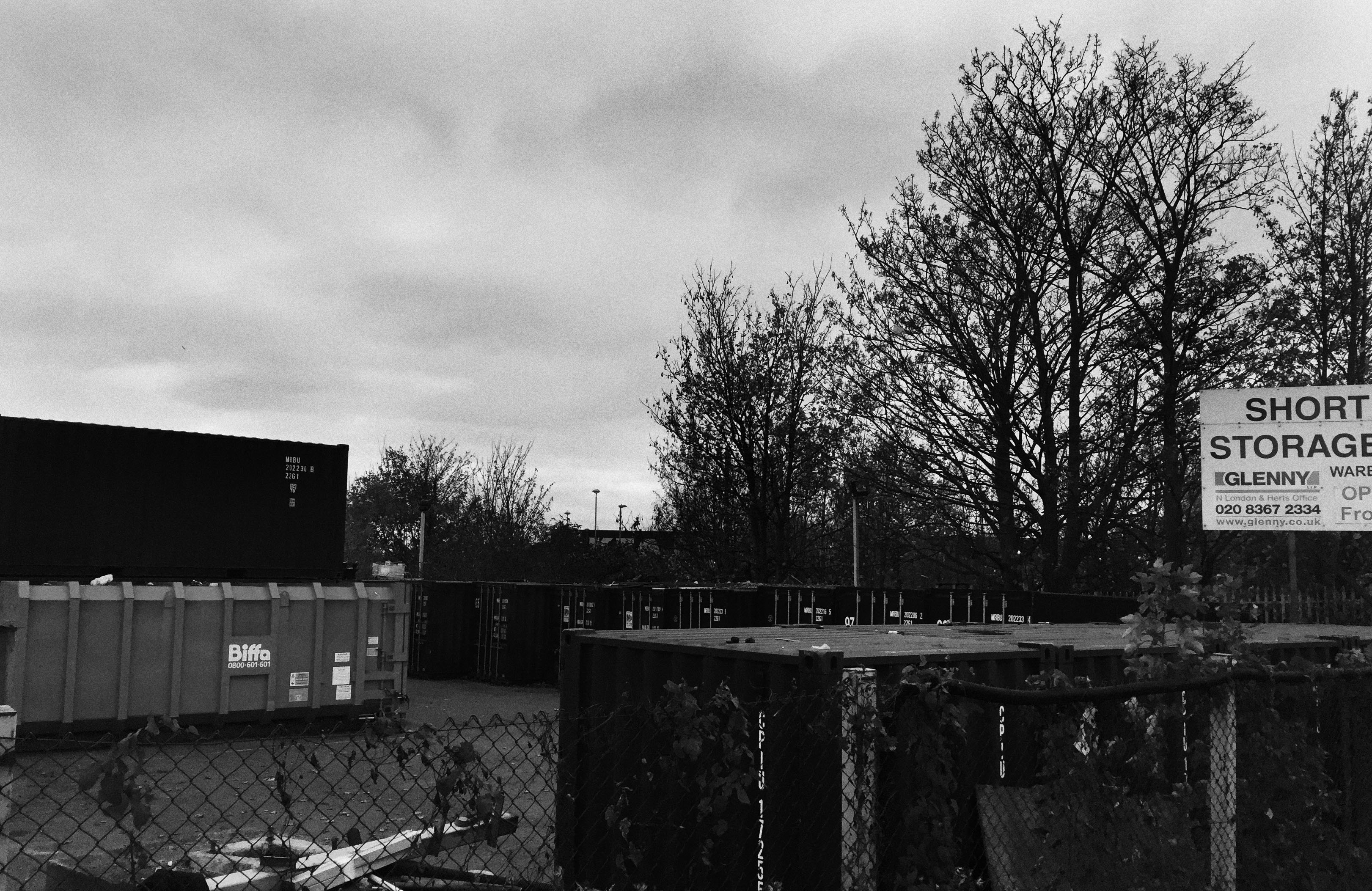
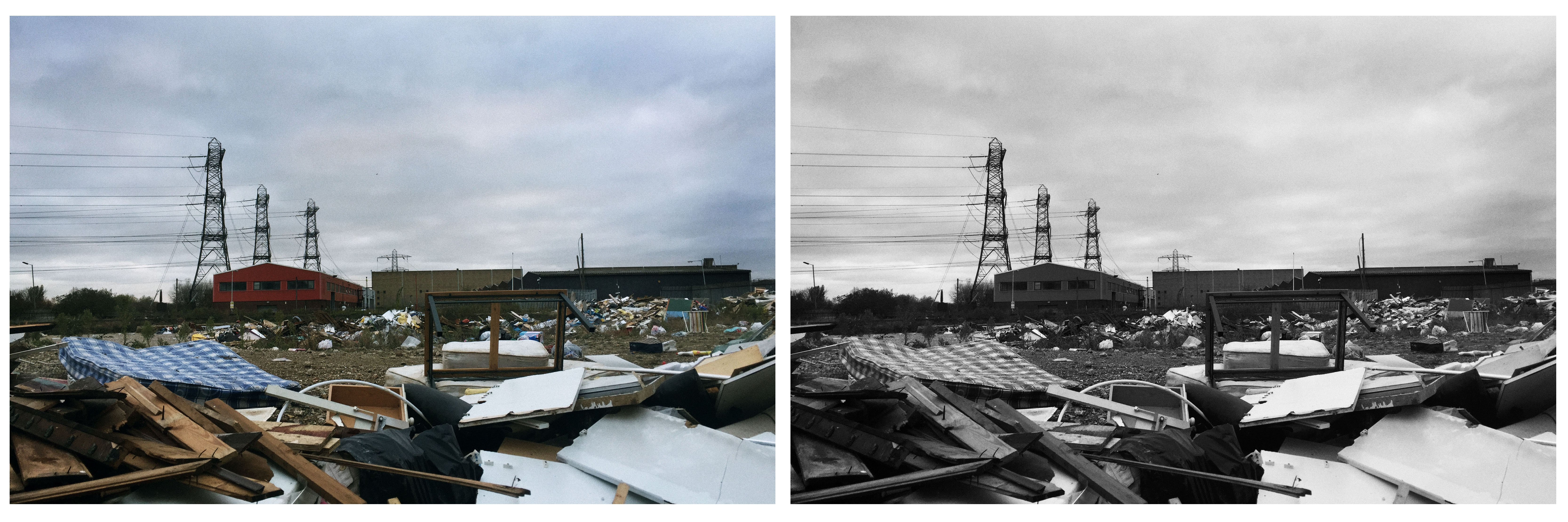
After looking at the imposing arcitecture built due to globalisation and the effect it has upon society, I wanted to expand further in the more negative aspects of this. To do this, I've decided to look at the industrial side of gloablisation and the negative impact it is having upon our environment. To explore this, I will first look at Edward Burtynsky and respond with images around an industrial area. Then, I will look at Tom Manley and discover the surrounding areas and the state it is in, economically and socially.
D E V E L O P M E N T O N E
E D W A R D B U R T Y N S K Y
Edward Burtynsky was born in 1955 in Ontario, and is known today as one of Canada's most repsected photographers. In 1982 he recieved his BAA in Photography/Media Studies from Ryerson University and went to capture global industrial landscapes which are featured in collections of over sixty major museums around the world. The dominant aspect to all his collections focus on his interest in exploring the residual landscape. Below are three images I was particualrly drawn to.
|
|
|
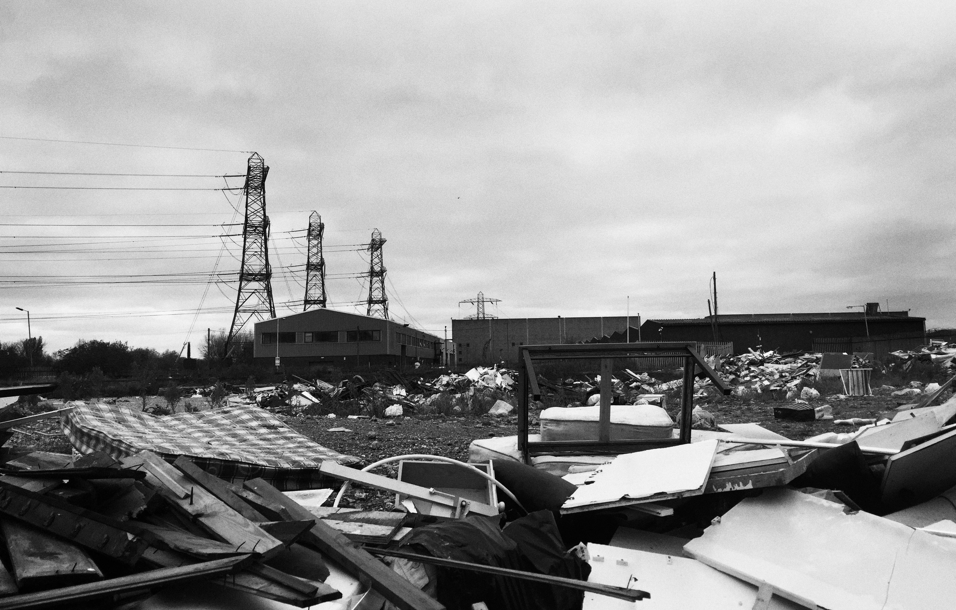
I was particularly drawn to these three images primarly for the extensive scale featured in all. The first image of the large scale car park strongly demonstrates themes of over population and the pollutive impact we have upon our world. Knowing that the average car per year releases an averagfe of 4.75 metric tons of carbon dioxide emissions allows the viewer to come to terms with the damaging effect humans are having upon the planet. The second image depicts a scenario rich in detail combined with scale open to variety of meaning. Primarily this scene is highlighting an elements of lack of care or nuture towards the environment. Despite the fact that this recycling yard is a place outside of our normal experience, it is something we partake in on a daily basis thus it is showing the majority of attitudes present in modern society and our disfunctional relationship with the natural world. Lastly the image on the right presents a birds eye persperctive of a multiplex highway. The patterns present in this image show the strange form we have ordered our lives and the strict regulations we obied by. It also shows how we are confined to our destructive ways and without it, we as humans are hopeless. Thus these three images all act as a metaphor to the problematiic dilemma to our modern existence.
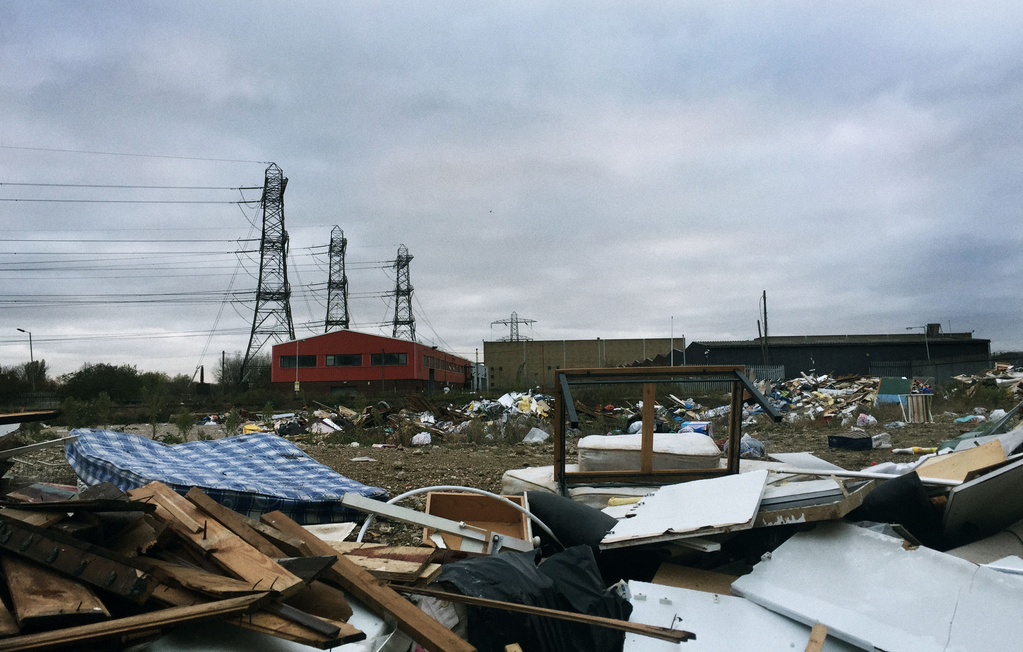
M Y R E S P O N S E
For this response, I wanted to focus on the industrial aspect present in our society. So in order to do this, I went to locations ( as shown on the map below ) and focused on capturing images that presented this industrial element. Below is my contact sheet and selected images in colour and black and white.
|
|
S E L E C T E D I M A G E S
C O L O U R E D I T S:
B L A C K A N D W H I T E E D I T S:
D E V E L O P M E N T T W O
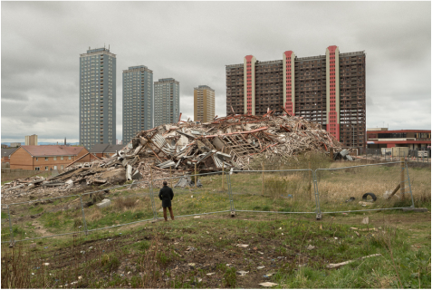
T O M M A N L E Y
Tom Manley is an English photographer who's work focuses primarily on the built environment, urban and social landscape, architecture and the cultural fabric of cities. His work has won a range of respect such as in 2008 where he won the Social Landscape and Documentary category in the Glasgow Institute of Architects Photography competition. Thus throughout his career he continues to focus on the theme of changing the face of the land, regernation and place identity. I have chosen two images of his work below which I feel particularly represent this. I have also attached a link here to his flickr which features a combination of all of his personal and commissioned work.
|
|
I have used these two images as inspiration on my weebly as i feel they strongly relate to the conceptual element of my development. This is due to the fact Manley captures destruct social environments around areas of industry. This is something i was particularly interested in after I looked at the industrial areas as I wondered how the surrounding areas copped socially and environmentally. Here it is evident from his photography that these areas are struggling indefinitely. Also, I liked the fact that Manley edited these photos to further enhance the dullness and the destructive effect we have ultimately had upon our society in poorer, less fortunate areas. I will capture areas such as these in response to Manley.
M Y R E S P O N S E
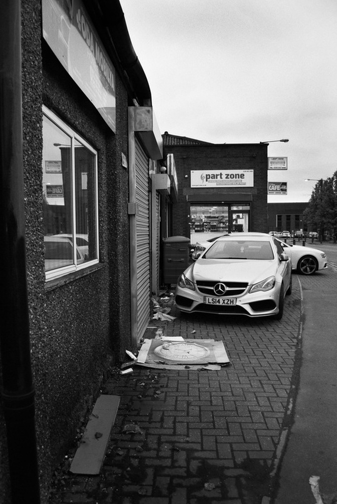
For my response, I captured these images around areas of industry to show the effect it has had upon society and the different communities, like in Tom Manley's response. So I went to local areas around the North Circular, below is my contact sheet and selected images.
|
|
S E L E C T E D I M A G E S
C O L O U R E D I T S:
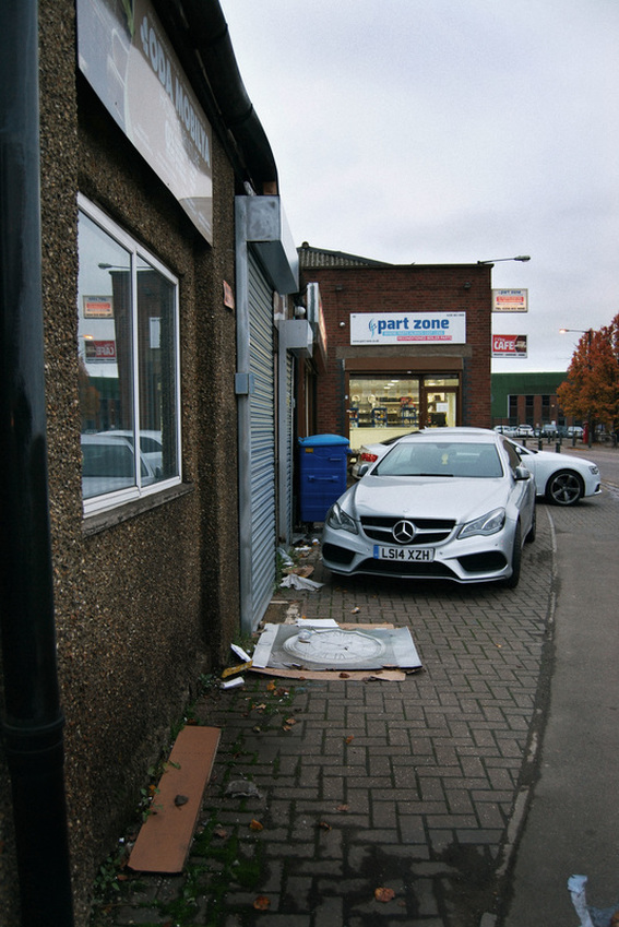
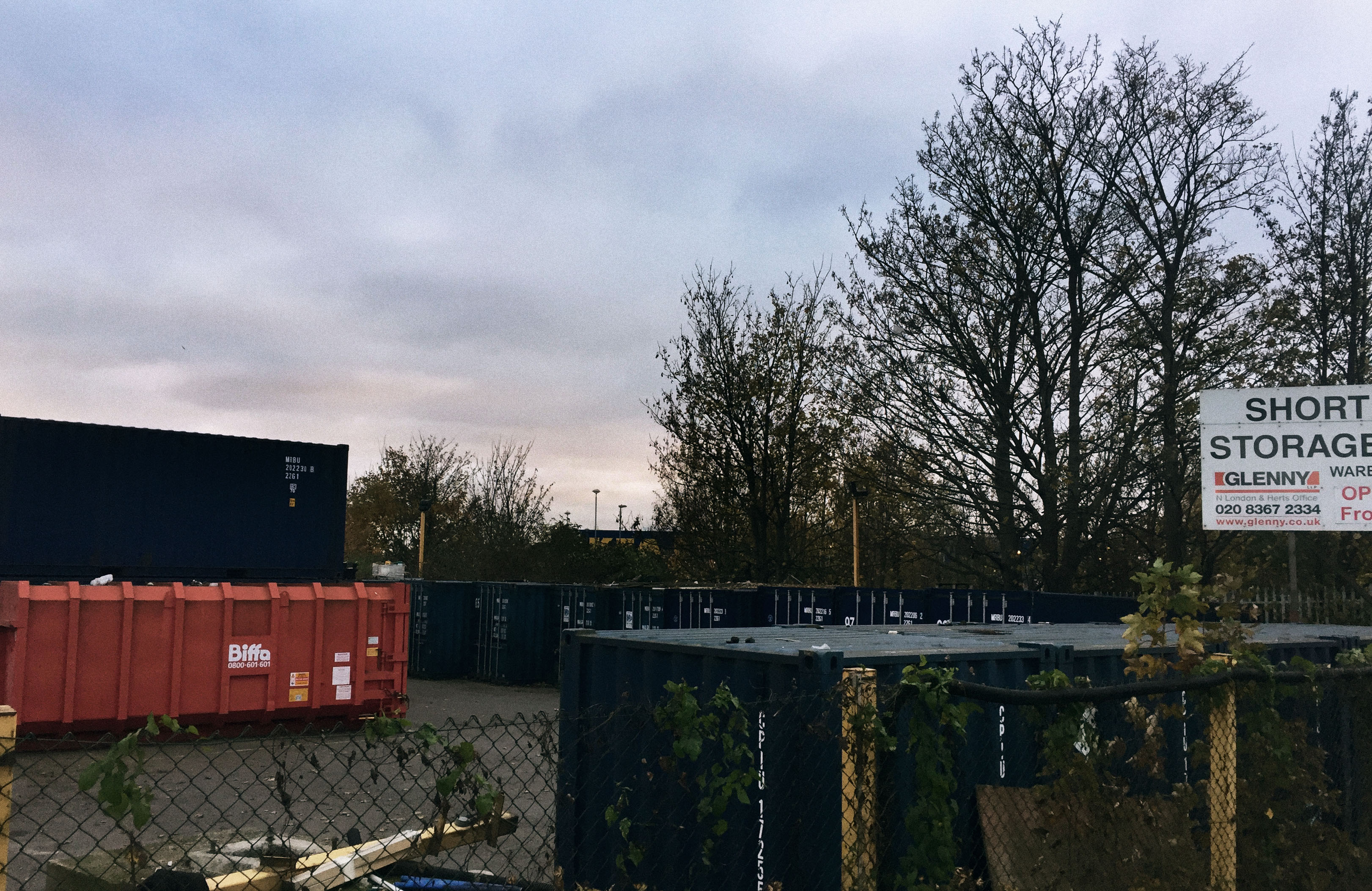
B L A C K A N D W H I T E:
A R T I S T A N D M E
I then looked at the other work of Tom Manley and in doing so found the images below. I used this against my work as I liked the comparison of natural world against my urban images.
T O M M A N L E Y ' S W O R K:
M Y W O R K:
T H I R D R E S P O N S E : M A N V S N A T U R E
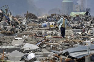
For this response, I wanted to show the contrast between the industry and the effect it has upon our society and the natural world. First I looked at the global effect of nature versus man. I looked at two events in particular- the Fukushima Tsunami event in Japan and the Chernobyl event.
F U K U S H I M A , J A P A N
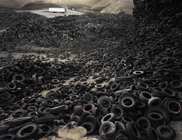
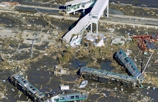
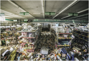
The Fukushima Daiichi nuclear disaster was an energy accident at the Fukushima Nuclear Power Plant in Fukushima, intiated primarily by the tsunami following the Tohoku earthquake on the 11th of March 2011. Despite the fact the active reactors were shut down, the tsunami destoryed the emergency reactors and the cooling generators. This lead to insufficient cooling thus causing three nuclear meltdowns and the release of radioactive material. Also, various hydrogen-air chemical explosions occured between the 12th and 15th of March. This disaster is the largest nuclear disaster since the 1986 Chernobyl disaster and the second disaster to be given the Level 7 event classification of the International Nuclear Event Scale. The impacts due to this disaster included 37 people with physical injuries, 2 workers taken to hospital with possible radiation burns and an expected 130-640 people in years and decades ahead to be killed from cancer. The United Nations Scientific Committee on the Effect of Atomic Radiation and World Health Organization report that there will not be an increase in miscarriges, stillbirths or physical and mental disorders in babies born after the accident. Below is images from the event, thus demonstrating the major impacts it has had upon the human world. Here is a clear example of nature fighting back and winning against our attempt at disrupting the natural world and subseqently has had a profound effect upon Japan's society.
|
|
|
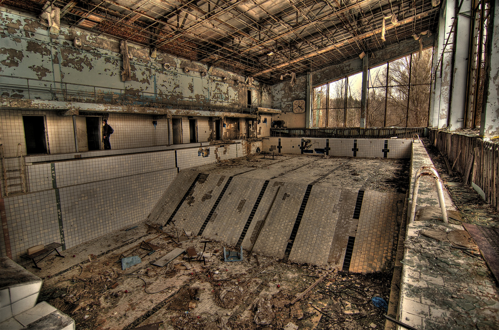
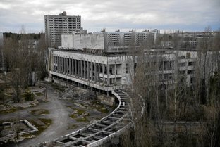
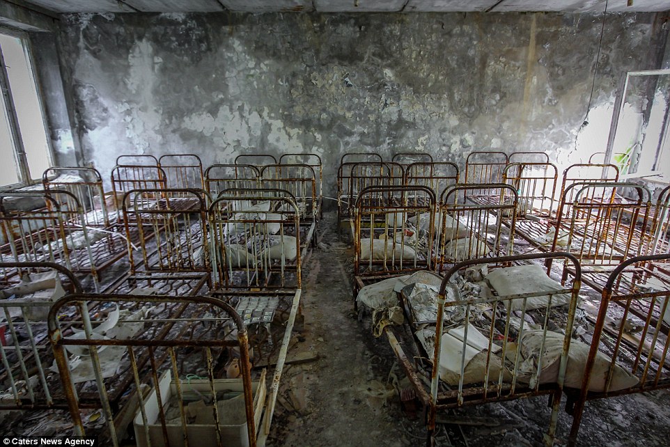
C H E R N O B Y L , U K R A I N E
The Chernobly disaster was a nuclear accident that occured on the 26th of April 1986 in the light water graphite moderated reactor at the Chernobyl Nuclear Power Plant near Pripyat. A combination of inherent reactor design flaws lead to the an uncontrollable reaction conditions that flashed water into steam generating a destructive steam explosion. This then produced updrafts for nine days lofting plumes of radioactive isotopes into the atmosphere. Thus concluding that this was the worst nuclear power plant accident in history, classifying as a level 7 event (the maximum classification). The incided lead to 31 direct deaths and a prediction from the Chernobyl Forum that the eventual death toll could reach 4,000, already being linked to 1000 cases of thyroid cancer. Thus demonstrating this astoning
|
|
|
D E V E L O P M E N T O N E
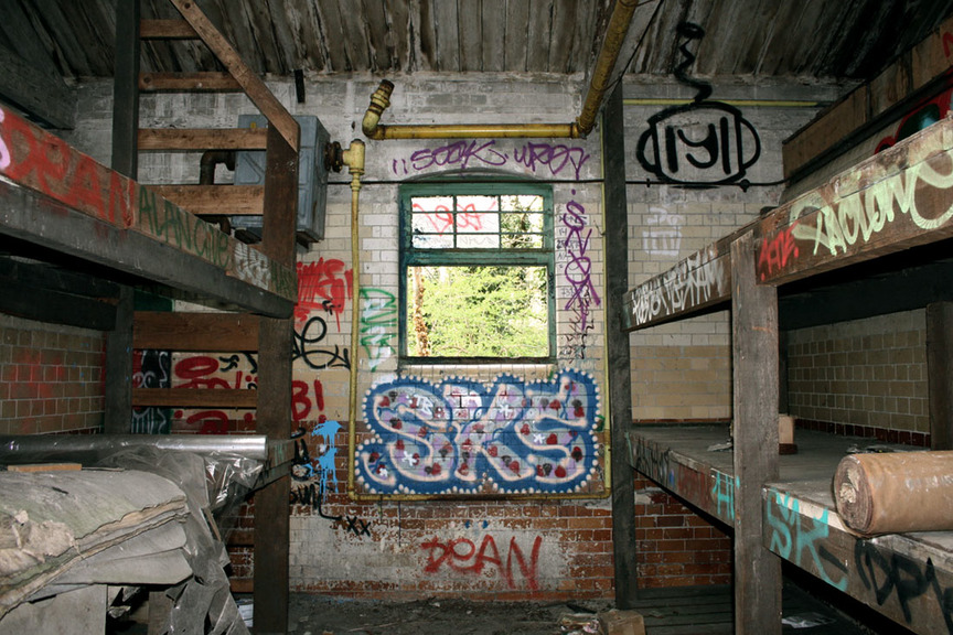
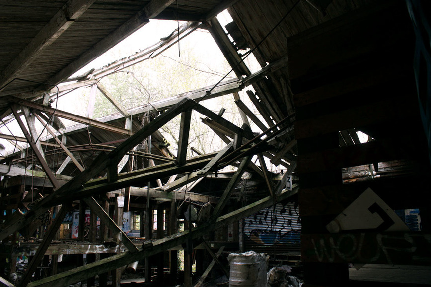
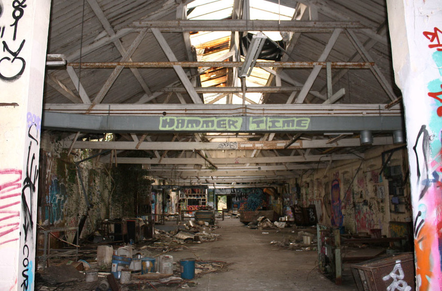
F I R S T R E S P O N S E
M A T H E W M E R R E T T
Mathew Merrett was born and raised in Toronto, where he developed a love for photography, in particularly architectural photography. He has spent several years exploring, photographing and exposing urban decay within abandoned buildings and factories. His inspiration sprung when 9/11 occurred encouraging his love for architectural photography to blossom. His compositions often are from bird's eye view and include depth of field. Below is just two of his images with I thought were very effective.
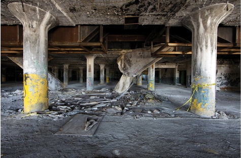
|
|
Both these demonstrate Merrett's ability to capture powerful and effective images. The composition of these two show the rupture of the structural element, destoryed clearly due to urban decay. On the left the vast forest of decaying columns create an interesting perspective and show a unique architectural representation of a industrial structure. I also liked the typical bland grey colour throughout the whole image with the splash of deteriorating chemical yellow. The fact that the broken structural parts of building are scattered in the centre of the image add a orderly formation to all the mess. However, on the right, the capturing of the destruct corridor shows it has been left to ruin with the only light seen from the broken windows above, thus hinting at a spiritual biblical element. The emptiness of both images creates a creepy, entrapped vibe, as though there is no escape. I was strongly drawn to the hence why I chose to include it as my inspiration.I also thought they are an effective presentation of how physical neglection from humans can hugely impact the physial environment and thus cause decay as a result of it.
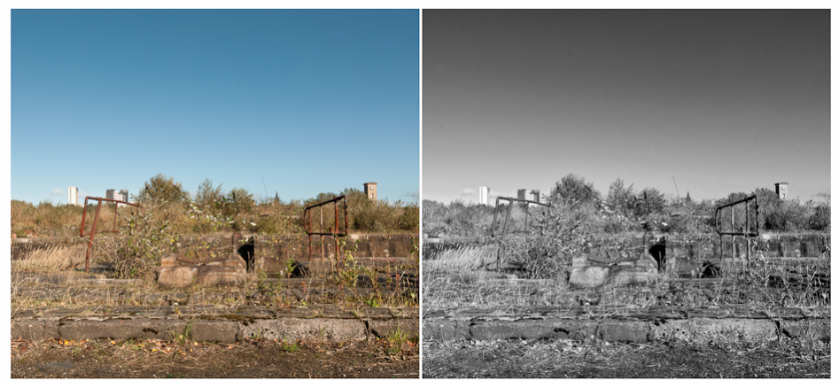
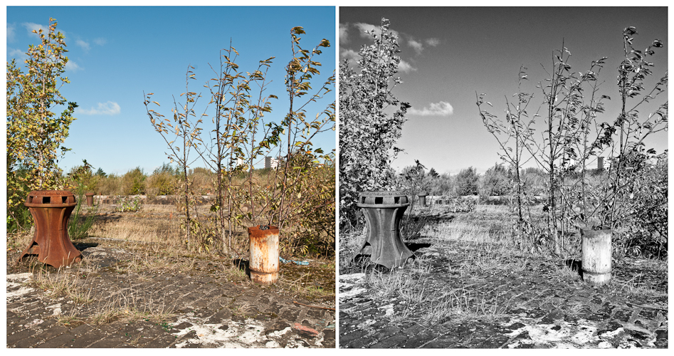
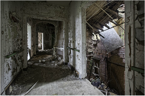
M Y R E S P O N S E
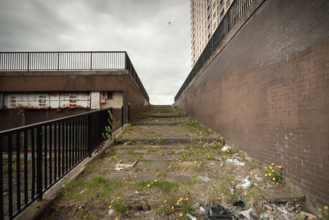
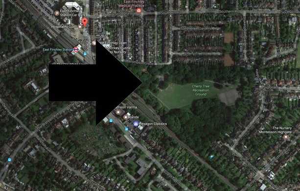
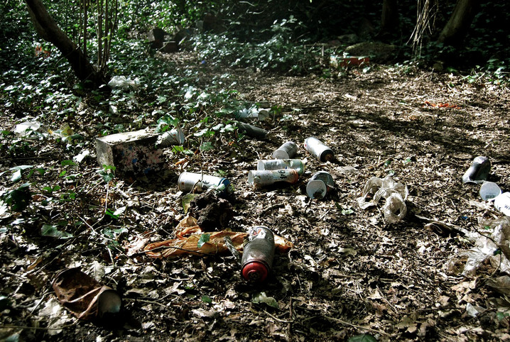
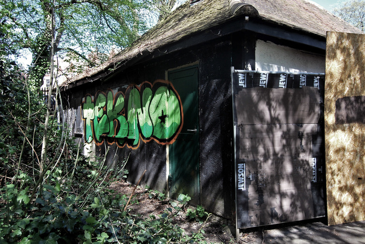
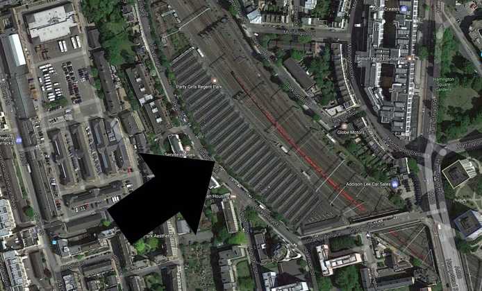
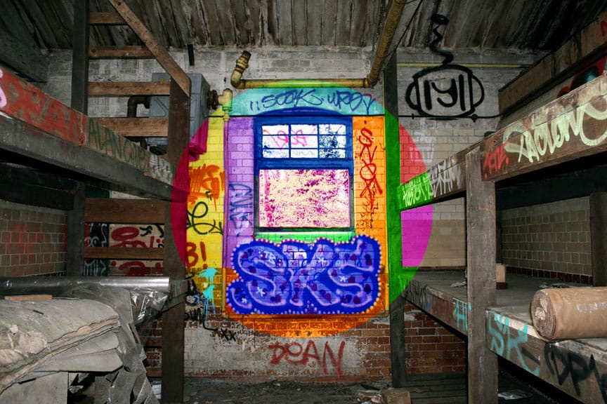
For this response to Mathew Merrett's work I decided to visit the abandonded building in my local area in East Fincherley's park Cherry Tree. Below is a map that illustrates it's location. This was effective as not only was the building destruct but the surrounding area relating strongly to the theme of man vs nature.
S E L E C T E D I M A G E S :

S E C O N D R E S P O N S E
I then decided to attempt to physcially abstract the aesthetical element on these images. In order to do so, I looked at Tim Suess.
T I M M S U E S S
Tim Suess was born in Basel, Switzerland and grew up with a passionate desire to capture images. His photography has enabled him to explore the world to expand and develop his work and in my opinion, has resulted in very striking images. Most of his work revolves around the slow battle between human structures and natures's decay processes. With this in mind and his fascination by the affects of time it has resulted in a powerful line of work. I have presented my two chosen images of his below.
|
|
Both these images of Timm Suess's present first and foremost a visually interesting aspect. The warm, autumnal colours of the left image present a form of decay in an intriguing way, not just between each individual image within the college but in each image, presented by the contrasting elements of decay. However, the right image is very interesting in many different aspects. First for the fact that you can see the two opposing colours of a rusting brown and a pastel blue which at some points almost merge together into an off yellow colour. I like the fact that Suess has taken a picture of an area of decay in which the peeling paint has actually fallen off revealing the texture below adding a whole new dynamic to the image. I also included this image as an inspiration as the way he has formed the college allows you to view this intriguing circular shape against the orderly vertical wooden material which I took a strong interest to. These colours and textures are both are primary and striking aspect to Suess's work and thus this is something I will investiagte in my response.
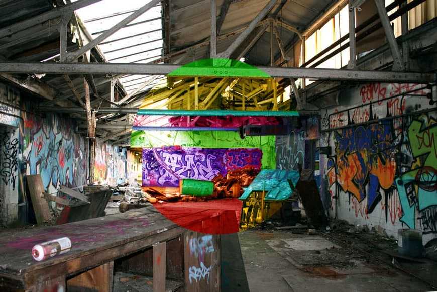
M Y R E S P O N S E
After researching Suess's style, I responding using the images captured in East Fincherley. I then used the most prominent elements of the images and adapted the size and rotated them to create a unique and new response. I also changed the colours and adapted the texturl element by enhancing the contrast. I did this as I noticed it was a very important aspect to Suess's work.
D E V E L O P M E N T T W O
F I R S T R E S P O N S E
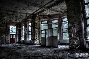
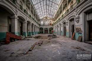
A L A N D U G G A N
Alan Duggan is a photographer based in Fleetwood, a small Lancashire town. At the beginning on his career his primary intention was to document derelict asylums, in which he was visting on various occasions. This passion began to grow and thus his photography developed as he continued to capture these amazing photographs of derelict abandoned locations. Below are three examples.
|
|
|
I chose these three images as I believe they are all very striking. They all possess themes of urban exploration and urban decay, thus demonstrating the impact of human neglection. The three images create a powerful effect upon the viewer as these buildings were once very grand and respected pieces of architecture, yet without the invested nuture or care from humans, this has ultimately lead to the slow proccess of nature reclaiming what was once theirs. This therefore leaves an emotive response upon the audience, in awe of the previous beauty. On the other hand, it also allows a quite harrowing effect due its eerie and isolated aura, almost as though it has been documented from a post apocoliptic world. This is very interesting for me adn my research upon this concept. It demonstrates themes of abandondment and man vs nature in a whole new form, and thus shows the effect and battle between the natural and man made world, demonstrating the permenant effect we implicate. I will use this and infuse it into my work.
M Y R E S P O N S E
When responding to Alan Duggan I wanted to show the contrast of the man made world and the effect and the natural world fighting back. So, in order to do this, I took images from two locations, demonstrating these two effects and thus showed the contrast below.
M A N W I N S
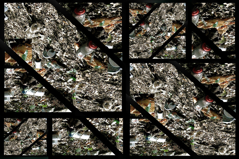
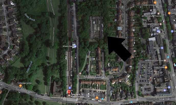
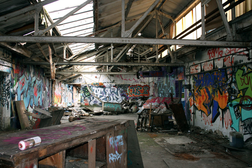
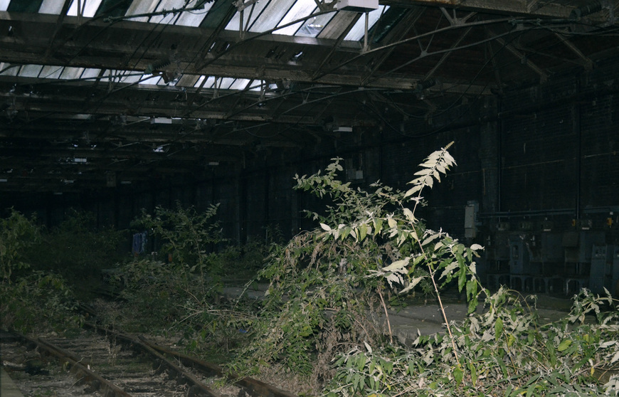
First I visted an abandonded building in Totteridge. Here I was able to look at the human neglection and how ultimately humans have impacted the natural world so much that nature was not able to fight back, thus showing humans/man winning. Below is a map of where i visted, my contact sheet and the selected images.
S E L E C T E D I M A G E S :
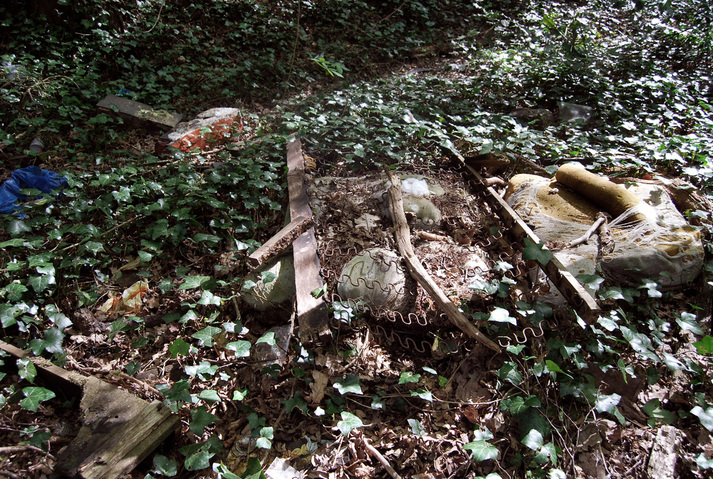
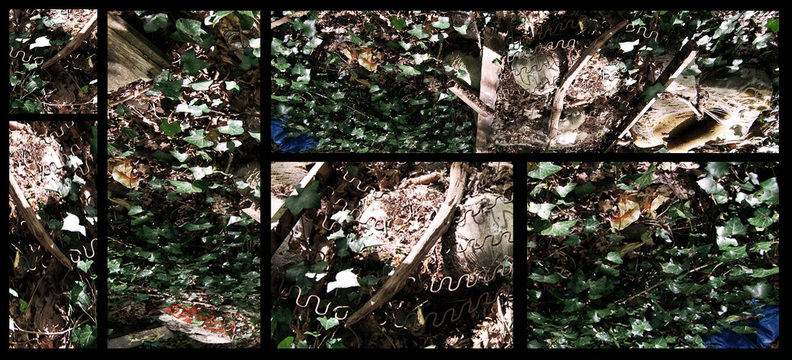
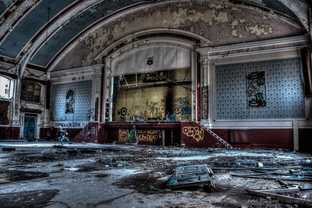
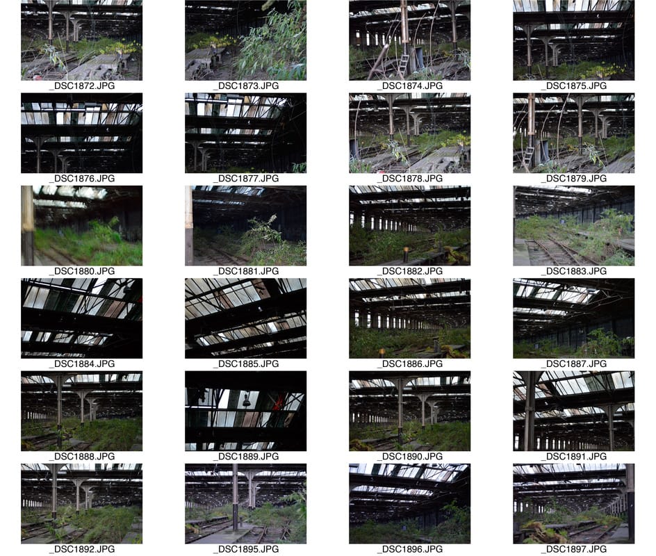
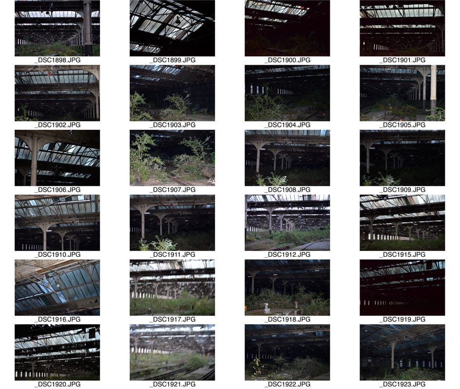
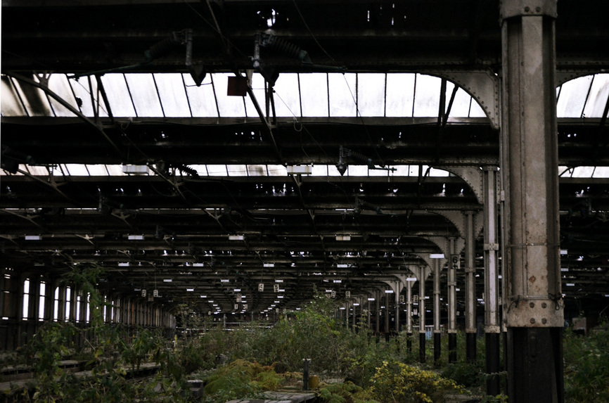
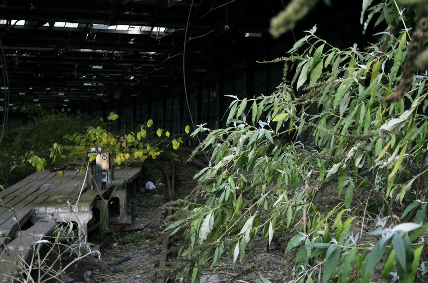
N A T U R E W I N S
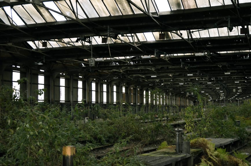
I also visited an abandonded train station in Camden. This acted as a contrast as it showed how nature had fought back one against humans, despite the dramatic impact we have had upon the natural world. Below is a map of where it is, my contact sheet and my selected images.
|
|
S E L E C T E D I M A G E S :

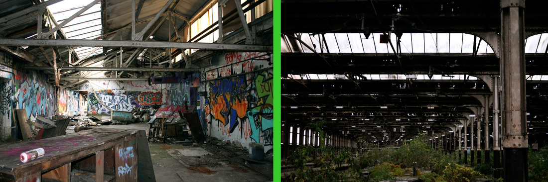
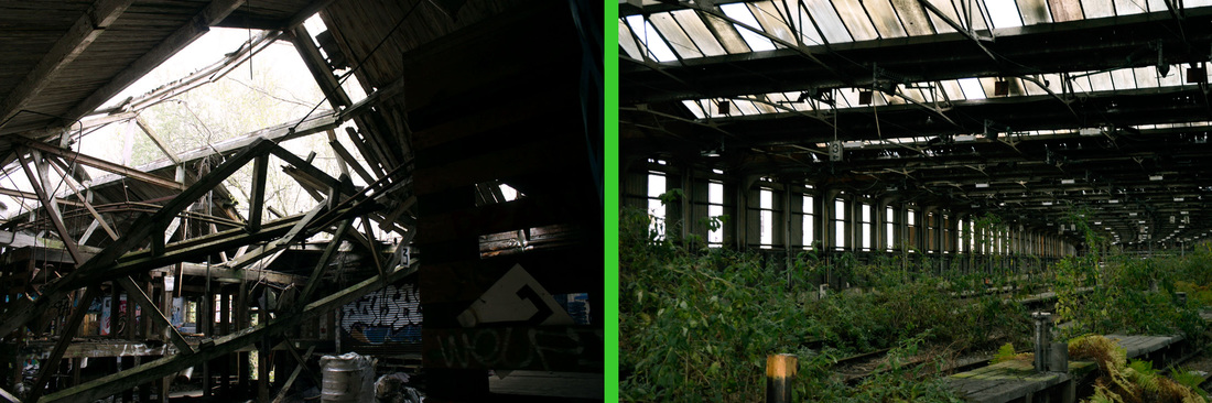
F I N A L E D I T
Then to further enhance the sense of contrast I edited the images together so that the major contrast could be viewed.

S E C O N D R E S P O N S E
I then decided to physically abstract the composition by editing it in photoshop in a unique form. In order to do this I looked at Georges Rousse and edited the images from the two visits in an abstract form, so that not only the concept was abstract but the aesthetics were too.
G E O R G E S R O U S S E
Georges Rousse is a French artist and photographer, born in 1947 in Paris, where he currently lives and works. Rousse took an interest in photography at a young age ( 9 years old ), when he recieved a Kodak Brownie camera as a christmas gift. He then went on to study professional photography and printing techniques In Nice and subsequently went on to open his own studio, dedicated to architectural photography. Below are three examples of his impressive work.
|
|
|
These three images all demonstrate Rousse's talent for capturing abandonded or derelict buildings. Rousse's attraction to these buildings has ultimately lead him to his successful career. By creating one-of-a-kind artworks through transforming these negelcted sites into a pictorial outcomes it demonstartes an abstract aesthetic. What particualrly drawed me to Georges Rousse was the fact he creates these effective artworks by hand devising single persepctive, geometrical colour and structure through his painting by hand and subsequently capturing it from a particular angle making it look as if it's not real. This trickery plays with the audience's emotions and ultimately is the key to his success. I will use this abstract representation and try to response in the same form.
M Y R E S P O N S E
In order to respond to Georges Rousse, I create these I edited the original photos on photoshop using different techniques in order to create the same effect as Rousse. I will explain below how i achieved each outcome.
To create this:
1. Put the photo in photoshop.
2. Used the rectangular marquee tool and selected a square.
3. Created a new layer and mantained the selected square.
4. Inverse select the new layer so everything but the sqaure was highlighted & then deleted the rest, leaving just the previously selected sqaure.
5. Selected a smaller sqaure using the same tool and then changed the colour balance to different, random colours.
6. I then repeated this all over the bigger square so the final outcome was lots of small coloured sqaures.
7. Lastly, I used the saturation tool and enhanced the brightness of the colours so they stood out more.
To create these:
1. Put these photos into photoshop.
2. Using the elipitical marquee tool selected a circle in the centre of the image.
3. Create a new layer and inverse select, then delete the highlighted area, leaving a circle left.
4. Then using the quick selection tool, select different small areas.
5. Once they are selected adjust the colour balance dramatically.
6. Lastly once all of the circle has been changed into different bright colurs, further enhance them by saturating them more.
F I N A L P I E C E
For my final piece I wanted to create something that demonstrated the prominent and damaging effects of globalisation on the natural world and how us as humans are primarily so relucant to do something to prevent further damage but also the lack of care or nuture we present to the natural environment. In order to do this to place an outstanding impact upon the viewer I decided to create a short clip in an abstract form so that the message could place a more prominent effect on humans in hope that this problematic issue our society has created can be adapted and changed in order for the natural world to survive and thirve.
A R T I S T I N F L U E N C E
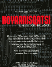
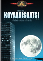
K O Y A N N I S Q A T S I
My main influence to my film was Godfrey Reggio's "Koyaanisqatsi (1983)". In his film it features a range of landscapes demonstrating the strong contrast and collision of the two worlds- the natural world vs urban, technological lifestyle. The title itself is a Hopi Indian word meaning "life out of balance" thus the message to this film is presenting to the audience the effect humans are having upon the world and our utter destruction of the natural world. It is also showing the strange methods in which we have constructed our world, specifically shown when there are the birds eye perspective of the extensive american freeways shaped in strange forms. I used this as my inspiration as I liked the voyersitic approach taken when filming this film as though the audience is alienated from this world and watching the way the people have constructed it. This is something I will attempt to do when creating my own film.
T R I A L S
Before I filmed by final piece it was vital that I attempted a variety of experiments so that the final outcome was its most successful. Below I have composed trial shots and time lapses.
T I M E L A P S E
I experimented with a variety of time lapses before constructing my final piece as I wanted to have the best possible outcome when making the final short clip. Below is my outcome.
|
|
S H O T S
Before each location I filmed at I captured a trial image to make sure the compositon and aesthetical aspect looked as I wanted it to. This was very important as I was able to make sure each shot related to the conceptual element on my project but also looked visually attractive. Below are my trial shots and my explaination to why I composed each shot like so.
|
|
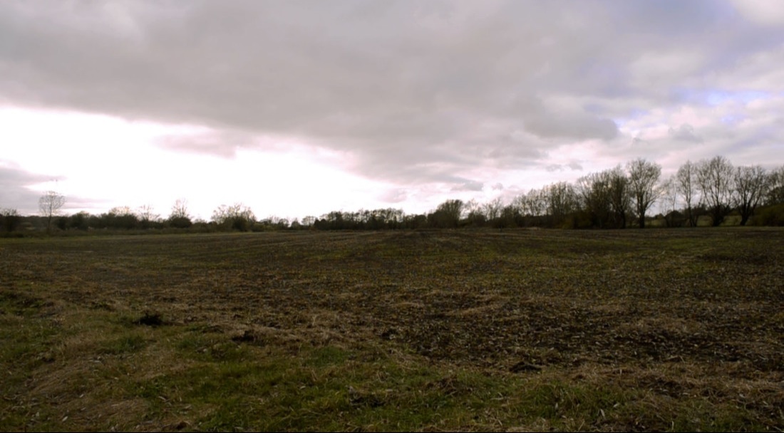
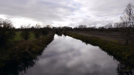
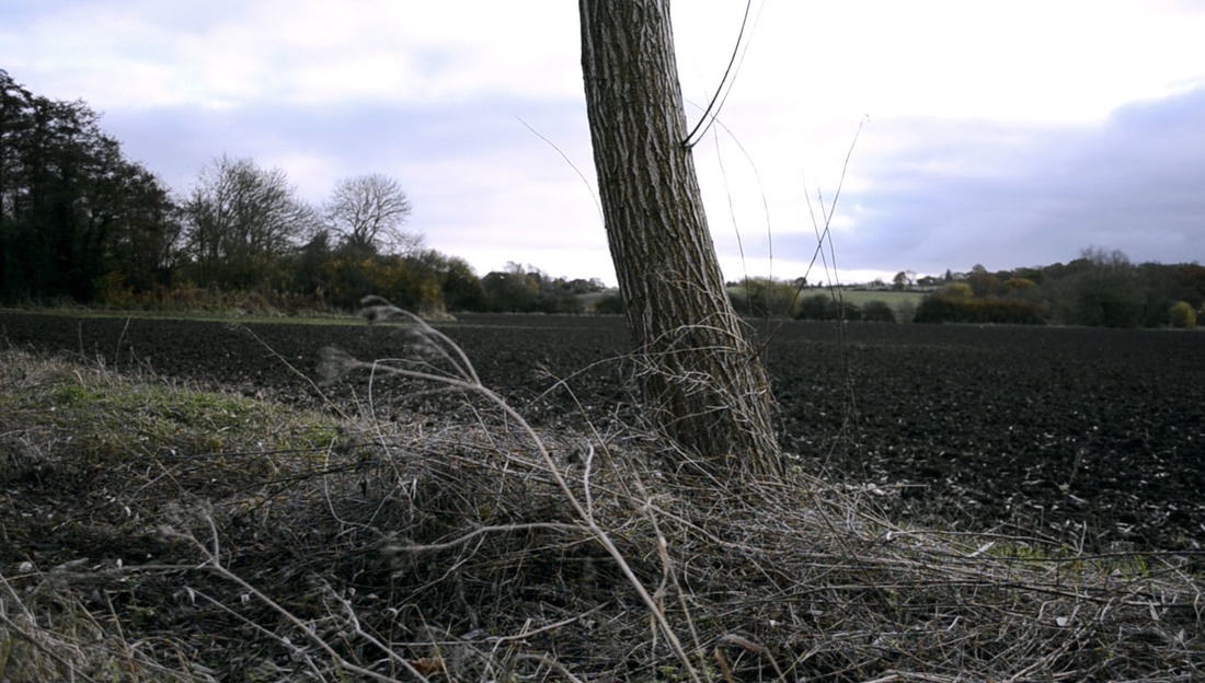
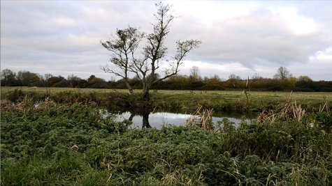
I decided to begin my film in an isolated natural environment to show the peaceful and harmonious aura the natural world presents without the interference of humans. So I started the film in an isolated location in Essex on a typical British day to further promote the natural beauty. In the left image, which is the second shot features a river. I decided to add this as I was drawn to the aesthetics: the reflection of the clouded sky on the water created a harmonious atmosphere.
|
|
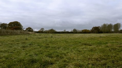
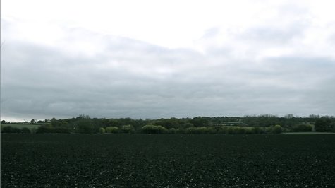
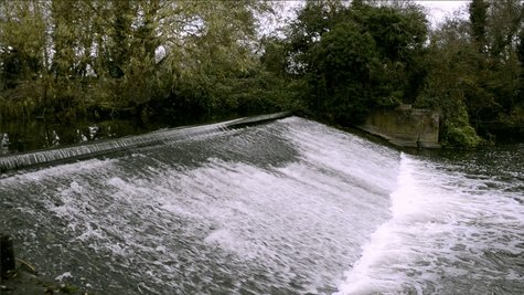
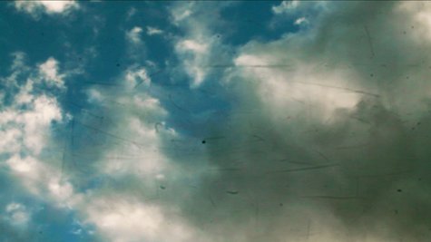
The third shot ( on the right ) focuses on a rich lush green field. I created an equal ratio of clouds and grass to stimulate an attractive composition. I also slightly enhanced the green element to further promote the natural beauty concept and to draw the audiences attention. Then on the next shot ( on the right ) I wanted to focus the audience's attention of the idea of flows, considering my clip focuses primarily on globalisation and thus flows are a vital aspect. So in order to demonstrate this I focused the shot on the sky and the rapid movement of the clouds moving. Therefore this meant I slowly introduced flows via the natural world and to hint at how we as humans have manipulated it.
|
|
Then for the fifth shot ( on the right ) I wanted to demonstrate the element of movement event more so I maintained the cloud flows in the background and then focused the shot on a dead wintered plant. This created a stark image which is something I wanted to do as I slowly introduced the human take over. I then furthered the element of movement, especially through plants by having a wide shot of an array of plants all moving at there same time at rapid speed. This then contributed to the flow/movement concept but also creates a unnerving, manic aura which is something I wanted to stress as the human involvement gets closer.
|
|
For my final nature shot ( on the right ) I wanted to increase the movement and hint at the transition so I thought capturing water would be a perfect demonstration of these two impacts. I then accelerated the speed on iMovie to increase these factors even further. Then for the transition shot ( on the left) I wanted to show how humans have interrupted nature. So I began the shot focused on the moving clouds then slowly moved down and introduced a man made structure; a gas tower.
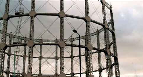
|
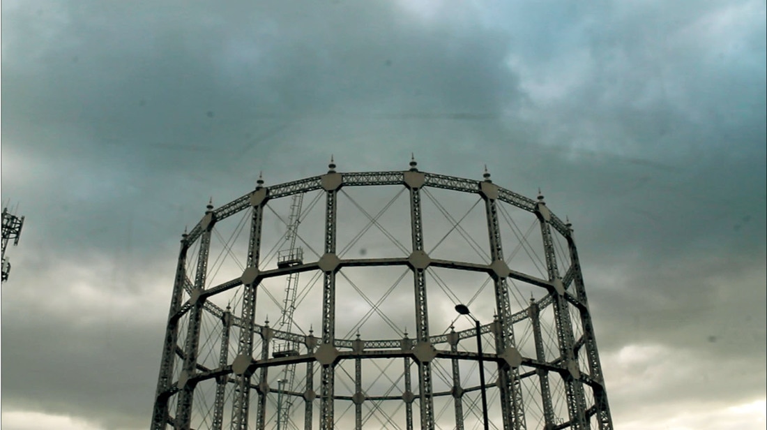
|
I then began to introduce the gas tower (on the left) from a close up shot to demonstrate its impowering impact, filling the screen. This would hopefully create a sense of horror surrounding these large structures and the contrast between the natural sky filled with clouds and these ugly man made infrastructure. Then for the next shot ( on the right) as I was doing a slow transition I wanted to reveal the structure over a variety of shots. This then built up the tension within the audience to this shot where the structure as a whole is finally revealed; almost like a big finale.
|
|
Next I wanted to introduce the rapid rate at which humans are expanding this destruction of the environment, so to indicate this I filmed cranes building a new development and fast forwarded the content. This then enhanced the speed at which we are rapidly advancing our urban world. I also decided to film it from below as this gave an overpowering effect and demonstrated how we are unable to go back on the scarring we are doing to the land.
|
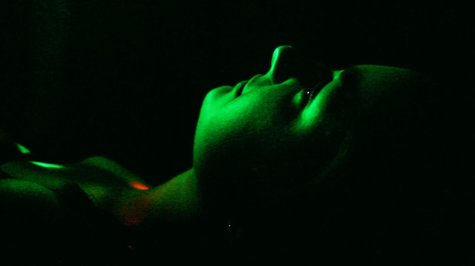
|
I then decided to dramatically change the screen content. I began at night time focusing on street lights passing the screen at a rapid rate. This once again indicates the rapid rate of movement and transformation but also the use of lights surrounded by the dark shows the lack of hope and how it is slowly diminishing. To further demonstrate this I introduced a human to replicate our involvement and destruction of the environment and using the model as a focus. I then switched mini clips of her with multicoloured lights over her face and the flashing street lights. I purposefully chose to project these multicoloured lights as I thought they presented a disoriented aura, like the attitudes we now present towards the natural world.
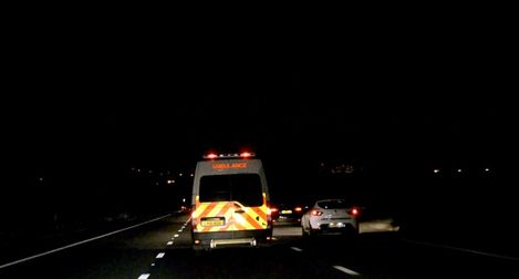
|
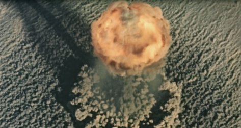
|
I finalised this segment of the film ( on the left ) with filming of an ambulance and zooming in. By using a service present in human life to represent the terror we have instigated this would impose a dramatic impact on the audience. I then quickly changed the screen content to clips I found from an external source. The external shot featured scenes of deforestation then of atomic bombs. I chose these two impacts to produce a sole message: destruction. Hopefully, by including these dramatic external shots this would then extent we have gone to and how this is a continuous process, which will eventually destroy everything if we are not careful.
F I N A L O U T C O M E
For my final piece I wanted to piece together all my developments and ideas into a final short film. My creating a film enables more of striking, long lasting effect upon the viewer, who may decide to act upon this impact we are imposing upon the environment. The beginning of the clip features a variety of natural landscapes set on a bright day thus to demonstrate how pure and innocent the natural world once is and still is. This is then heavily contrasted to the next segment of the clip, which features a model and various scenes set at night of cars driving and flashing lights. The model acts as an evil force showing the negative effect humans are having upon nature, destroying it and not caring, which is further amplified by her mundane attitude/expression throughout. The scenes of the cars represent the transition and journey between the beauty to destruction, hence why the clip the goes onto to explosions ( an external shoot ), showing the extensive lengths we have gone to with our destruction. The scenes of the bombed town ( external content ) are of the destruction in Aleppo. I decided to feature this as it is a current problematic affair that is majorly impacting our world, socially, economically and environmentally. Thus by demonstrating this real problem occur it also grabs the audience's attention as they recognise this content, appealing to the viewer emotionally. Lastly, the film ends with a reverse of everything featured before. I purposefully constructed this as this ends the clip on a positive note and leaves the audience in hope that we can reverse these negative impacts and go back to respecting the natural world, rather than destroying it. Below is the clip.
Globalisation from Molly Fenn on Vimeo.
E V A L U A T I O N : When evaluating my final project, I noticed some flaws. Some of the content featured wasn't as successful as the final outcome that I wanted thus perfoming the immense effect upon the audience, just like Koyannisqasti. Below I have demonstrated the unsuccessful shots and reasons for it, leading to my improvement.
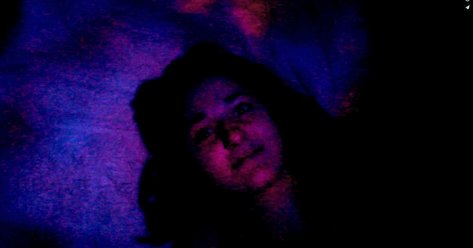
|
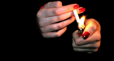
|
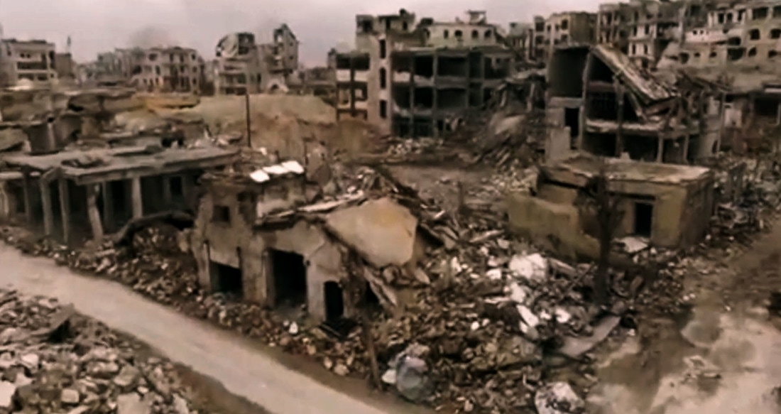
|
Shot 1 - This shot wasn't ideal due to the model's expression, which appeared sarcastic thus diminishing the effect the rest of the video clip was attempting to impose upon the viewer. In removing this shot and replacing it with another shot with more severity adds to the video as a whole and creates a more impressive and shocking outcome.
Shot 2 - For this shot I felt it was very amateur and didn't fit with the rest of the content. So despite the fact I was attracted to the aesthetical composition of the shot, the fact that it disrupted the flow of the video as a whole meant that the message was also disrupted. So instead I removed this shot in hope of sorting out the flow.
Shot 3 - This shot featured drone captured content of Aleppo, from an external source. I removed this for various reasons. Primarily, the concept behind the content didn't fit very well with the rest of the film, which again I felt made the message to the rest of the film to diminish. Additionally, I wanted to the video to focus more on my own content and feature a few external sources, of which I physically incapable of filming but was essential in creating the extreme extensive effect.
Globalisation edit from Molly Fenn on Vimeo.
